
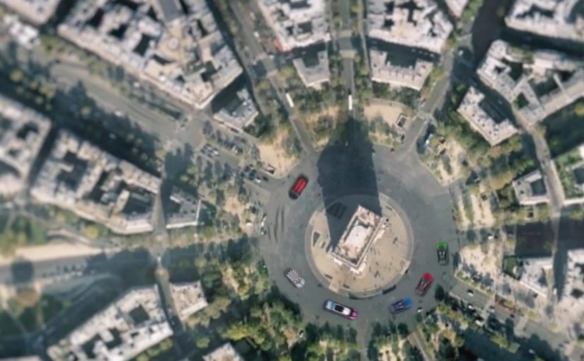
Google Maps Racing Advergame

Mini France has managed to successfully offer a virtual Mini experience with the help of a Social/Google Maps mash-up advergame called “Mini Maps”. Here, advergame means a branded game that turns the marketing idea into the experience itself.

With DDB Paris and Unit9 they created a Facebook app that lets you customize a virtual Mini and then challenge Facebook friends to time trials around the world through Google Maps. In the challenge you are racing your friends over satellite images of your favorite locations around the world!

Why this works

  • The idea is instantly graspable. Customize your Mini. Pick a place. Race the clock. Challenge friends.
  • Google Maps is not a backdrop. The satellite layer becomes the playable surface, which makes every track feel personal.
  • Social competition is built in. Time trials make it easy to compare performance without complex multiplayer setup.

In interactive brand marketing, the scalable advantage comes when a familiar platform becomes part of the mechanic, not just part of the media plan.

What this signals for interactive brand experiences

The real question is not whether a brand can borrow a popular platform, but whether the platform becomes the mechanic that makes the brand memorable. The strongest move here is that Google Maps is not a skin around the idea. It is the idea in use. That matters because location becomes the hook, customization becomes the commitment step, and friendly competition becomes the retention loop, meaning the simple reason people come back and play again. This gives the brand repeat interaction instead of one-time exposure.

Extractable takeaway: When the platform supplies the play mechanic, the brand experience feels more native, more personal, and easier to revisit with friends.

What to steal for map-based social games

  • Use real places as the content. When the track is a familiar location, the hook is instant and personal.
  • Make competition the retention loop. Time trials against friends give players a reason to come back and improve.
  • Keep customization lightweight but expressive. A few visible choices are enough for ownership without slowing play.
  • Build the platform into the mechanic. If Google Maps is the story, the experience should demonstrate it, not just reference it.

A few fast answers before you act

What is “Mini Maps”?

“Mini Maps” is a Facebook advergame for Mini France that combines social sharing with Google Maps to create location-based time trial races.

What does the viewer actually do?

You customize a virtual Mini and then challenge Facebook friends to time trials across Google Maps locations, racing over satellite imagery.

Why is Google Maps central to the experience?

Because it provides the world itself. The satellite view turns real places into tracks, which makes the challenge feel more personal and replayable.

What is the reusable pattern here?

Start with a concrete action, move to a simple challenge mechanic, then let social competition drive repeated return visits.

What should brands copy from this model?

Use a platform feature as the core mechanic, keep the player action simple, and add a lightweight social challenge that gives people a reason to come back.
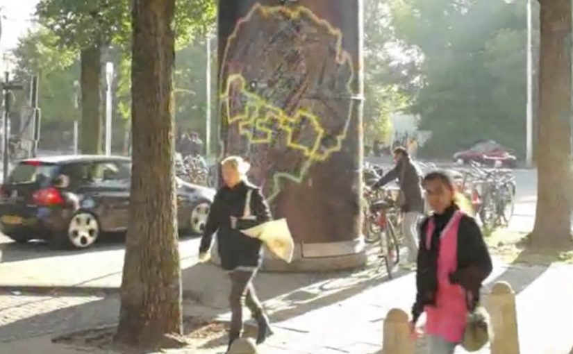
Nike Take Mokum: graffiti you paint by running

Boondoggle Amsterdam came up with a campaign for Nike that made running less serious. They distracted youngsters from their boring running schedules and challenged them to release their creativity on Amsterdam by using their feet as paint instead.

A Facebook app called “Take Mokum” (Amsterdam’s local nickname) was developed that allowed runners to make digital graffiti on the map of Amsterdam. All they had to do was actually run the route and upload their KMs with Nike+. In this context, Nike+ is simply the upload that validates the kilometres. The app would then paint the graffiti for them. These graffiti pieces could then be shared, and liked fanatically.

Running as a creative tool, not a discipline

The mechanism is beautifully simple: convert effort into expression. The runner designs a “tag” by choosing a route. Here, a “tag” is the graffiti-style signature you draw with your route. The city becomes the canvas. Nike+ becomes the proof that the route was actually run. Then the app visualises the path as graffiti, so the output feels like art rather than exercise data.

That flips the motivation model. Because the route becomes a visible mark, every kilometre contributes to something you can show, not just a number you log. You are not running to hit a number. You are running to create something worth showing. The real question is whether you can turn a fitness discipline into a culture-native act of self-expression.

In youth-facing, city-based campaigns, adoption often follows social signalling, not self-optimisation.

Why it lands with youngsters

This campaign taps into identity and visibility. Graffiti culture is about leaving a mark. Take Mokum lets people do that in a digital layer without vandalising anything. The “like” loop adds social reward. The route becomes content, not just a workout.

Extractable takeaway: If you want people to stick with effort, make the output look like identity and let the community reward it.

It also removes the seriousness that can make running feel like punishment. The challenge is playful. The accomplishment is shareable.

The intent: make Nike’s running promise felt, not claimed

The business intent is aligned with Nike’s broader mission to change running. Instead of telling young people that running is cool, the campaign makes running a means to do something else: create, compete for attention, and express style. The product story is embedded in the behaviour.

Behaviour-change work should treat data as validation and culture as the incentive.

The result, as described: young Amsterdam started running, and Nike’s mission to change running was actually experienced by youngsters.

What to steal from Take Mokum

  • Turn effort into an artefact. People stick with habits when the output feels worth keeping or sharing.
  • Let users design the challenge. The route is the creative input. That increases ownership.
  • Use data as validation, not as the headline. Nike+ proves the run. The graffiti is the reward.
  • Build a social loop. Sharing and liking are not add-ons. They are the motivation engine.
  • Match the culture. The campaign borrows from street expression rather than “fitness discipline”.

A few fast answers before you act

What is Nike Take Mokum?

It is a Facebook app that lets runners create digital graffiti on an Amsterdam map by running a route and uploading the kilometres through Nike+.

How does the app turn a run into graffiti?

The runner’s route becomes the “drawing”. After the Nike+ upload, the app visualises the path as a graffiti-like mark on the city map.

Why is this motivating compared to a normal running plan?

Because the reward is creative and social. You produce something you can share and get reactions to, not just a time and distance record.

What audience behaviour did this campaign aim to create?

To get young people running by making the activity feel playful, expressive, and socially visible, rather than structured and serious.

What is the key takeaway for behaviour-change campaigns?

Motivation improves when you convert effort into identity. Give people a way to express themselves, then let the community reinforce it.

Google Chrome Fastball

You are not just watching a film. You are choosing what happens next. Google Chrome Fastball pulls you into the story by asking you to select actions and outcomes, so you participate in how the narrative unfolds.

The work. FastBall. A Race Across the Internet

This example is created by Bartle Bogle Hegarty for Google and is titled “FastBall. A Race Across the Internet”. It sits in that space where brand storytelling becomes interactive because the viewer can make choices that change what happens next.

How the mashup format drives participation

The concept blends YouTube, social, and app mechanics into a single flow. By mashup, this means one experience that stitches video, click choices, and social-style interaction into a single flow. The key move is that it compels you to participate in the storytelling by selecting a potential action within, or an outcome to, the story.

That works because each choice creates a small sense of ownership, which keeps attention high and makes the Chrome message feel experienced rather than merely described.

In digital brand launches, interactivity works best when the product promise is demonstrated through the format itself, not added as a slogan after the fact.

Why it fits a Chrome release message

The game is designed to celebrate a new version of the Chrome browser, with Adobe Flash Player built in. The experience itself becomes the proof point. Fast, playful, and built for the browser. The real question is whether the launch mechanic makes the product benefit feel real before the brand has to explain it. This is a stronger launch pattern than a passive film because the browser benefit is demonstrated in use.

Extractable takeaway: When the product promise is speed, ease, or fluidity, build the launch so people can feel that promise inside the experience, not just hear it in the copy.

What to steal for interactive brand storytelling

  • Turn the viewer into a decision-maker. Branching choices create participation without needing logins or complex setup.
  • Keep the choice points simple and frequent. Small decisions maintain momentum and make completion more likely.
  • Make the product benefit the mechanism. If you are selling “fast in the browser”, the experience should feel fast in the browser.
  • Design the story so every path still lands the message. Viewer control should change the journey, not break the brand point.

A few fast answers before you act

What is Google Chrome Fastball?

It is an interactive YouTube and social mashup game that turns viewers into participants by letting them choose actions and outcomes inside the story.

Who creates it?

It is created by Bartle Bogle Hegarty for Google.

What is the core interaction pattern?

Branching participation. The viewer selects a move or outcome, and the story continues based on that choice, which makes the brand message feel experienced rather than stated.

What is the launch intent behind the concept?

It is built to celebrate a Chrome release where Adobe Flash Player is built in, using a browser-native experience as the demonstration.

What should marketers copy from Fastball?

Use interactivity only when the participation mechanic helps prove the product benefit. The format should carry the message, not distract from it.