Playable Music Posters: Tap to Hear

Borders between media are blurring. Books are being swiped, magazines digitally scrolled and even in print one can today occasionally navigate. So it is no surprise when regular paper posters come to life on being combined with bluetooth, conductive ink, sensors and speakers.

Paper as an interface, not a surface

The mechanism is straightforward. Conductive ink turns parts of a poster into touch-sensitive zones. Sensors detect taps, knocks, or touch patterns. Bluetooth and small speakers, or a paired phone, provide the audio output. The poster stops being an image and starts behaving like a controller.

In consumer marketing and live environments, interactive print is a way to turn passive out-of-home into a touchpoint that behaves like a device.

Beck’s Playable Poster

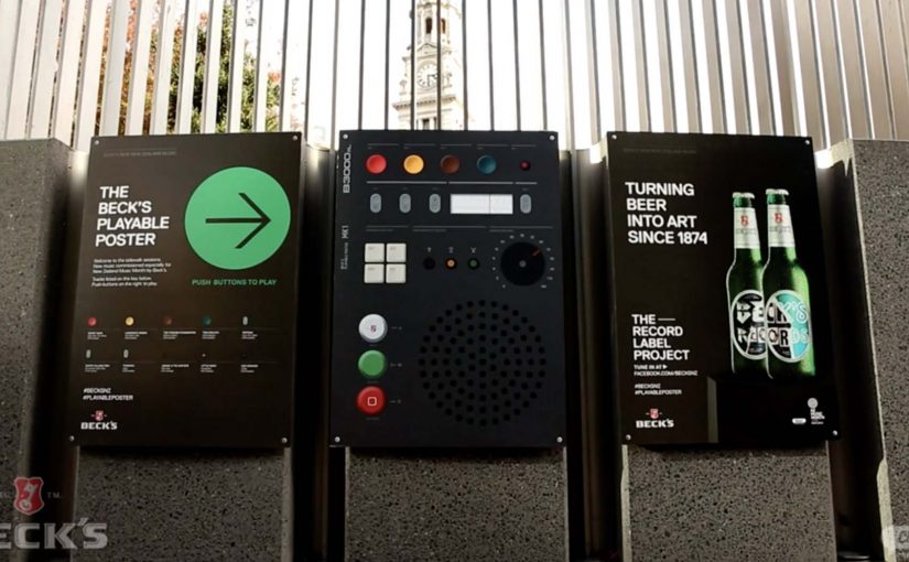
Looking for an innovative way to mark New Zealand’s Music Month, Beck’s partnered with Shine to design a playable poster. Using conductive ink and speakers the posters were made playable with a simple tap of the finger.

The Sound of Taste

Herb and spice brand Schwartz is all about flavour. So to dramatise flavour which was invisible and silent, they got print tech collective Novalia and ad agency Grey London to collaborate on an interactive poster. The poster used conductive ink to turn the surface area of the paper into an interactive interface that also connected to the viewers smartphone to deliver a richer experience.

Change the tune

Agency Republic from UK created a poster with an embedded sensor which when knocked changed the song being played on the agencies shared sound system.

Why these work: the demo happens in your hands

Each example keeps the interaction legible. Tap to trigger sound. Touch to explore flavour as audio. Knock to skip a track. The poster does not ask people to learn a new behavior. It hijacks an existing one, touching a surface, and rewards it instantly.

The real advantage is not novelty. It is memorability. When print responds, people remember the message because they caused the outcome themselves.

What to steal for your next print idea

  • One interaction, one reward. Do not overload the surface with too many modes.
  • Make the “how” obvious. A tap zone, a knock cue, a simple instruction. Then deliver instantly.
  • Use phones as infrastructure. If pairing adds depth, let the phone do what paper cannot, audio, saving, sharing.
  • Design for public confidence. People will only touch a poster if it feels safe, clean, and socially acceptable.

A few fast answers before you act

What is “conductive ink” doing in these posters?

It creates touch-sensitive paths on paper, so taps or touches can be detected and mapped to actions like playing audio.

Do these posters need special printing like QR codes?

They still require specialist production, but the interaction can be integrated invisibly into the design. The poster itself becomes the control surface rather than carrying visible codes.

Why add Bluetooth to print?

Bluetooth allows paper to trigger sound through a phone or external speaker, which is essential when the content is audio or when you want richer layers than print can carry.

What makes an interactive poster feel “worth it” to a passer-by?

Immediate payoff and low friction. If the result is instant and satisfying, people will try it. If setup or pairing is slow, they walk past.

Where does this format fit best?

In environments where people have dwell time and curiosity, festivals, transit hubs, retail windows, office interiors, and brand experiences where interaction is socially normal.

Coca-Cola: Rainbow Nation Rainbows

A rainbow you can actually chase across Johannesburg

Twenty years ago, South Africa elected Nelson Mandela in the country’s first-ever democratic election. This led Archbishop Desmond Tutu to coin the phrase “The Rainbow Nation,” referring to the country’s diverse people.

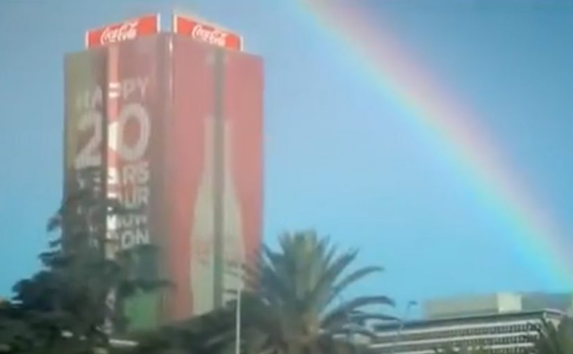
Now to celebrate this 20th anniversary of democracy, Coca-Cola decided to literally create rainbows. Using sunlight, water, some fancy science and a little bit of magic, they made rainbows pop up all over Johannesburg. Some rainbows even reached the ground, for those who sought to discover where they ended.

The trick: make the symbol physical

This is not a graphic. It is a phenomenon placed into normal streets. And the moment the rainbow reaches the ground, the campaign stops being something you watch. It becomes something you can follow.

Why discovery beats declaration

You are not told what to feel. You either stumble into it and smile. Or you choose to go looking for the end. That voluntary participation is what makes it feel like magic, not messaging.

In city-scale brand activations, the strongest participation comes from turning a familiar symbol into a discoverable experience people can physically encounter.

What it was really celebrating

Twenty years of democracy, expressed through a shared symbol, brought to life in the city.

Ideas worth borrowing

  • Turn an abstract story into something people can encounter in the real world.
  • Add a simple “seek and find” layer so curiosity becomes the call-to-action.
  • Keep the explanation light. Let the experience carry the meaning.

A few fast answers before you act

What did Coca-Cola do for “Rainbow Nation”?

They made rainbows appear across Johannesburg to celebrate twenty years of South African democracy, including rainbows that reached the ground.

Why is the phrase “Rainbow Nation” used?

Archbishop Desmond Tutu coined “The Rainbow Nation” to describe South Africa’s diverse people following the country’s democratic transition.

What was the viewer experience?

People encountered rainbows in public space, and some could be followed to the ground to discover where they ended.

What is the core creative mechanic?

Transforming a cultural symbol into a real-world phenomenon people can discover in the city.

British Airways: Barcode Reader

You pick up a travel guide, walk to the barcode reader, and scan it to check the price. Instead of only showing numbers, the scanner delivers a British Airways message that nudges you toward destinations beyond the UK.

The placement is the whole strategy. British Airways runs this in the travel section of a bookstore, right when people are already thinking about leaving town. If someone is browsing Rome, New York, or Buenos Aires, the brand can show up in a way that feels like a useful prompt rather than a random interruption.

The mechanic is simple. The barcode scan is the trigger, and the barcode reader becomes the display. British Airways uses that moment to broaden perception of its route network, aimed at Brazilians who may only associate BA with the UK.

In travel marketing, the planning moment is the highest-intent moment, and well-timed messages can feel like help rather than advertising.

Why the bookstore aisle is the right “media channel”

Travel guides are a proxy for intent. People do not usually buy a destination book by accident. So a bookstore travel aisle acts like a real-world keyword search, with the added benefit that the customer is already in decision mode.

What makes the barcode reader feel credible

The message arrives from the same device people trust for pricing and checkout. That matters because it borrows the authority of a functional tool. The ad does not ask for a click or a download. It simply uses an existing action and adds a relevant layer.

What the campaign is really trying to change

This is not a fare promotion first. It is a mental map update. The brand wants travellers to store British Airways as “global option,” not “UK airline.” The work is credited to AGE Isobar São Paulo and was later shortlisted in the Direct Lions under Ambient Media, small scale.

What to steal for your own context-first activation

  • Target the moment of intent. Find the real-world behaviour that signals “I am planning.”
  • Use the tools already in the environment. Functional devices carry trust and reduce friction.
  • Make the message additive. Add information that fits the action, do not derail it.
  • Design for instant comprehension. If it needs explanation, it will be ignored.

A few fast answers before you act

What is the British Airways Barcode Reader activation?

It is a contextual bookstore execution where scanning travel books on a barcode reader triggers British Airways messaging about flying to destinations beyond the UK.

Why does it work better than a generic travel ad?

Because it appears at the exact moment people are considering travel. The placement creates relevance before the copy even starts.

What is the core behaviour the campaign hijacks?

Price checking. The scan is already happening, so the brand adds a message to an existing action rather than asking for a new one.

What business problem is this solving?

Route perception. It aims to expand awareness that British Airways serves many destinations, not only the UK, in a market where that belief is limited.

What is the main risk with this kind of tactic?

If the message feels intrusive or slows down the checkout flow, it turns from helpful to annoying. The execution has to stay lightweight and quick.