smart: The Dancing Traffic Light

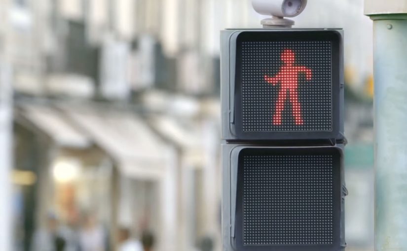
Traffic lights can be dangerous for pedestrians, especially for those who do not like to wait for the light to change. So the Smart team from Mercedes-Benz created “The Dancing Traffic Light”, where a person’s dance moves were brought to a traffic light in real time. As a result, 81% more people stopped at that red light.

A red light that earns attention

The mechanism is simple. Put a person’s live dance into the “don’t walk” figure so waiting becomes entertainment rather than dead time. The red signal stays red, but the moment changes from friction to curiosity.

In busy cities, pedestrian safety interventions work best when they change what people do in the waiting moment, not when they rely on warnings people already ignore.

Why it lands

This works because it does not moralize. It redirects impatience. By turning the red figure into live motion, it converts passive waiting into anticipation, which is why people keep their attention on the signal instead of acting on impulse. People stop because they want to see what happens next, and because the signal feels like it is doing something for them instead of only restricting them.

Extractable takeaway: If your goal is compliance in a repeated micro-moment, do not just increase instruction. Add a small, repeatable reward that makes the safer choice feel like the more interesting choice.

What the brand is really demonstrating

The real question is how to make waiting at the curb feel better without weakening the rule itself.

The installation is framed as a safety idea, but it also functions as a brand proof point. “Smart” city thinking is expressed as an everyday behavior fix, not a futuristic gadget.

The stronger idea is not the choreography. It is the use of delight as a safety mechanism.

What to steal from this crossing

  • Design for boredom. Most unsafe shortcuts happen when people are impatient. Solve the impatience.
  • Keep the rule intact. The light still means stop. Only the experience changes.
  • Use real-time participation. Live input creates social magnetism and makes the system feel alive.
  • Measure behavior, not buzz. The strongest metric here is stopping behavior at the crossing, not views.

A few fast answers before you act

What is “The Dancing Traffic Light”?

It is an interactive pedestrian signal concept where a red “don’t walk” figure mirrors a nearby person’s dance moves in real time to make people more willing to wait.

What problem does it solve?

It reduces risky crossing behavior driven by impatience, by making the waiting phase more engaging.

Why does real-time motion matter?

Because it creates unpredictability and social attention. People watch longer when the content is live and human.

What kind of metric should you track for ideas like this?

Behavior change at the location, such as stopping and waiting rates, plus any reduction in unsafe crossing incidents.

How can another brand adapt this pattern?

Find a repeated safety or compliance moment, keep the rule unchanged, and add a small live reward that makes the safe choice feel like the better choice.

Metro Trains Melbourne: Dumb Ways to Die

Accident rates on the Melbourne Metro were rising due to an increase in risky behavior around trains, and a rail safety message was the last thing people wanted to hear.

So McCann Melbourne turned the message people needed to hear into a message people wanted to hear, by embedding it into a song and an accompanying music video. Dumb Ways to Die.

Entertainment-first safety communication

The mechanism is a deliberate format swap. Replace shock tactics and lecturing with an original song, a playful animated world, and a chorus that makes the safety points memorable enough to repeat.

In large urban public-transport systems, the most effective safety communication often feels like entertainment first, with the message carried by repetition and recall rather than warning language.

Why it lands

It works because it respects audience resistance instead of fighting it. The real question is how you make a safety message travel when the audience does not want to hear a safety message at all. For resistant audiences, entertainment-first is the stronger safety strategy because it earns voluntary attention before it asks for behavior change. People who tune out safety ads will still watch and share a catchy video, and the refrain makes the cautionary points stick through rhythm and humor. The legacy write-up reports that the campaign quickly moved beyond advertising into social currency, with very high sharing in its first month.

Extractable takeaway: When your audience actively avoids the topic, make the format shareable enough that people choose to spread it for the entertainment value, then let repetition do the behavior-change work.

The proof of spread

By using entertainment rather than shock tactics, the message is described as transcending advertising to become something people shared. Here is the case video.

What safety communicators can borrow

  • Start with a format people opt into. If attention is the barrier, do not begin with a PSA tone.
  • Write for recall. A chorus and simple phrasing can outperform “important information” copy.
  • Build a visual system. Distinct characters and repeatable scenes make the idea remixable and memorable.
  • Package the case story separately. A dedicated case video helps the idea travel in marketing circles without diluting the original film.

A few fast answers before you act

What is Dumb Ways to Die?

A rail-safety campaign for Metro Trains Melbourne that delivers the safety message through a catchy song and animated music video instead of traditional PSA warnings.

Why use humor for a serious safety topic?

Because the target audience resists conventional safety messaging. A humorous, musical format earns voluntary attention and repeat viewing, which increases recall.

What made it spread so widely?

A simple hook, a memorable chorus, and highly shareable animation that people could pass along as entertainment, with the safety message embedded inside.

What is the case video for?

It explains the strategy and rollout behind the campaign, and it packages results and rationale for marketers and stakeholders.

What is the main risk with “entertainment-first” safety work?

If the humor overwhelms the behavioral point, the audience remembers the joke but not the safety action you want them to change.

Video Campaigns: When the Player Is Message

Two videos that did not just play, they proved the point

Video innovation rarely comes from “better footage”. It comes from changing how the viewer experiences the message. These two campaigns are clean examples of that approach.

In the last week or so I came across two campaigns that used video to innovatively deliver their message.

Volkswagen Hidden Frame – using the YouTube play bar as the story

The Volkswagen Side Assist feature helps drivers avoid accidents by showing other vehicles when they are in the side mirror’s blind spot.

To drive home the message, AlmapBBDO developed a film that used YouTube’s play bar to show the difference the VW Side Assist made in people’s lives.

No Means No – a player that interrupts denial

Amnesty Norway, in an attempt to change the Norwegian law on sexual assault and rape, developed a film that used a custom video player to pop up the key message.

The campaign was a success and the law was about to change as a direct consequence of the campaign.

Why interface-led video lands harder

Both ideas shift the viewer from passive watching to active noticing. By “interface-led” I mean the player UI, like the progress bar, overlays, or controls, doing storytelling work, not just housing the film.

Extractable takeaway: If the interface carries part of the argument, the viewer is forced to notice the point during playback, which reduces message loss.

The real question is whether your player can carry the argument when attention collapses.

Volkswagen used a familiar interface to make a safety benefit visible in the moment. Amnesty used an interface interruption to force the key message to be seen, not skipped. In both cases, the “player” stopped being furniture and became the persuasion device.

In global consumer brands and publisher-style marketing teams, interface constraints often determine what gets noticed and what gets ignored.

What these campaigns were really trying to achieve

The business intent was not “engagement” as a vanity metric. It was message delivery with minimal loss.

Volkswagen aimed to make an invisible feature feel tangible and memorable. Amnesty aimed to change perception and behavior at the cultural level, and the player design reinforced that urgency by refusing to be background noise.

Player-hacking patterns to copy

Here, “player-hacking” means designing the video controls and UI as part of the message, not just the wrapper.

  • Use the interface as evidence. When the message is hard to show, let the UI demonstrate it.
  • Design for the skip reflex. If your message is often ignored, build an experience that makes ignoring harder.
  • Keep viewer control intentional. Interactivity works when it serves comprehension, not novelty.
  • Make the “point” happen inside the viewing moment. Do not rely on a voiceover claim when the experience can prove it.

A few fast answers before you act

What is an “interface-led” video campaign?

An interface-led video campaign is one where the player experience, like the progress bar, overlays, or controls, is part of the storytelling, not just the container.

How did Volkswagen Hidden Frame use YouTube differently?

It used YouTube’s play bar as a narrative device to demonstrate the value of Side Assist, making the benefit feel visible rather than described.

What did Amnesty Norway’s No Means No change about the player?

It used a custom video player that surfaced the key message via a popup, ensuring the point was encountered during playback.

Why do these ideas work better than a standard film in some cases?

Because they reduce message loss. The viewer is guided to notice the point through the viewing mechanics, not just the content.

What is the practical takeaway for brands?

If your message is often missed, redesign the viewing experience so the message is structurally harder to ignore and easier to understand.