Fanta: Lift & Laugh

A school elevator that refuses to stay boring

Ogilvy Brazil sought to reinforce Fanta’s brand image of “joy” in the USA. So they came up with an elevator prank called “Lift & Laugh”.

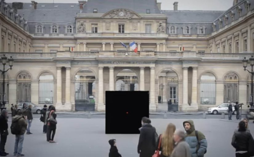
An elevator in a school in Atlanta was chosen to arouse students curiosity and laughter. In the elevator they installed a device that responded to the movements and comments from the students.

The mechanic: a responsive space that reacts back

This works by turning a routine moment. waiting for an elevator ride. into an interaction loop. The environment listens, then answers in real time, so the people inside start experimenting to see what triggers the next reaction.

An ambient ad is a brand experience placed in an everyday setting, where the setting itself becomes the medium and the message is delivered through participation.

In youth and soft drink marketing, “joy” only sticks when it is felt in-the-moment, not just claimed in a tagline.

The real question is whether your experience design can make play discoverable without instructions.

Why the prank lands with students

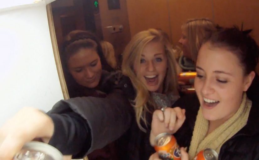
It creates instant permission to play. The elevator is a confined stage, the reactions are immediate, and the group dynamic amplifies everything. If one person laughs, everyone joins, and the experience escalates without needing instruction.

Extractable takeaway: When the audience’s own movement or words trigger an immediate response, the fun feels earned and becomes more likely to be retold.

The business intent: make joy a repeatable brand behavior

This is not just a one-off gag. It is a proof point for a positioning idea. Fanta turns dull places into fun places. If the experience is good enough, the brand gets earned attention plus social retell value without needing to push product features.

In the end many students did not want to get off the elevator and asked for a repeat trip.

What to steal if you want an experience people replay

  • Make the interaction discoverable. People should learn the rules by trying, not by reading.
  • Reward experimentation fast. Short feedback loops create momentum.
  • Design for groups, not individuals. Laughter spreads socially. Build for that amplification.
  • Anchor the behavior to your brand. The “why” should map cleanly to what you stand for.

A few fast answers before you act

What is Fanta’s Lift & Laugh?

It is an elevator prank experience where the elevator reacts to students’ movements and comments, turning a normal ride into a playful, responsive brand moment for Fanta.

Where did the activation take place?

It was staged in a school in Atlanta, using a real elevator as the experience space.

How does the elevator prank create engagement?

It uses immediate cause and effect. People try something, the elevator responds, and the group starts experimenting together to trigger more reactions.

Why does this work especially well with students?

The elevator becomes a contained stage and laughter spreads socially. One reaction gives others permission to play, which escalates the experience quickly.

What makes this “ambient advertising” rather than a standard ad?

The everyday environment becomes the medium. The message is delivered through participation in a real situation, not through a screen or a slogan.

What should brands learn from this format?

If you want “fun” as a brand attribute, build it into a situation people already live. Then make participation the delivery mechanism, not a message about participation.

The Escape Service: Press the red button

DDB Paris creates a new service for the French rail booking site Voyages-sncf.com. “The Escape Service” lets people escape to any destination they want by simply pushing a magical red button.

Together with the French collective Pleix, they design three celebrations that emerge from a 3×3 meter black box that unfolds like a giant jack-in-the-box. In Paris, the cube lures passers-by in, asks where they want to go, then bursts into a destination-themed surprise and hands out a mock ticket for the chosen trip.

The film also ends by inviting viewers to press the button themselves and experience a first-person view version of the Escape Service. That first-person view version is a POV cut where the camera takes your place at the button.

A black box that behaves like a travel shortcut

The mechanism is deliberately minimal. There is one obvious choice, press the red button. The payoff is oversized, because the box transforms into a celebration that makes “go anywhere” feel real without explaining routes, prices, or schedules.

In European rail and travel marketing, turning an abstract promise like “escape” into a public, physical moment helps people imagine the journey instantly.

Why the red button is the real interface

The button turns travel intent into an action you can perform in one second. That matters because it removes hesitation. You do not need to “plan” to participate. You only need curiosity, and the street does the rest.

Extractable takeaway: When your promise is intangible, make the first step a one-second action that people can try without planning, then let the payoff do the explaining.

What the campaign is really proving for Voyages-sncf.com

This is not about a single destination. It is about choice and immediacy. The idea says: if you can decide on the spot, you can book on the spot. The mock ticket detail pushes the story from spectacle into something you can take away and show.

The real question is whether your service promise can be compressed into one action people will try without needing more information.

This kind of one-action interface is worth copying when you need to turn curiosity into intent fast.

Moves to borrow from the red-button mechanic

  • Reduce the interaction to one decision. One button is better than a menu when you need street participation.
  • Make the reward visible to bystanders. If spectators can understand the payoff, the crowd recruits the next person.
  • Personalize the outcome fast. A destination choice and a ticket-like takeaway make the moment feel “mine”.
  • Bridge offline to online without forcing it. A first-person online version extends reach without changing the story.

A few fast answers before you act

What is “The Escape Service” for Voyages-sncf.com?

It is a public pop-up experience where a black box invites people to press a red button, choose a destination, and trigger a surprise celebration that dramatizes the idea of escaping by train.

Why use a red button and a box?

Because it is self-explanatory. A single button removes friction and creates a clear before-and-after moment that people remember and film.

What makes this more than a stunt?

The mechanic maps cleanly to the service promise: pick a destination and go. The mock ticket detail turns the experience into a personal travel intent, not only entertainment.

How does this support online booking?

It makes “decide and book” feel effortless. The film’s first-person online extension reinforces that the same impulse can continue digitally.

What is the transferable lesson for service marketing?

When your product is intangible, build a physical interface that compresses the benefit into one action and one memorable payoff.

Coca-Cola: Happiness Truck

Happiness Machine, now with a Rio beach twist

Coca-Cola, whose Happiness Machine video was described as a runaway hit for the brand last year with 3 million views, is back with a sequel that offers more of an international flavor.

“Happiness Truck” takes place in Rio de Janeiro and is a twist on the original idea, which showed a Coke machine that spit out free Cokes, flowers, balloon animals, pizza and submarine sandwich at a college cafeteria. This time around, a special truck dispenses free Cokes as well as a beach toy, a surfboard, sunglasses, beach chairs, t-shirts and soccer balls.

The mechanic: one button, a public reward loop

The idea is almost embarrassingly simple. Put a big, inviting “PUSH” button on a branded truck. Let passersby trigger it. Then over-deliver on what comes out. Drinks first, then gifts that match the location and mood. Here, “public reward loop” means one person triggers the moment, everyone sees the payoff, and the crowd reaction invites the next press.

The Coca-Cola Happiness Truck is an experiential marketing activation where a branded truck dispenses free drinks and beach items to people who press a large button, turning a giveaway into a shared street moment.

In global FMCG marketing, these activations work best when the surprise is immediate, the moment is public, and the brand behavior feels generous rather than promotional.

Why it lands: the brand promise becomes observable

People do not need to be convinced by copy. They watch someone press a button and receive something real. The real question is whether bystanders can understand the payoff without explanation. The crowd reaction provides social proof, and the escalating gifts create a mini narrative that keeps people watching. The Rio-specific items, surfboards, beach chairs, sunglasses, make the generosity feel locally tuned, not copy-pasted from the first film. Because the trigger is public and the payoff is instant, the activation creates social proof without explanation.

Extractable takeaway: If the audience can see the action and the reward at a glance, you earn belief through visible behavior, not through messaging.

The business intent behind the “international sequel”

This is a sequel strategy that scales a successful format while refreshing the setting. It keeps the core concept intact. Surprise rewards from a familiar Coca-Cola object. and broadens it into a global “where will happiness strike next” platform.

It also turns brand warmth into a repeatable content engine. Each location can add its own culturally legible gifts, which gives the series room to travel without changing the structure.

Steal this street-activation pattern

This is worth copying when you can make the trigger obvious and the payoff immediate in public.

  • Make the trigger obvious. One button beats instructions.
  • Design escalation. Start with the expected reward, then add unexpected layers to hold attention.
  • Localize the gifts. Choose items that instantly signal place and mood.
  • Capture the crowd, not just the hero. The bystanders are the credibility layer and the amplification engine.

A few fast answers before you act

What is Coca-Cola’s Happiness Truck?

It is a street activation in Rio de Janeiro where a branded truck dispenses free Coca-Cola and beach-themed gifts to passersby who press a large “PUSH” button.

How is it related to the Happiness Machine?

It is described as a sequel that keeps the same surprise-generosity structure, but moves it from a cafeteria vending machine to a public street setting.

What is the core mechanic, step by step?

A public trigger creates a clear moment of action. An immediate reward lands first. Then the activation escalates with location-fit gifts, and filmed reactions provide the proof and the content.

Why does the push-button format work so well?

It removes friction and makes the story instantly legible. One simple action creates a visible payoff, so bystanders understand it immediately and social proof builds on the spot.

Why does localization matter in this execution?

The Rio-specific items make the generosity feel tuned to the place and mood, not copy-pasted. That detail makes the sequel feel fresh while keeping the structure familiar.

What business intent is this kind of activation serving?

It turns a brand promise into observable behavior and a repeatable content format. The same structure can travel to new locations without changing the concept.