Nike: República Popular do Corinthians

Nike: República Popular do Corinthians

Corinthians celebrated its 100th anniversary in 2010. Nike’s response is not a one-off jersey drop or a polite tribute film. It is a whole new country.

“República Popular do Corinthians” reframes the club’s fanbase as a nation. With supporters reported in the tens of millions, the campaign leans into the idea that this “country” would outsize many real ones by population, and treats that as the brief.

Building a nation, not a slogan

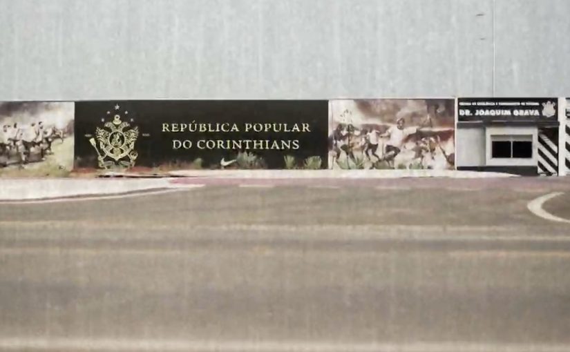
The mechanism is full institutional cosplay. That is, a deliberately official-looking build-out of symbols, rules, and institutions, executed with enough detail that it feels official. F/Nazca Saatchi & Saatchi São Paulo designs the assets a nation “needs”. A coat of arms. A flag. Documents. Legislation. Currency. Heroes. An embassy. Even a president.

In fan-led sports cultures, identity symbols and rituals often travel further than product messages because supporters use them to perform belonging in public.

Why it lands with 30 million people watching

This is a campaign that gives fans something to do, not just something to admire. The “country” frame turns fandom into citizenship, and citizenship invites participation. Collect the documents. Fly the flag. Use the language. Carry the identity. The real question is whether you have a community identity people already perform, or just an audience that only consumes.

Extractable takeaway: When your audience already behaves like a community, stop treating them like a segment. Give them a shared “operating system”. Symbols, rules, roles, and artifacts that let them express membership without needing the brand in the room.

It also sidesteps the usual anniversary trap. Instead of nostalgia-first storytelling, it builds a living structure fans can inhabit, which makes the celebration feel ongoing rather than commemorative.

The commercial intent hiding inside the romance

The emotional story is belonging. The business outcome is demand. A nation needs uniforms, badges, and visible markers of identity, and the campaign makes those markers socially meaningful.

The legacy write-up around the work describes substantial earned attention, including a reported figure of $7,800,000 in free media coverage. Separate from that media value claim, the campaign is also publicly associated with industry recognition, including being named “Idea of the Year” by the Saatchi & Saatchi network’s Worldwide Creative Board.

Stealable moves from the Corinthians “nation”

  • Build an identity kit. Go beyond a logo. Create artifacts people can carry, collect, and display.
  • Make participation the message. If it only works when watched, it is fragile. If it works when used, it spreads.
  • Design for self-propagation. Fans should be able to recruit other fans without a brand explanation deck.
  • Let the world “recognize” it. Embassies, documents, and rituals create the feeling of legitimacy, which is what turns a joke into a movement.

A few fast answers before you act

What is “República Popular do Corinthians”?

It is a Nike campaign that frames Corinthians supporters as citizens of a fictional nation, complete with national symbols and official-seeming artifacts, created to celebrate the club’s centenary.

What is the key mechanism that makes it memorable?

Completeness. Instead of one hero asset, it builds an entire identity system. Flag, documents, currency, roles, and an “embassy” that makes the nation feel legitimate enough to participate in.

Why does the “nation” metaphor work so well for sports fans?

Because fandom already behaves like identity. The nation frame gives supporters a structured way to express belonging, recruit others, and turn private loyalty into public signals.

How can a non-sports brand use this pattern without forcing it?

Start with a real community behavior you can amplify, then design a small set of artifacts and rituals that make participation easy. If people will not use it without you promoting it, simplify the kit until they do.

What is the smallest version of this you can ship?

Make one role feel real, then give it one symbol and one usable artifact. If people can adopt it without instructions, you have something that can spread without constant brand narration.

Bonafont: The Tweeting Fridge

Bonafont: The Tweeting Fridge

The campaign starts with a simple gift. Bonafont sent a mini fridge stocked with 2 liters of bottled water to an influential Twitter personality in Brazil.

The twist was inside the door. The fridge was wired so every time it was opened, a tweet was automatically posted on the celebrity’s account, signaling to thousands of followers that they were drinking water. With a library of pre-written messages, the feed stayed fresh while the behavior stayed consistent.

In other words, hydration became a public ritual, and the act of opening the fridge became the publishing trigger, meaning the moment that automatically creates the post.

The most effective reminders are the ones that piggyback on social proof from people an audience already pays attention to.

A social reminder disguised as a connected object

The mechanism is straightforward. A door-open event triggers a social post. The creative leap is turning a private habit into a visible cue, so the audience gets a repeated prompt without ever being directly targeted by an ad. It is an Internet-of-things demo used as a behavioral nudge.

In global consumer health and FMCG marketing, habit cues scale best when they ride on routines people already perform and signals people already notice.

Why it lands

People rarely fail to drink water because they disagree with the idea. They fail because they forget, especially during work hours. This execution attacks the memory problem, not the belief problem. It also makes the reminder feel lighter. You are not being lectured by a brand. You are seeing someone you follow take a sip.

Extractable takeaway: When the behavior you want is repetitive and easy to forget, attach the reminder to a reliable physical trigger and let social proof do the distribution, so the message spreads as a habit signal, not a campaign slogan.

The real question is whether your reminder can show up as a lightweight cue at the moment of action, rather than as persuasion delivered in advance.

This is a pattern worth copying when “forgetting” is the main barrier and the trigger can be made automatic.

Stealable moves for your next behavior-change activation

  • Choose a trigger that is automatic. Door opens, post happens. No extra step means no drop-off.
  • Borrow credibility from the right messenger. The influencer is not decoration. They are the proof carrier.
  • Keep content variation ready. Repetition builds habit, but repetition with identical copy feels spammy.
  • Make the action visible, not the persuasion. Showing the behavior is often more powerful than explaining it.
  • Scale through a simple rotation model. Passing the object to new personalities keeps attention without redesigning the system.

A few fast answers before you act

What is “The Tweeting Fridge” in one sentence?

A connected mini fridge that automatically tweets when the door is opened, using social proof to remind followers to drink water.

Why is the fridge better than a normal “drink water” campaign?

Because the reminder is tied to a real-world trigger and delivered through a trusted voice, so it feels like a habit cue rather than an ad.

What problem does it solve for the brand?

It increases consumption by turning “forgetting” into “remembering,” using repeated prompts that keep the brand present at the moment of use.

What is the biggest risk if a brand copies this idea?

Over-automation. If the posting feels spammy or deceptive, audiences can turn against the brand and the influencer at the same time.

How do you keep an automated post from feeling spammy?

Use a small rotation of natural messages and avoid excessive frequency, so the automation reads like a habit signal instead of a bot loop.

Peugeot 408: Print ad with a real airbag

Peugeot 408: Print ad with a real airbag

To advertise the safety benefits of the Peugeot 408, Brazilian agency Loducca put a mini airbag inside a print ad. Readers were invited to hit a marked spot on the page and see what happened. On impact, the tiny bag inflated, demonstrating in miniature what an airbag would do.

The ad appeared in Brazil’s business magazine Exame and was reportedly distributed with protective packaging so the airbag would not trigger by accident.

A magazine page you have to hit

The mechanism is brilliantly blunt. You do not watch a crash test. You perform a micro impact, a small, deliberate tap that simulates impact, with your hand, and the medium responds. That action turns a passive read into an experience, and it makes the “airbag” benefit impossible to ignore. Brands should treat safety claims as proof problems and design demonstrations the viewer can personally trigger.

In automotive safety marketing, the highest-performing proof is the kind you can physically trigger yourself.

The real question is whether your proof of safety can be triggered by the audience, not merely asserted by the brand.

Why print becomes more credible when it behaves like a product

Print normally communicates through trust in words and images. This ad adds a different kind of credibility, mechanical proof. Because it inflates on cue, the viewer’s brain files the message as something closer to engineering than persuasion. That matters because “safety” is a hard attribute to sell with rhetoric alone. People want reassurance, not adjectives.

Extractable takeaway: When a product claim is about protection, the strongest creative move is to make the audience feel a cause-and-effect demonstration, not just read about it.

The packaging is part of the idea

The special packaging is not just logistics. It signals intent. This is a controlled, designed interaction. It is also a reminder that experiential print has operational realities. Here, “experiential print” means print that behaves like a product interaction, with a designed trigger and response. If you build an ad that can go off in someone’s bag, you must engineer the distribution like you would engineer a product.

How to design triggerable safety proof

  • Make the claim triggerable. If the benefit is physical, design a physical proof moment.
  • Keep the interaction single-step. One obvious action, one immediate response, no instructions needed.
  • Let the medium do the explaining. The inflation is the headline. Copy becomes supporting detail.
  • Design the supply chain, not just the concept. Packaging, safety, and consistency are part of creative effectiveness.
  • Use spectacle sparingly. The wow moment is strongest when it directly maps to the product truth.

A few fast answers before you act

What is the Peugeot 408 “airbag in a print ad” idea?

A magazine ad with a real mini airbag insert that inflates when the reader hits a marked spot, mimicking an airbag deploying during impact.

Why does this work better than a normal safety print ad?

Because it converts a claim into a physical demonstration. The reader triggers the proof, which feels more credible than copy alone.

What makes interactive print feel premium instead of gimmicky?

When the interaction is directly tied to the product benefit and works reliably. The mechanism should be the message, not a disconnected trick.

What’s the biggest risk with mechanical inserts in magazines?

Execution risk. Misfires, non-fires, and distribution issues can overwhelm the idea. The production and packaging have to be engineered as carefully as the concept.

How can a brand replicate this approach on a smaller budget?

Design a tactile proof moment using simple materials and one clear action. The key is immediate cause-and-effect that maps cleanly to the claim.