Coca-Cola Interactive Mini Bottles

Coca-Cola Interactive Mini Bottles

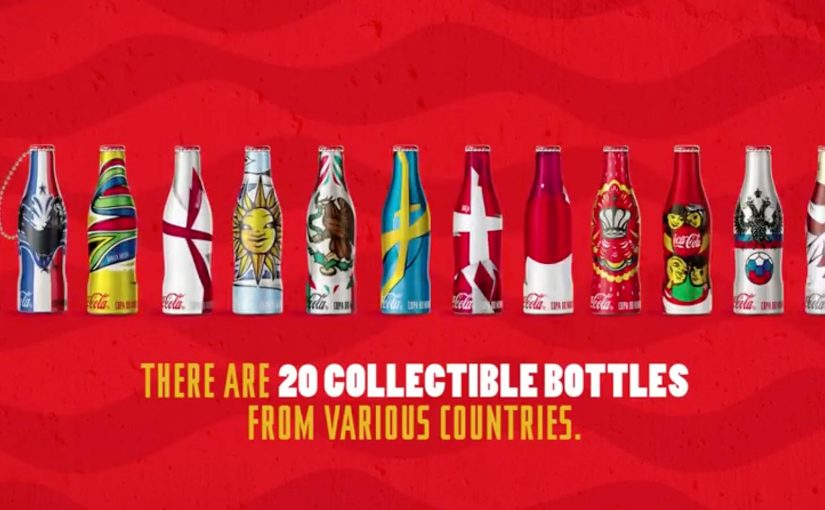
Coca-Cola has launched 20 special edition mini bottles to get fans around the world excited about the upcoming 2014 FIFA World Cup, which will take place in Brazil from June 12th to July 13th.

The bottles come wrapped in flags of countries that have hosted the World Cup previously. Argentina, Chile, Uruguay, Mexico, USA, England, Germany, Spain, France, Italy, Sweden, Switzerland, South Africa, Japan and South Korea. As well as the three upcoming host countries Brazil, Russia and Qatar. Plus two special Coca-Cola editions.

Coca-Cola fans can also create and send special messages and avatars to other bottle owners through Facebook and iPhone or Android apps. In addition, special markers on the bottles activate augmented reality animations when held up to a smartphone camera.

What makes these bottles more than packaging

This is a simple shift with big implications. The bottle is not only a container. It becomes a trigger. A collectible. And a social connector. This is smart brand design because it turns packaging into media without asking people to leave the product in their hand.

The real question is how to make a small physical object behave like media, participation, and social signal at the same time.

The flags do the first job. They make the bottles instantly recognizable and tradable. People have a reason to hunt for specific countries and compare what they found. The digital layer does the second job. By digital layer, this means the messages, avatars, and AR animations unlocked through the bottle. It turns ownership into participation, because the bottle now links to messages, avatars, and AR animations.

Why augmented reality fits this moment

AR works best when the behavior is natural. Here the behavior is already there. You hold the bottle in your hand. You point your phone at it. You get something back instantly. That is what makes the marker idea effective, because it adds a reward to an existing behavior instead of asking people to learn a new one.

Extractable takeaway: When the product already sits in someone’s hand, the strongest digital layer is the one that rewards curiosity in the moment rather than redirecting attention somewhere else.

In global brand portfolios, this matters because packaging that doubles as an activation point can scale engagement and give people a stronger reason to choose the brand at shelf without adding a separate physical touchpoint.

What to borrow from collectible packaging activations

  • Make the physical object the interface. The bottle is the entry point, not a poster, banner, or separate microsite.
  • Give fans something to collect and trade. Flags are a built-in collecting mechanic.
  • Add a social layer that only owners can unlock. Messaging and avatars make participation feel earned, not generic.
  • Use mobile as the bridge. iOS and Android apps turn “I saw it” into “I can activate it” immediately.

A few fast answers before you act

What are Coca-Cola Interactive Mini Bottles?

They are 20 special edition mini bottles designed to build excitement for the 2014 FIFA World Cup, using country-flag designs plus a digital interaction layer.

What is interactive about them?

Owners can send messages and avatars to other bottle owners via Facebook and iOS or Android apps. The bottles also include markers that trigger augmented reality animations through a smartphone camera.

Why use country flags on the bottles?

It creates instant collectability. People can look for specific countries, compare what they found, and feel part of a shared event build-up.

What is the role of augmented reality here?

AR turns the label into an activation point. Point your phone at the bottle, and the design becomes an animation experience rather than static packaging.

What is the main marketing idea worth copying?

Make the product itself the gateway to the experience. When the physical object triggers the digital layer, participation becomes effortless and more memorable.

Coca-Cola Turkey: Invisible Vending Machine

Coca-Cola Turkey: Invisible Vending Machine

Since the time I started writing this blog, I have come across many innovative vending machines. Some I featured right here on Ramble.

Now to add to this collection, here is an invisible vending machine from Coca-Cola Turkey that becomes visible only when couples walk by. The machine was created specially for Valentine’s Day (last week) and was installed in Istanbul to spread happiness Coca-Cola style.

A vending machine you cannot see until the right moment

The trick is the reveal. What looks like a normal stretch of wall becomes a vending interface only when two people approach together. That instant transformation creates a micro-scene, and the micro-scene pulls in everyone nearby.

In consumer brand activations, public installations work best when the interaction is obvious, fast, and shareable without instruction.

How the interaction is described to play out

  • Invisible by default. The unit blends into the wall and does not present itself as a machine.
  • Couples trigger the reveal. When two people pass together, the interface lights up and becomes visible.
  • Personal moment, not just a dispense. In coverage at the time, the machine asks for names and then produces two personalised cans.

Why it lands

This is not “another vending machine story”. It is a street-level surprise that creates a small, romantic spotlight for a couple, and a quick bit of theatre for everyone else. The invisibility is not a gimmick. It is a pacing device that makes the reveal feel like a reward. The real question is whether the experience creates a transformation that bystanders can explain in one sentence.

Extractable takeaway: If you want people to stop, watch, and retell an activation, build a visible transformation into the experience. A before-and-after moment is easier to share than a static stunt.

What Coca-Cola gets out of the Valentine framing

Valentine’s Day provides the social permission for public sweetness, names, and sentiment. For the brand, it is a clean link back to togetherness and “sharing happiness”, while turning a sample into a story people can repeat without being prompted.

Retail theatre patterns worth borrowing

By “retail theatre” I mean designing a retail moment as a small piece of live, shareable experience, not just a dispense or transaction.

  • Hide the interface until it matters. Visibility can be part of the reward, not just a prerequisite.
  • Keep the trigger legible. People should understand why it happened in one glance, or they will not mimic it.
  • Design for bystanders. The couple is the participant. The crowd is the media channel.
  • Personalise lightly. Names, messages, or small custom outputs feel intimate without needing heavy data.

A few fast answers before you act

What is the “invisible vending machine” concept?

A vending machine that stays hidden until a couple approaches, then reveals itself and delivers a Valentine-themed Coca-Cola moment.

Why make the machine “invisible” at all?

It creates a sharp reveal, and that reveal is the shareable payload. People remember transformations more than static installations.

What is the simplest way to replicate the effect?

Use a clear proximity trigger plus lighting and screen content that turns on instantly, and ensure the “why it appeared” is immediately understandable.

What is the biggest execution risk?

If the trigger is inconsistent or unclear, people will not repeat the behaviour and the crowd will not form. Reliability matters more than complexity.

What should you measure beyond views?

Dwell time, participation rate per hour, bystander clustering, social mentions generated on site, and any lift in nearby sales during the activation window.

Coca-Cola Happiness Machine #ReasonsToBelieve

Coca-Cola Happiness Machine #ReasonsToBelieve

Coca-Cola is at it again, this time unleashing happiness in Sweden. A special Coke machine sits at a bus stop to spread some summer happiness in the middle of the cold and dark Nordic winter. The results…

Why the bus stop is the perfect stage

A bus stop is pure waiting time. That makes it a natural canvas for surprise, generosity, and shared reactions. When the environment is grey and cold, the contrast of “summer happiness” lands even harder, because it flips the mood of the moment instantly.

Extractable takeaway: Waiting time is a pre-built attention state. Pair it with a simple, generous interruption and you get a shared reaction people want to retell.

What this activation proves in one simple move

You do not need a complex mechanic to create a strong brand experience. Here, “mechanic” simply means the one interaction rule that triggers the surprise. Put the idea in the right place, at the right time, and make the reward feel unmistakably human. Because the moment is public and immediate, people experience it together, and that is why it spreads on its own.

In European cities, transit touchpoints like bus stops are one of the few places where strangers reliably share the same small moment of time.

The real question is whether your idea turns that routine pause into a shared reaction people will retell.

This kind of work wins when simplicity and placement do the heavy lifting, not explanation.

Stealable patterns from a bus-stop surprise

  • Borrow “waiting time” as attention. Start where people are already paused and open to distraction.
  • Design for contrast. Put warmth and play into a cold, routine context so the shift is instantly legible.
  • Keep the rule simple. A single, human-feeling reward beats a complicated interaction people have to learn.

Click here to see other Coca-Cola Happiness campaigns from around the world.


A few fast answers before you act

What is the Coca-Cola Happiness Machine concept?

It is a series of experiential campaigns where a Coca-Cola machine behaves unexpectedly, giving people a surprise that feels generous and shareable in public.

Why does placing it at a bus stop work so well?

Because waiting amplifies attention. People are already paused, watching, and open to distraction. The setting turns a small surprise into a social moment.

What makes “happiness” activations feel authentic instead of gimmicky?

The reward has to be simple, immediate, and emotionally clear. If the moment reads as kindness or delight first, the branding can stay light and still win.

What is the main design lesson here?

Engineer contrast. Put warmth where people expect cold. Put play where people expect routine. That is how a short interaction becomes a memorable story.