bpost Live Webshop: Every second cheaper

bpost Live Webshop: Every second cheaper

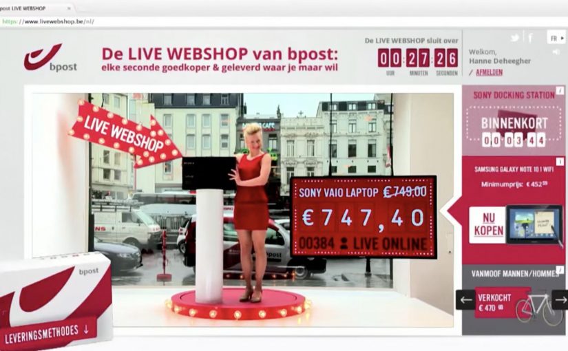
bpost is Belgium’s postal operator. To prove their ability to deliver, and to fend off new contenders in the delivery market, they open a pop-up store right in central Brussels that you can watch like a shop window.

A range of must-have items is put on display, from smartphones to designer coffee makers. The twist is that the only way to buy them is through a special online auction where the price of every product drops every second.

People have to act fast to catch an item before someone else does. Once sold, the item is picked up by a postman right in front of the webcam and delivered to the winning bidder, so everyone watching can see how quick and reliable the service is.

In European parcel and delivery markets, the hardest promise to prove is speed and reliability, so public demonstrations often land harder than product claims.

The real question is how you make a service promise visible enough that people trust it without having to take your word for it.

As a result, awareness of bpack, the delivery service being promoted, is reported as rising to 65%. In 6 days, 260,000 unique visitors are reported. For every hour the shop is online, bpost is reported as selling 8 products on average.

A webshop you can watch, not just click

The pop-up window makes the online mechanic tangible. People see the products in real life, then experience the purchase as a live moment, with delivery turning into the proof point rather than a line in the footer.

Why the “dropping price” mechanic creates urgency

A price that decreases every second builds a clear trade-off: wait for a better deal, or buy now before someone else does. Because the price is visibly falling, hesitation becomes a risk you can feel. That tension is the game. It keeps attention locked and makes the checkout decision feel like winning, not spending.

Extractable takeaway: Use a visible, fast-moving trade-off so waiting feels costly and acting feels like progress, not purchase.

What bpost is really selling with bpack

The service story is simple: “wherever you are, we deliver.” The activation turns that into something visible, with a postman dispatching the parcel immediately after purchase. The product is delivery confidence. Proof beats claims when reliability is the benefit.

Service-proof moves worth reusing

  • Make the benefit observable. If your promise is speed, show speed in public.
  • Use a mechanic that explains itself. A visible countdown beats a paragraph of copy.
  • Build in a live “receipt”. The moment of dispatch is the proof people remember.
  • Design for spectators. If watching is entertaining, the audience becomes the distribution layer.

A few fast answers before you act

What is the bpost Live Webshop?

It is a pop-up retail window in Brussels where products can only be bought via a live webshop auction, with prices dropping every second and delivery shown on camera to prove service speed.

How does the “price drops every second” auction work?

Each product starts at a set price and continuously decreases over time. The first person to click and buy wins the item at that moment’s price.

Why show a postman picking up the parcel live?

Because it turns a delivery claim into visible proof. The dispatch moment demonstrates reliability and speed better than messaging can.

What is bpack in this campaign?

bpack is positioned as the delivery service being promoted. The activation is designed to raise awareness and trust in that specific service.

What is the main lesson for brands selling services?

When trust is the barrier, do not just explain the promise. Stage it so people can watch the promise being kept.

Liaison Dangereuse: Striptease Shopping

Liaison Dangereuse: Striptease Shopping

Valentine’s lingerie shopping, turned into a show

Liaison Dangereuse, a German lingerie brand, gave Serviceplan a creative challenge: increase lingerie sales around Valentine’s Day.

Seduction always works. So what about making the buying experience attractive and unique for men by giving them the opportunity of buying lingerie directly from the body of beautiful models, and pairing that with a memorable striptease? Thus a new way to sell online lingerie was created.

The mechanism that changes behavior

The idea reframes checkout as participation. Instead of browsing product grids, the customer “shops” from the model, which makes selection feel more like discovery than transaction, and reduces hesitation at the moment of choice.

In European ecommerce and performance marketing, the fastest lever is reducing hesitation by making the path to purchase feel emotionally easy and socially tellable.

The real question is whether you can turn your highest-friction step into a guided, retellable moment without breaking brand trust.

This kind of mechanic is worth copying only when it fits your brand voice and clear consent boundaries.

Why it lands with the intended buyer

This is built for a very specific Valentine’s reality: many male buyers want help choosing, and they want the moment to feel confident, not awkward. A guided, theatrical experience removes indecision and makes the purchase feel like part of the gift.

Extractable takeaway: When the buyer feels unsure about choice, redesign selection so confidence is the default and the mechanic becomes the story.

Earned media as a built-in distribution layer

Serviceplan not only generated free media coverage from major websites, newspapers and magazines in Germany, it also reported additional traffic of 155% to the Liaison Dangereuse website. Reported sales went up by 50% during the promotion.

Click here to watch the video on Ads of the World website.

Steal this conversion mechanic

  • Design for the buyer’s emotion. Remove embarrassment and decision anxiety. Add guided confidence.
  • Make the shopping path the story. If the mechanic is inherently retellable, distribution comes with it.
  • Focus the experience on the highest-friction moment. Choice, not payment, is often the real dropout point.
  • Measure what matters. Track uplift in qualified traffic, add-to-cart rate, and conversion, not just press mentions.

A few fast answers before you act

What is “Striptease Shopping” for Liaison Dangereuse?

It is a Valentine’s-focused ecommerce activation that lets shoppers buy lingerie through a model-led, striptease-style interface, turning product selection into a playful, guided experience.

Who is the experience designed for?

It targets gift-buyers who feel unsure about lingerie choices. The mechanic reduces awkwardness and indecision by making selection feel assisted rather than self-directed.

What is the behavioral mechanism that improves conversion?

It reframes checkout as participation. By turning browsing into a simple, story-like interaction, it reduces hesitation and makes the purchase feel emotionally easy.

Why did it generate strong earned media?

The buying mechanic is unusual and instantly demonstrable. That makes it easy to describe, easy to show, and inherently shareable across press and social channels.

What results were reported from the promotion?

Campaign summaries reported +155% website traffic and +50% sales during the promotion period.

What is the key risk to manage with “seduction” mechanics?

Brand fit and boundaries. If the experience feels exploitative or off-brand, the attention can backfire. The idea needs clear intent, consent, and tone discipline.

Fits.me: Virtual Fitting Room

Fits.me: Virtual Fitting Room

One of the main problems with buying clothes online is simple. You cannot feel the fit. So you guess, the parcel arrives, and the return loop starts again.

Fits.me, an Estonian company, builds a Virtual Fitting Room around a shape-shifting robotic mannequin. Instead of trying to “predict” fit with a size chart, the mannequin physically changes form to match your body dimensions, letting you preview how different sizes sit on a body shaped like yours.

A mannequin that changes shape so the garment can do the explaining

The mechanism is a robotic mannequin, often referred to as a FitBot, a shape-adjustable mannequin that can be tuned across a wide range of body measurements. Clothing is photographed on the mannequin in multiple sizes, and the shopper can compare how the same item behaves as size changes, on a body that resembles their own. Because the garment is shown on the same body shape across sizes, the comparison makes fit differences visible and reduces guesswork.

A robotic mannequin providing a Visual Size Guide.

In online apparel retail, fit uncertainty drives returns and suppresses conversion, so anything that reduces sizing doubt tends to outperform its surface-level novelty.

Why this approach feels more “real” than a size chart

What makes it persuasive is that it turns sizing into a visual comparison instead of a number. The real question is whether you can help a shopper see the trade-offs between sizes before checkout, without asking them to trust a black-box recommendation. If you have that problem, this is the right pattern to use. You are not being told “you are a Medium.” You are shown what Small, Medium, and Large look like on a similar shape, which is closer to the in-store decision process.

Extractable takeaway: When a purchase decision depends on a physical sensation you cannot deliver online, replace the missing sensation with a repeatable visual proof that helps shoppers compare options, not just read recommendations.

What the rollout says about where the pain is

At the time, the system is positioned around a male mannequin first, with Fits.me saying it is planning to unveil a female version in November. That sequencing is a reminder that “who we can fit well” is often a product constraint, not a marketing choice, especially when the technology depends on physical ranges and repeatable photography.

For more information visit www.fits.me.

What to steal from Fits.me’s FitBot

  • Make fit a comparison, not a verdict. Let shoppers see multiple sizes side by side on a body-like reference instead of outputting a single “recommended” size.
  • Design for confidence, then measure it. Track size changes after viewing, conversion on fitted items, and return-rate shifts by category.
  • Respect constraint sequencing. If the system only fits certain body ranges well at first, be explicit about where it is reliable and expand the range as the asset library grows.

A few fast answers before you act

What is a “Virtual Fitting Room” in this Fits.me context?

It is a system that uses a shape-adjustable robotic mannequin to model how garments look across sizes on a body shaped to match the shopper’s measurements, so shoppers can compare fit visually before buying.

Why does this reduce returns in theory?

Because it reduces guesswork. When shoppers can see how different sizes drape and sit, they are less likely to buy multiple sizes “just in case,” and less likely to be surprised when the item arrives.

What is the key difference versus typical size charts or recommendation widgets?

This approach is comparison-first. It shows a garment on a body-like reference across multiple sizes, rather than outputting a single recommended size and asking the shopper to trust it.

When does a visual fit tool like this not help much?

It helps most with size uncertainty, but it cannot fully replace tactile judgments like fabric feel or personal comfort preferences, so some returns will still be driven by “feel” rather than fit.

What should retailers measure if they deploy something like this?

Engagement with the fitting experience, size-selection changes after viewing, conversion lift on fitted products, and return-rate reduction by category and by first-time versus repeat shoppers.