Ralph Lauren: Polo 4D

Ralph Lauren: Polo 4D

In September 2012, Hugo Boss live streamed its Boss Black Fall Winter 2012 fashion show directly in 3D. Now fast forward to 2014 and Ralph Lauren launches their Polo for Women Spring 2015 collection via a cinematic 4D experience. Here, “4D” means a physical projection experience that uses water, light, film, and live atmosphere to create depth and immersion.

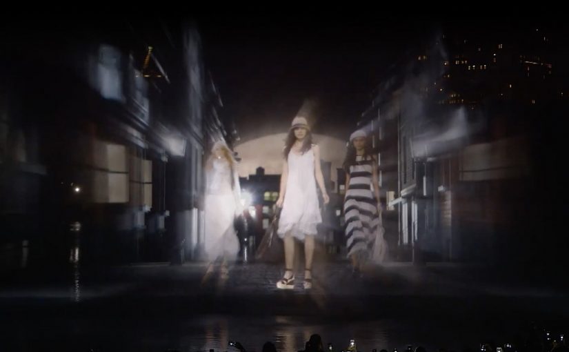
On the evening of September 8th, during New York Fashion Week, Ralph Lauren turns the idea of a runway into a 60-foot-tall water-screen projection that towers above Manhattan’s Central Park, fusing fashion, art, and technology.

A runway made of water, light, and film

The mechanism is a projection-mapped water screen that functions like a living canvas. High-resolution scenes and “models” are projected onto a fan-shaped spray of water, creating the effect of figures moving across a surface that reads as a runway, even though it is literally water.

In global fashion marketing, immersive show formats are used to signal modernity and earn attention beyond the invited audience.

Why it lands

This works because it treats the collection launch as a public cultural moment, not a closed industry ritual. The scale is instantly legible. The format borrows from cinema. The setting adds myth. Central Park at night turns the presentation into something people talk about even if they cannot describe the garments in detail. Because the water-screen illusion reduces the show to one instantly retellable image, the experience travels beyond the guests who were physically there.

Extractable takeaway: When your category is saturated with beautiful imagery, compete on format. If the show itself becomes the story, the brand gets disproportionate reach without relying on louder messaging.

What Ralph Lauren is really doing

The real question is whether the launch format can make Polo for Women feel more culturally current than a conventional runway could. Ralph Lauren is using spectacle less to explain the collection than to position Polo as a modern media brand. The 4D framing functions as a brand statement. It positions Polo for Women as contemporary and city-native, and it uses spectacle to bridge runway tradition with a media behavior that is already screen-first.

What brand launch teams can borrow

  • Choose a “native stage”. A location with cultural meaning can do as much work as the production itself.
  • Make scale part of the idea. If it reads in one glance, it travels faster in photos, recaps, and retellings.
  • Build a film, not a documentation. When the content is cinematic by design, it holds up outside the event moment.
  • Let tech serve a single clear illusion. “Models walking on water” is the story. Everything else supports that.

A few fast answers before you act

What is Ralph Lauren Polo 4D?

It is a New York Fashion Week presentation that uses a projection-mapped water screen in Central Park to stage a cinematic runway-style experience for Polo for Women Spring 2015.

Why call it “4D”?

Coverage describes it as “4D” because the visuals are engineered to feel more immersive than a flat projection, with the water spray and depth effects contributing to the illusion.

How big was the water screen?

Reporting describes a water screen around 60 feet tall and 150 feet wide.

What makes this different from a normal runway show?

It blends film, set design, and projection mapping so the “runway” becomes an environment and a story, not just a walk-and-look format.

What is the transferable lesson for brand launches?

If you want a launch to travel, design for one clear, repeatable illusion that audiences can describe in a sentence.

smart: The Dancing Traffic Light

smart: The Dancing Traffic Light

Traffic lights can be dangerous for pedestrians, especially for those who do not like to wait for the light to change. So the Smart team from Mercedes-Benz created “The Dancing Traffic Light”, where a person’s dance moves were brought to a traffic light in real time. As a result, 81% more people stopped at that red light.

A red light that earns attention

The mechanism is simple. Put a person’s live dance into the “don’t walk” figure so waiting becomes entertainment rather than dead time. The red signal stays red, but the moment changes from friction to curiosity.

In busy cities, pedestrian safety interventions work best when they change what people do in the waiting moment, not when they rely on warnings people already ignore.

Why it lands

This works because it does not moralize. It redirects impatience. By turning the red figure into live motion, it converts passive waiting into anticipation, which is why people keep their attention on the signal instead of acting on impulse. People stop because they want to see what happens next, and because the signal feels like it is doing something for them instead of only restricting them.

Extractable takeaway: If your goal is compliance in a repeated micro-moment, do not just increase instruction. Add a small, repeatable reward that makes the safer choice feel like the more interesting choice.

What the brand is really demonstrating

The real question is how to make waiting at the curb feel better without weakening the rule itself.

The installation is framed as a safety idea, but it also functions as a brand proof point. “Smart” city thinking is expressed as an everyday behavior fix, not a futuristic gadget.

The stronger idea is not the choreography. It is the use of delight as a safety mechanism.

What to steal from this crossing

  • Design for boredom. Most unsafe shortcuts happen when people are impatient. Solve the impatience.
  • Keep the rule intact. The light still means stop. Only the experience changes.
  • Use real-time participation. Live input creates social magnetism and makes the system feel alive.
  • Measure behavior, not buzz. The strongest metric here is stopping behavior at the crossing, not views.

A few fast answers before you act

What is “The Dancing Traffic Light”?

It is an interactive pedestrian signal concept where a red “don’t walk” figure mirrors a nearby person’s dance moves in real time to make people more willing to wait.

What problem does it solve?

It reduces risky crossing behavior driven by impatience, by making the waiting phase more engaging.

Why does real-time motion matter?

Because it creates unpredictability and social attention. People watch longer when the content is live and human.

What kind of metric should you track for ideas like this?

Behavior change at the location, such as stopping and waiting rates, plus any reduction in unsafe crossing incidents.

How can another brand adapt this pattern?

Find a repeated safety or compliance moment, keep the rule unchanged, and add a small live reward that makes the safe choice feel like the better choice.

Castello: Eat the Art

Castello: Eat the Art

Cheese brand Castello teams up with ad agency Duval Guillaume to give New Yorkers the opportunity to taste their cheese in a very original way. A pop-up museum is set up at Grand Central Terminal, where famous still-life paintings that contain cheese are reproduced with great precision using real Castello cheeses. The difference is simple. You can smell and eat the copied works of art.

Over the course of two days, more than 500,000 visitors reportedly pass through the exhibition, and around 40,000 people actually taste the cheese.

Turning “look” into “taste”

The mechanism is sensory sampling disguised as culture. Borrow the credibility of recognizable art, rebuild it with the product itself, then let the audience complete the experience by tasting the thing they are looking at.

In urban retail environments where people are overloaded with visual messages, multisensory experiences create disproportionate stopping power because they feel like a break from advertising, not another ad unit.

Why it lands

This works because it turns product trial into a story people want to repeat. A free sample is forgettable. “I ate a painting made of cheese at Grand Central” is social currency, which means it is a simple story people want to pass on. It gives the brand an earned reason to be talked about without needing heavy branding on every surface.

Extractable takeaway: If your category wins on taste, do not hide behind claims. Build a public moment where trying the product feels like participating in something bigger than a sample.

What the business intent looks like

The real question is how to turn food sampling into a public moment people actively choose and then talk about. Castello gets scale and relevance in one move. Grand Central delivers footfall. The art framing delivers permission to pause. And the tasting converts attention into the only proof that matters for food. “It is good”. This is a stronger food-marketing move than standard sampling because it makes trial memorable.

What food brands can steal from this

  • Wrap sampling in a reason to stop. People do not queue for “try this”. They queue for a moment.
  • Use a familiar cultural code. Still-life paintings are instantly legible, even at walking speed.
  • Let the product be the medium. When the product is literally the artwork, the message cannot be missed.
  • Design for retellability. If the experience can be summarized in one sentence, it travels further.

A few fast answers before you act

What is Castello “Eat the Art”?

It is a pop-up museum experience where still-life paintings featuring cheese are recreated using real Castello cheeses, and visitors can smell and taste the “art”.

Why stage it in Grand Central Terminal?

Because high footfall increases reach, and a transit setting makes the surprise feel bigger. You find a museum moment in the middle of a commute.

Is this advertising or sampling?

It is sampling, delivered through an ambient, cultural format that makes the trial feel special rather than transactional.

What makes the concept effective for food brands?

It converts attention into taste. Food marketing becomes more persuasive when it gets people to try the product quickly, in a memorable context.

What is the simplest way to adapt the pattern?

Pick a familiar cultural frame your audience already respects, then embed product trial directly into that frame so trying the product feels like participation.