IKEA: Catalogue Countdown Room

You walk into IKEA and find a room that is not finished. It is counting down. Each day the space changes again, styled with new catalogue products, like the store itself is teasing what is about to arrive.

That is the idea behind IKEA’s in-store Catalogue Countdown Room in Singapore and Malaysia. After previously re-imagining the 2013 catalogue with visual recognition technology that brought pages to life, this launch moment focuses on anticipation and theatre inside the store. It turns the catalogue release into a daily event that people can watch, not just pick up.

In practice, the countdown room is refreshed repeatedly as the countdown progresses, then broadcast live via IKEA’s Facebook presence so the excitement travels beyond the store floor.

In omnichannel retail marketing, the most repeatable “launch” pattern is to make one physical moment behave like media, then let social distribution carry it further than paid reach alone.

Why a countdown room beats “catalogue is here”

Catalogue launches usually arrive with a shrug. Everyone expects them, so attention is low. A countdown reframes the arrival as something you can miss, and that creates urgency. The room format also makes the catalogue feel less like a book and more like a living set of ideas you can step into.

What the mechanism is really doing

The room is a content engine. Each refresh creates a new “moment” for store visitors, and a new visual for social. This is why the idea scales. It can host small performances, demos, and micro-events without needing a different concept every day. The catalogue becomes the raw material.

What to steal for your next retail launch

  • Build one stage that can change. A single physical space that transforms repeatedly generates content without extra production locations.
  • Turn “arrival” into anticipation. Countdowns make routine drops feel like events.
  • Design for shareable proof. The room should look different enough each day that people want to show the change.
  • Let the store be the hero. When the in-store moment is genuinely interesting, social becomes documentation, not advertising.

A few fast answers before you act

What is the IKEA Catalogue Countdown Room?

It is an in-store installation that changes during a countdown to the new IKEA catalogue launch. The room is repeatedly restyled using catalogue products, and the changes are shared through social channels.

Why does a countdown create more engagement than a standard catalogue drop?

A countdown adds scarcity and rhythm. People know something is happening each day, so they return, check in, and talk about what changed instead of treating the catalogue as background noise.

What makes this an integrated campaign?

The same story runs across the store, social distribution, and supporting communications. The room creates the physical event. Social extends it beyond store visitors. The catalogue provides the content foundation.

What is the key lesson for retailers launching many new products at once?

Do not try to communicate everything at once. Create a single repeatable format that can spotlight different products over time, so attention compounds across multiple touchpoints.

What is the biggest risk with “live” retail content?

If the daily payoff is weak, people stop checking. The room needs visible change and a reason to watch each day, otherwise the countdown becomes decoration.

Kenneth the Talking Vending Machine

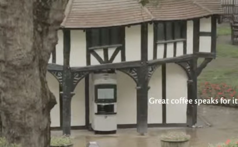
Kenco Millicano’s whole bean instant coffee is the closest thing to a proper coffee from a vending machine. However people have a negative perceptions in general about drinking instant coffee from a machine. So to engage and excite people enough to want to substitute their traditional coffee shop coffee for an instant in a vending machine, Kenco Millicano along with Leo Burnett London came up with a talking vending machine. The voice for the machine was provided by comedian Mark Oxtoby, who spent a whole day in Soho Square interacting with passerby’s…

Similarly in Hong Kong, Levi’s along with ad agency TBWA came up with a talking phone booth dubbed the “Levi’s Summer Hotline”. In the booth two popular local radio hosts connected via video from a nearby Levi’s store and challenged visitors to answer questions or do crazy stunts. The crazier the stunt, the bigger the prize, which was printed out in the booth like a receipt to be redeemed at the nearby Levi’s stores. The booth got half a million people to enter and interact over a three day period, and drove sales up by 30%!

To see more examples of interactive vending machines click here.

Parrot AR.Drone: The Flying Banner

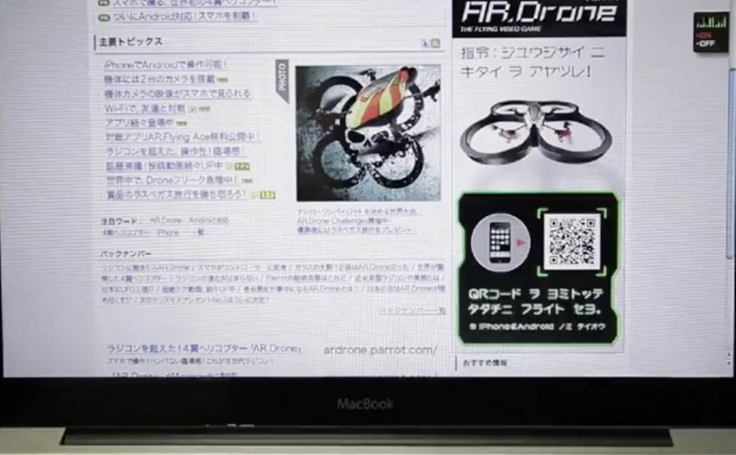
The Parrot AR.Drone is a quadrotor you can control with an iPhone or iPad. Instead of explaining that in copy, Beacon Communications Tokyo built an interactive web banner that lets people experience the idea.

The banner displays a QR code. Scan it and your phone becomes the controller for a virtual AR.Drone that appears inside the banner. You pilot it around the screen using your smartphone, effectively turning the ad into a small playable product demo.

In consumer electronics launches, the most persuasive interactive advertising is a playable demo that mirrors the product experience in seconds.

Why this banner stands out

Most banners talk about what a product can do. This one makes the product behaviour the message. If the AR.Drone is “controlled by your phone,” the ad is controlled by your phone. That direct mapping makes the idea instantly believable.

Standalone takeaway: If your product is an interface, let the audience use that interface inside the ad unit, even in a simplified form.

The mechanic: QR to second screen control

The QR code is not decoration. It is the bridge that turns a passive placement into a two-device experience. The banner stays on the desktop screen. Control moves to the phone. That split makes the interaction feel closer to the real product, and it also creates a small sense of “this is special” because the ad is no longer self-contained.

How it creates attention without shouting

As described in industry coverage, users could fly the drone around the page and even “blast” parts of the site to reveal the full-screen message. That gives the interaction a purpose and a payoff. It is not just movement. It is progression.

Beacon also reported unusually strong click-through performance compared to typical expectations for the placement. In this case, that makes sense. People do not click because they were interrupted. They click because they were already playing.

What to steal from The Flying Banner

  • Replicate the product, do not describe it. A short, real interaction beats a long explanation.
  • Use one clear bridge between devices. QR works here because it is immediate and simple.
  • Design an obvious payoff. A reveal, a score, a result. Give the interaction a reason.
  • Keep the controls teachable. If people cannot learn it in seconds, the banner loses them.
  • Make it readable for spectators. Movement on the main screen helps others understand what is happening fast.

A few fast answers before you act

What is “The Flying Banner” for Parrot AR.Drone?

It is an interactive web banner where scanning a QR code turns your smartphone into a controller for a virtual AR.Drone that you can pilot inside the banner.

Why is this a stronger demo than a normal video ad?

Because it lets people feel the core promise. Phone-controlled flight. through direct interaction, not description.

What role does the QR code play in the experience?

It is the handoff mechanism from desktop to phone. The desktop shows the “world.” The phone becomes the controller, matching how the real product is used.

What is the biggest risk with multi-device banner ideas?

Drop-off. If the connection step is slow, confusing, or unreliable, most users abandon before they experience the payoff.

How would you modernize this mechanic today?

Keep the principle of second-screen control, but reduce friction. Use a fast connect flow and ensure the experience is still satisfying even if someone chooses not to connect a phone.