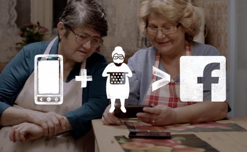
Two Romanian widows are still cooking Sunday lunch as if the whole family is coming. Vodafone Romania and McCann Bucharest turn that habit into an invite, pairing “Sunday Grannies” with students who miss a home-cooked meal.
The campaign is described as starting from a loneliness insight about older people living alone. It then uses a simple Facebook presence to make the invite visible and easy to accept. Trade coverage reports that the page reached hundreds of thousands of likes, drew TV coverage and celebrity visits, and was credited with a strong lift in 4G smartphone sales.
How the idea actually works
This is social service marketing in the literal sense. By that, I mean a brand-built service that solves a small human problem in the real world, with the product making the exchange possible. The brand builds a small, real-world service and lets the product be the enabling infrastructure, not just the media spend.
Mechanically, it is a tight loop. Create a public, repeatable moment. Post the Sunday menu. Invite people into a physical table. Capture the warmth and social proof. Repeat weekly so the story compounds, and so other households can copy the pattern.
In European telecom markets where network claims quickly converge, service-led ideas win when the product is the connective tissue of the service, not a logo on the poster.
Why it spreads faster than a brand message
The campaign travels because it resolves two real tensions at once. Older people who want company do not want pity. Students who want comfort do not want charity. A shared meal removes the awkwardness, and Facebook removes the friction of making the first move. The brand is present, but it is not the protagonist. The relationship is.
Extractable takeaway: If you want earned reach, design a repeatable social ritual with a clear role for each side, then use your platform or product to remove the one piece of friction that normally stops it from happening.
The brand job it quietly does
Vodafone is not “talking about connectivity”. It is demonstrating it in a setting people already understand, family lunch. That matters because telecom benefits are otherwise abstract. Here, mobile internet becomes the bridge between offline loneliness and online invitation, with the brand positioned as the enabler of human reconnection.
The real question is whether the product is doing real connective work in the exchange, or whether the brand is only borrowing emotion from it.
What to steal for your next service-led campaign
- Start with a human surplus. In this case, it is too much food and too much empty table, every Sunday.
- Pair it with a clear unmet need. Students want a home meal and belonging, not another discount.
- Use one platform behavior people already do. A simple page and posts beat a complex build when speed and shareability matter.
- Make it weekly. Cadence creates anticipation, habit, and accumulated proof.
- Let the product be functional. Connectivity is the mechanism, not a claim in the closing frame.
A few fast answers before you act
What is “Sunday Grannies” in one line?
It is a Vodafone Romania and McCann Bucharest activation that invites students to weekly home-cooked lunches hosted by elderly women, using Facebook to match people and normalize the first step.
What is the core mechanism I can reuse?
Create a repeatable social ritual, publish a clear invitation, and use your product or platform to remove the friction of connecting two groups who both benefit but rarely meet.
Why does the Facebook layer matter?
It turns a private act, Sunday lunch, into a public, low-risk invite with social proof. People can see it, share it, and join without an awkward cold approach.
What results were reported?
Trade coverage and the case study report large page growth, mass media pickup, and a reported 4G smartphone sales lift. Some reporting also credits the work with increased social media adoption among seniors.
Is this “purpose marketing” or “product marketing”?
Both, when done correctly. The social good is real, but the product is also structurally necessary for the service to function, which is what makes the brand linkage credible.
What is the biggest failure mode if I try this?
Turning people into a prop. If the ritual feels extractive, one-sided, or performative, it collapses. The exchange must be dignified for both sides and valuable even without the brand story.