The Live Tile Experiment: Oslo Live Tiles

Microsoft has been heavily advertising the new Windows 8, Surface RT and Windows Phone 8 along with their respective features. In Norway, Microsoft partners with Norwegian electro rock band Datarock to bring the experience of Windows 8 and Windows Phone 8 Live Tile functionality to unsuspecting residents of downtown Oslo. Live Tiles are interface elements that surface changing, real-time information before you click.

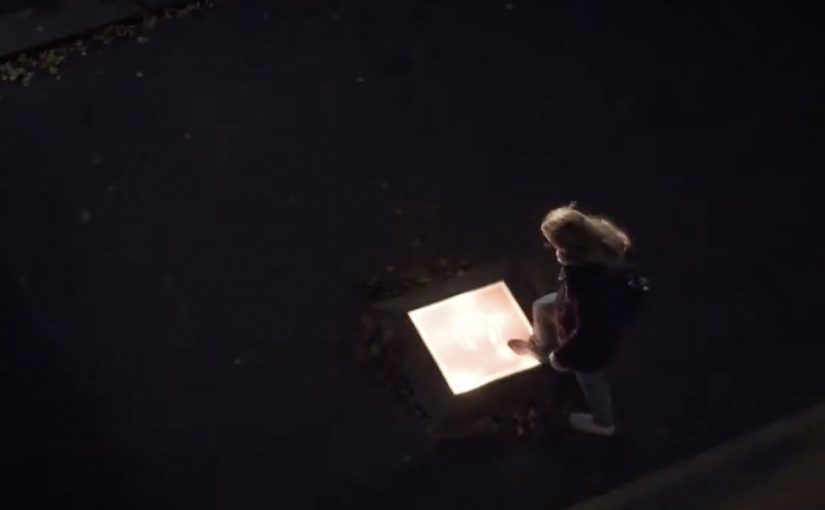
A giant lit-up “tile” appears on the street outside a seemingly closed-off venue. When a passer-by steps onto it, the wall drops and the hidden party spills into the street, with Datarock performing live. The result is an evening to remember.

What the stunt makes you understand about Live Tiles

Live Tiles are designed to feel active, not static. They are not just shortcuts to apps. They are meant to show “something is happening” before you even click. This activation dramatizes that promise by making the tile itself the trigger for real-world content. Because the tile is both preview and trigger, the promise of “something is happening” becomes instantly believable.

In European city-center launches, the most effective experiential stunts translate a UI idea into a single physical action people can trigger without instructions.

Why the surprise mechanic works

The build-up is visible. You hear music, you see a barrier, you notice something glowing at your feet. Curiosity does the recruiting. The moment of commitment is tiny, just stepping onto the tile, but the payoff is oversized, because the environment changes instantly around you.

Extractable takeaway: If you want people to understand a product behavior fast, design a tiny, obvious trigger that unlocks an outsized change in the environment.

What Microsoft is really selling here

Specs are not the message. The message is a feeling: Windows looks alive. By turning a UI element into a street-level “switch” that unleashes a live experience, the campaign makes the feature memorable even for people who never touch the product that night.

The real question is whether your feature can be felt through a simple trigger before it is explained.

This kind of launch is the right move when you want the feature’s behavior to become the story people repeat.

Trigger-based patterns for feature marketing

  • Convert the feature into a trigger. If the benefit is “real-time,” make the audience activate something in real time.
  • Make the payoff disproportionate. A small action should unlock a big reveal.
  • Stage it for bystanders too. The crowd reaction is part of the content.
  • Keep the story tellable. “I stepped on a tile and a concert exploded” is easy to repeat.

A few fast answers before you act

What is “The Live Tile Experiment”?

It is a street stunt in Oslo that turns the Live Tile concept into a physical trigger. Step on a giant tile and a hidden Datarock performance is revealed as the wall drops.

What product feature does it communicate?

Live Tiles, the Windows 8 and Windows Phone 8 interface element designed to display changing, real-time information and content.

Why use a concert reveal instead of a traditional demo?

A live reveal creates an emotional memory tied to the feature idea. It shows “alive and dynamic” faster than any explanation.

What makes the activation easy for the public to participate in?

The required action is obvious and low effort. People only need to step onto the tile to trigger the outcome.

What is the key lesson for feature launches?

Do not describe the benefit. Stage a moment that behaves like the benefit, so people feel it immediately.

Interactive iPad ads: five touch-first patterns

New research from the IAB has shown that when it comes to advertising on tablets, interactivity is the key. And once you look at what the best iPad units are doing, that conclusion makes intuitive sense.

Take Microsoft’s iAd for Windows Azure. Instead of explaining “code in the cloud,” it lets you touch and change code inside the ad, and the layout responds. That is the core pattern for tablet advertising. Don’t describe the value. Let the reader experience it in seconds.

On tablets, display works best when the ad behaves like a small piece of product UI rather than a static interruption.

The IAB point, translated into creative

If your audience is holding a touchscreen, your ad has an extra superpower. Touch-first is the creative posture where the first meaningful thing the unit asks for is a gesture, and the response delivers the point. Drag, swipe, tap, reveal, simulate. The objective is not “more features.” It is to earn attention by giving the user a simple action and an immediate payoff. Because the payoff is immediate, the value lands without needing a paragraph of claims.

Extractable takeaway: On tablets, design the first gesture so it proves one promise immediately, then let everything else be optional.

In tablet-heavy retail and media environments, the strongest units turn touch into a tiny product moment that pays off in seconds.

The real question is whether your tablet creative proves the promise through a single gesture, or just says it in copy.

Interactivity should be the default assumption for tablet display, not a bonus layer.

Five iPad ad interactions worth stealing

White Collar

As a simple use of touchscreen behaviour, users solve a puzzle by dragging an icon across the screen to locate answers to questions displayed in the banner. It’s lightweight, but it turns a passive placement into an active moment.

Volkswagen Park Assist

To experience the Volkswagen Tiguan’s Park Assist, users touch two targets on the screen. The car then reverses and parks itself between those targets. A feature demo becomes a two-tap “proof” moment.

Visa Signature

Built in HTML5, the ad presents a virtual wallet that lets users browse and plan a holiday, buy theatre or cinema tickets, or reserve a hotel. It behaves like a mini service experience rather than an ad.

Toyota

Using the slogan “Filled with People,” the ad lets users drag a slider to watch an unfinished Toyota move through the factory floor while it is assembled. The interaction makes the narrative feel earned, not narrated.

Microsoft

Microsoft wanted developers to understand that Windows Azure allows code to be created in the cloud. So they built an iAd that lets readers alter its code, which in turn changes the layout. It’s a direct translation of message into mechanism.

What these examples have in common

  • One obvious gesture. Drag, tap, swipe. No tutorial needed.
  • Fast payoff. The response is immediate, so the user feels in control.
  • Feature-as-experience. Parking, planning, building, assembling. The “meaning” is in the interaction.
  • Tablet-native pacing. These units assume longer attention than mobile banners and reward it.

Touch-first moves to reuse in your next tablet ad

  • Make the first interaction the headline. The opening instruction should be one short verb. “Drag.” “Tap.” “Swipe.”
  • Use interactivity to prove one point. Pick one promise and build one satisfying micro-demo around it.
  • Design for fat-finger reality. Targets must be generous. Feedback must be unmistakable.
  • Keep exits graceful. If someone watches but doesn’t interact, the unit should still communicate the core idea.

A few fast answers before you act

Why does interactivity matter more on tablets than on desktop banners?

Because touch is the native input. When an ad uses the same gestures as the device, it feels more like content and less like a bolt-on placement.

What’s the simplest “interactive” pattern that still works?

A single drag or tap that reveals something meaningful. A before/after, a quick feature demo, or a short guided reveal with instant feedback.

What’s the most common way interactive tablet ads fail?

Too much complexity. Multiple steps, unclear targets, or slow loading kills the moment before the user gets a reward.

Do interactive ads always beat static ads?

No. Interactivity helps when it makes the message easier to understand or more satisfying to experience. If it’s interaction for its own sake, it becomes friction.

How do you decide whether a tablet idea should be a “mini app” like Visa’s example?

Only do it when the brand’s value is in navigation and choice. If you need users to explore options, then a mini UI can be the product story. Otherwise, a single micro-demo is usually stronger.

Bing: Decode JAY-Z

In a market dominated by Google, Bing wants to feel like a modern choice, and a younger audience is the fastest route to relevance. So it partners with JAY-Z for the launch of his book Decoded.

A book launch that shows up in the real world first

Instead of revealing the book in one place, pages are unveiled in locations referenced on those pages: a Gucci jacket, a restaurant, a hotel pool, a pool table, a car, a bus stop, and a subway. The stunt turns reading into a hunt, and turns “promotion” into something you can physically stumble into.

How the decode game works

Bing ties the physical reveals to an integrated game where fans assemble the book digitally using Bing Search and Bing Maps. Clues to page locations are released daily across Facebook, Twitter, and radio, pushing fans back into search behavior and map-based navigation as part of the entertainment.

In consumer search platforms, discovery mechanics that bridge real-world locations and digital navigation can turn a launch into participation.

Why it lands with a younger audience

The mechanics reward curiosity, speed, collaboration, and social proof. Finding a page is a story you can post. Decoding a clue is a micro-win. Watching the book come together feels like progress you helped create, not content that was simply handed to you. That works because each clue forces a Search and Maps action, so the product becomes the route to the reward.

Extractable takeaway: If you want a younger audience to adopt a utility product, tie progress to repeatable micro-wins that are easy to share.

The business intent hiding in plain sight

For Bing, the goal is not only buzz around Decoded. It is repeated usage of Search and Maps in a context where using the tools feels like play, not a utility task. The partnership borrows cultural gravity from JAY-Z, then converts it into product interaction.

The real question is whether your launch can force repeat product actions, not just cultural attention.

This is stronger than a celebrity endorsement, because it makes Search and Maps the game board instead of the backdrop.

Steal the decode launch mechanics

  • Make the “content” unlockable. People value what they have to discover, not what they are merely shown.
  • Anchor digital behavior to a physical trigger. Real locations make clues feel concrete and worth chasing.
  • Ship a daily cadence. Drip-fed clues keep attention warm without demanding long sessions.
  • Design for sharing as proof-of-work. Proof-of-work here means a visible signal that you did the effort, not just consumed the content.

A few fast answers before you act

What is “Decode JAY-Z” in one line?

A scavenger-hunt book launch where pages appear in real places, and fans use Bing Search and Bing Maps to find and assemble the book digitally.

What are the key mechanics?

Location-based page reveals, daily clues distributed through social and radio, and a digital assembly experience built around search and maps.

Why does this work better than a standard launch?

It converts passive awareness into repeat actions, and each action produces a shareable win that keeps the loop going.

What is the transferable takeaway for product marketing?

If your product is a tool (search, maps, utility apps), embed it inside a game where using the tool is the fun, not the homework.

What should you measure to know it worked?

Track repeat usage of the specific features you embedded in the game (search queries, map actions, and return visits), not only reach or mentions.