Video Campaigns: When the Player Is Message

Two videos that did not just play, they proved the point

Video innovation rarely comes from “better footage”. It comes from changing how the viewer experiences the message. These two campaigns are clean examples of that approach.

In the last week or so I came across two campaigns that used video to innovatively deliver their message.

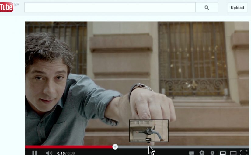
Volkswagen Hidden Frame – using the YouTube play bar as the story

The Volkswagen Side Assist feature helps drivers avoid accidents by showing other vehicles when they are in the side mirror’s blind spot.

To drive home the message, AlmapBBDO developed a film that used YouTube’s play bar to show the difference the VW Side Assist made in people’s lives.

No Means No – a player that interrupts denial

Amnesty Norway, in an attempt to change the Norwegian law on sexual assault and rape, developed a film that used a custom video player to pop up the key message.

The campaign was a success and the law was about to change as a direct consequence of the campaign.

Why interface-led video lands harder

Both ideas shift the viewer from passive watching to active noticing. By “interface-led” I mean the player UI, like the progress bar, overlays, or controls, doing storytelling work, not just housing the film.

Extractable takeaway: If the interface carries part of the argument, the viewer is forced to notice the point during playback, which reduces message loss.

The real question is whether your player can carry the argument when attention collapses.

Volkswagen used a familiar interface to make a safety benefit visible in the moment. Amnesty used an interface interruption to force the key message to be seen, not skipped. In both cases, the “player” stopped being furniture and became the persuasion device.

In global consumer brands and publisher-style marketing teams, interface constraints often determine what gets noticed and what gets ignored.

What these campaigns were really trying to achieve

The business intent was not “engagement” as a vanity metric. It was message delivery with minimal loss.

Volkswagen aimed to make an invisible feature feel tangible and memorable. Amnesty aimed to change perception and behavior at the cultural level, and the player design reinforced that urgency by refusing to be background noise.

Player-hacking patterns to copy

Here, “player-hacking” means designing the video controls and UI as part of the message, not just the wrapper.

  • Use the interface as evidence. When the message is hard to show, let the UI demonstrate it.
  • Design for the skip reflex. If your message is often ignored, build an experience that makes ignoring harder.
  • Keep viewer control intentional. Interactivity works when it serves comprehension, not novelty.
  • Make the “point” happen inside the viewing moment. Do not rely on a voiceover claim when the experience can prove it.

A few fast answers before you act

What is an “interface-led” video campaign?

An interface-led video campaign is one where the player experience, like the progress bar, overlays, or controls, is part of the storytelling, not just the container.

How did Volkswagen Hidden Frame use YouTube differently?

It used YouTube’s play bar as a narrative device to demonstrate the value of Side Assist, making the benefit feel visible rather than described.

What did Amnesty Norway’s No Means No change about the player?

It used a custom video player that surfaced the key message via a popup, ensuring the point was encountered during playback.

Why do these ideas work better than a standard film in some cases?

Because they reduce message loss. The viewer is guided to notice the point through the viewing mechanics, not just the content.

What is the practical takeaway for brands?

If your message is often missed, redesign the viewing experience so the message is structurally harder to ignore and easier to understand.

The Live Tile Experiment: Oslo Live Tiles

Microsoft has been heavily advertising the new Windows 8, Surface RT and Windows Phone 8 along with their respective features. In Norway, Microsoft partners with Norwegian electro rock band Datarock to bring the experience of Windows 8 and Windows Phone 8 Live Tile functionality to unsuspecting residents of downtown Oslo. Live Tiles are interface elements that surface changing, real-time information before you click.

A giant lit-up “tile” appears on the street outside a seemingly closed-off venue. When a passer-by steps onto it, the wall drops and the hidden party spills into the street, with Datarock performing live. The result is an evening to remember.

What the stunt makes you understand about Live Tiles

Live Tiles are designed to feel active, not static. They are not just shortcuts to apps. They are meant to show “something is happening” before you even click. This activation dramatizes that promise by making the tile itself the trigger for real-world content. Because the tile is both preview and trigger, the promise of “something is happening” becomes instantly believable.

In European city-center launches, the most effective experiential stunts translate a UI idea into a single physical action people can trigger without instructions.

Why the surprise mechanic works

The build-up is visible. You hear music, you see a barrier, you notice something glowing at your feet. Curiosity does the recruiting. The moment of commitment is tiny, just stepping onto the tile, but the payoff is oversized, because the environment changes instantly around you.

Extractable takeaway: If you want people to understand a product behavior fast, design a tiny, obvious trigger that unlocks an outsized change in the environment.

What Microsoft is really selling here

Specs are not the message. The message is a feeling: Windows looks alive. By turning a UI element into a street-level “switch” that unleashes a live experience, the campaign makes the feature memorable even for people who never touch the product that night.

The real question is whether your feature can be felt through a simple trigger before it is explained.

This kind of launch is the right move when you want the feature’s behavior to become the story people repeat.

Trigger-based patterns for feature marketing

  • Convert the feature into a trigger. If the benefit is “real-time,” make the audience activate something in real time.
  • Make the payoff disproportionate. A small action should unlock a big reveal.
  • Stage it for bystanders too. The crowd reaction is part of the content.
  • Keep the story tellable. “I stepped on a tile and a concert exploded” is easy to repeat.

A few fast answers before you act

What is “The Live Tile Experiment”?

It is a street stunt in Oslo that turns the Live Tile concept into a physical trigger. Step on a giant tile and a hidden Datarock performance is revealed as the wall drops.

What product feature does it communicate?

Live Tiles, the Windows 8 and Windows Phone 8 interface element designed to display changing, real-time information and content.

Why use a concert reveal instead of a traditional demo?

A live reveal creates an emotional memory tied to the feature idea. It shows “alive and dynamic” faster than any explanation.

What makes the activation easy for the public to participate in?

The required action is obvious and low effort. People only need to step onto the tile to trigger the outcome.

What is the key lesson for feature launches?

Do not describe the benefit. Stage a moment that behaves like the benefit, so people feel it immediately.

Turismo de Portugal: Cobblestone QR Codes

To get into the minds of tourists, Turismo de Portugal decides to fuse QR code technology with Portugal’s historical cobblestone tradition. The result is described as the first QR code made from Portuguese cobblestones.

The first QR code is embedded into the city ground in Lisbon, followed by an installation in Barcelona. Reported write-ups describe the campaign as successful enough to spark plans for similar cobblestone QR codes in other cities such as Berlin, Paris, Tokyo, New York, Vienna, Goa, Lima, and Oslo.

When street craft becomes the interface

The mechanism is simple. A familiar tourist behavior, looking down at the street and looking for cues, is turned into a scan trigger. The QR code is physically “native” to the place because it is built using the same black-and-white stone patterns people already associate with Portuguese streets, especially in historic areas like Chiado.

In destination marketing and city tourism promotion, bridging physical street culture to mobile content is a reliable way to convert foot traffic into deeper engagement. Destination brands should treat the street as the interface, not just the backdrop.

In European destination marketing, the most scalable activations turn street-level cues into a clear mobile doorway.

Why this lands with visitors

It does two jobs at once. It signals “authentic Lisbon” through material and craft, and it gives the tourist an immediate next step through their phone. The real question is how you turn a place’s own cues into a frictionless next step without making it feel like advertising. Unlike a poster or a billboard, the code is part of the ground people are already walking on, so discovery feels like finding something, not being targeted.

Extractable takeaway: If you want mobile interaction in public space, embed the call-to-action into something the place already owns. Local texture first, technology second. The scan should feel inevitable, not imported.

What to steal for your own place-based activations

  • Make the trigger belong to the environment. Use local materials, patterns, or rituals so the interaction feels contextual.
  • Design for tourist attention spans. The best street interactions reward a 5-second decision, not a long explanation.
  • Use “discovery” as the media buy. When people feel they found it, they are more likely to scan, share, and talk about it.
  • Plan for maintenance and legibility. Outdoor codes live or die based on wear, lighting, contrast, and camera-readability.

A few fast answers before you act

What is the Cobblestone QR idea in one sentence?

A QR code built into the street using Portuguese cobblestones, so tourists can scan a piece of the city itself to access content.

Why does making a QR code “physical” matter?

Because it turns a generic tech behavior into a place-specific experience. The scan feels like interacting with Lisbon, not with a random sign.

What makes this different from putting a QR code on a poster?

Placement and meaning. A poster is rented space. A street pattern is owned space. The medium carries authenticity before the message even loads.

What should the QR code open to?

A fast-loading mobile page that confirms you are in the right place and offers one clear next step. If the page feels generic or slow, the “found it” magic disappears.

What is the biggest execution risk?

If the code is hard to scan or the content behind it is weak, the novelty collapses. The physical build earns attention. The mobile experience must repay it.