Crafted By My Heart

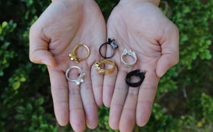
A ring becomes more than a ring when the pattern is literally yours.

“Crafted By My Heart” is an app launched by DDB Group Hong Kong that lets you customize jewelry with your own heartbeat. You place a finger over the smartphone’s camera and flash. The app detects subtle changes in finger coloration, measures your heartbeat, then translates its intensity and rhythm into a unique digital rendering. That rendering becomes the basis for a one-of-a-kind ring.

From pulse to pattern

Turn a biometric signal into a personal design language, then manufacture it as a physical object. By “biometric signal,” I mean a measurable body output, like heart rhythm, captured directly from the user.

How the experience works

The flow is intentionally simple. The mechanism matters because it converts an invisible, emotional idea (“this is us”) into visible proof that feels undeniably personal.

  1. Capture
    You use the phone’s flash and camera to read your heartbeat through small changes in skin coloration.
  2. Translate
    The heartbeat becomes a digital rendering that is unique to your rhythm.
  3. Craft
    That rendering is used to create a ring. It is not a generic engraving. It is a form generated by your own signal.

In premium gifting categories, the story attached to the object often matters as much as the object itself.

The product choices are clear and bounded

The app offers two base designs, Surge and Sierra, with three finishes: gold, silver, or black silver. Rings cost between HK$1,198 and HK$1,588 (listed as US$155 to US$205), and take around 15 to 20 working days to complete.

Why a heartbeat beats engraving

Most “personalization” is decorative choice. This is structural personalization, where the customer input generates the form, which raises perceived meaning and makes the purchase easier to justify.

Extractable takeaway: If the customer’s input does not change the form of the product, you are offering decoration, not personalization, and it will be competed away by more options and lower price.

Personalization is structural, not cosmetic

A lot of customization is color, text, or surface. Here, the customer input generates the form. That feels materially more personal.

Technology removes the intimidation barrier

Biometrics and jewelry-making sound complex. The interaction is not. One finger. One phone. A result you can explain in one sentence.

The story is built-in

The product carries a narrative you can repeat instantly. It is your heartbeat, turned into a physical object. That makes it inherently giftable.

The deeper point

The real question is: how do you turn personalization from “more choices” into emotional proof people will pay for?

Meaningful personalization rarely comes from expanding menus. It comes from finding a signal that matters emotionally, translating it into a design system, and making the creation process easy enough that people actually do it.

What to steal

  • Start with a signal, not a style. Pick an input customers already value emotionally (not just data you happen to have).
  • Translate the signal into form. Make the input change geometry or structure, not just surface decoration.
  • Keep choices bounded. Offer a small set of base options so the “unique” part stays legible.
  • Design for retellability. If the owner cannot explain it in one sentence, it will not travel socially.

A few fast answers before you act

What is the core mechanic behind Crafted By My Heart?

The phone’s camera and flash detect heartbeat via subtle changes in finger coloration, then translate the rhythm into a digital rendering used to craft a ring.

What does the customer actually customize?

They select a base design and finish. The unique part is the heartbeat-generated rendering that drives the final piece.

What are the available designs and finishes?

Two base designs, Surge and Sierra. Three finishes, gold, silver, and black silver.

What are the price and production timelines?

HK$1,198 to HK$1,588 (US$155 to US$205). Around 15 to 20 working days.

What is the transferable lesson for other categories?

If you can capture a personal signal that people care about and make it visibly change the product’s form, you turn “customization” into meaning, not configuration.

Coca-Cola: Sharing Can That Splits in Two

When “share” is built into the can

With summer coming up and an ice cold soda in your hand, people around you are bound to hope that you will share the soda with them. The normal way of doing so would be to sip from the same opening.

Now in an attempt to create another way of sharing happiness, Coca-Cola teamed up with Ogilvy in Singapore and France to create a shareable can of Coke that splits into two and creates two half pints. The results.

The packaging hack: one can becomes two

The can does not just contain the drink. It choreographs the moment. Split it. Hand one half over. The product becomes the gesture.

In global FMCG brands, packaging is often the fastest way to turn “share” from a line of copy into a behavior.

If the behavior matters, design it into the object. Because the can physically divides into two drinkable halves, the social negotiation disappears and the gesture becomes obvious.

Why it changes the social moment

The post nails the truth. People want a sip. This design turns that awkward micro-negotiation into a simple ritual that feels natural in the moment. Here, “ritual” means a tiny repeatable sequence anyone can copy. Split, hand one half over, drink.

Extractable takeaway: When the friction lives in a shared micro-moment, redesign the object so the desired behavior is the default, not a negotiation.

The job it solves

Create another way of sharing happiness in summer, without two people sipping from the same opening. Here, “sharing happiness” is not abstract. It is one can producing two separate openings, so two people can drink without swapping sips.

The real question is how to make sharing feel effortless and hygienic at the exact moment someone is holding the drink.

Steal the split-and-share ritual

  • Encode the behavior: If the behavior matters, build it into the object, not only the message.
  • Remove micro-friction: Design for the real scenario, then remove friction inside that moment.
  • Make the ritual portable: Create a repeatable ritual. The best ones travel without explanation.

A few fast answers before you act

What is the “sharing can” concept?

A Coke can engineered to split into two drinkable halves, creating two half pints from one can.

Who was involved?

Coca-Cola partnered with Ogilvy. The post associates the work with Singapore and France.

What moment does it target?

The everyday situation where someone has a cold drink and others around them hope they will share it.

What is the core creative move?

Turning “sharing happiness” into a physical product feature rather than a line of copy.

Coca-Cola: FM Magazine Amplifier

Coca-Cola to promote its FM app in Brazil allowed readers of the Capricho magazine to simply roll up the magazine and transform it into a portable amplifier for their iPhones. All the readers had to do was insert the iPhone into the spot indicated and tune into the Coca-Cola FM application. By “portable amplifier” here, I mean passive acoustic amplification from rolled paper, not electronics.

Why this is clever

The idea turns print into a functional accessory. No electronics. No QR-code dependency. Just smart physical design that rewards curiosity and makes the app the natural next step. Because the rolled magazine forms a simple acoustic horn, it directs the phone’s speaker output and makes the sound feel louder right away.

Extractable takeaway: When a piece of media becomes a working object, the “ad” turns into a demo and the digital step feels inevitable.

  • One simple action. Roll the magazine, insert the iPhone, hit play.
  • Instant utility. Louder sound is a real, immediate benefit.
  • Media becomes product. The magazine is not only a channel. It is the device.

In global consumer brands, analog-to-mobile bridges like this help when you need an obvious path into an app without adding new tech.

What to learn from it

This is a strong reminder that “mobile activation” does not always need a screen-first mechanic. When you can create a physical trigger that is obvious and satisfying, you reduce friction and increase shareability. People demonstrate it to others because it is surprising, and because it works.

The real question is how to make the next mobile step feel like a continuation of what people are already doing in the moment.

The strongest activations put physical utility first and let the app be the immediate follow-on.

  • Start with utility. Give people a benefit they can feel instantly, then invite the app as the next step.
  • Design one obvious move. Keep the interaction to a single action people can copy and demonstrate.
  • Make it easy to show. If it reliably “works”, people will hand it to someone else and replay the moment.

A few fast answers before you act

What is the Coca-Cola FM Magazine Amplifier?

It is a Capricho magazine execution in Brazil designed to be rolled into a tube that passively amplifies iPhone audio, used to promote the Coca-Cola FM app.

Why does a paper amplifier work at all?

The rolled shape acts like a simple acoustic horn, directing and concentrating the phone’s speaker output so it sounds louder.

What makes this effective as an app promotion?

The app is not advertised as a feature list. It is experienced. The physical utility creates a reason to open the app immediately.

What is the transferable pattern?

Turn media into a usable object, then connect that object to a single, obvious mobile behavior that completes the experience.