Amazon Dash: The Button That Rewrites Loyalty

A one-click purchase is not the point. Default is.

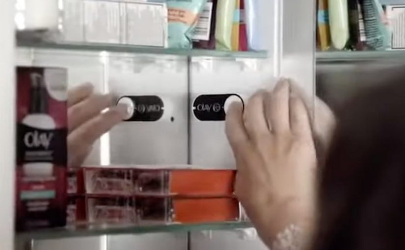
Amazon Dash Button looks simple. A branded button you stick near the place of usage. You press it. The same item arrives again.

But the strategic move is not “one click.” It is making the reorder the default behavior.

Dash Button turns repeat buying into an ambient habit. By “ambient habit,” I mean a repeat action triggered by the environment rather than an active shopping session. It shifts commerce away from discovery and toward automation. It pushes the battle for the customer from the shelf and the screen to the home.

What the Dash Button does

Dash Button is a small connected device tied to one specific product, and often one specific pack size. You link it to your Amazon account. You place it where the need occurs.

Examples are obvious in everyday life:

  • Detergent button near the washing machine
  • Coffee button in the kitchen
  • Pet food button near the feeding area

When the product runs low, you press. Amazon confirms the order, typically via app notifications, and ships.

The experience is intentionally narrow. That narrowness is the innovation.

In consumer convenience products, loyalty is often less about love and more about default.

In high-frequency household categories, the interface at the point of use can matter more than the message at the point of sale.

Why the narrowness matters

Dash Button removes three high-friction moments that brands fight over every day. Because one button equals one SKU, the moment of need no longer reopens the choice.

Extractable takeaway: If you can turn repeat purchase into a single configured action, you shift competition from persuasion in the moment to setup before the moment.

  1. Search. The customer does not type a query.
  2. Comparison. The customer does not see alternatives.
  3. Persuasion. The customer does not view ads, ratings, or promotions in the moment.

In other words, the customer does not shop. They simply replenish.

Once a household adopts replenishment behavior, the role of branding changes. The brand becomes less about persuasion and more about being the chosen default.

The hidden bet. Repeat purchases are the real moat

Dash Button is a physical expression of a platform strategy.

If Amazon captures replenishment categories, it wins the durable, high-frequency part of retail. The items that quietly drive recurring revenue and predictable logistics.

The button also functions as a data instrument. It reveals how often a household needs a product, where it is used, and which categories are truly habitual versus occasional.

That insight feeds subscriptions, predictive delivery, and future interface removal.

What this signals to CPG and retail leaders

Dash Button compresses marketing into an upstream decision.

The real question is how you become the configured default before the point of purchase even exists.

For CPG leaders, this forces uncomfortable clarity on loyalty, pack architecture, trade visibility, and availability. For retailers, it signals a shift in power toward whoever owns the reorder interface.

The consumer tension. Convenience vs control

Dash Button introduces a trust tradeoff.

Consumers value convenience, but they also worry about accidental orders, loss of price checks, oversimplified choice, and dependence on a single platform.

Those tensions do not invalidate the model. They clarify what platforms must solve through better confirmations, clearer reorder states, and smarter replenishment rules.

The bigger story. Interfaces disappear

Dash Button fits a broader direction in commerce. Buying moves away from screens and toward contexts.

The pattern is consistent: less explicit shopping, more embedded intent, more automation, and more default-driven brand outcomes.

Dash Button is not the endpoint. It is an early, tangible step toward commerce that feels invisible.

What to steal from Dash-default loyalty

  • Win the setup, not the moment. Treat the “configured default” as the real battleground, not the last-second persuasion layer.
  • Make narrowness a feature. If the goal is replenishment, deliberately constrain the action so choice does not reopen at the moment of need.
  • Put the trigger where the need occurs. The closer the interface sits to usage, the more it behaves like an always-on shelf for repeat buying.
  • Design for convenience with control. Keep confirmations and reorder states clear so automation feels helpful, not risky.

A few fast answers before you act

What was Amazon Dash?

Dash was a physical reorder button that let customers buy a specific everyday product with one press, removing browsing and checkout steps.

What is the core mechanism?

Turning replenishment into a default action. One button equals one SKU. The interface collapses choice into speed and habit.

Why does this change loyalty dynamics?

Because the reorder interface becomes the brand decision. If the button exists, switching requires extra effort, so the default compounds over time.

What is the business intent?

Increase repeat purchase frequency and reduce churn by owning the replenishment moment and lowering friction to near zero.

What should other brands steal?

Design for the reorder moment. If your category is habitual, the winning move is to remove steps, make the default easy, and earn repeat behavior through convenience.

Simon Pierro: iPad Magic on Ellen

An iPad becomes a stage prop. Photos, objects, and interfaces behave like they can leak into the real world. That is the whole hook of Simon Pierro’s “digital magic”, and it plays especially well on a talk-show set. Here, “digital magic” means classic sleight of hand staged through a device interface so the screen appears to affect the physical world.

Simon Pierro is a digital magician from Germany who takes audiences to places they’ve never been, using a technological marvel they know and love, an iPad.

His latest performance was on The Ellen DeGeneres Show at the massive Warner Bros. studio complex in Hollywood. Here he treated Ellen DeGeneres and her enthusiastic audience to some of his best tricks, including his newest illusion, an iPad selfie.

Why “digital magic” works as a format

The mechanism is familiar stagecraft wrapped around a modern interface. The iPad provides a believable frame for impossible transitions, because everyone already understands screens, apps, photos, and swipes.

Extractable takeaway: Wrap your “impossible” moment in a familiar interface so the reveal reads instantly and can be retold without extra explanation.

In consumer technology and entertainment media, demos travel further when they feel like a performance, not a product explanation.

The moment that sells the illusion

The strongest beats are the ones that collapse distance between screen and reality. When a selfie or a photo becomes “physical”, the audience gets a clean before-and-after moment that is easy to retell and easy to clip.

The real question is whether your demo is built to be retold, not just understood.

If you market experiences, you should treat the demo as performance first and explanation second.

How to stage experience demos people retell

  • Use a prop people already trust. Familiar devices make impossible outcomes feel temporarily plausible.
  • Design for one clear closer. A single “how did that happen” finale gives the video its replay value.
  • Keep the story inside the frame. The best tricks look self-contained, so viewers do not need context to enjoy them.

A few fast answers before you act

What is “digital magic” in simple terms?

It is classic illusion and sleight of hand staged through modern devices, so screens, apps, and media become part of the trick.

Why does iPad magic perform well on TV and online?

Because the visuals read instantly and the reveals are clean. You do not need language or setup to understand the surprise.

What is a “signature reveal”?

It is the one moment you want viewers to remember, the clean switch from normal to impossible that carries the message on its own.

What makes a trick “shareable” as video content?

A tight sequence of cause and effect. You see the normal state, then the impossible state, and the clip ends before the mystery dissolves.

How do you translate this into brand work without copying it?

Borrow the structure. Use a familiar interface, create one signature reveal, and anchor the message in a single visual moment people can retell.

Ralph Lauren: Polo 4D

In September 2012, Hugo Boss live streamed its Boss Black Fall Winter 2012 fashion show directly in 3D. Now fast forward to 2014 and Ralph Lauren launches their Polo for Women Spring 2015 collection via a cinematic 4D experience. Here, “4D” means a physical projection experience that uses water, light, film, and live atmosphere to create depth and immersion.

On the evening of September 8th, during New York Fashion Week, Ralph Lauren turns the idea of a runway into a 60-foot-tall water-screen projection that towers above Manhattan’s Central Park, fusing fashion, art, and technology.

A runway made of water, light, and film

The mechanism is a projection-mapped water screen that functions like a living canvas. High-resolution scenes and “models” are projected onto a fan-shaped spray of water, creating the effect of figures moving across a surface that reads as a runway, even though it is literally water.

In global fashion marketing, immersive show formats are used to signal modernity and earn attention beyond the invited audience.

Why it lands

This works because it treats the collection launch as a public cultural moment, not a closed industry ritual. The scale is instantly legible. The format borrows from cinema. The setting adds myth. Central Park at night turns the presentation into something people talk about even if they cannot describe the garments in detail. Because the water-screen illusion reduces the show to one instantly retellable image, the experience travels beyond the guests who were physically there.

Extractable takeaway: When your category is saturated with beautiful imagery, compete on format. If the show itself becomes the story, the brand gets disproportionate reach without relying on louder messaging.

What Ralph Lauren is really doing

The real question is whether the launch format can make Polo for Women feel more culturally current than a conventional runway could. Ralph Lauren is using spectacle less to explain the collection than to position Polo as a modern media brand. The 4D framing functions as a brand statement. It positions Polo for Women as contemporary and city-native, and it uses spectacle to bridge runway tradition with a media behavior that is already screen-first.

What brand launch teams can borrow

  • Choose a “native stage”. A location with cultural meaning can do as much work as the production itself.
  • Make scale part of the idea. If it reads in one glance, it travels faster in photos, recaps, and retellings.
  • Build a film, not a documentation. When the content is cinematic by design, it holds up outside the event moment.
  • Let tech serve a single clear illusion. “Models walking on water” is the story. Everything else supports that.

A few fast answers before you act

What is Ralph Lauren Polo 4D?

It is a New York Fashion Week presentation that uses a projection-mapped water screen in Central Park to stage a cinematic runway-style experience for Polo for Women Spring 2015.

Why call it “4D”?

Coverage describes it as “4D” because the visuals are engineered to feel more immersive than a flat projection, with the water spray and depth effects contributing to the illusion.

How big was the water screen?

Reporting describes a water screen around 60 feet tall and 150 feet wide.

What makes this different from a normal runway show?

It blends film, set design, and projection mapping so the “runway” becomes an environment and a story, not just a walk-and-look format.

What is the transferable lesson for brand launches?

If you want a launch to travel, design for one clear, repeatable illusion that audiences can describe in a sentence.