Pizza Hut is the official pizza of the NCAA, a men’s basketball tournament known informally as March Madness and played each spring in the United States.
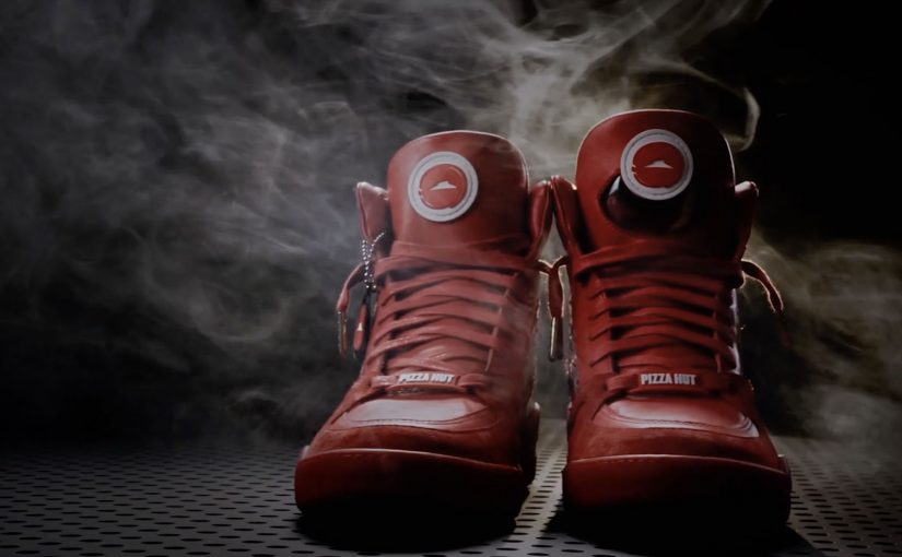
For last year’s tournament, Pizza Hut created what was billed as the world’s first shoe that ordered a pizza. Now, to celebrate their second year as the official pizza of the NCAA, Pizza Hut, Droga5 and the Shoe Surgeon launched Pie Tops II. It is a limited-edition high top shoe that not only uses your geolocation to order the current Pizza Hut deal at the press of a button, but also allows users to pause the game while they receive their delivery.
A TV ad has also been released to highlight the new pause feature of these newly relaunched Pie Top shoes.
A sneaker button that behaves like a remote
The mechanism is deliberately simple. Put a single button on the shoe. Tie it to an app. Map the press to two jobs: order, then pause. The shoe becomes a physical shortcut for a very specific March Madness moment, when people want food but do not want to miss play. That works because it removes friction at the exact moment attention is highest.
In second-screen sports viewing, the strongest interactions reduce interruption while keeping attention on the live game.
Why it lands on game day
Pie Tops II works because it converts a familiar tension into a prop. Hunger versus attention. Convenience versus FOMO. The “pause” feature turns a delivery problem into a punchline, and the shoe format makes the whole thing instantly tellable.
Extractable takeaway: If you can turn a high-frequency habit into a one-action ritual, you make the brand feel like part of the event, not just an ad around it.
The real intent behind the novelty
This is not really about footwear. The real question is how Pizza Hut earns a place inside the live ritual instead of advertising around it. It is about owning a behavior loop during March Madness. By behavior loop here, I mean a repeatable sequence of trigger, action, and reward that keeps the brand attached to the moment. Pizza ordering, deal recall, and a reason to talk about Pizza Hut in the same breath as the game. The smart move here is not the gadget but the way it turns brand utility into event behavior. Limited-edition scarcity does the rest, because it makes the product itself a piece of shareable culture.
What brands can steal from Pie Tops II
- Pick one moment to own: design for a specific tension that happens repeatedly during an event, not for “sports fans” in general.
- One control, two outcomes: a single action that triggers both utility and delight is more memorable than a complex feature list.
- Make the object do the storytelling: the product should explain the campaign in one sentence, even without a logo.
- Build viewer control into the idea: letting people keep the game in their hands makes the brand feel helpful, not interruptive.
- Scarcity as distribution: limited runs can function like media spend when the object is inherently talkable.
A few fast answers before you act
What are Pie Tops II?
They are limited-edition Pizza Hut sneakers designed for March Madness that let you order pizza via a button press and, as described, pause the game while you wait for delivery.
What problem is this campaign solving?
It dramatizes a familiar game-day problem. People want food without missing play. The stunt turns that tension into a memorable product feature and a shareable story.
Why does the “pause” feature matter more than the pizza-ordering feature?
Ordering is convenient. Pausing is emotionally resonant because it speaks directly to FOMO during live sports. It is the twist that makes the idea travel.
Is this wearable tech or brand entertainment?
It is primarily brand entertainment packaged as a functional shortcut. The utility makes it credible. The novelty makes it worth talking about.
What is the reusable pattern for other brands?
Create a physical or tactile shortcut for a high-frequency moment. Keep the interaction to one obvious action. Then tie it to an event where people already have strong emotions and repeat behaviors.