
Amazon Dash: The Button That Rewrites Loyalty

A one-click purchase is not the point. Default is.

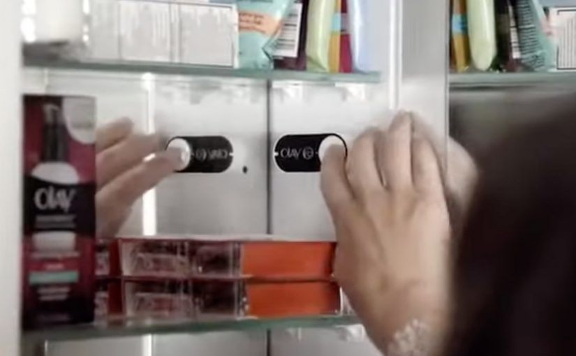
Amazon Dash Button looks simple. A branded button you stick near the place of usage. You press it. The same item arrives again.

But the strategic move is not “one click.” It is making the reorder the default behavior.

Dash Button turns repeat buying into an ambient habit. By “ambient habit,” I mean a repeat action triggered by the environment rather than an active shopping session. It shifts commerce away from discovery and toward automation. It pushes the battle for the customer from the shelf and the screen to the home.

What the Dash Button does

Dash Button is a small connected device tied to one specific product, and often one specific pack size. You link it to your Amazon account. You place it where the need occurs.

Examples are obvious in everyday life:

  • Detergent button near the washing machine
  • Coffee button in the kitchen
  • Pet food button near the feeding area

When the product runs low, you press. Amazon confirms the order, typically via app notifications, and ships.

The experience is intentionally narrow. That narrowness is the innovation.

In consumer convenience products, loyalty is often less about love and more about default.

In high-frequency household categories, the interface at the point of use can matter more than the message at the point of sale.

Why the narrowness matters

Dash Button removes three high-friction moments that brands fight over every day. Because one button equals one SKU, the moment of need no longer reopens the choice.

Extractable takeaway: If you can turn repeat purchase into a single configured action, you shift competition from persuasion in the moment to setup before the moment.

  1. Search. The customer does not type a query.
  2. Comparison. The customer does not see alternatives.
  3. Persuasion. The customer does not view ads, ratings, or promotions in the moment.

In other words, the customer does not shop. They simply replenish.

Once a household adopts replenishment behavior, the role of branding changes. The brand becomes less about persuasion and more about being the chosen default.

The hidden bet. Repeat purchases are the real moat

Dash Button is a physical expression of a platform strategy.

If Amazon captures replenishment categories, it wins the durable, high-frequency part of retail. The items that quietly drive recurring revenue and predictable logistics.

The button also functions as a data instrument. It reveals how often a household needs a product, where it is used, and which categories are truly habitual versus occasional.

That insight feeds subscriptions, predictive delivery, and future interface removal.

What this signals to CPG and retail leaders

Dash Button compresses marketing into an upstream decision.

The real question is how you become the configured default before the point of purchase even exists.

For CPG leaders, this forces uncomfortable clarity on loyalty, pack architecture, trade visibility, and availability. For retailers, it signals a shift in power toward whoever owns the reorder interface.

The consumer tension. Convenience vs control

Dash Button introduces a trust tradeoff.

Consumers value convenience, but they also worry about accidental orders, loss of price checks, oversimplified choice, and dependence on a single platform.

Those tensions do not invalidate the model. They clarify what platforms must solve through better confirmations, clearer reorder states, and smarter replenishment rules.

The bigger story. Interfaces disappear

Dash Button fits a broader direction in commerce. Buying moves away from screens and toward contexts.

The pattern is consistent: less explicit shopping, more embedded intent, more automation, and more default-driven brand outcomes.

Dash Button is not the endpoint. It is an early, tangible step toward commerce that feels invisible.

What to steal from Dash-default loyalty

  • Win the setup, not the moment. Treat the “configured default” as the real battleground, not the last-second persuasion layer.
  • Make narrowness a feature. If the goal is replenishment, deliberately constrain the action so choice does not reopen at the moment of need.
  • Put the trigger where the need occurs. The closer the interface sits to usage, the more it behaves like an always-on shelf for repeat buying.
  • Design for convenience with control. Keep confirmations and reorder states clear so automation feels helpful, not risky.

A few fast answers before you act

What was Amazon Dash?

Dash was a physical reorder button that let customers buy a specific everyday product with one press, removing browsing and checkout steps.

What is the core mechanism?

Turning replenishment into a default action. One button equals one SKU. The interface collapses choice into speed and habit.

Why does this change loyalty dynamics?

Because the reorder interface becomes the brand decision. If the button exists, switching requires extra effort, so the default compounds over time.

What is the business intent?

Increase repeat purchase frequency and reduce churn by owning the replenishment moment and lowering friction to near zero.

What should other brands steal?

Design for the reorder moment. If your category is habitual, the winning move is to remove steps, make the default easy, and earn repeat behavior through convenience.
Knorr physical retargeting: iBeacon soup truck

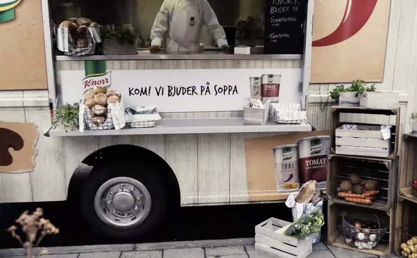
In November, a Knorr food truck in chilly Stockholm offers free warm samples of the brand’s tomato and Thai soups. Visitors can eat it on the spot or take home the samples.

To ensure visitors can also be retargeted through relevant mobile ads, Knorr equips the truck and the sampling team with battery-powered iBeacons. Through these beacons, visitors who already have the Swedish newspaper Aftonbladet app installed are registered as having been there. Instead of pushing a coupon immediately, the campaign waits until the next time the user opens the Aftonbladet app, then serves the offer as a mobile ad on the start screen.

Physical retargeting is the practice of using a real-world visit as the trigger for a later digital message, so the follow-up feels connected to what the person actually did offline.

Why the timing choice matters more than the beacon

In FMCG sampling, delayed retargeting works best when the message arrives in a natural “open app” moment, not as an intrusive push at the street corner. The iBeacons are the plumbing, but the experience design is the restraint. The campaign avoids interrupting the sampling moment and instead chooses a later point of attention when the person is already browsing content. That shift makes the offer feel more like a relevant reminder than a forced conversion attempt. Brands should treat iBeacons as infrastructure and invest the real effort in timing and creative that respects the sampling moment.

Extractable takeaway: Treat the offline moment as the relationship builder, then use the next self-initiated “open app” moment as the conversion window.

What the campaign proves, beyond “we can target”

The real question is whether your follow-up arrives at a moment of attention the user has already chosen. Sampling often struggles with attribution. This approach creates a cleaner bridge between the street interaction and a measurable mobile impression, without requiring a QR scan or a form fill at the truck.

A repeatable offline-to-mobile loop

  • Separate experience from conversion. Let the street moment stay human, then follow up later in a calmer context.
  • Use a trigger the user already understands. “When I open the app, I see it” is easier than “enable Bluetooth, accept three prompts”.
  • Keep the reward aligned. A soup sample followed by a soup coupon is a coherent loop.
  • Design for opt-in environments. The cleanest versions of this pattern run inside existing app ecosystems where ads are already expected.

A few fast answers before you act

What is Knorr “physical retargeting” in this example?

It is an offline-to-online marketing loop where visiting the soup truck becomes the trigger for receiving a relevant offer later inside a mobile app.

Why not show the coupon immediately at the truck?

Because immediate prompting can feel invasive and can disrupt the sampling experience. Waiting until the next app open delivers the offer in a more natural attention moment.

What role does the Aftonbladet app play?

It is the environment where the follow-up ad appears. People who already have the app installed can be recognized as having visited and later see the offer when they reopen the app.

What is the core benefit for the brand?

It links a real-world sampling touchpoint to a measurable, relevant mobile follow-up, improving recall and making conversion more likely.

What is the biggest failure mode for this tactic?

If the follow-up arrives too late or feels unrelated, it reads as generic targeting. The timing and message match are what make it feel earned.

Microsoft HoloLens: The Next Step of Computing

Microsoft brings holograms into the real world

At Microsoft’s Windows 10 event, the company unveils a new augmented reality experience for the platform called HoloLens.

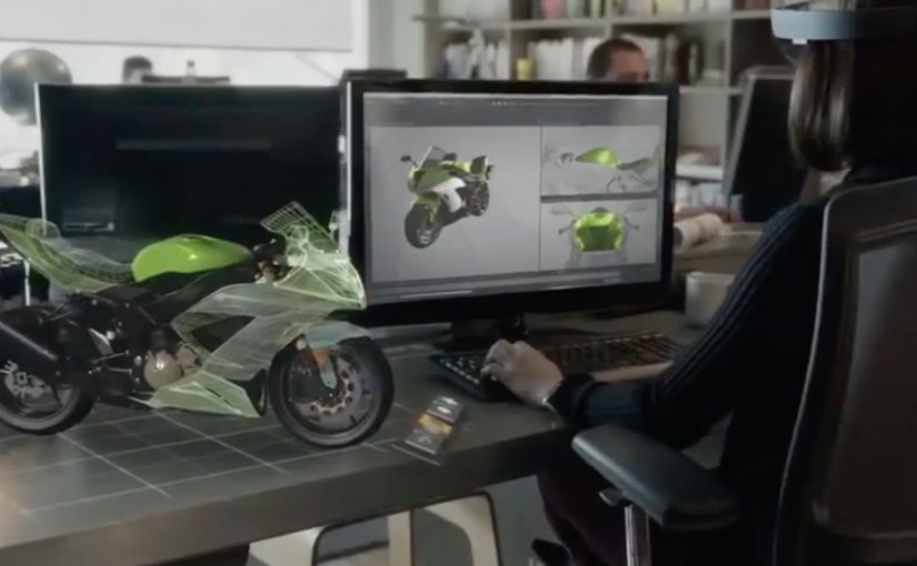
Using a special holographic headset, Windows 10 users can make holograms appear in real life. Not on a screen. In the room, anchored to space.

This is the kind of step-change that reframes computing from something you look at to something you live inside.

Watch below how Microsoft demonstrates holograms as spatial interfaces, not screen content.

What makes HoloLens different

HoloLens is positioned as an untethered augmented reality experience, built to feel like a real device rather than a lab prototype.

The device is said to use:

  • See-through lenses
  • Spatial sound
  • Advanced sensors
  • A dedicated holographic processing unit

Together, these elements aim to deliver a state-of-the-art mixed reality experience without cables or external trackers.

In this context, augmented reality means digital objects are layered into the real world through see-through optics, not a fully immersive virtual environment.

Why this matters

HoloLens signals a shift in interface design. Instead of dragging windows around a flat screen, digital objects become part of physical space. Apps turn into holograms. Workflows become spatial. Interaction becomes more natural because it maps to how people already understand the world.

In global digital product and marketing teams, the significance is not just the headset. It is the move from screen-first design to space-first interaction.

Extractable takeaway: HoloLens is important because it presents AR not as a feature inside existing software, but as a new computing layer where interface, content, and context are all anchored to physical space.

What to steal from this launch

The real question is not whether holograms look futuristic. It is whether a new interface model changes behavior in a way people can feel immediately.

That is what this launch gets right. It demonstrates the shift through experience, not just specification. The message is simple: when a technology changes where interaction happens, it also changes how products should be designed.

  • Lead with the interaction shift, not the feature list. Show what changes in the user’s behavior before explaining the underlying technology.
  • Make the benefit visible in context. Demonstrate the experience in a real environment so people immediately understand the practical value.
  • Use the demo as proof, not decoration. The strongest launch moments show the product working in the exact conditions users care about.
  • Explain the stack after the experience lands. Once the audience feels the change, technical details reinforce credibility instead of creating friction.
  • Design for the new interface model. If interaction moves from screens to space, content, UI, and workflows must be rethought for that environment.

A few fast answers before you act

Is HoloLens virtual reality?

No. It is augmented reality using see-through lenses that overlay holograms onto the real world.

What is the key technical promise?

Untethered, spatially aware holograms powered by sensors, spatial sound, and a dedicated holographic processing unit.

Why is being untethered important?

Untethered hardware makes the experience feel like a real computing device instead of a lab setup, which lowers friction for everyday use and demonstration.

What changes when apps become spatial?

The interface moves off the screen and into physical space, which changes how people place, view, and interact with digital content while moving through the real world.

What makes this feel like a new computing layer?

The shift is not only visual. It combines sensing, sound, and spatial anchoring so digital objects behave as if they belong in the room, not just on a display.