
Coca-Cola Peace Machines

Small World Machines. India and Pakistan meet through a Coke

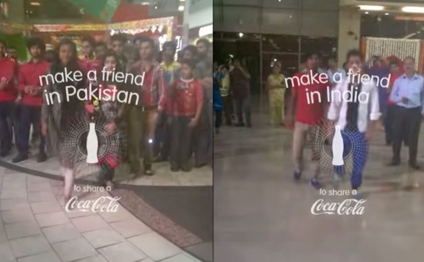
Over the years Coca-Cola keeps experimenting with vending machines and tries to make them much more than the average soda-spitter-outer. It places two machines, one in India and the other in Pakistan, and turns them into a communication portal. These “Small World Machines” allow citizens from both countries to interact with each other and complete shared tasks. Here, “shared tasks” means actions designed to be completed together, not alone. The machines reward them with a Coke. The results…

Fair Play Machines. Inter and Milan fans can only give to rivals

The success of that has inspired Coca-Cola to once again bring fighting parties together. Now instead of bringing together nations at odds, it has tapped into the rivalry between Italian soccer teams Inter and Milan.

To ease the aggression between the fans, Coca-Cola installed their “Fair Play Machines” on opposite sides of Milan’s San Siro stadium as the teams faced off. Pressing the button of one machine dropped a Coke can down the chute of that on the side of the rival team. So this way rivals could only receive Cokes from each other. The results…

The real question is whether you can design an interaction where the easiest way to get your reward is to give something to the other side first.

In global consumer brands, especially when audiences are polarized, experience rules travel further than slogans.

What this teaches about “peace” as a design problem

The strongest move is not messaging. It is creating a constraint that makes cooperation the easiest path to a reward. A constraint is a built-in rule of the experience that limits options so the intended behaviour becomes the easiest one. This works because the reward is gated behind a cooperative act, so the social friction becomes part of the game instead of a barrier. When a machine encodes that rule, behaviour shifts without anyone needing to preach.

Extractable takeaway: If you want two sides to act differently, stop asking for goodwill. Change the rules of the interaction so the smallest “yes” becomes the default move.

Design moves you can borrow from Peace Machines

  • Gate the reward behind a give-first action. Make the path to getting something run through giving something to the other side.
  • Keep the rule legible in one glance. If people need an explanation, the moment is gone.
  • Turn tension into a shared task. Use a simple co-action that feels like play, not reconciliation.

A few fast answers before you act

What are Coca-Cola “Peace Machines” in this context?

They are vending machine concepts that turn a simple Coke transaction into a social interaction, designed to reduce tension between rival groups.

What is the core mechanic of the Fair Play Machines?

Pressing the button on one machine sends a Coke to the machine on the rival side. Rivals can only receive Cokes from each other.

How do Small World Machines relate to this?

They use the same principle. A machine becomes a bridge, enabling people in opposing contexts to interact and complete shared tasks that lead to a reward.

What does “constraint” mean in experience design?

It is a built-in rule that limits options so the intended behaviour is the easiest one to choose.

What is the main design lesson for brands?

If you want behaviour change, build the rule into the experience. Make the cooperative action the trigger for the reward, and keep it simple enough to understand instantly.
Coca-Cola: Give a Coke, Be Santa

A vending machine that asked you to choose who you are

The strongest holiday ideas turn seasonal sentiment into a simple action people can take in public. Coca-Cola’s holiday vending machine is a clean example of that move.

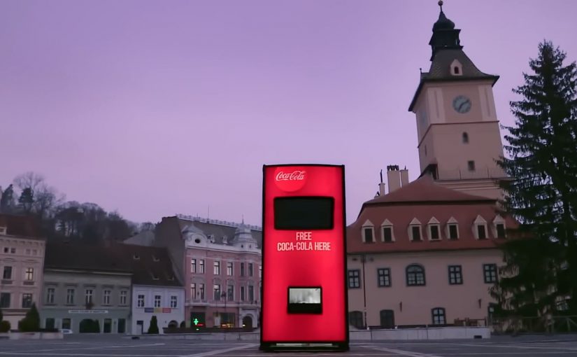
Coca-Cola wanted to bring out the Santa in everyone. So for the 2013 holiday season, they created a special vending machine that prompted users to either get a free Coke or give a free Coke.

The two-button mechanic that made sharing the story

If the user chose a free Coke, the machine quickly dispensed the drink for the user to enjoy.

However, if the user decided to share, then the machine did something a little more special. Watch the video below to find out.

In high-traffic FMCG retail settings, a binary choice lets a brand value show up as behavior in seconds.

Why “give” feels better than “get” in December

The psychology here is straightforward. A free product is nice, but it is forgettable. A choice that reflects identity is sticky.

Extractable takeaway: If you want a value like generosity to travel, put it into a visible choice where the “better self” option is easy to pick and easy to witness.

By putting “give” and “get” side by side, the machine turns a small decision into a moment of self-image and social proof, meaning other people can see the choice and validate it. During the holidays, people want to see themselves as generous, and they want to be seen that way by others.

The business intent behind bringing out the Santa

The intent is not simply distribution.

The real question is whether your brand promise can be expressed as a choice people are proud to make in public.

This is a stronger holiday move than a message-only campaign because it makes the value legible and repeatable at the point of interaction.

Coca-Cola uses the vending machine to translate a brand promise into behavior. The brand is associated with warmth and sharing because the consumer enacts it, not because the brand claims it.

How to reuse this give-or-get choice design

  • Turn values into a choice. Make the brand idea something people can do, not just hear.
  • Reward the “better” behavior. If sharing is the story, make sharing the more memorable path.
  • Keep the interaction instantly legible. Two clear options beat complex instructions in public spaces.
  • Design for a public moment. When others can witness the decision, the story travels faster.

A few fast answers before you act

What did Coca-Cola build for the 2013 holiday season?

A special vending machine that offered users a choice: take a free Coke or give a free Coke.

What was the core mechanism?

A simple two-option prompt. Choosing “get” dispensed a Coke immediately. Choosing “give” triggered a more special outcome.

Why does the “give” option matter so much?

Because it turns a freebie into an identity moment. People remember what they chose, and others can witness it.

What business goal did this support?

Making Coca-Cola’s holiday positioning feel real by linking the brand to a visible act of sharing, not just a message about sharing.

What is the main takeaway for brands?

If you want to own a value like generosity, design an interaction where people can demonstrate that value in the moment.

Amazon Dash: When Commerce Becomes a Button

A tiny button that quietly changes how buying works

When Amazon introduces Dash, it does not look like a revolution. No screens. No interfaces. No checkout flow.

Just a small physical button. One press. Reorder complete.

At first glance, Amazon Dash can feel like a gimmick. But in practice, it signals something more fundamental. A deliberate attempt to remove shopping itself from the act of buying.

What Amazon Dash does in the home

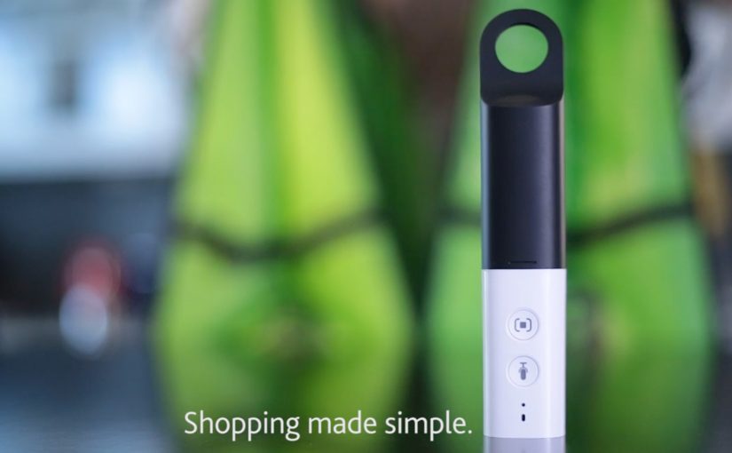
Amazon Dash, often described as the “Dash Button”, is a physical, Wi-Fi-connected button linked to a specific household product. Detergent. Coffee. Pet food. Batteries.

You place it where the need happens. On the washing machine. Inside a cupboard. Near the dog food bowl.

When you run out, you press the button. Amazon handles the rest.

No browsing. No comparison. No cart. No second thought.

Intent compression is the point, not the plastic

The button is not the story.

The real shift is intent compression. By intent compression, I mean collapsing need recognition, product choice, payment, and fulfillment into one trigger that requires almost no thought.

The real question is what happens to brand choice when reordering stops being a decision and becomes a reflex.

Dash is not a gimmick. It is a blueprint for default-setting commerce.

In replenishment categories like household essentials and other repeat-purchase goods, the winner is the brand or platform that becomes the default reorder, not the one that wins the next search.

Why “no interface” feels so good

Dash works because it removes cognitive load at the exact moment people are most willing to simplify. When a household runs out, the goal is not discovery. It is restoration. A one-press action fits the habit loop. Trigger, action, relief.

Extractable takeaway: If you can remove steps at the moment of need, you do not just improve conversion. You reshape behavior, because people repeat what feels effortless and reliable.

That same mechanism explains why Dash can feel uncomfortable. Accidental orders. Reduced price transparency. Loss of conscious choice. The discomfort is the point, because it reveals the boundary of how much control people will trade for frictionless convenience.

What Amazon is really buying with Dash

Dash compresses multiple steps. Need recognition. Product selection. Payment. Fulfillment. Into a single physical action.

Seen from that angle, Dash is less about buttons and more about locking demand upstream, before competitors even enter the consideration set.

Dash is also a learning system. It teaches Amazon about behavior, habit formation, replenishment cadence, and reorder economics, because the “moment of truth” becomes measurable and repeatable.

A signal to brands, not just consumers

For brands, Amazon Dash carries a subtle but powerful message.

If you win the button, you win the household. If you lose it, you disappear from the moment of need.

Traditional branding competes on shelves and screens. Dash shifts the battlefield into kitchens and cupboards. Physical presence becomes digital dominance.

Distribution is no longer only about visibility. It is about defaultness. Defaultness here means being the preselected choice a household reorders without revisiting the decision.

What to steal if you are not Amazon

The logic behind Dash is bigger than the hardware. Commerce keeps moving toward fewer decisions, fewer interfaces, more automation, and stronger platform pull.

  • Design for replenishment moments. Identify “run out” triggers and reduce the steps required to restore.
  • Compete for the default. Build experiences that make the second purchase easier than the first.
  • Make the trade-off explicit. Add lightweight safeguards (clear confirmations, simple cancellations, price-change visibility) so convenience does not feel like a trap.
  • Instrument the habit loop. Measure time-to-reorder, reorder frequency, and churn as first-class signals, not just conversion.
  • Protect trust. If the experience becomes invisible, reliability becomes the brand.

Sometimes, the future of shopping is just a button on a wall. The bigger story is what happens when buying becomes infrastructure.


A few fast answers before you act

Is Amazon Dash “just a button”?

No. It is a button plus an operating model that turns reordering into a near-automatic behavior.

What does “intent compression” mean in this context?

It means collapsing multiple steps. Recognize need, choose product, pay, and fulfill. Into one trigger with minimal deliberation.

Why does Dash matter even before voice becomes mainstream?

It proves the “no interface” ambition using a simple physical shortcut. It removes friction without needing new user behavior like talking to a device.

What is the strategic advantage for Amazon?

Dash moves competition upstream by capturing repeat demand before a shopper compares alternatives. That makes loyalty structural, not persuasive.

What is the core risk for brands?

If replenishment becomes default-driven, brands that are not the default become invisible at the moment of need, even if awareness is high.

What is the consumer downside, and what mitigates it?

The downside is reduced price awareness and accidental orders. Mitigations are clear confirmations, transparent price-change cues, and easy reversibility.