Lexus ES: Print Ad That Comes Alive on iPad

Lexus ES: Print Ad That Comes Alive on iPad

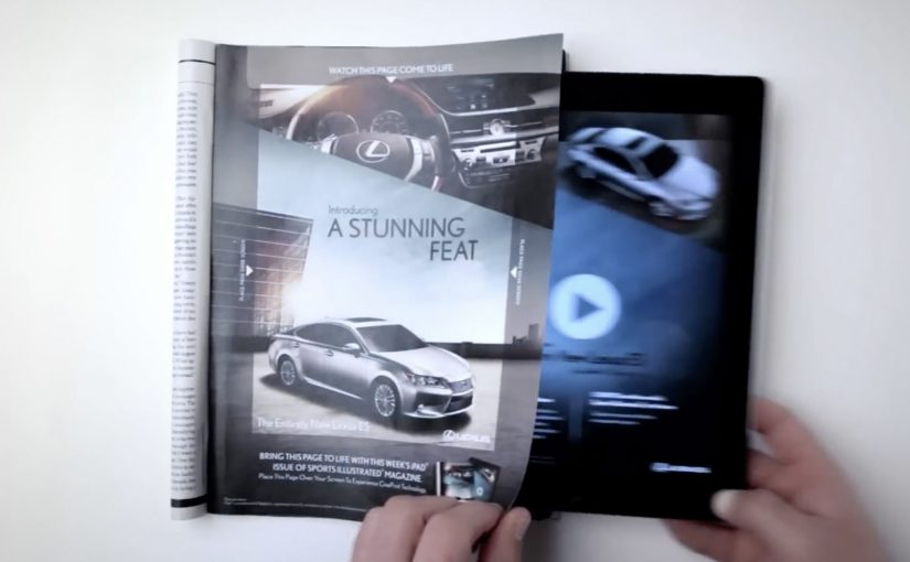
You are flipping through Sports Illustrated and a Lexus ES print ad starts behaving like a screen. The car appears to change color, its headlights flare on, the interior reveals itself, and the whole moment syncs to music.

On a number of occasions I have featured examples of brands creating interactive print ads. By “interactive print ad”, I mean a print page that becomes dynamic when paired with a tablet, with the page acting as the interface and the screen supplying light and motion. Here, the new Lexus 2013 ES is seen changing colors, turning on its headlights and exposing its interiors while music plays in this interactive print ad for the Oct. 15 Sports Illustrated issue.

Paper as a “display”

The trick is not that the magazine suddenly has electronics inside it. The page becomes a physical overlay, and the motion comes from a second screen underneath it. Place the ad over an iPad while the matching Lexus ES video plays, and the printed ink acts like a mask that makes the animation feel like it is happening on the paper itself.

An interactive print ad is a print execution that becomes dynamic when paired with a second screen, using the page as the interface and the tablet as the light and motion source.

In premium automotive marketing and magazine environments, this approach keeps the experience on the page while still delivering the “wow” of moving imagery.

Why this beats the usual print-to-digital handoff

Most interactive print ideas send you away from the page via QR codes, short links, or app installs. This one does the opposite. It pulls the digital layer into the print moment, so the reward arrives immediately and visually, without asking the viewer to leave the ad context.

Extractable takeaway: When a medium is already in someone’s hands, bring the digital layer into that moment instead of routing people elsewhere.

What Lexus is buying with this execution

This is not primarily a spec demo. It is a perception demo. The real question is whether the format makes “advanced technology elevated by style” feel true before the viewer even reads the copy. The ES positioning is “advanced technology elevated by style”, and the format reinforces that promise by making a traditionally static medium feel newly technical. The ad itself becomes proof of the claim.

Stealable moves for interactive print

  • Keep the interaction on the page. If you can deliver the payoff in the same frame, attention holds.
  • Use a familiar object as the interface. A magazine page is intuitive. No learning curve.
  • Design one signature reveal. Headlights, interior, color shift. Pick the one moment people will retell.
  • Make it work in low light. If the illusion depends on contrast, design the experience so it still reads in real life.

A few fast answers before you act

How does this “interactive print ad” actually work?

The print page is placed over an iPad while a synced video plays underneath. The page acts as a mask, so the animation appears to live on the paper.

Is the interactivity coming from electronics inside the magazine?

No. The motion, light, and sound come from the tablet. The magazine page provides the physical overlay and the illusion of print moving.

Why is this more engaging than a QR code in a print ad?

The payoff is immediate and stays on the page. QR flows add steps and send the viewer away, which increases drop-off.

What is the brand advantage of doing it this way?

The medium becomes the message. The execution demonstrates “technology plus design” through the experience itself, not just through copy.

What is the key execution risk?

If alignment, lighting, or setup friction is too high, the illusion breaks and the viewer quits before the reveal lands.

Kellogg’s Tweet Shop: Pay with a tweet

Kellogg’s Tweet Shop: Pay with a tweet

Last month in London, Kelloggs setup a pop up store where passers-by who walked in could try the low calorie snacks and then post a review on Twitter. “Special K girls” in red dresses who manned the store, checked each customer’s tweet before handing over a packet of Special K Cracker crisps.

How the Tweet Shop turns sampling into distribution

The mechanic is deliberately lightweight. Walk in, try the product, then publish a short reaction on Twitter before you leave. Staff verify the tweet on the spot, then you get a pack to take away.

A “pay with a tweet” activation is a pop-up retail format where the transaction is a public social post rather than money, converting product sampling into earned reach and searchable social proof.

In global FMCG marketing, this kind of social-to-sample loop, where a public post unlocks a take-away sample, works when the “payment” is fast, public, and directly tied to a tangible reward.

Why it lands: the tweet is both receipt and recommendation

Most sampling disappears into a bag with no trace. Here, the brand creates a visible record of trial. Each tweet acts like a receipt that confirms participation, and a micro-endorsement that other people can stumble on later.

Extractable takeaway: When you turn trial into a public trace and close the reward immediately, posting feels like participation, not payment.

The real question is whether the post feels like a fair exchange for the product, not a forced endorsement.

The red-dress staffing is not just costume. It makes the interaction unmistakably “Special K” in photos, which helps the moment travel beyond the store.

This is a smart trade only when you can keep the ask lightweight and the reward immediate.

What Kellogg’s is buying with “social currency”

  • Frictionless trial. People try a new product with zero financial risk.
  • Instant word of mouth. Reactions publish in real time, while the experience is still fresh.
  • Searchable proof. A hashtag-based trail can cluster impressions and sentiment in one place.
  • High street theatre. A pop-up adds “I was there” energy that a standard promo rarely achieves.

Design rules for your next “pay with a post” idea

  • Make the ask specific. Tell people exactly what to post and keep it short enough to do without thinking.
  • Verify fast. The handover moment should feel immediate, or it stops being fun.
  • Reward honesty. If you only want praise, people feel manipulated. If you invite real reactions, the format feels fair.
  • Design the store for photos. If the space is not camera-ready, you waste the free distribution you just created.

A few fast answers before you act

What is the “Tweet Shop” concept in simple terms?

It is a pop-up shop where people receive a product after posting a tweet about their experience, with staff checking the post before the handover.

Why would a brand accept tweets instead of money?

Because a public post can create awareness and credibility at scale, while the product cost stays predictable and controlled.

What makes this different from a normal free sample?

The sample creates a visible social trace. Each person who tries it leaves behind a shareable review that others can discover.

What is the biggest risk with “pay with a tweet” activations?

If the ask feels forced or takes too long, people opt out. If the experience is not worth sharing, the format collapses into awkward bribery.

How do you judge whether this worked?

Track trial volume, unique posts, sentiment, and whether conversation continues after the pop-up closes, not just during the event.

MTV Under The Thumb: second-screen TV for Europe

MTV Under The Thumb: second-screen TV for Europe

A social TV app that moves with you

MTV’s Under The Thumb is positioned as an interactive platform that changes how Europe’s digital teenagers watch and share entertainment across devices.

One product, three viewing modes

When you’re out and about, MTV shows can be streamed on demand on your phone.

When you’re at home, the app turns into a remote control by pairing with a browser on a PC, laptop, or connected TV, so you can drive playback on a bigger screen from your phone.

When you’re feeling social, it syncs viewing with friends so you can watch the same show and chat together in real time, even when you are in different places.

Why the mechanism is the message

The “platform” claim only holds if the app earns repeat use in different contexts. The real question is whether it becomes a repeatable daily habit, not just a clever demo. Under The Thumb does that by bundling three habits into one interface: portable streaming, at-home viewer control, and co-viewing chat. Here, “second screen” means the phone acts as the controller while video plays on a larger display, and “co-viewing” means friends watch the same content in sync while chatting. That combination turns a media brand into something closer to a routine than a channel. This is a stronger product bet than treating second-screen features as a one-off gimmick.

Extractable takeaway: Under The Thumb combines on-the-go streaming, at-home phone-as-remote viewer control, and real-time co-viewing chat in one app, so the same service stays useful across the day.

In European youth entertainment, the phone is where attention, conversation, and control converge, even when video shifts to a bigger screen.

Launch momentum, before the ads even land

The app is unveiled at the Mobile World Congress in Barcelona. In the launch window, it is described as spreading fast among tech and TV audiences, with download velocity reported as strong even before MTV’s supporting advertising campaign fully kicks in.

For more visit www.mtvunderthethumb.com.

Second-screen patterns worth copying

  • Design for context switching. Keep the same service useful when people move from mobile bursts to a bigger screen at home.
  • Make viewer control the default. Let the phone run playback on the larger display so attention stays on the show, not on setup.
  • Layer in social without breaking flow. Sync co-viewing and chat so conversation stays aligned with what is on screen.

A few fast answers before you act

What is MTV Under The Thumb?

It is a social TV app for MTV that combines on-demand mobile streaming, second-screen remote control for larger displays, and co-viewing with chat.

How does the dual-screen remote feature work?

The phone pairs with a browser on a PC, laptop, or connected TV. Your phone then controls playback on the bigger screen while the service continues to run through the app experience.

What does “co-viewing” mean in this context?

Co-viewing means friends watch the same content at the same time while chatting in-app, with viewing synchronized so the conversation matches the moment on screen.

Why is this a smart move for a youth entertainment brand?

It follows real behavior. People watch in short bursts on mobile, shift to bigger screens at home, and want to talk while they watch. The app is designed to keep MTV present across all three situations.

What should product teams copy from this model?

Design for context switching. Make the same service valuable in multiple moments of the day, and give users clear viewer control plus a lightweight social layer that does not interrupt playback.