
Zonacitas.com: Singles Finder App

“Love is out there. If we get organized, there’s plenty for all.” That is the simple provocation behind the Singles Finder App built for Zonacitas.com, a major Argentinian dating portal.

Buenos Aires is often described as a nightlife-heavy city with thousands of bars, discos, and pubs. That abundance creates a practical problem for singles. Where do you go tonight if your goal is to actually meet someone?

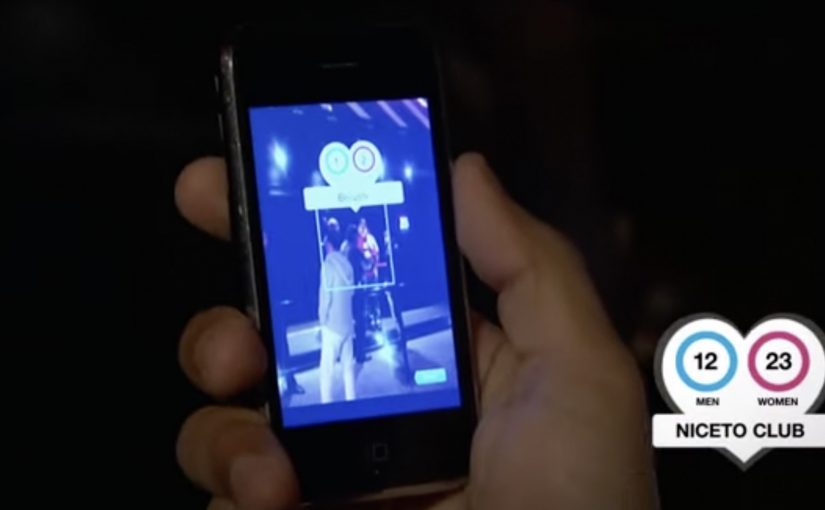
Singles Finder reframes the decision as information. It is described as a free iPhone app that shows the number of single prospects in each location, so users can choose where to go before they go.

Turning nightlife into a searchable index

The mechanism is straightforward. The app surfaces venue-level counts of single men and women, letting users compare options and pick the spot with the best odds for their intent, rather than relying on guesswork or luck.

In big-city nightlife ecosystems, the winning consumer experience is often the one that reduces uncertainty about where to invest your next two hours.

Why it lands

This works because it respects the real barrier. The hardest part is not downloading a dating app. It is deciding where to show up in the physical world. The real question is where you can increase the odds before you leave home.

Extractable takeaway: When your category depends on offline outcomes, shift the product value from “matching” to “decision support,” meaning a clear, comparable signal that helps people pick where to go before they leave. Help people choose where to go, not just who to message.

What Zonacitas.com is really buying

As positioning, it moves the brand from “dating portal” toward “nightlife utility.” As behavior, it encourages planning and repeat usage. As marketing, it turns a crowded, emotional category into a rational promise you can explain in one sentence. This is a stronger bet than competing on endless profiles and messaging alone.

Takeaways for location-driven products

  • Make the choice easier, not louder. Reduce the decision space with a simple comparison signal.
  • Shift value upstream. Solve the problem before the user commits time and money to a night out.
  • Design for “before I leave home.” The best moment is pre-decision, not mid-venue.
  • Keep the promise legible. A count is clearer than a vibe.

A few fast answers before you act

What is the Singles Finder App?

It is a Zonacitas.com mobile app concept that shows how many single prospects are in each nightlife location, helping users decide where to go before they head out.

Why is the “count per venue” mechanic persuasive?

It turns an emotional, uncertain choice into a comparable signal. Users can pick a venue based on odds rather than guesswork, which feels immediately useful.

What problem does this solve that typical dating portals do not?

It addresses the offline planning step. Instead of focusing only on profiles and messaging, it supports the real-world decision of where to show up tonight.

Who is this best for?

It is best for people facing many similar nightlife options and a time-bound goal. The value is reducing randomness in the “where do we go” decision.

How should the promise be explained in one line?

Explain it as “help me choose where to go tonight.” The clearer the decision it supports, the faster users understand why it is useful.

What should a brand measure for an activation like this?

App opens during peak nightlife hours, venue search and comparison behavior, downstream check-ins or venue visits where available, and retention driven by repeat planning on future nights.
Zoo Records: Hidden Live

Thousands of Hong Kong’s alternative music fans crave the raw energy, focus, passion, and participation of a live performance. Zoo Records faces a simple challenge. How do you bring that live experience directly to the fans.

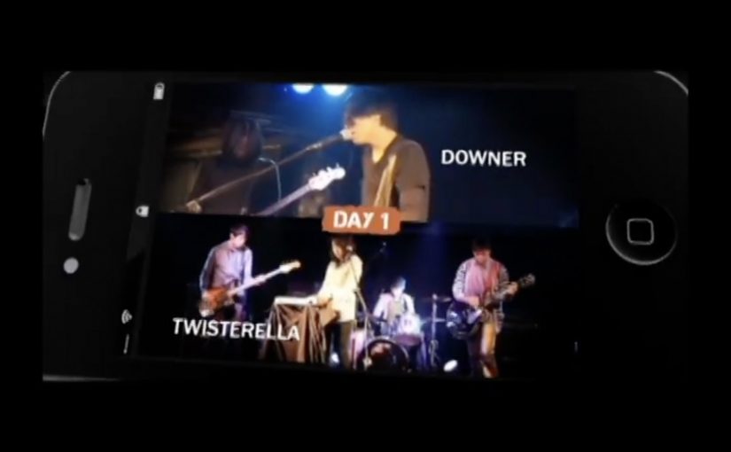
With Leo Burnett Hong Kong, Zoo Records creates “Hidden Live”, billed as a live mobile music festival. Eight indie bands perform across four nights, but the “venue” is not a stage. It is your phone. Tickets contain a hidden code. Scan it and your device becomes the gateway to the gig. Viewers can interact with bands in real time and even buy albums directly through mobile.

The mobile-ticket mechanism

The mechanic is a controlled unlock. In practice, that means entry depends on a visible code that changes the phone from passive screen to active venue. Free tickets are released shortly before each show, and the hidden code on the ticket is the key. Because the code makes entry feel earned and visible, the phone starts to behave like a venue rather than just another media player, which gives people a clearer reason to share and join. A friend’s device is not just showing a clip. It is hosting a live event.

In high-density cities where culture travels through phones first, turning personal devices into venues can scale live experiences beyond physical capacity.

Why it lands

This works because it keeps the emotional core of live music while removing the usual bottleneck. Venue size. Queue friction. Location limits. It also builds interactivity into the experience, so fans feel present rather than merely watching, and the album-buying layer makes the moment commercially useful without interrupting the performance.

Extractable takeaway: If your audience is starved of access, design an “unlock” that turns their existing device into the venue, then attach real-time interaction and a low-friction purchase path to the same moment.

What Zoo Records is really doing

The real question is how to make mobile access feel like attendance, not just distribution. The visible goal is to bring indie live energy to fans. The strategic goal is to convert participation into retail outcomes. Discovery that leads straight to purchase, while the scene still feels authentic. The campaign’s language is about “hidden” culture becoming reachable, and the mechanism makes that promise concrete.

The smart move here is making access itself part of the performance, not treating mobile as a secondary channel.

What to steal from Hidden Live

  • Make access the headline. Do not market “content”. Market the ability to enter something live.
  • Use a key people can show. Codes, tickets, and unlock moments create status and sharing.
  • Design interactivity on purpose. Real-time touchpoints turn viewing into participation.
  • Attach commerce to peak emotion. If buying is one tap while the set is live, it feels like support, not an upsell.

A few fast answers before you act

What is “Hidden Live”?

A Zoo Records campaign where live indie performances are unlocked via mobile by scanning a code on a ticket, turning phones into the concert venue.

Why use ticket codes for a mobile experience?

Codes create scarcity and a ritual. They also provide a simple, visible unlock moment that fans can share and explain quickly.

What makes it feel like a festival rather than a stream?

Scheduled live sets across multiple nights, real-time interaction with bands, and a shared participation loop around access and attendance.

How does the campaign connect to sales?

By letting fans buy the performing bands’ albums directly through mobile while the performance is live.

When is this pattern most useful?

When demand exceeds physical capacity, when fans already behave mobile-first, and when you can make access feel exclusive without making it complicated.

Peugeot 408: Print ad with a real airbag

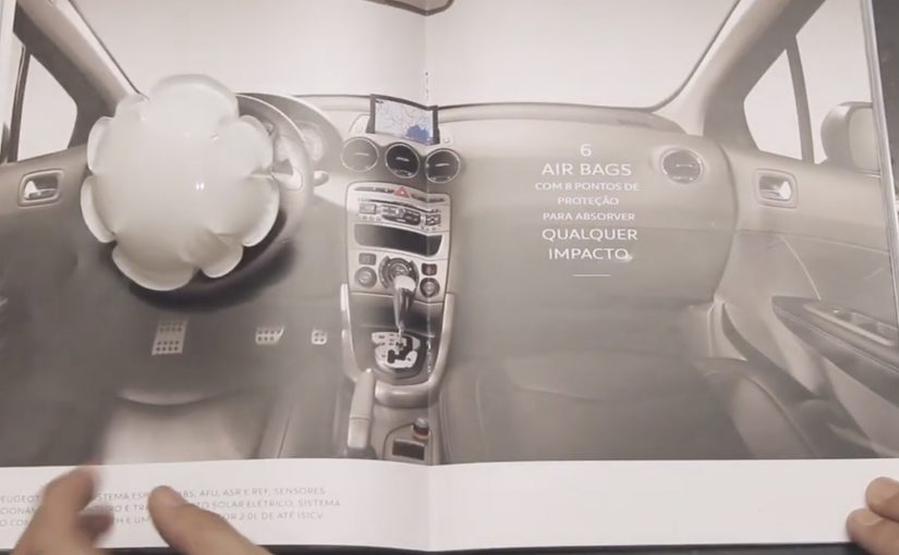
To advertise the safety benefits of the Peugeot 408, Brazilian agency Loducca put a mini airbag inside a print ad. Readers were invited to hit a marked spot on the page and see what happened. On impact, the tiny bag inflated, demonstrating in miniature what an airbag would do.

The ad appeared in Brazil’s business magazine Exame and was reportedly distributed with protective packaging so the airbag would not trigger by accident.

A magazine page you have to hit

The mechanism is brilliantly blunt. You do not watch a crash test. You perform a micro impact, a small, deliberate tap that simulates impact, with your hand, and the medium responds. That action turns a passive read into an experience, and it makes the “airbag” benefit impossible to ignore. Brands should treat safety claims as proof problems and design demonstrations the viewer can personally trigger.

In automotive safety marketing, the highest-performing proof is the kind you can physically trigger yourself.

The real question is whether your proof of safety can be triggered by the audience, not merely asserted by the brand.

Why print becomes more credible when it behaves like a product

Print normally communicates through trust in words and images. This ad adds a different kind of credibility, mechanical proof. Because it inflates on cue, the viewer’s brain files the message as something closer to engineering than persuasion. That matters because “safety” is a hard attribute to sell with rhetoric alone. People want reassurance, not adjectives.

Extractable takeaway: When a product claim is about protection, the strongest creative move is to make the audience feel a cause-and-effect demonstration, not just read about it.

The packaging is part of the idea

The special packaging is not just logistics. It signals intent. This is a controlled, designed interaction. It is also a reminder that experiential print has operational realities. Here, “experiential print” means print that behaves like a product interaction, with a designed trigger and response. If you build an ad that can go off in someone’s bag, you must engineer the distribution like you would engineer a product.

How to design triggerable safety proof

  • Make the claim triggerable. If the benefit is physical, design a physical proof moment.
  • Keep the interaction single-step. One obvious action, one immediate response, no instructions needed.
  • Let the medium do the explaining. The inflation is the headline. Copy becomes supporting detail.
  • Design the supply chain, not just the concept. Packaging, safety, and consistency are part of creative effectiveness.
  • Use spectacle sparingly. The wow moment is strongest when it directly maps to the product truth.

A few fast answers before you act

What is the Peugeot 408 “airbag in a print ad” idea?

A magazine ad with a real mini airbag insert that inflates when the reader hits a marked spot, mimicking an airbag deploying during impact.

Why does this work better than a normal safety print ad?

Because it converts a claim into a physical demonstration. The reader triggers the proof, which feels more credible than copy alone.

What makes interactive print feel premium instead of gimmicky?

When the interaction is directly tied to the product benefit and works reliably. The mechanism should be the message, not a disconnected trick.

What’s the biggest risk with mechanical inserts in magazines?

Execution risk. Misfires, non-fires, and distribution issues can overwhelm the idea. The production and packaging have to be engineered as carefully as the concept.

How can a brand replicate this approach on a smaller budget?

Design a tactile proof moment using simple materials and one clear action. The key is immediate cause-and-effect that maps cleanly to the claim.