Renault Clio: The Silent Song Contest

Renault Clio: The Silent Song Contest

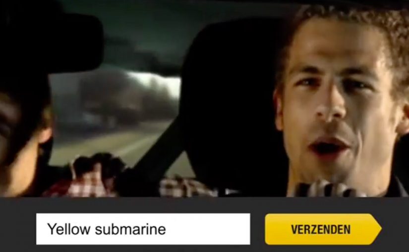
People are known to let loose and sing like crazy in their cars. For the launch of the new Renault Clio, Belgian agency Boondoggle turned that familiar behaviour into a Facebook game.

A series of online videos were posted on Facebook featuring different Clio drivers singing, with one twist. The sound was removed. To participate, players had to lip-read and guess the correct song as quickly as possible. The player with the most correct guesses at the end of the promotion won the Clio.

A game built from a behaviour people already recognise

The mechanic works because the setup is instantly relatable. Everyone has seen someone singing in a car, or has done it themselves. Muting the audio transforms that everyday scene into a puzzle, and Facebook becomes the scoreboard.

In automotive launch campaigns, lightweight interactive games can keep attention longer than a standard film because they invite repeated attempts rather than one passive view.

Why it lands

It hits a sweet spot between simple and sticky. The barrier to entry is low. You watch a clip and take a guess. Yet the experience rewards skill and speed, which makes it competitive. The silence is also a smart creative constraint. It forces focus, and it makes the guessing moment feel earned.

Extractable takeaway: If you want repeat engagement, take a common behaviour, remove one expected element, and turn the gap into a game people can get better at.

What Renault is really trying to get from Facebook here

The prize is a Clio, but the real objective is frequency. A contest format encourages people to come back for new clips, compare scores, and share with friends to test who can guess faster. That creates repeated brand exposure without needing repeated media spend.

The real question is whether your launch needs one memorable view or a repeatable reason for people to come back and compete.

What to copy from the Silent Song Contest

  • Start from a human truth. Real behaviour makes the concept self-explanatory.
  • Use a constraint as the hook. Muted audio is not a limitation. It is the game engine.
  • Design for replay. Multiple clips and a cumulative score drive repeat visits.
  • Keep the action atomic. Watch, guess, score. No multi-step friction.
  • Reward skill, not luck. Competitive mechanics feel fairer than random draws.

A few fast answers before you act

What is the Silent Song Contest in one sentence?

A Facebook game for the Renault Clio where players watch muted videos of drivers singing, lip-read to guess the song quickly, and compete on total correct answers to win the car.

Why does removing sound make the idea stronger?

Removing sound turns a normal singing clip into a puzzle. The missing audio forces attention and makes the guess feel earned and shareable.

What makes this work on Facebook specifically?

This works on Facebook because the clips are easy to watch, comment on, and share, and the contest format benefits from people returning as new videos appear.

What is the biggest execution risk?

If clips are too hard, people quit. If too easy, they get bored. Difficulty needs to be tuned so most people feel progress over time.

What should you measure beyond video views?

Repeat participation rate, average guesses per user, completion rate across the series, share rate, and whether the campaign shifts launch awareness and consideration.

Navarro Correas: Wine Art Project

Navarro Correas: Wine Art Project

Navarro Correas creates a 13 x 8.2 meter structure in Bogotá, Colombia. It consists of 1,000 acrylic cells and an automated robotic mechanism that fills each cell with six different shades of wine.

How the installation works

People activate the robotic mechanism by sending a text message with the acrylic cell number they want filled. Over time, 1,000 text messages build the full image, described as recreating Van Gogh’s self-portrait. A masterpiece made with Navarro Correas’ own wines.

An SMS-controlled installation is a public artwork where participants trigger physical changes by texting simple commands, turning the audience into the “interface”.

In large-scale city activations, participation gets dramatically stronger when the crowd can see their input change a shared object in real time.

The real question is not whether people will send one text, but whether each text feels like a visible personal contribution to something bigger.

Why it lands: it turns contribution into ownership

This works because it makes participation concrete. You are not “liking” or “voting”. You are choosing a specific cell and watching a physical outcome appear. The growing picture becomes a public scoreboard of collective effort.

Extractable takeaway: If you want mass participation, design a mechanic where each small action is visible, additive, and irrevocably part of the final outcome. People engage longer when they can point to “their piece” of the whole.

The stronger idea here is the visible build, not the SMS channel by itself.

The wine-as-paint choice also earns attention twice: first as a spectacle (liquid filling the grid), and then as a reveal (the final portrait). The mechanism creates suspense, and suspense keeps people texting.

What the brand is really doing here

The installation positions the wine as a maker’s material, not just a drink. It borrows the credibility of craft and art, then backs it with a participatory system that feels modern and social without needing a social network.

What to steal for your next interactive public piece

  • Make the input trivial: one action, one identifier, no learning curve.
  • Make the effect observable: people should immediately see change after they act.
  • Use “additive progress”: partial completion should still look interesting, so the build phase has its own payoff.
  • Design for attribution: let participants feel “I contributed”, even if the contribution is small.
  • Pick a reveal that rewards patience: the final image should be worth waiting for.

A few fast answers before you act

What is the Navarro Correas Wine Art Project?

It is a public installation made of 1,000 acrylic cells that are filled by a robotic mechanism with different shades of wine. People participate by texting a cell number to trigger a fill, gradually revealing a final portrait image.

Why use SMS for interactivity?

SMS is frictionless and universal. It requires no app download, works on basic phones, and is fast enough for impulse participation in a public space.

What makes this different from a normal billboard stunt?

The audience directly controls the build. Each message produces a visible change, so the piece becomes a collective construction rather than a one-way display.

What is the key behavioral driver?

Ownership through contribution. People engage more when they can claim a specific part of the outcome and see the shared progress accumulate.

What should you measure for a campaign like this?

Participation volume, unique participants, repeat participation, time-to-completion of the full artwork, dwell time around the installation, and any earned media or social mentions driven by the live build.

eBay: Give-A-Toy Store

eBay: Give-A-Toy Store

One of the things that all people do during the holidays, besides real shopping, is window shopping. Storefront window displays therefore have a stronger significance during the holiday season. Keeping that in mind, eBay has developed a way to make this experience move from passive to interactive and engaging.

Give-A-Toy Store is a 3D Christmas window installation with QR code tagged toys, built to evoke the passer-by’s giving side. Scanning the QR codes inside the eBay app allows passers-by to donate that toy on the spot, with the window lighting up and rewarding them for the donation.

The window installation is currently available at Toys for Tots in New York (at 35th and Broadway) and San Francisco (at 117 Post St).

Additionally customers can also customize their own toys on eBay’s Facebook page. For each toy created, eBay will donate $1 (up to $50,000).

From window shopping to “giving on the sidewalk”

This is a simple flip. The window is no longer just display media. It becomes a donation interface. You look, you scan, you give. Then you get instant feedback in the physical world.

How the mechanism does the heavy lifting

The mechanic is intentionally friction-light. Toys are visually presented as scannable choices. The QR tag is the call-to-action. The eBay app is the checkout. The window lighting up is the reward loop, confirming that something happened and making the act feel social even if you are alone.

In high-traffic retail corridors, a good interactive storefront turns waiting and wandering into measurable intent, without asking people to step inside.

Why it lands in a holiday crowd

It works because it respects the window-shopping mindset. People are already browsing. They are already comparing. This just adds a small, clear next step that feels aligned with the season. The visual “thank you” in the window also matters. It makes the donation feel immediate and real, not abstract and back-end.

Extractable takeaway: If you can make the environment visibly react to a mobile action, you create trust and momentum. The moment becomes self-explanatory, and bystanders learn the behavior just by watching.

What the brand is really building

The real question is whether a holiday storefront can turn passing attention into a mobile action that feels immediate enough to complete on the sidewalk.

This is not only about donations. It is a product demo for mobile commerce in disguise. It shows that scanning can be a legitimate buying action, that the phone can complete a transaction in seconds, and that the brand can connect physical retail ritual with digital conversion.

What this teaches about interactive storefronts

  • Make the first action obvious. If scanning is the behavior, the codes must look like the product tag.
  • Design a physical confirmation. Light, motion, or animation reduces doubt and makes the act feel rewarding.
  • Keep the choice set tight. Fewer, clearer options beat a cluttered scene when people are walking past.
  • Match the moment. Holiday giving is a natural fit for “instant donate” mechanics.
  • Make it watchable. When others can see the window respond, you get free teaching and free social proof.

A few fast answers before you act

What is the core idea behind Give-A-Toy Store?

Turn a holiday window into a scannable donation experience, so giving happens in the same moment as browsing.

Why does the window lighting up matter?

It provides immediate confirmation and reward. That reduces hesitation, makes the interaction feel real, and invites others nearby to notice and copy the behavior.

What makes this different from a normal QR campaign poster?

The display is the product experience. The scene feels like a store window first, and the QR code is integrated as a natural “price tag” action rather than a separate ad instruction.

What is the biggest execution risk?

Friction. If scanning is unreliable, the app flow is slow, or the codes are hard to spot at walking distance, people will not complete the action.

How would you adapt this if you do not have an app?

Keep the structure. Use a fast mobile entry point, and pair it with a visible physical confirmation so people know their action worked.