
Škoda & Citroën: Fixing Mobility Friction

The journey is now part of the product

This is not the first time a car brand has moved into adjacent safety or wellbeing territory.

What makes these two examples stronger is that they do not feel random. Škoda and Citroën are both dealing with small but consequential failures around the trip itself, not trying to invent a new category for the sake of it. That is a more credible stretch because the problem sits close to how the brand is already experienced.

What Škoda and Citroën are really addressing is mobility friction. Mobility friction is the small but consequential failure around a journey that changes safety, comfort, or control without changing the vehicle itself.

One brand is tackling external awareness around cyclists and pedestrians. The other is tackling in-car stress for pets. Different use cases, same underlying move. Both are extending the brand promise into the part of the journey where the consumer actually feels the problem.

Škoda and the new urban safety gap

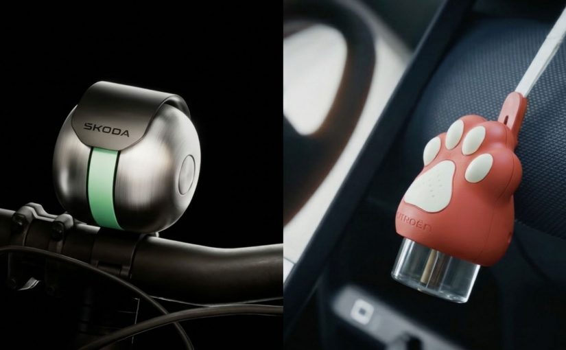
Škoda starts with a simple failure. Standard bike bells are easier to miss when pedestrians are wearing active noise-cancelling headphones, or ANC, so the company worked with the University of Salford to identify a narrow 750 to 780 Hz band that cuts through ANC more effectively and built DuoBell around that finding. Škoda says the product also uses a second resonator and an irregular strike pattern to make the alert harder for ANC systems to suppress.

That line of thinking fits a brand whose history began with bicycles and that still maintains a visible connection to cycling today.

This lands because the fix is practical, easy to explain, and directly tied to a real safety failure on the street.

Škoda also has the stronger proof layer here. The idea is backed by publicly available Salford research, and Škoda reports that testing showed pedestrians wearing ANC headphones gained up to 22 metres of additional reaction distance when DuoBell was activated.

This is the right kind of adjacent product move for an automotive brand.

Citroën and comfort beyond human passengers

Citroën starts from a different failure. For many pets, the car is not a neutral space. It is a stressful one. The Calm Diffuser is designed to release calming pheromones during the journey so the ride feels less anxious for dogs and cats. Citroën frames the device as an extension of its comfort promise to everyone on board, including pets.

That is why the idea works. Citroën is not leaving its lane here. It is widening a promise it already owns.

The brand logic matters more than the object itself. Citroën has long tried to make comfort a differentiator, and Calm Diffuser extends that positioning from human occupants to pet occupants. That is a small move on paper, but it reflects a larger shift in how consumers define who the journey is for.

What enterprise teams should notice

The real question is whether the brand is removing a journey failure consumers already feel, in a way that fits a promise it already owns.

That is not just a creative decision. It is an operating model decision. Teams need to know where friction shows up, which audience feels it most, which brand promise gives permission to act, and whether the answer belongs in product, service, content, partnership, or commerce. That is where consumer experience platforms and MarTech matter, because they help surface repeated friction, validate demand, segment relevance, and scale the explanation layer across touchpoints instead of treating each move as a one-off stunt.

The commercial upside is bigger than the product itself. The stronger capability is learning how to identify adjacent consumer problems early, prove that they matter, and translate brand promise into something operational and useful.

What mobility brands should take from this

The lesson is not that every automotive brand now needs a side product. The lesson is that adjacent innovation works when it removes a nearby failure in the journey, reinforces an existing promise, and can be supported across owned touchpoints, retail, CRM, and service.

The takeaway is clear. The brands that win these moves will not be the ones that look most inventive. They will be the ones that make the journey measurably safer, calmer, or easier in ways the business can actually support.


A few fast answers before you act

What is Škoda DuoBell?

Škoda DuoBell is a bicycle bell designed to be more detectable to pedestrians wearing ANC headphones. Škoda developed it with the University of Salford to respond to rising cyclist and pedestrian risk in dense urban settings.

What makes DuoBell different from a normal bike bell?

Škoda says DuoBell was tuned around a 750 to 780 Hz band that can cut through ANC more effectively than a conventional bell, with additional sound design choices to improve detectability.

What is Citroën Calm Diffuser?

Calm Diffuser is Citroën’s in-car device designed to release calming pheromones for pets during travel. Citroën presents it as a way to make journeys more comfortable for all passengers, including pets.

Why does Calm Diffuser fit Citroën so well?

It fits because Citroën has long treated comfort as a core brand promise. Calm Diffuser extends that promise from human occupants to pet occupants without feeling forced.

Why do these two launches matter beyond novelty?

They matter because they show a more disciplined way to extend a brand. Instead of chasing spectacle, both ideas target a specific friction point around the journey and connect the solution back to a promise the brand already owns.
6 Best Campaigns: Clarity Wins in March

When brand logic becomes visible

Across Burger King, Aerie, Yahoo Mail, Hotels.com, Huggies, and Cheetos, the work does not resolve into one dominant style. What it does share is something more useful. Each campaign makes the underlying brand logic easier to grasp without needing the case-study explanation afterward.

Brand logic is the commercial rule that links what a brand says, what it does, and why the audience should care. The strongest work this month makes that rule visible early, which matters because a legible mechanism improves comprehension, speeds recall, and gives the campaign a better chance of carrying business intent instead of just generating surface attention.

For enterprise brand teams, that is not a creative nuance but an operating advantage, because clearer strategy survives translation across agencies, channels, retail partners, and internal stakeholders.

It also travels better across consumer experience platforms and MarTech systems, where the strategy has to remain legible through content, CRM, personalization, commerce, and media execution.

The strongest campaigns now win by making strategy legible before they try to make execution louder.

The real question is whether people can decode the commercial intent fast enough for the work to compound in culture instead of stalling as cleverness.

Six campaigns that made strategy easier to see

Burger King: There’s a New King, and It’s You

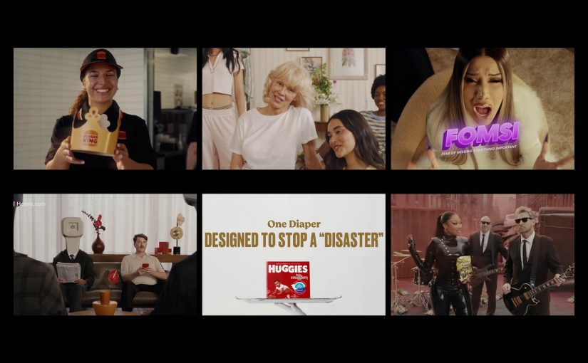
Burger King turns turnaround work into the campaign itself. Burger King U.S. and Canada president Tom Curtis helps anchor the message, and the brand shifts the crown from the mascot to the guest, ties the story to years of restaurant modernization, operational improvement, and feedback loops, and makes the listening agenda visible instead of hiding it behind generic brand language. That is why the work lands. It turns brand repair into a public narrative people can understand immediately.

Aerie: 100% Aerie Real

Aerie does not use AI as a trend hook. It uses Pamela Anderson to reinforce a policy-backed position that the brand will not use AI-generated bodies or people in marketing, extending its broader authenticity stance. The important move here is operational, not cosmetic. A cultural tension becomes a codified boundary, and that makes the brand stance more credible than a one-off message about authenticity.

Yahoo Mail: Planner

Yahoo Mail gives its AI feature a human entry point. In Yahoo’s launch framing, Planner is an AI-powered personal productivity hub, and rapper Cardi B introduces “FOMSI,” or fear of missing something important, as the tension the feature resolves. That is the smart translation layer. The product is not positioned as abstract intelligence. It is positioned as relief from inbox anxiety.

Hotels.com: It’s All in the Name

Hotels.com strips the proposition down to literal truth. In its new brand platform, the company argues that plenty of things in life are misleading, but its own name is not, and pairs that with a refreshed visual identity and a promise around rewards, simplicity, and flexibility. The discipline here is the point. The brand does not add complexity to seem more interesting. It removes abstraction so the value proposition is easier to decode and remember.

Huggies: Expensive Sh*t

Huggies takes a functional claim and stages it as risky entertainment. The one-hour event put 18 babies in Huggies Little Snugglers on high-value luxury items, streamed the result across TikTok Live, Instagram Live, and YouTube Live, and turned blowout protection into proof people would actually watch. That is what elevates it. The demonstration is not just believable. It is designed for distribution.

Cheetos: Pickle’s Back

Cheetos relaunches Flamin’ Hot Dill Pickle by packaging the return as entertainment first and product news second. The official music video pairs Megan Thee Stallion with Nickelback and turns a flavor comeback into a cultural moment rather than a standard limited-time announcement. That is the lesson. Launch mechanics matter more when the format feels native to how people already consume and share attention.

What brand teams should take from March’s best work

The common move across all six examples is not louder storytelling. It is clearer exposure of the mechanism.

  • Burger King makes operational change visible.
  • Aerie makes the authenticity rule visible.
  • Yahoo makes the AI utility visible.
  • Hotels.com makes the product proposition visible.
  • Huggies makes the product performance visible.
  • Cheetos makes the launch format visible.

The best campaigns of March 2026 did not win by saying more. They won by making the strategy easier to see, easier to feel, and easier to repeat.


A few fast answers before you act

What defined the strongest campaigns in March 2026?

The strongest work made the commercial idea immediately legible. Instead of asking the audience to infer the strategy, the campaigns surfaced it through proof, policy, simplicity, or entertainment.

How are brands using AI differently in campaigns?

The better use cases split in two directions. Some brands, like Yahoo Mail, frame AI as practical relief for a real problem. Others, like Aerie, turn their refusal to use AI in customer-facing imagery into a differentiating brand stance.

Why is clarity becoming a competitive advantage in advertising?

Clarity lowers decoding effort. When people understand the mechanism quickly, recall improves, the message travels faster, and the campaign is more likely to carry commercial intent instead of being remembered only for style.

What role does product demonstration play now?

Product demonstration still works, but it works harder when it is engineered for attention, social circulation, and emotional payoff, not when it stays trapped in a conventional feature explanation. Huggies is the clearest example this month.

What is changing in how brands launch products?

More launches are being wrapped in formats people actively choose to watch, including music video logic, creator energy, or entertainment structures. Cheetos shows how a product return can behave more like culture than an announcement.

AI Image Tools: From Prompt to Publish

Most coverage of AI image tools still reads like a model beauty contest. One tool wins on realism, another on style, another on speed, and the audience gets the usual low-value conclusion: try them all and see what sticks.

That is not how serious content teams operate. Julia McCoy’s walkthrough is useful because it puts seven popular image tools in one frame, but the more commercially useful lens is different. The job is not to admire outputs. It is to identify which image model helps a team move from prompt to publish with the least waste.

Identifying image models that can actually ship assets

Most teams do not need the most impressive image model in the abstract. They need the right model for the job in front of them, which means matching the tool to the asset type, approval risk, speed requirement, and downstream workflow.

The missing discipline is model-fit. Model-fit is the discipline of choosing an image generator based on what the asset needs to do in production, not just how good the first output looks on screen.

In enterprise content operations, the winning model is usually the one that survives review, resize, and reuse without spawning manual cleanup. At enterprise scale, the issue is not just image quality. It is whether the asset can move cleanly into DAM, CMS, localization, and approval workflows without creating governance exceptions.

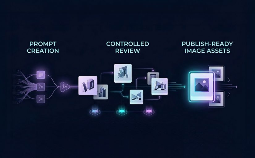
The right image model is the one that reduces production friction, preserves brand control, and helps teams ship usable assets. The real question is not which model looks best in a demo, but which one moves a team from prompt to publish with the least waste.

What each image tool is really good at

DALL-E 3 in ChatGPT: Best when teams need fast branded content

DALL-E 3 is best understood as a conversational image generator inside a broader workflow. Its advantage is not just image creation. It is the ability to iterate in natural language, refine outputs quickly, and adapt formats without breaking flow. That makes it especially useful for social graphics, rough branded concepts, and content support assets where speed matters as much as polish.

This is where operator value shows up. If a team can move from idea to usable asset in one conversational environment, production friction drops. The catch is that text rendering can still be unreliable, which means it should support content production, not replace design QA.

Midjourney Alpha: Best when the brief needs visual drama

Midjourney Alpha is a high-detail image model built for stronger visual impact. Its web interface makes the workflow cleaner than the old Discord-first experience, but the reason teams use it is simpler. It produces more dramatic, presentation-friendly imagery when the brief needs mood, depth, or aesthetic intensity.

That makes it a fit for keynote headers, thought-leadership visuals, blog hero art, and concept-led storytelling. The trade-off is practical. High aesthetic quality does not always translate into reliable likeness, identity accuracy, or brand-safe precision.

Meta AI: Best when speed of iteration matters more than finish

Meta AI is most useful as a fast iteration tool. Its strength is responsiveness. It lets users shape and reshape images quickly while prompting, which makes it valuable for early concept exploration and low-friction experimentation.

For content teams, that matters when the task is not final asset creation but directional testing. It is less useful when the workflow depends on reference-image fidelity or more controlled production behavior.

Microsoft Designer: Best for learning prompts and creating simple content fast

Microsoft Designer is less about highest-end image quality and more about accessibility. It helps users understand what prompt ingredients influence outputs, which makes it useful for beginners or teams building prompt literacy.

That makes it a practical choice for low-risk social content, internal creative exploration, or teams still learning how to brief image models effectively. The limitation is consistency. What helps teams learn does not always help them ship premium assets.

Canva Magic Media: Best when generation needs to flow straight into design

Canva Magic Media matters because it sits inside a design workflow marketers already use. That is its real advantage. The value is not only the image. It is the reduced distance between generation, editing, background removal, layout, and final export.

For marketers and in-house content teams, that can matter more than absolute model quality. If the asset is headed straight into campaign design or social production, workflow integration often beats raw creative range.

Adobe Firefly: Best when style control and enterprise workflow matter

Adobe Firefly is the most relevant tool here for teams that care about stylistic control and closer alignment with professional creative workflows. Its strength is not just generation. It is controlled generation inside a broader production ecosystem.

That makes it more commercially useful for teams already operating in Adobe-heavy environments. The value is greater when governance, consistency, and downstream editing matter more than novelty.

My Mood AI: Best when the brief depends on face fidelity

My Mood AI is not really competing for the same role as the broader image generators. It is a likeness-focused workflow built for personal headshots, creator-style visuals, and portrait-led use cases where the face is the asset.

That distinction matters. When the task is human likeness, general-purpose image models still break too often. A specialist approach makes more sense because the commercial requirement is not “make an image.” It is “make this person usable on-brand.”

Why workflow fit matters more than model hype

A lot of teams still talk about AI image tools as if the whole story is creative novelty. That undersells the real business value. The gain is operational.

When the brief is routed to the right model, review cycles shorten, manual cleanup falls, and more assets make it through approval into live use.

That is why workflow fit matters more than model hype. DALL-E 3 compresses ideation inside chat. Canva and Microsoft reduce handoff friction for everyday content creation. Adobe Firefly is stronger when generation needs to stay connected to a broader creative stack. Midjourney is more useful when visual impact is the point of the asset, not just a nice bonus.

The business mistake is trying to standardize on one “best” image model. The better move is to standardize on routing logic. Which briefs need speed. Which need design-system continuity. Which need strong hero visuals. Which need face fidelity. Which need heavy post-generation editing. That is the difference between tool sampling and commercially useful transformation.

A practical image stack teams can actually use

If I were setting this up for a content organization, I would not start by asking which single image tool to buy into. I would map asset demand first, then assign model lanes around asset class, approval risk, editing depth, and likelihood of reuse. Used properly, this is a governed routing layer, not an experimentation sandbox. Teams need approved tools by asset type, defined QA gates, and clear escalation when briefs require design, legal, or brand review.

Start with DALL-E 3, Meta AI, Microsoft Designer, and Canva for fast ideation and everyday content support. Move to Midjourney Alpha and Adobe Firefly when visual finish or downstream creative control matters more. Keep My Mood AI for portrait-led work where recognizability is the requirement rather than a nice-to-have. That routing model is more useful than forcing every brief through one “best” tool, because it cuts waste where content teams usually lose time: revision, cleanup, and rework.


A few fast answers before you act

Which AI image tool is best for fast branded content?

DALL-E 3 is the cleanest fit when the team wants conversational prompting and quick variations inside ChatGPT, while Canva and Microsoft Designer are stronger when the asset needs to move immediately into design or presentation workflows.

Which tool is best for presentation-grade visual impact?

Midjourney Alpha is the strongest fit when the asset needs mood, detail, and visual drama to carry the message. It is the best choice here when aesthetic intensity is part of the business value.

Which image tool fits marketers already working in design platforms?

Canva is the easiest fit for fast marketing production, while Adobe Firefly becomes more relevant when the team already works inside a professional Adobe-centered creative environment.

Can one image model cover every content use case?

No. The smarter operating model is to assign different tools to different jobs instead of pretending one model should own social content, hero art, headshots, and design-integrated production all at once.

What usually breaks before publish?

The failure point is usually not whether the tool can generate an image. It is whether the image survives review, edit depth, channel adaptation, and stakeholder scrutiny without creating more cleanup than value.

How should teams evaluate AI image tools commercially?

Evaluate them by prompt-to-publish fit. Look at production friction, brand control, workflow integration, face fidelity where needed, and how much manual rework the tool creates before an asset can ship.