Giraffas: The Goal Screen

Giraffas: The Goal Screen

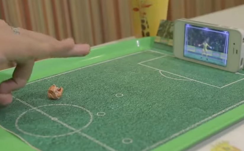
To capitalize on the lead up to the 2014 FIFA World Cup, Brazilian fast food chain Giraffas creates a mobile game that turns their tray papers into a virtual soccer field. To play, consumers rip the side of the paper tray, make a paper ball, and flick it into their mobile screens.

7 million tray papers are printed, and the game is made possible by using the smartphone camera to recognize the ball distance, the accelerometer to identify the trajectory of the kick, and the microphone to recognize the area of impact.

A game that bridges paper and screen

The mechanism is a simple physical ritual, meaning a repeatable action with objects already on the tray, that unlocks a digital experience. The tray liner provides the “pitch”. The paper ball provides the input. The phone turns sensors into a referee, translating distance, direction, and contact into gameplay.

That matters because the tray liner and paper ball remove setup friction, so the leap from noticing the idea to trying it stays almost instant.

In quick-service restaurants, the strongest interactive ideas add value during the waiting and eating moment, without requiring staff training or extra hardware at the counter.

The real question is how little effort a brand can ask of people before play feels easier than ignoring it.

Why it lands

The strongest part of the idea is not the World Cup tie-in. It is the packaging mechanic that makes play feel native to the meal. This works because it turns a disposable surface into a reason to play, and it makes participation feel immediate. It is not “download an app for later”. It is “play right now, with what you already have, while you are here”. The World Cup context supplies motivation, but the in-store simplicity supplies repeatability.

Extractable takeaway: When you want in-the-moment engagement, design a physical trigger that is already in the customer’s hands, then use the phone only as the translator. The fewer steps between curiosity and action, the more people actually try it.

What to borrow from this tray-to-screen mechanic

  • Use packaging as the interface. If your brand owns a surface (tray liners, cups, wrappers), it can become the entry point.
  • Make the first attempt effortless. Rip, roll, flick. Three verbs. No instructions wall required.
  • Exploit phone sensors, not novelty tech. Camera, accelerometer, and microphone are scalable because they are already everywhere.
  • Anchor to a cultural moment, but keep it evergreen. The event creates urgency, the mechanic creates habit.

A few fast answers before you act

What is “The Goal Screen” for Giraffas?

It is an in-store mobile game that turns Giraffas tray papers into a virtual soccer field, using a paper ball that customers flick into their phone screen.

Why does the paper tray matter to the experience?

The tray paper acts as the physical “pitch” and the trigger for play, making the game feel native to the restaurant moment.

How does the phone detect the kick?

The setup is described as using the camera for distance, the accelerometer for trajectory, and the microphone for impact area.

What is the marketing objective behind this kind of mechanic?

To make the in-store visit more entertaining and memorable, and to create a reason to interact with the brand during the meal.

What is the transferable lesson for other brands?

Turn a ubiquitous brand touchpoint into a play surface, then use the phone as a lightweight sensor hub that makes the interaction feel “magical” without added hardware.

iBeacons: Context as the Interface

iBeacons: Context as the Interface

From proximity to context

iBeacons introduce a simple but powerful idea. The physical world can trigger digital behavior.

A smartphone does not need to be opened. A user does not need to search. The environment itself becomes the signal.

At their core, iBeacons enable proximity-based awareness. When a device enters a defined physical range, a predefined digital action can occur. That action may be a notification, a content change, or a service trigger.

The evolution is not about distance. It is about context.

What iBeacons enable

iBeacons are small Bluetooth Low Energy transmitters. They broadcast an identifier. Nearby devices interpret that signal and respond based on predefined rules.

This creates a new interaction model. Digital systems respond to where someone is, not just what they click. Because that location signal arrives before a click, the system can reduce friction by pre-loading the most relevant content or service for that moment.

Retail stores, public spaces, machines, and even wearable objects become programmable environments. The physical location is no longer passive. It actively participates in the experience.

Why proximity alone is not the breakthrough

Early use cases focus heavily on messaging. Push notifications triggered by presence. Alerts sent when someone enters a zone.

That framing misses the point.

The real value emerges when proximity is combined with intent, permission, and relevance. Without those elements, proximity quickly becomes noise.

iBeacons are not a messaging channel. They are an input layer. Here, “input layer” means a reliable real-world signal that can change digital content or services without requiring a click.

The real question is whether proximity removes a step for the user, or just adds another interruption.

In global retail and consumer-brand environments, iBeacons work best when they connect physical moments to consented digital help at the point of need.

From messaging to contextual experience design

As iBeacon use matures, the focus shifts away from alerts and toward experience orchestration.

Instead of asking “What message do we send here?”, the better question becomes “What should adapt automatically in this moment?”

This is where real-world examples start to matter.

Example 1. When a vending machine becomes a brand touchpoint

The SnackBall Machine demonstrates how iBeacons can turn a physical object into an interactive experience.

Developed for the pet food brand GranataPet in collaboration with agency MRM / McCann Germany, the machine uses iBeacon technology to connect the physical snack dispenser with a digital layer.

The interaction is not about pushing ads. It is about extending the brand experience beyond packaging and into a moment of engagement. The machine becomes a contextual interface, meaning the object itself selects the right digital behavior when someone is present. Presence triggers relevance.

This is iBeacon thinking applied correctly. Not interruption, but augmentation.

Example 2. When wearables make context portable

Tzukuri iBeacon Glasses enable hands-free, glance-based, context-aware information.

The Tzukuri iBeacon Glasses, created by Australian company Tzukuri, take the concept one step further.

Instead of fixing context to a location, the context moves with the person.

The glasses interact with nearby beacons and surfaces, enabling hands-free, glance-based, context-aware information. The interface does not demand attention. It integrates into the wearer’s field of view.

This example highlights a critical shift. iBeacons are not limited to phones. They are part of a broader ambient computing layer. Here, “ambient computing layer” means computing embedded in objects and surroundings that responds without demanding a screen-first interaction.

Modern product and experience design is slowly replacing “screen” with “context” as the interface.

Why these examples matter

Both examples share a common pattern.

Extractable takeaway: Treat proximity as a signal to adapt the service in the moment. If it does not reduce friction or increase clarity, it is not context. It is noise.

The user is not asked to do more. The system adapts instead.

The technology fades into the background. The experience becomes situational, timely, and relevant.

That is the real evolution of iBeacons. Not scale, but subtlety.

The real evolution. Invisible interaction

The most important step in the evolution of iBeacons is not adoption. It is disappearance.

The more successful the system becomes, the less visible it feels. No explicit action. No conscious trigger. Just relevance at the right moment.

This aligns with a broader shift in digital design. Interfaces recede. Context takes over. Technology becomes ambient rather than demanding.

Why iBeacons are an early signal, not the end state

iBeacons are not the final form of contextual computing. They are an early, pragmatic implementation.

They prove that location can be a reliable input. They expose the limits of interruption-based design. They push organizations to think in terms of environments rather than channels.

What evolves next builds on the same principle. Context first. Interface second.

Practical rules for context-first experiences

  • Start with the moment, not the message. Define what should adapt automatically when someone is present, before deciding what to notify.
  • Proximity is an input, not a channel. Use beacon signals to change content, offers, or service steps. Do not treat them as another push pipeline.
  • Permission and intent are part of the design. Make opt-in explicit and only trigger actions that match why the user is there.
  • Optimize for invisibility. The best beacon experience feels like the environment helping, not marketing interrupting.
  • Measure behavior change. Track whether friction drops and tasks complete faster, not whether notifications were opened.

A few fast answers before you act

What are iBeacons in simple terms?

iBeacons are small Bluetooth Low Energy transmitters that let phones detect proximity to a location or object and trigger a specific experience based on that context.

Do iBeacons automatically track people?

No. The experience usually depends on app presence and permissions. Good implementations make opt-in clear and use proximity as a trigger, not as silent surveillance.

What is the core mechanism marketers should understand?

Proximity becomes an input. When someone is near a shelf, a door, or a counter, the system can change what content or actions are offered, because the context is known.

What makes a beacon experience actually work?

Relevance and timing. The action has to match the moment and reduce friction. If it feels like random messaging, it fails.

What is the main takeaway?

Design the experience around the place, not the screen. Use context to simplify choices and help people complete a task, then measure behavior change, not opens.

Amazon Dash: When Commerce Becomes a Button

Amazon Dash: When Commerce Becomes a Button

A tiny button that quietly changes how buying works

When Amazon introduces Dash, it does not look like a revolution. No screens. No interfaces. No checkout flow.

Just a small physical button. One press. Reorder complete.

At first glance, Amazon Dash can feel like a gimmick. But in practice, it signals something more fundamental. A deliberate attempt to remove shopping itself from the act of buying.

What Amazon Dash does in the home

Amazon Dash, often described as the “Dash Button”, is a physical, Wi-Fi-connected button linked to a specific household product. Detergent. Coffee. Pet food. Batteries.

You place it where the need happens. On the washing machine. Inside a cupboard. Near the dog food bowl.

When you run out, you press the button. Amazon handles the rest.

No browsing. No comparison. No cart. No second thought.

Intent compression is the point, not the plastic

The button is not the story.

The real shift is intent compression. By intent compression, I mean collapsing need recognition, product choice, payment, and fulfillment into one trigger that requires almost no thought.

The real question is what happens to brand choice when reordering stops being a decision and becomes a reflex.

Dash is not a gimmick. It is a blueprint for default-setting commerce.

In replenishment categories like household essentials and other repeat-purchase goods, the winner is the brand or platform that becomes the default reorder, not the one that wins the next search.

Why “no interface” feels so good

Dash works because it removes cognitive load at the exact moment people are most willing to simplify. When a household runs out, the goal is not discovery. It is restoration. A one-press action fits the habit loop. Trigger, action, relief.

Extractable takeaway: If you can remove steps at the moment of need, you do not just improve conversion. You reshape behavior, because people repeat what feels effortless and reliable.

That same mechanism explains why Dash can feel uncomfortable. Accidental orders. Reduced price transparency. Loss of conscious choice. The discomfort is the point, because it reveals the boundary of how much control people will trade for frictionless convenience.

What Amazon is really buying with Dash

Dash compresses multiple steps. Need recognition. Product selection. Payment. Fulfillment. Into a single physical action.

Seen from that angle, Dash is less about buttons and more about locking demand upstream, before competitors even enter the consideration set.

Dash is also a learning system. It teaches Amazon about behavior, habit formation, replenishment cadence, and reorder economics, because the “moment of truth” becomes measurable and repeatable.

A signal to brands, not just consumers

For brands, Amazon Dash carries a subtle but powerful message.

If you win the button, you win the household. If you lose it, you disappear from the moment of need.

Traditional branding competes on shelves and screens. Dash shifts the battlefield into kitchens and cupboards. Physical presence becomes digital dominance.

Distribution is no longer only about visibility. It is about defaultness. Defaultness here means being the preselected choice a household reorders without revisiting the decision.

What to steal if you are not Amazon

The logic behind Dash is bigger than the hardware. Commerce keeps moving toward fewer decisions, fewer interfaces, more automation, and stronger platform pull.

  • Design for replenishment moments. Identify “run out” triggers and reduce the steps required to restore.
  • Compete for the default. Build experiences that make the second purchase easier than the first.
  • Make the trade-off explicit. Add lightweight safeguards (clear confirmations, simple cancellations, price-change visibility) so convenience does not feel like a trap.
  • Instrument the habit loop. Measure time-to-reorder, reorder frequency, and churn as first-class signals, not just conversion.
  • Protect trust. If the experience becomes invisible, reliability becomes the brand.

Sometimes, the future of shopping is just a button on a wall. The bigger story is what happens when buying becomes infrastructure.


A few fast answers before you act

Is Amazon Dash “just a button”?

No. It is a button plus an operating model that turns reordering into a near-automatic behavior.

What does “intent compression” mean in this context?

It means collapsing multiple steps. Recognize need, choose product, pay, and fulfill. Into one trigger with minimal deliberation.

Why does Dash matter even before voice becomes mainstream?

It proves the “no interface” ambition using a simple physical shortcut. It removes friction without needing new user behavior like talking to a device.

What is the strategic advantage for Amazon?

Dash moves competition upstream by capturing repeat demand before a shopper compares alternatives. That makes loyalty structural, not persuasive.

What is the core risk for brands?

If replenishment becomes default-driven, brands that are not the default become invisible at the moment of need, even if awareness is high.

What is the consumer downside, and what mitigates it?

The downside is reduced price awareness and accidental orders. Mitigations are clear confirmations, transparent price-change cues, and easy reversibility.