Augmented Reality: Hyperlinking the real world

Augmented Reality: Hyperlinking the real world

A French company called Capturio turns a t-shirt into a business card. You point your phone at what someone is wearing, and the “link” is the fabric itself. No QR code required.

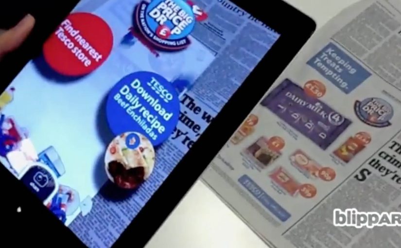
Right after that, Blippar in the UK takes the same idea to printed images. A newspaper page, poster, or pack becomes the trigger. The result is a 3D augmented reality overlay that appears on-screen the moment the image is recognised. Again, no QR code.

From visible codes to recognition triggers

QR codes get put to good use in countless innovative projects. But the drift is towards technology that produces similar results without visible codes. QR codes are not “dead”. Recognition-based triggers win whenever you can control the surface and want the interaction to feel seamless.

How “invisible links” work in practice

Capturio’s concept is simple. The physical object becomes the identifier. A t-shirt behaves like a clickable surface in the real world.

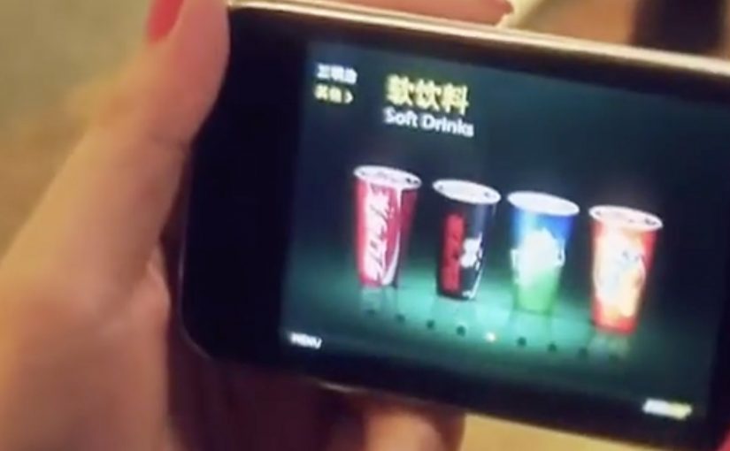
Blippar applies the same pattern to print. Image recognition here means matching what the camera sees to a known reference image so the system can anchor content to that surface.

The interaction is straightforward:

  1. Download a custom app, in this case the Blippar app.
  2. Scan a Blippar-enabled printed image, identifiable by a small Blippar logo, using an iPhone, iPad, or Android device.
  3. Start interacting with the augmented reality 3D overlay on the screen.

In India, Telibrahma uses the same approach to increase experiential engagement for brands via traditional media like newspapers and posters.

In consumer marketing and retail environments, this pattern turns owned surfaces into low-friction entry points for digital experiences.

Why recognition beats visible codes

A visible code is a visual tax. It signals “scan me”, but it also interrupts design and can feel bolted-on. When the surface itself becomes the trigger, the mechanism and the message align. The scan feels like discovery, not compliance. That mechanism is exactly why this pattern tends to spread once teams see it work in the wild.

Extractable takeaway: If you want people to scan, remove the decision point. Make the object itself the identifier, and make the reward immediate.

The bigger idea is not the novelty of 3D overlays. It is that physical surfaces become links. Clothing, posters, newspaper pages, packaging, storefronts. Anything that can be recognised can behave like a gateway to content, commerce, or interaction.

What this unlocks for brands

This is useful when you need a bridge from “attention” to “action” without adding friction. It can turn traditional media into a gateway for:

  • Content. Rich product stories, demos, or tutorials that do not fit on-pack or on-page.
  • Commerce. A route into product detail and purchase flows from packaging or print.
  • Interactivity. Lightweight games, utilities, or experiences that create repeat engagement.

What to steal for your next activation

  • Pick a surface you own. Packaging, print, or wearable assets work best when distribution is in your control.
  • Make the trigger legible. Even without a QR code, users need an affordance like a small mark, instruction, or demo.
  • Design the “first 5 seconds”. Recognition must lead to an immediate payoff, or people will not try twice.
  • Decide what success means. Share, sign-up, repeat use, or store visit. Do not ship without one primary metric.

A few fast answers before you act

What does “hyperlinking the real world” mean here?

It means using image recognition and augmented reality so physical objects like shirts, posters, and print behave like clickable links without QR codes.

Which companies are the concrete examples in this post?

Capturio (France), Blippar (UK), and Telibrahma (India).

How does Blippar work at a high level?

Download the app, scan a Blippar-enabled image marked with a small Blippar logo, then interact with a 3D AR overlay on-screen.

Is this actually “the end” of QR codes?

No. QR codes remain useful. But recognition-based triggers are often preferred when you want the surface to stay clean and the interaction to feel seamless.

What types of media does this apply to?

Newspapers, posters, packaging, and other printed or visual surfaces that can be reliably recognised by a camera.

What should you measure first if you try this?

Start with activation rate, meaning how many people who see the surface actually trigger the experience. Then track the next action, such as shares, sign-ups, or clicks into commerce.

SAS TimeKiller App: for delayed flights

SAS TimeKiller App: for delayed flights

For the last two years in a row, SAS (Scandinavian Airlines) wins recognition as Europe’s most punctual airline. With their ad agency SWE Advertising Stockholm, they create a small time-wasting utility app that is not actually made for loyal SAS customers, but for customers of competitor airlines. Here, a “utility app” means a tiny set of simple time-wasters meant to fill airport waiting time, not a booking tool.

The idea is to poke fun at SAS’ rivals by suggesting their passengers will need this app from SAS because chances are their flight will be delayed and they will need something to kill time with.

Punctuality is a service promise that is easier to demonstrate through playful proof than to claim in a static ad.

Why the joke works as a positioning tool

The app is framed as “help” for the wrong audience. That reversal does two things at once. It flatters SAS’ own performance, and it gives people a sharable punchline that does not require you to know anything about the airline’s route map or pricing.

Extractable takeaway: If you have a provable operational edge, package it as “help” for the people who do not have it. The inversion makes the proof memorable and easy to retell.

What the utility format adds

A utility app earns attention differently than a film. People understand the use case immediately, and the brand is present during the exact moment when “punctuality” becomes emotionally relevant, which is waiting around with nothing to do. Because the brand shows up inside that boredom, the punctuality claim feels like lived experience rather than marketing.

In European travel markets where delays are a shared irritation, proof-based humor like this can travel faster than polished slogans.

The real question is whether your brand can turn a performance claim into something people choose to share.

Competitor teasing like this is worth doing only when your punctuality claim can withstand scrutiny.

Steal the move: playful proof of punctuality

  • Target the competitor’s pain point. The message lands because it attaches to a real frustration, delays.
  • Make the idea explainable in one line. “An app for when your airline is late” is instantly clear.
  • Let the brand voice do the selling. The confidence in the joke is the differentiator.
  • Choose a format that matches the claim. If the promise is saving time, build something that lives inside wasted time.

A few fast answers before you act

What is the SAS TimeKiller App?

It is a light utility app positioned as a set of simple time-wasters for passengers who end up waiting because their flight is delayed.

Who is the app really aimed at?

Competitor airline customers. The concept uses them as the audience so SAS can underline its punctuality by contrast.

What is the core message SAS communicates?

If you fly SAS, you should not need a time-killing app at the airport. If you fly someone else, you might.

Why is an app a smart channel for this idea?

Because it places the brand in the exact moment of frustration and boredom, which makes the message feel relevant rather than abstract.

What is the main risk with this kind of competitor jab?

If your own operational performance slips, the joke can backfire. This format works best when your proof point is consistently strong.

Subway “Daredevil Delivery”

Subway “Daredevil Delivery”

Subway was facing massive competition from other fast food chains in China. Mobile agency iconmobile was given the task to claim the mindsets of their target audience in an innovative way that also triggered sales.

A mobile game was created to let users step into the role of a subway delivery guy. Rather than just providing an emotional benefit, the app also included…

  • a map that provided direction to shops nearby
  • a click-2-call order function
  • a mobile coupon channel to trigger sales according to the users behaviour

Here, a mobile coupon channel means offers delivered through the phone based on what the user does in the experience, not a generic discount blast.

Why the mechanics matter

The idea combines three practical conversion tools with gameplay. A nearby-store map reduces “where do I go”. Click-to-call reduces “how do I order”. Coupons reduce “why now”. The game gives all of it a reason to be opened in the first place. This is smart mobile thinking because it makes the route from attention to order materially shorter. The real question is how to turn a branded interaction into a faster path to purchase.

Extractable takeaway: entertainment works harder when it removes friction at the exact moment interest is highest.

In mobile-led fast food categories, this matters because attention is easy to win for a moment, but ordering friction still kills intent fast.

What Subway is really trying to do

The business intent is to turn branded play into store discovery, faster ordering, and timed coupon redemption.

What to borrow for mobile campaigns

  • Attach utility to entertainment. Games can drive attention, but the built-in tools drive action.
  • Keep the path to purchase short. If ordering is a tap away, intent has less time to cool down.
  • Use behaviour to time incentives. Coupons work better when they match what the user is doing in the moment.

A few fast answers before you act

What is Subway “Daredevil Delivery”?

A mobile game campaign in China that put users in the role of a Subway delivery guy, paired with tools that could trigger real orders.

Which agency created it?

iconmobile.

What features connected the game to sales?

A nearby-store map, a click-to-call ordering function, and a mobile coupon channel based on user behaviour.

Why is this stronger than a branded game on its own?

Because the game creates attention, while the map, call function, and coupon channel give that attention a direct path to store visits and orders.

What is the key lesson for mobile?

Pair a fun mechanic with immediate utility, so the experience can convert curiosity into action without friction.