
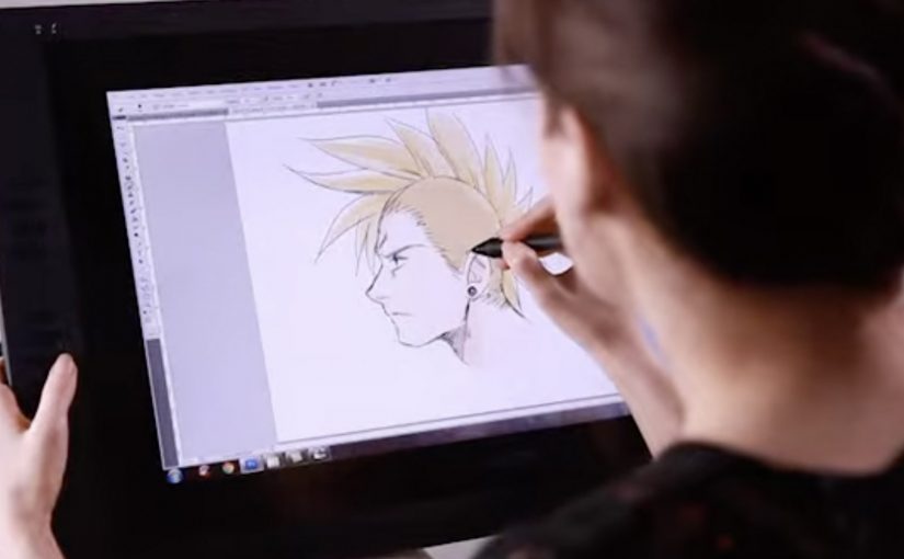
Wacom Inkling: paper sketches, digitized

Wacom is launching a cool new digital sketch pen for artists called the Inkling. This unique pen allows artists to draw or sketch on a standard piece of paper and then automatically have a digital version created.

The trick is that Inkling pairs a real ink pen with a small receiver that clips to your paper and records your strokes as you draw, so you can plug it into a computer later and bring the sketch into your digital workflow.

What Inkling changes in a familiar habit

Most artists already start with pen and paper because it is fast, portable, and forgiving. Inkling keeps that behaviour intact, but removes the “scan it later” step by capturing the drawing while it happens.

How the capture works in practice

  • Draw normally. You sketch with an actual ballpoint pen on regular paper.
  • Record quietly. The clipped receiver tracks each stroke and stores the sketch.
  • Transfer when ready. You connect the receiver to your computer and import the captured file for editing.
  • Refine digitally. The value shows up when you want to iterate, clean up, or reuse elements without redrawing from scratch.

In creative and design workflows, bridging paper-first sketching to digital editing keeps momentum for artists who think with their hands.

The real question is whether you can keep paper-first speed while still landing in edit-ready digital files.

Why it lands: it removes one of the most annoying handoffs

The friction is never “making the sketch”. The friction is getting that sketch into the tools where it becomes a layout, a storyboard, an illustration draft, or a presentation asset. Inkling makes the handoff feel like part of the act of drawing, not a separate job you do later.

Extractable takeaway: If you remove one ugly handoff between a familiar analog habit and a digital toolchain, you get adoption without asking creators to change how they start.

What Wacom is really selling here

This is not just a new pen. It is a bridge product that expands Wacom’s relevance beyond tablets and into the earliest moment of creation, when ideas are still raw and fast. A bridge product connects a trusted old workflow to a newer one, so users can cross without friction. Wacom is right to focus on the handoff, not on adding more pen features. If the first capture happens with Wacom, the next steps in the workflow are more likely to happen with Wacom-friendly tools too.

Takeaways for marketing creator tools

  • Respect existing habits. Do not force a new behaviour when the old one already works.
  • Remove a single painful step. “No scanning” is a clearer benefit than a long list of features.
  • Sell the workflow, not the gadget. The story is speed from idea to editable file.
  • Show the before and after. Demos work best when viewers can see the exact handoff being eliminated.

A few fast answers before you act

What is Wacom Inkling?

It is a digital sketch pen system that lets you draw on regular paper with real ink while capturing a digital version of the sketch for later transfer to a computer.

Do you need special paper to use Inkling?

No. The idea is that you sketch on standard paper while a clipped receiver records your strokes.

How do you get the sketch onto your computer?

You connect the receiver to your computer and import the stored sketch so it can be edited digitally.

What is the main benefit compared to scanning?

You skip the “capture later” step. The sketch is already recorded as you draw, which makes it faster to move from rough idea to editable file.

Who is this best suited for?

It fits artists and designers who start on paper for speed, then want to refine, iterate, or reuse parts of the sketch digitally without redrawing everything.
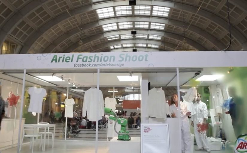
Ariel Actilift: Facebook-Controlled Shoot

Procter & Gamble Nordics, in collaboration with Saatchi & Saatchi Stockholm, B-Reel and Atomgruppen, creates an interactive campaign centered on a specially built glass installation in Stockholm Central Station, Sweden.

For one week, passers-by at Stockholm Central Station can watch designer clothes hung on a washing line being soiled by ketchup, drinking chocolate and lingonberry jam via fans on the Ariel Sweden Facebook page (or Denmark, Norway, Finland equivalents).

The mechanic: stain it from Facebook, then win it back clean

In order to win the designer clothes, Ariel fans use a Facebook-controlled industrial robot cannon to soil them. The stained clothes are then sent in the post after being washed on-site with regular Ariel Actilift.

In high-traffic European transit hubs, the strongest “social media” ideas are the ones that visibly change the physical world in front of everyone, not just the feed.

Why it lands: it makes participation feel consequential

This is a neat reversal of how most product demos work. Instead of the brand creating a controlled “before and after”, it invites the audience to create the mess themselves, then proves the wash result under public scrutiny.

Extractable takeaway: If you want participation that people remember, make the audience’s input irreversible in the moment, then let your product do the recovery. The contrast between “I caused this” and “it still comes out” is stronger than any claim line.

The glass box is doing strategic work. It turns a Facebook click into a visible event for commuters, which makes the campaign feel bigger than the people who are actually playing.

What the campaign is really selling

At a surface level it is a stunt to win clothes. At a deeper level it is reassurance. The mess is extreme and deliberately unglamorous, so the cleanliness result reads as confidence, not a carefully staged demo.

The real question is whether a Facebook click creates enough public consequence to make the cleaning proof feel worth watching.

What to steal for your next social-plus-physical idea

  • Let the audience create the proof: user-generated “inputs” that change the outcome are more persuasive than brand-controlled setups.
  • Use a public stage: a transparent environment creates trust because the product has nowhere to hide.
  • Keep the control surface simple: one clear action. One obvious effect. No complicated UI.
  • Design a real reward path: the prize should be operationally credible, not a vague “chance to win”.
  • Make the brand step undeniable: show the product moment on-site so the claim is witnessed, not narrated.

A few fast answers before you act

What is the core idea of this Ariel activation?

A Facebook interface controls a robot cannon that stains designer clothes in a glass installation. Ariel then washes the clothes on-site, and participants can win the cleaned items.

Why combine Facebook with a physical installation?

Because it turns digital participation into a public spectacle. The online action has a visible consequence in the real world, which makes it more engaging and more shareable.

What product truth is being demonstrated?

That Ariel can handle tough, visible stains. The audience creates the stains, and the brand shows the wash outcome under observation.

What makes this different from a normal product demo?

The brand gives up control of the “mess creation” to the public. That makes the demonstration feel less scripted and more credible.

What should you measure if you run something like this?

Participation rate, dwell time at the installation, social engagement tied to the control interface, earned media pickup, and any lift in product consideration during the activation window.

ERAN: When Facing Distress, Dial 1201

Here is a campaign from ERAN, the National Crisis Intervention Hotline in Israel.

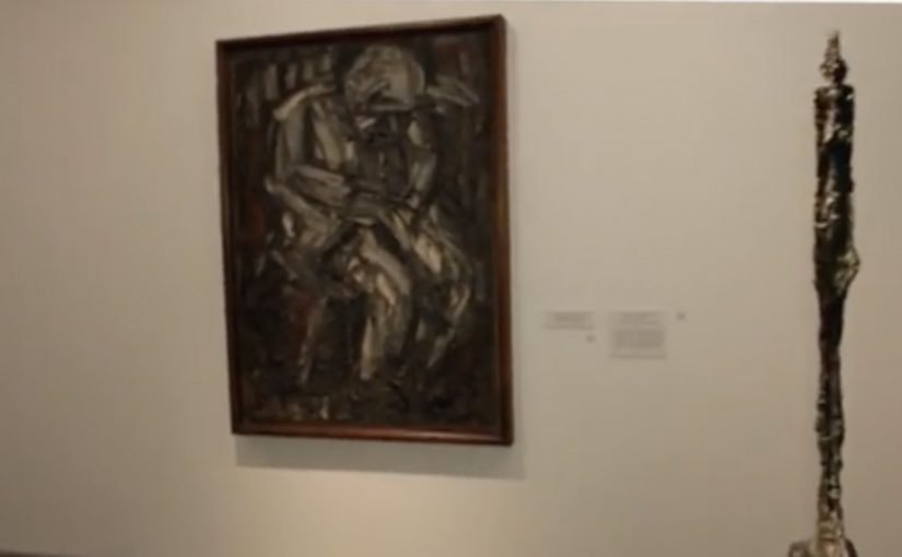
To make people aware of the 1201 hotline, McCann Erickson worked with the Israel Museum in Jerusalem. They identified paintings that express distress, then changed each artwork’s audio guide number to 1201. Dialing that number on the guide gives visitors a customized message that mirrors the emotion of what they are looking at, while quietly pointing to the same number outside the museum.

A hotline reminder that hides in plain sight

The trick is that nothing feels like advertising at first. You are already in “audio guide mode”. You are already entering numbers. The campaign simply reroutes a familiar behavior into a moment of recognition, then uses the artwork’s emotional weight to make the number stick.

How the mechanism earns attention without shouting

This is ambient marketing built from context rather than volume. The museum provides the emotional frame. The audio guide provides the interface. The number provides the bridge between cultural experience and real-world help. It is a one-step interaction, and the message arrives when the viewer is already primed to feel.

Because the visitor is already using the guide as intended, the intervention feels credible rather than intrusive, which makes the number easier to absorb and remember.

In public service communication, the most effective prompts often appear inside routines people already trust, so the call-to-action feels like guidance rather than persuasion.

Why it lands

It lands because it changes the meaning of a number. “1201” stops being a hotline you may never need, and becomes a small, memorable experience tied to a specific feeling and a specific place. The museum setting also lowers defensiveness. People expect reflection, not selling, so they are more open to receiving a supportive message.

Extractable takeaway: If you can place a helpline inside an existing, legitimate interface, and align it with an emotionally resonant context, you turn awareness into recall without relying on fear or shock.

What ERAN is really doing here

This is recall engineering. That means designing a vivid cue so a critical number is easier to remember when it matters.

The real question is how to make a crisis number memorable before someone actually needs it.

ERAN is right to optimize for respectful recall over louder awareness. The value is not the interaction itself. The value is that a visitor leaves with a number that now has emotional meaning.

What to borrow from this hotline recall design

  • Borrow an interface people already use. Audio guides, ticketing kiosks, vending machines, any trusted routine.
  • Let context do the targeting. The environment pre-qualifies the emotional state and attention level.
  • Keep the action to one step. The smaller the action, the higher the completion.
  • Design for respectful tone. Supportive beats sensational when the topic is distress.
  • Make the recall object simple. A short number, a clear phrase, one job.

A few fast answers before you act

What is the core idea of “When Facing Distress, Dial 1201”?

Turn museum audio guide numbers into a hotline reminder by assigning “1201” to distress-themed artworks and delivering supportive messages through the guide.

Why use a museum as the medium?

Because visitors expect emotion and reflection. That context makes the message feel natural, and it helps the number attach to a real feeling rather than a generic PSA.

What makes this more memorable than a poster?

The viewer performs an action. They dial the number. That small act creates muscle memory and meaning, which improves recall later.

What is the biggest execution risk?

If the experience feels like it interrupts the museum visit or trivializes the artworks, it can trigger backlash. The tone has to stay respectful and restrained.

How can other causes apply this approach?

Find a trusted public interface, align the message with the environment’s emotional purpose, and make the action so simple it can happen without instruction.