
Mercedes-Benz: Transparent Walls for PRE-SAFE

For the PRE-SAFE® precrash system from Mercedes-Benz, ad agency Jung von Matt in Germany set out to make chaotic traffic intersections safer.

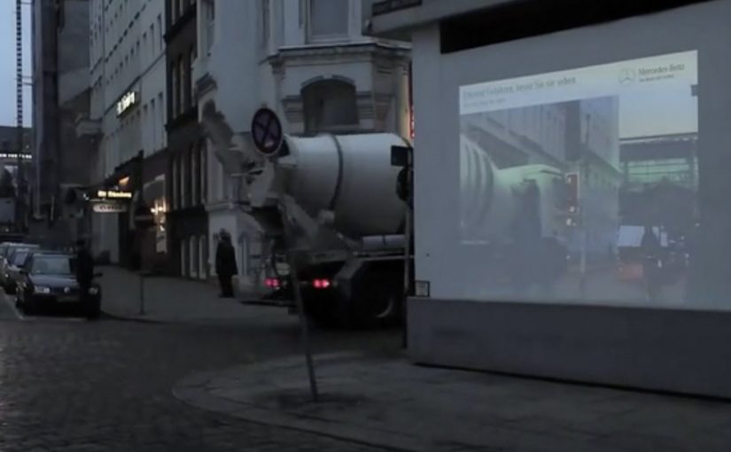
The idea was to let everyone “look around the corner” as if walls were transparent. In this execution, “transparent walls” means projecting a live camera view onto the building edge so the blind spot becomes visible. A camera filmed what was happening out of sight around the corner, and the live images were projected onto an 18/1-format billboard mounted on the building edge for approaching traffic to see.

When out-of-home becomes a live safety interface

This is not an awareness poster. It behaves like infrastructure. The corner. The blind spot. The moment of uncertainty. All become the media placement and the message at the same time.

The real question is whether your safety story behaves like a tool at the decision point, not a slogan people ignore.

How the mechanism creates “transparent walls”

  • Capture. A camera records the street view that drivers cannot see until they commit to the turn.
  • Project. A large-format display on the building corner shows that view in real time.
  • Anticipate. People approaching the intersection get a few extra seconds to recognise a cyclist, car, or hazard.

In urban mobility and automotive safety communications, making risk visible in the moment can change behaviour faster than warning copy.

Why it lands

Safety messages often fail because they arrive as abstract advice. This one arrives as immediate utility. It gives people a concrete, legible advantage at the precise point where bad outcomes happen. Because the live projection turns hidden risk into visible information, the benefit is believed without asking anyone to trust a claim. Safety-led brand work should earn attention through utility, not admonition. The result feels less like advertising and more like “someone fixed a problem.”

Extractable takeaway: The most persuasive safety communication is not a claim. It is a demonstrable reduction of uncertainty, delivered at the exact moment people need it.

What the brand intent looks like underneath

The stunt does double duty. It dramatizes what PRE-SAFE® is for without explaining sensors, thresholds, or system logic. It also signals a brand posture. Mercedes-Benz is not only selling performance. It is selling anticipation.

Steal this pattern: make uncertainty visible

  • Build the message out of the environment. Pick a real-world constraint your audience feels, then solve it visibly.
  • Make the proof self-evident. If people can understand the benefit in one glance, the idea scales.
  • Reduce uncertainty, not fear. Practical clarity outperforms shock in public safety-adjacent work.
  • Choose the right “moment.” Place the intervention where decisions are made, not where people are merely passing through.
  • Design for all road users. Intersections are shared systems. Make the benefit readable for drivers, cyclists, and pedestrians.

A few fast answers before you act

What is “Transparent Walls” in one sentence?

It is a digital out-of-home installation that shows live footage from around a blind corner on a building-edge billboard, so approaching traffic can spot hazards earlier.

How does this connect to PRE-SAFE®?

It demonstrates the value of anticipation. Seeing danger earlier is the human equivalent of what precrash systems aim to deliver technologically.

Why use a live camera feed instead of a scripted film?

Because real-time content makes the utility undeniable. People trust what they can see unfolding right now.

What are the main execution risks?

Latency, visibility in different lighting conditions, weather robustness, and ensuring the display informs rather than distracts drivers.

How would you measure success?

Observed speed adjustments, braking behaviour changes, near-miss reduction at the intersection, dwell/attention metrics, and sentiment around perceived usefulness.
Hire Us: Twitter Follow Stunt Lands a Job

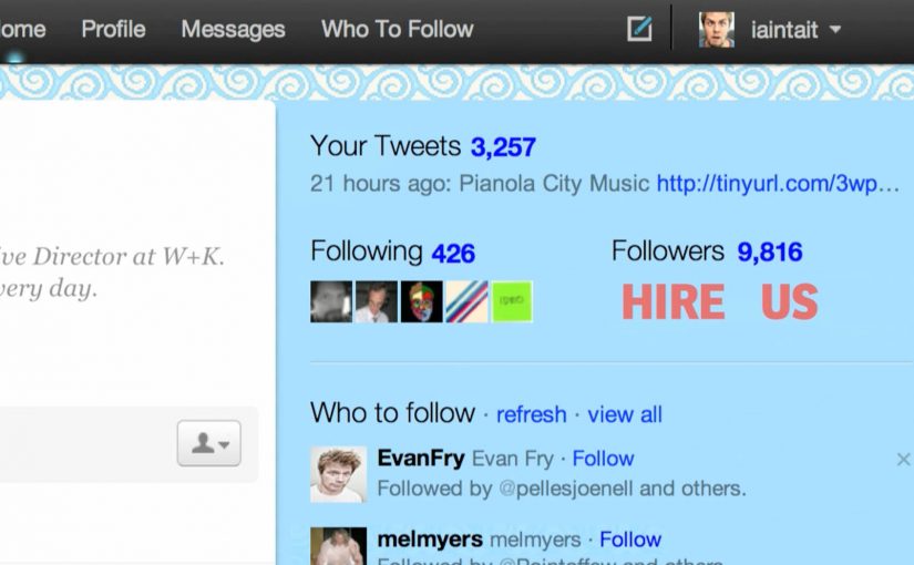
Dutch creative team Bas van de Poel and Daan van Dam set up five separate Twitter accounts and started following various Dutch Creative Directors on Twitter. Their message was simple: HIRE US.

Even though the idea is very similar to the Jeep Twitter Puzzle campaign, the execution is different and innovative. It gets them noticed and finally a job with Boondoggle in Amsterdam.

Why five accounts is the point, not the gimmick

The mechanism is engineered repetition. By “engineered repetition,” I mean deliberately creating multiple small signals that form an obvious pattern in the target’s notifications. One account can be ignored. Five accounts create a pattern. When multiple new followers arrive with the same blunt message, it triggers curiosity and a small sense of social pressure. Someone is doing something intentional, and it is hard not to look.

It is also highly targeted. They do not broadcast “hire us” into the void. They place it directly in the attention stream of the people who can change their outcome.

In creative hiring markets, attention is scarce, so using a platform’s native behaviours to deliver an instantly legible message is often the fastest way to get noticed.

Why it lands: interruption plus clarity

This works because it is instantly legible. No clever puzzle to decode. No long portfolio pitch. The call to action is the entire creative idea. That clarity is what makes it feel confident. And because it happens inside Twitter’s native behaviours, following, notifications, profile clicks, it does not require extra friction. The recipient can react in seconds.

Extractable takeaway: When you need attention from specific decision-makers, create a small pattern using the platform’s native behaviours that communicates the ask in one glance and makes the next step easy.

The intent: turn hiring into a creative brief

The business intent is obvious. Get hired. But the deeper intent is to reframe the hiring process. Instead of asking for a meeting, they create a live demonstration of how they think. Targeted, lightweight, and culturally fluent in the medium.

The real question is how you create an impossible-to-ignore signal for the right people without turning the medium into spam.

Done with tight targeting and restraint, this approach is a legitimate creative proof point. Done broadly or repeatedly, it backfires as noise.

Borrow this for your own career marketing

  • Be specific about who you want. Target decision-makers, not “everyone”.
  • Design an interruption that fits the platform. Use native behaviours, not extra hoops.
  • Make the message instantly legible. One idea. One line. No explanation required.
  • Turn the ask into proof. Show your creativity in the method, not in a PDF pitch.
  • Keep it respectful and reversible. Clever is good. Spammy is not.

A few fast answers before you act

What did Bas van de Poel and Daan van Dam actually do?

They created five Twitter accounts and followed Dutch Creative Directors with a single message: “HIRE US”.

Why did using multiple accounts matter?

It created a noticeable pattern and a stronger interruption than a single follow, prompting curiosity and profile clicks.

How is this different from the Jeep Twitter Puzzle?

It is similar in spirit, but the execution is simpler and more direct. A single clear call to action rather than a puzzle mechanic.

What made it effective as self-promotion?

High targeting, low friction, and a message that communicates confidence in one second.

What is the main takeaway for personal branding?

If you want attention from decision-makers, design a small, platform-native experience that demonstrates how you think and makes the next step easy.

Samsung: Unleash Your Fingers

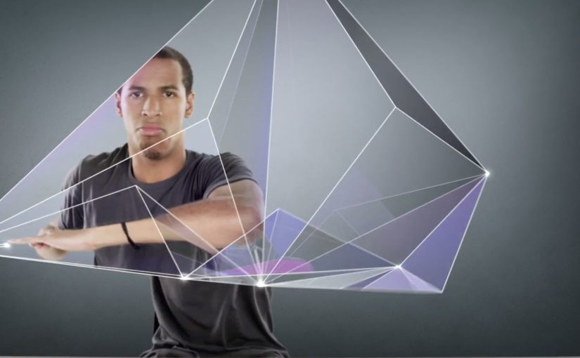
For the launch of the Galaxy S II in France, Samsung brought JayFunk, the internet finger tutting phenomenon, from Los Angeles to Paris to deliver an incredible and surprising choreography.

When “touch” becomes performance

Finger tutting is a style of dance where intricate shapes and geometric figures are created using hands and arms. Samsung frames that craft as the purest expression of what a touch device asks of you. Your fingers become the headline.

The mechanic is the metaphor

The film does one clear thing. It takes a niche skill. It stages it like a reveal. It lets the choreography do the talking, then uses visual treatment to make the hands feel almost “interface-like”. The message is implicit. This is a phone built for what your fingers can do.

In consumer electronics launches, the fastest route to preference is often a single metaphor that makes a feature feel obvious without listing specifications.

Why it lands

This works because it respects attention. There is no explanation tax, no product demo checklist, and no forced storyline. It is a short, repeatable spectacle that makes “touch” feel expressive, not functional. Because the performance externalizes touch as a visible skill, the product promise becomes intuitive before the viewer processes a single specification. Samsung’s own newsroom later described the video as quickly climbing viral charts and reaching millions of views at the time, which fits the format. It is built to be replayed and forwarded.

Extractable takeaway: When your product benefit is hard to visualize, borrow a human craft that embodies it, then let the craft carry the proof while the brand stays in the background.

What Samsung is really signalling

The brand is not only selling a handset. It is staking a position in culture. Touchscreens are not just input. They are a playground. Casting a specialist performer signals modernity, precision, and mastery, all without ever saying those words.

The real question is how to make touch feel culturally meaningful before anyone asks about specifications.

What launch teams can take from this

  • Lead with a single, watchable skill. Spectacle beats explanation when the benefit is sensory.
  • Make the metaphor tight. Fingers, touch, gestures. Everything points to one idea.
  • Keep product presence restrained. Let the audience connect the dots. It feels smarter and travels better.
  • Design for replay. Short, surprising sequences outperform long narratives for launch buzz.
  • Use culture as targeting. A niche community can become your amplification engine if you treat it with respect.

A few fast answers before you act

What is the main idea behind “Unleash Your Fingers”?

Turn touch interaction into a cultural performance, so the phone’s core benefit is felt rather than explained.

Why use finger tutting instead of a normal product demo?

Because it externalizes “dexterity on glass” in a way people can immediately understand and want to share.

What should a brand be careful about with a performance-led launch film?

Do not let the performance become disconnected from the product. The metaphor must stay legible, and the brand role must feel earned.

How could a non-tech brand apply the same approach?

Pick a human craft that embodies your promise, then film it so the craft proves the point without heavy narration or feature lists.

What is a practical success metric for work like this?

Beyond views, look for lift in branded search, share rate, completion rate, and recall of the single idea the film is built around.