
Prigat: User Generated Orange Juice

Prigat, a leading company in the Israeli fruit juice market, launched one of the more inventive Facebook mechanics of its era. It invited people to squeeze real orange juice by doing something absurdly simple. Smile at your webcam.

The idea was packaged as “User Generated Orange Juice (UGOJ).” A Facebook application that translated user participation into a physical outcome you could actually watch.

The mechanism: your smile triggers a real machine

A custom Facebook app developed by Publicis E-Dologic used webcam-based smile detection to trigger a real, oversized juicer. When the app detected a smile, it activated the juicer and squeezed fresh oranges. Users could watch the machine live 24/7, so the cause-and-effect was visible rather than implied.

Campaign coverage also described a personalization touch where the participant’s name appeared on the machine during use, and that the resulting juice was directed to a charity choice.

In social platform marketing, physical proof loops outperform abstract engagement prompts because they give people a reason to believe and a reason to share.

Why this lands

This works because it turns a universal emotion into a measurable input. Smiling is effortless, socially contagious, and camera-friendly. The live feed makes the outcome undeniable, and that “I did this” ownership nudges people to recruit friends so their smiles compound into more visible results.

Extractable takeaway: If you want participation at scale, connect a low-friction action to a real-world output that people can witness in the moment, then make sharing feel like extending the impact, not like promoting the brand.

What Prigat is really doing

The campaign turns Facebook from a place for liking into a place for doing. The real question is how to turn a passive social audience into a participant who can see, trust, and share the brand experience. This is stronger than a standard Facebook giveaway because the proof is built into the interaction itself. It converts attention into a visible production line, then uses the live stream as credibility and the smile photos as distribution. Prigat gets warmth by associating the brand with positive emotion and generosity, while the machine supplies a visible proof point that keeps the story believable.

What to steal from the Prigat participation loop

  • Design a simple input. The easier the action, the more likely people repeat it and recruit others.
  • Show the output live. A real-time feed reduces skepticism and increases share-worthiness.
  • Make participation legible. If the user can see their effect immediately, they trust the loop.
  • Attach a social good endpoint. A charity destination converts novelty into meaning.

A few fast answers before you act

What is “User Generated Orange Juice” (UGOJ)?

It’s a Facebook app activation where users smile at a webcam and trigger a real juicer that squeezes fresh oranges, visible via a live stream.

How does the smile activation work?

The app uses webcam-based smile detection to decide when to trigger the juicer. The user’s action becomes the on-switch.

Why include a 24/7 live view of the juicer?

It provides proof. People can watch the result of participation, which increases trust and makes the story easier to share.

What kind of results were reported?

Reported results include around 30,000 new likes, over 20,000 photos uploaded, and roughly 40,000 oranges squeezed.

What’s the key risk if you copy this concept?

Trust and privacy perception. You need clear, simple communication that the webcam is used only to detect the smile for the interaction, and that the experience is safe and transparent.
Jeep: Compass Remote Postcards

One of the oldest and most effective ways to sell a product is with a good demonstration. Leo Burnett Brussels takes that approach and gives it a fresh spin for the Jeep Compass by turning the demo into a journey people can follow.

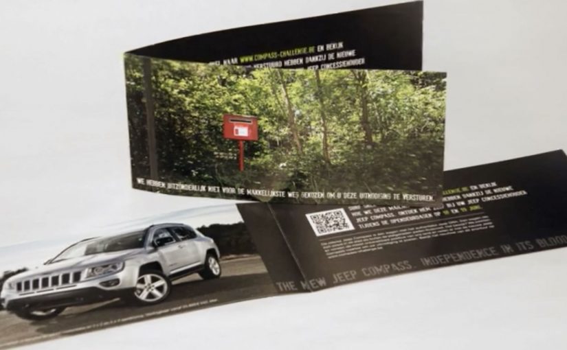
Cameras are strapped onto a few Jeep Compasses, and the team sets out to find the most remote post locations they can. Direct mailers are then shipped from these far-flung places, pointing recipients to a site where they can follow the trip and see the Compass in action.

Remote postcards as proof, not promise

The mechanic is simple. Put the product in the environment that proves the claim, document it, then send a physical artifact from the place itself. The postcard becomes evidence that the vehicle actually got there, not just a line in a brochure.

In automotive marketing, demonstrations land best when the proof is embedded in the distribution, so the message and the evidence arrive together.

The real question is how to turn an off-road capability claim into proof people can hold, trust, and retell. This is stronger than a spec-led demo because the proof is built into the medium itself.

Why this lands

This works because it collapses storytelling and verification into one object. A postcard from a remote location is inherently credible. Add footage from the route, and the demonstration feels earned rather than staged, even for people who only skim the campaign.

Extractable takeaway: If your product benefit is “go anywhere” or “handle more,” make the medium carry the proof. Send something that could only exist if the product performed as claimed.

What the campaign is really optimizing for

Beyond awareness, this is built to move the vehicle into active consideration. It gives prospects a concrete reason to re-evaluate the vehicle, and it creates a narrative that sales teams and enthusiasts can retell without needing technical jargon or spec sheets.

How to adapt this demonstration pattern

  • Turn proof into an artifact. Physical mail can signal effort and credibility.
  • Design a followable journey. A route with checkpoints is easier to remember and share than a one-off stunt.
  • Keep the CTA tight. One action. Follow the trip. See the product perform.
  • Make the environment do the persuading. Terrain and remoteness communicate capability faster than copy.

A few fast answers before you act

What is the core idea of the Jeep Compass remote postcards?

Use real remote locations as the demonstration, then mail postcards from those locations and direct recipients to follow the journey and watch the vehicle perform.

Why use direct mail instead of only video?

A postcard from a remote post office feels like proof. It is a physical signal that the journey happened.

What makes this a product demonstration, not just content?

The route and the mailer are consequences of the capability claim. The campaign structure is built around showing the vehicle doing the work.

What kind of products benefit most from this pattern?

Products with a capability claim that is easy to show in the real world. Durability, reach, range, off-road, endurance, or access.

What’s the biggest risk if you copy this approach?

If the “proof” feels manufactured or the journey is hard to follow, the credibility advantage disappears. The checkpoints and documentation need to be clear.

Zonacitas.com: Singles Finder App

“Love is out there. If we get organized, there’s plenty for all.” That is the simple provocation behind the Singles Finder App built for Zonacitas.com, a major Argentinian dating portal.

Buenos Aires is often described as a nightlife-heavy city with thousands of bars, discos, and pubs. That abundance creates a practical problem for singles. Where do you go tonight if your goal is to actually meet someone?

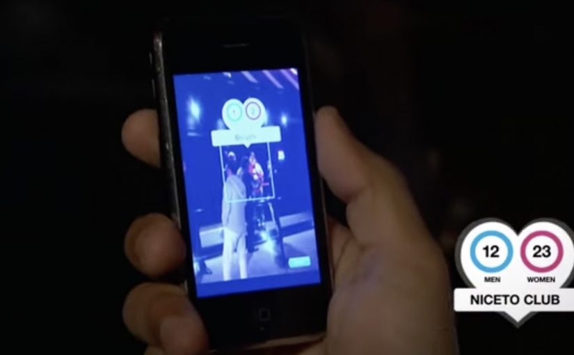
Singles Finder reframes the decision as information. It is described as a free iPhone app that shows the number of single prospects in each location, so users can choose where to go before they go.

Turning nightlife into a searchable index

The mechanism is straightforward. The app surfaces venue-level counts of single men and women, letting users compare options and pick the spot with the best odds for their intent, rather than relying on guesswork or luck.

In big-city nightlife ecosystems, the winning consumer experience is often the one that reduces uncertainty about where to invest your next two hours.

Why it lands

This works because it respects the real barrier. The hardest part is not downloading a dating app. It is deciding where to show up in the physical world. The real question is where you can increase the odds before you leave home.

Extractable takeaway: When your category depends on offline outcomes, shift the product value from “matching” to “decision support,” meaning a clear, comparable signal that helps people pick where to go before they leave. Help people choose where to go, not just who to message.

What Zonacitas.com is really buying

As positioning, it moves the brand from “dating portal” toward “nightlife utility.” As behavior, it encourages planning and repeat usage. As marketing, it turns a crowded, emotional category into a rational promise you can explain in one sentence. This is a stronger bet than competing on endless profiles and messaging alone.

Takeaways for location-driven products

  • Make the choice easier, not louder. Reduce the decision space with a simple comparison signal.
  • Shift value upstream. Solve the problem before the user commits time and money to a night out.
  • Design for “before I leave home.” The best moment is pre-decision, not mid-venue.
  • Keep the promise legible. A count is clearer than a vibe.

A few fast answers before you act

What is the Singles Finder App?

It is a Zonacitas.com mobile app concept that shows how many single prospects are in each nightlife location, helping users decide where to go before they head out.

Why is the “count per venue” mechanic persuasive?

It turns an emotional, uncertain choice into a comparable signal. Users can pick a venue based on odds rather than guesswork, which feels immediately useful.

What problem does this solve that typical dating portals do not?

It addresses the offline planning step. Instead of focusing only on profiles and messaging, it supports the real-world decision of where to show up tonight.

Who is this best for?

It is best for people facing many similar nightlife options and a time-bound goal. The value is reducing randomness in the “where do we go” decision.

How should the promise be explained in one line?

Explain it as “help me choose where to go tonight.” The clearer the decision it supports, the faster users understand why it is useful.

What should a brand measure for an activation like this?

App opens during peak nightlife hours, venue search and comparison behavior, downstream check-ins or venue visits where available, and retention driven by repeat planning on future nights.