Samsung: Galaxy 11

Samsung: Galaxy 11

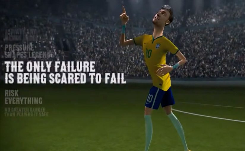
Samsung, to promote its new Galaxy S5 smartphone during the 2014 World Cup, created a 13 minute animated film (split in 2 parts) featuring some of the world’s greatest footballers on a mission to save Earth from an alien race called Hurakan.

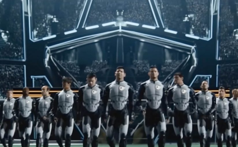
To save Earth from total annihilation, the human footballers dubbed the “Galaxy 11” get into a winner take all football match with the alien race. In the film, the Galaxy 11 are seen using various Samsung Galaxy devices to face off against the horned creatures, who have a penchant for flips and fancy kicks.

How this sells without stopping the story

The real question is whether your brand can earn minutes of attention without pausing the story to sell.

This works when the product has a credible job inside the plot, because that makes every appearance feel like story logic instead of an interruption.

In global consumer brands, World Cup season is one of the few windows where audiences will engage with branded entertainment if the story earns it.

Why this format works for a World Cup moment

A World Cup moment is crowded with highlight reels and second-screen noise. A self-contained animated story gives viewers a reason to stay, because they want to see how the match resolves.

Extractable takeaway: When attention is scarce, trade a single claim for a simple plot. Conflict, goal, showdown. Then let your product earn screen time by being useful to the characters.

  • It is built for attention. A 13 minute animated story gives Samsung room to create a world, not just a product claim.
  • The product is part of the mission. Galaxy devices show up as tools the team uses, so the placement feels “in-world” rather than bolted on.
  • It scales globally. Football, sci-fi stakes, and animation travel across markets without heavy explanation.

What to learn from “Galaxy 11”

If you want people to stay with a brand story for more than a few seconds, give them a narrative engine. Here, a narrative engine means a repeatable conflict-goal-showdown loop that keeps scenes moving. A clear enemy, a clear goal, and a clear showdown. Then let the product play a credible role inside that story, instead of pausing the story to sell.

  • Start with stakes, not specs. Establish the enemy and the win condition before the product shows up.
  • Give the product a job. Make the device a capability the characters rely on inside the plot.
  • Keep the structure simple. Enemy, goal, showdown. Then end with a clear resolution.

A few fast answers before you act

What is Samsung “Galaxy 11”?

It is a two-part animated film created for the 2014 World Cup that puts elite footballers into a “save Earth” match against an alien team called Hurakan, while featuring Samsung Galaxy devices in the story.

How long is the film?

It runs about 13 minutes in total and is split into two parts.

How do Samsung Galaxy devices fit into the film?

The Galaxy devices are shown as tools the team uses during the mission, so the product appears through action rather than through a conventional pitch.

Why use animation for a World Cup campaign?

Animation makes it easier to build a shared “in-world” story and let it travel across markets, because the stakes and visuals are easy to understand.

What is the transferable pattern for brands?

Build a short, high-stakes story with a simple structure. Then integrate the product as a believable capability inside the plot.

Homeless Fonts: Fonts from Cardboard Signs

Homeless Fonts: Fonts from Cardboard Signs

When you walk by a homeless person holding a cardboard sign, you usually see an anonymous face struggling to survive. Homeless Fonts flips that moment. It turns the most visible part of street life. The handwriting. Into something people and brands can actually pay for.

From street sign to typeface

The Cyranos McCann teamed up with the Arrels Foundation in Barcelona to launch HomelessFonts.org. The site features fonts built from the real handwriting of local homeless people, available for purchase by marketers who want something more human than a default type library.

Here, a “font” is a downloadable typeface file that designers can license and use across ads, packaging, and digital interfaces, just like any other professional typeface.

In urban European cities, design-led micro-commerce can convert overlooked skills into dignified income streams.

Where the money goes

The money raised from the website is intended to support accommodation, food, social programs, and health care for people experiencing homelessness. For more information visit www.HomelessFonts.org.

Why this lands

It works because it asks brands to buy a useful asset instead of “donating to a cause.” You are not funding an abstract promise. You are paying for a tool that visibly changes the tone of your message, and the purchase itself carries a story your audience can recognize instantly.

Extractable takeaway: If you want purpose marketing to stick, attach the donation mechanic to a practical, reusable brand input (a font, a template, a dataset, a sound pack) so the act of funding also improves the work.

What it’s really trying to change

The real question is whether brands will pay for contribution instead of performative concern.

This is a stronger model than pure cause messaging because it gives people commercial value, not just visibility.

Beyond fundraising, the campaign reframes homeless people from passive recipients to contributors with identity and craft. The typefaces carry names and personality, and that shifts the conversation from pity to participation.

What to steal from Homeless Fonts

  • Sell a tool, not a feeling. Build the fundraising mechanic around something buyers genuinely need.
  • Make the proof visible. The output (handwriting) is instantly recognizable, which makes the story easy to retell.
  • Design for everyday reuse. The more places the asset can live (print, digital, packaging), the more sustainable the model becomes.
  • Keep the transaction simple. Clear product. Clear price. Clear destination for proceeds.

A few fast answers before you act

What is Homeless Fonts?

It’s a collection of purchasable fonts created from the handwriting of homeless people in Barcelona, sold via HomelessFonts.org.

Who created it?

The project was launched by the Arrels Foundation in partnership with Cyranos McCann.

How do brands actually use the fonts?

Like any licensed typeface. Designers can apply them in headlines, posters, packaging, social content, landing pages, and campaign visuals to add a distinctly human texture.

What does buying a font change versus asking for donations?

It turns support into a market exchange for a useful asset. That reduces “charity fatigue” and gives brands a concrete output that carries the story forward every time it’s used.

Where is the money intended to go?

The campaign describes proceeds being used for accommodation, food, social programs, and health care supporting people experiencing homelessness.