The Village Telephone

The Village Telephone

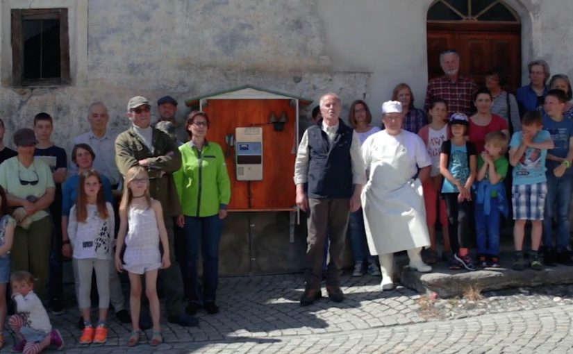
In the mountain village of Tschlin, it is so quiet that when the telephone in the village square rings, you can hear it from every corner of the village. So when that phone starts ringing, people move. The butcher. The innkeeper. The pastor. Whoever is closest. The whole premise is simple: if the phone rings and nobody makes it in time, the caller wins.

The hook

Turn “quietest place in Switzerland” from a claim into a game people can test in real time.

What Graubünden Tourism and Jung von Matt set up

Graubünden Tourism and Jung von Matt/Limmat publish the village phone number online and invite anyone to call it between 10:00 and 20:00. If a resident answers, you get a conversation with a real person from Tschlin. If the call goes unanswered, you win prizes such as free stays, dinner, or merchandise.

To prove that nobody is sitting next to the phone “waiting,” the campaign also runs a live view of the village square, so participants can see what is happening and who is answering. The transparency is part of the promise.

The real question is whether a destination promise can be verified by a stranger in seconds.

When the audience can run the proof themselves, the claim becomes dramatically more credible.

Why the village telephone lands

The mechanic, meaning the simple rule set people can try, creates tourism interest because the proof is experienced in the moment, then shared as a story.

Extractable takeaway: If your benefit is experiential (quiet, fast, safe, simple), build a public test that lets people attempt to disprove it. Then make the proof visible while they try.

It makes the destination benefit testable

Most tourism ads describe tranquility. This one lets you attempt to break it with a phone call.

It turns locals into the medium

No actors are needed. The villagers are the campaign, and that authenticity is visible in every answered call.

It creates a built-in story loop

Call. Ringing. Sprint. Answer. Or silence. Win. The narrative resets every time the phone rings, which is exactly why people keep trying.

In European destination marketing, a public, verifiable test is often what makes a small place feel real to people who have never been there.

The timeframe that makes it feel like an “event”

The action runs from Monday, June 6 to Saturday, June 11, 2016. It is short enough to create urgency, and long enough to become a talking point beyond Switzerland.

Signals that the stunt travels

Reported outcomes for the six-day activation include 30,000 attempted calls, 3,906 conversations, and 1.5 million video views, alongside significant media pickup.

The deeper point

This is a clean example of “proof marketing.” By “proof marketing,” I mean marketing that lets the audience verify the promise with their own action, not a brand assertion. The campaign does not ask you to believe that Tschlin is quiet. It gives you a simple action to attempt, shows you the village while you do it, and lets the locals validate the claim with their own behavior.

Steal the village phone pattern

  • Make the promise testable. Turn the adjective into one action people can try in real time.
  • Show the proof live. Use transparency (like a live view) so the audience trusts the rules.
  • Design a repeatable loop. Reset the story every time the trigger happens so people keep replaying it.
  • Time-box it like an event. A short window creates urgency and makes the stunt easier to talk about.

A few fast answers before you act

What is the core mechanic?

Call the village telephone between 10:00 and 20:00. If a resident answers, you talk. If the call goes unanswered, you win prizes.

Why is the live feed important?

It proves the fairness of the promise. People can see that nobody is waiting next to the phone, and they can see who they are speaking with.

Who is behind the campaign?

Graubünden Tourism (Graubünden Ferien) with Jung von Matt/Limmat.

When does it run?

June 6 to June 11, 2016.

What is the transferable pattern?

If your promise is experiential (quiet, fast, safe, simple), build a public test that lets people attempt to disprove it. Then make the proof visible while they try.

The Noite: Troll Ad Button

The Noite: Troll Ad Button

To promote a new season of The Noite, Publicis Brasil plays directly with a habit online video has trained into everyone. Skip the ad and move on.

Instead of treating that skip as the enemy, the campaign introduces a second choice. Viewers can click either “Skip Ad” or “Troll this ad”. The “troll” option leads to an unexpected piece of content that stays connected to the original message, and the campaign claims the result was four times more views than comparable pre-roll.

Turning a skip moment into a choice

The mechanic is not more targeting or louder creative. It is viewer control at the exact moment attention usually collapses. If you want to leave, you can. If you want to “troll”, you get rewarded with a playful detour that still carries the show.

In online video advertising, where skippable formats condition people to minimize attention, a simple interactive choice can convert avoidance into participation.

Why it lands

This works because it admits the truth of the format. People dislike being delayed. So the campaign reframes the pre-roll as a game with an opt-out, not a lecture with a countdown. The second button also creates curiosity, because it promises a different outcome than the usual “wait or skip” loop, and curiosity is one of the few reliable reasons people volunteer attention.

Extractable takeaway: If your audience’s default behavior is to escape, build a choice that makes staying feel like a self-directed action, then pay it off immediately with content that still ladders back to the brand.

What the show is really optimizing

The stated win is views, but the deeper win is sentiment. The Noite positions itself as culturally fluent in the platform’s frustrations, and that makes the promotional message feel less like interruption and more like shared humor. It is a promotion that behaves like entertainment.

The real question is not how to stop people from skipping, but how to make the pre-roll moment feel worth choosing.

The smarter move is not to fight skip behavior. It is to design a branded detour that respects it.

What to borrow from the button logic

  • Design at the drop-off point. Put your idea where attention usually dies, not after it.
  • Offer a real opt-out. Interactivity only feels fair if “leave” is genuinely available.
  • Make the alternate path rewarding fast. The payoff has to arrive immediately or the trick reads as manipulation.
  • Keep it on-message. The detour can be weird, but it should still be clearly linked to the original proposition.

A few fast answers before you act

What is the “Troll Ad Button” idea in one line?

A skippable pre-roll that adds a second option, “Troll this ad”, so viewers choose a playful alternate experience instead of simply skipping.

Why is a second button more effective than a better pre-roll film?

Because it changes the relationship with the format. It turns the moment into a decision the viewer owns, which can trigger curiosity and voluntary attention.

What metric did the campaign claim?

That it generated four times more views than similar pre-roll executions.

What is the key risk with “interactive pre-roll” mechanics?

If the alternate option is not genuinely different or feels like a trick, viewers punish the brand with distrust and faster skipping next time.

When should you use this pattern?

When your audience already expects to skip, and your brand can credibly reward curiosity with content that feels entertaining and immediate.

WhatsApp Taxi

WhatsApp Taxi

You need a taxi. Instead of calling or using a dedicated app, you open WhatsApp, share your location, and place the order by message. Taxi Deutschland positions “WhatsApp Taxi” as a simple way to request a cab in major German cities using the behavior people already know. Messaging.

Why this shows up now

After years of public sharing and transparency on social media, people gravitate toward more intimate, private, and even anonymous ways to communicate. That shift boosts the popularity of messaging apps and ephemeral messaging. Chat apps become hubs for social networks, games, e-commerce, and more.

The service. Taxi ordering by location message

Taxi Deutschland launches a new service called “WhatsApp Taxi” that allows users in major German cities to order a taxi by simply sharing their location via a WhatsApp message. The interaction is reduced to one core input. Your location.

The pattern. Messaging becomes an interface

Just last week I wrote about how KLM was starting to use Facebook Messenger for customer service related queries and tasks. WhatsApp Taxi sits in the same movement. Utility shifts into the messaging layer, which means the chat app becomes the place where the service starts, is confirmed, and is updated. The chat thread becomes the service surface.

In service categories where the audience already coordinates through chat, the smarter move is often to reduce entry friction rather than build another interface.

Why this lands for service adoption

This is a stronger service design move than another branded utility app because one familiar message and one high-confidence input make the service easier to try, which is why the interaction feels lighter and more repeatable.

Extractable takeaway: When the job to be done can be triggered with one trusted input inside a familiar chat flow, messaging can outperform a dedicated interface on adoption because it removes setup and learning cost.

The real question is whether your service needs a dedicated interface at all when messaging can already handle the request, confirmation, and follow-up. For Taxi Deutschland, the business intent is to reduce ordering friction and capture demand inside an existing behavior instead of forcing a new app habit.

What service brands can lift from WhatsApp Taxi

  • Ship in the behaviour people already have: If your audience already lives in messaging, put the service where the habit already exists.
  • Reduce the request to one high-confidence input: Location-first is a clean pattern when the service is fundamentally “come to me”.
  • Make chat the interface: Treat the thread as the order surface. Request, confirmation, updates, and support stay in one place.
  • Keep the interaction minimal: If one message can start the service, adoption is easier than “install app, register, learn UI”.
  • Design for repeat use: The same simple flow should work the second time without needing new learning or setup.

A few fast answers before you act

What is WhatsApp Taxi?

A Taxi Deutschland service that lets users order a taxi via WhatsApp by sharing their location in a message.

Where does it work?

Taxi Deutschland positions the service for use in major German cities.

What is the core user action?

Send your location via WhatsApp message to initiate the taxi order.

Why is this a marketing and product signal?

It shows how messaging apps evolve from communication tools into utility layers where services can be initiated and managed.

What is the transferable lesson for brands?

If your service can be reduced to a small set of high-confidence inputs, messaging can become a low-friction interface that people already understand.