Coca-Cola: First Drinkable Advertising

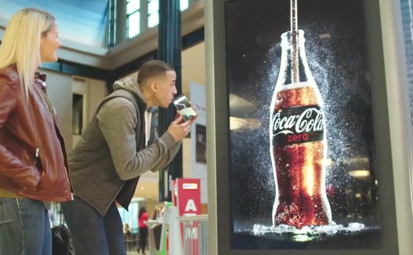
You are looking at a Coke Zero ad on a billboard, on TV, in print, or even on radio. Instead of just watching it, you Shazam it. On your phone, Coke Zero appears to pour into a glass on-screen, and that moment converts into a free Coke Zero coupon you can redeem at select retail stores across the US.

The premise is blunt and smart. Many people think they know the taste of Coke Zero, but they actually do not. So Ogilvy & Mather creates a campaign where the quickest route from awareness to belief is not another claim. It is immediate trial.

How “drinkable” advertising is engineered

This execution turns Shazam into a universal call-to-action layer across media. Here, “drinkable” means the ad triggers a mobile pour moment that turns into a redeemable coupon for immediate trial.

  • Any channel can trigger the experience. Billboard. TV. Print. Radio.
  • The smartphone becomes the conversion surface. Visual payoff first, then the coupon.
  • The coupon bridges straight into retail. “Try it now” becomes a physical action, not a brand sentiment.

The important part is not the novelty of animation. It is the end-to-end path from message to product-in-hand, because the Shazam trigger and coupon make the next step unambiguous.

Why this works as shopper marketing, not just a stunt

The campaign is designed to reduce the classic friction points that kill trial. In performance-led shopper marketing, the fastest path from awareness to belief is reducing trial friction and making redemption immediate.

Extractable takeaway: If you want trial, design the interaction so it ends in redemption, not in more content.

  • No guessing what to do next. Shazam is the behaviour.
  • No abstract promise. The ad demonstrates “taste” by pushing you to the real thing.
  • No delayed gratification. The reward is immediate and concrete. A redeemable coupon.

It is experiential marketing that does not require a pop-up installation or a live event. The experience travels with the media buy.

This is shopper marketing done right. It treats media as the first step of redemption, not as a detour into “engagement.”

The real question is whether your media can trigger immediate trial without adding steps or new infrastructure.

Steal this: Shazam-to-trial loop

If you are trying to drive trial at scale, this is a reusable model.

  1. One trigger across channels. Create a single interaction that works across channels.
  2. Mobile as the conversion surface. Use mobile to make the experience feel personal and immediate.
  3. Redemption, not delay. Close the loop with a retail mechanic that is simple to redeem.

Do that well, and “engagement” stops being a vanity metric. It becomes a measurable bridge to purchase.


A few fast answers before you act

What makes this advertising “drinkable”?

Shazaming the ad triggers a mobile experience that ends in a free Coke Zero coupon. It is designed to turn exposure into real-world trial.

Why use Shazam in the first place?

It provides a consistent interaction across media formats, including channels where clickable links do not exist.

What business problem is this solving?

Driving immediate trial for a product where many people assume they already know the taste, but have not actually experienced it.

What is the key CX detail that makes it work?

A simple, familiar action. One step to trigger, then a clear reward that can be redeemed in-store.

How do you prove this is more than a stunt?

Measure Shazam activations and coupon redemptions, then compare trial impact against a similar media buy without the redemption mechanic.

Nivea SunSlide

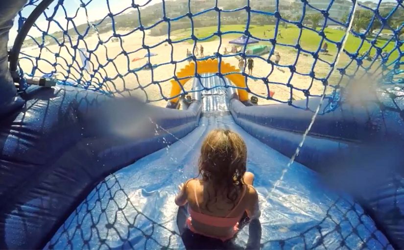
Kids are at the beach. They want to run, swim, and slide for hours. Parents want one thing first: sunscreen. That usually means a negotiation. Nivea flips the dynamic by turning sun protection into the game itself. It builds a slip-and-slide that sprays water-resistant SPF 50+ as kids go down. One ride applies the sunblock. The line is simple and strong: the “funnest” way to apply sunscreen. The claim is even better because it is measurable: one slide covers about 100 kids per hour.

The core move

Remove the biggest friction in kids’ sun protection by embedding sunscreen into something they already want to do.

The real problem it solves

Parents do not struggle with intent. They struggle with compliance.
Kids do not resist sunscreen because they hate protection. They resist because applying it interrupts fun.

The real question is how you make sun protection happen without making kids stop the fun.

SunSlide is a behavioral design solution. By behavioral design, I mean shaping the environment so the desired action happens as the default. It makes the protected action the entertaining action.

What gets built

A physical slide that sprays sunscreen as part of the ride. The experience does not ask kids to pause. It rewards them for participating. By turning application into the ride, it removes the interruption that triggers resistance.

In some coverage, the wider campaign context frames this against South Africa’s high skin-cancer risk and the heightened vulnerability of children, which is why “make protection automatic” becomes the creative strategy.

Why it works as brand experience

It works because the product promise is delivered as a moment of play, not a lecture.

Extractable takeaway: If you can embed a protective behavior into something people already want to do, adoption feels like participation and the brand earns trust through utility.

Utility is the message

The campaign does not tell you to protect your kids. It shows a mechanism that does it.

The product truth is delivered through physics

Water-resistant SPF is not a claim on a pack. It is the substance literally flowing through the experience.

The story is instantly repeatable

“A slide that applies sunscreen” is a one-sentence idea that travels without explanation.

The deeper point

Brand experience works best when it earns attention by being useful. This is what brand-led innovation looks like when it is honest. It takes a genuine consumer pain point, removes friction with a physical design, and makes the brand feel helpful rather than preachy.

What to borrow if you design activations

  • Find the one moment people always skip. Do not start with awareness. Start with the behavioral gap. Here, it is the interruption moment.
  • Convert interruption into participation. If the solution feels like a rule, people resist. If it feels like play, they opt in.
  • Make the benefit visible and countable. “100 kids per hour” makes the idea feel real. It turns a stunt into a scalable concept.

A few fast answers before you act

What is SunSlide?

A slip-and-slide that sprays water-resistant SPF 50+ sunscreen onto kids as they ride, making sun protection automatic.

What problem does it solve?

It removes the recurring “stop and apply sunscreen” interruption that kids resist and parents dread.

Why is it effective as marketing?

Because the product benefit is experienced, not explained. The activation becomes the proof.

What is the key behavior design lesson?

If you can embed the desired behavior into something people already enjoy, compliance becomes participation.

What is the biggest risk with this kind of idea?

If the experience feels unsafe, messy, or untrustworthy, parents opt out immediately. The execution must feel controlled, clean, and credible.

WestJet: Ultimate Las Vegas Upgrade

WestJet over the years has passionately given back to their guests with various unimaginable experiences.

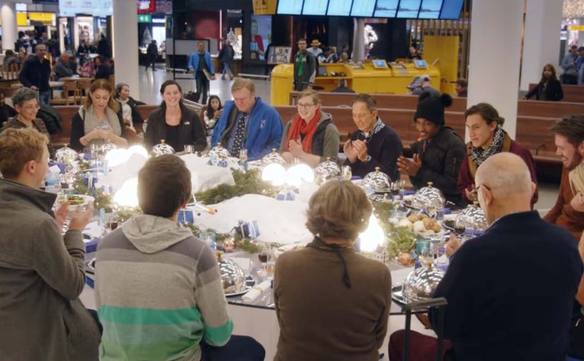
Now in their latest campaign targeting Toronto to Las Vegas bound WestJet guests, they got Las Vegas comedian Carrot Top to offer guests a special walk down the red or blue carpet. Those who chose to walk down the red carpet continued on their vacation as they had originally planned. Those who chose the blue carpet went with Carrot Top on an action-filled experience that included a stunning acrobatic display, a world-class DJ, a private airplane hangar, showgirls, and VIP access to the best of the city.

A choice mechanic that turns boarding into a story

The mechanism is a fork in the road with immediate consequences. Here, the choice mechanic is a designed decision point where one visible choice changes the path and the story. You are offered a simple choice, red or blue, with no time to overthink it. The red path is “normal”. The blue path is “something is happening”, and the reveal escalates quickly once the choice is made.

In travel and service brands, surprise upgrades work best when they are structured as a clear decision point that people can instantly explain to someone else.

Why it lands

This works because it gives guests a feeling of control while still delivering surprise. That mechanism works because a visible fork creates ownership before the surprise arrives, which makes the payoff feel earned rather than random. The blue carpet is not a random selection. It is a self-chosen leap into the unknown, which makes the outcome feel more personal and more shareable. The red carpet also matters, because it preserves contrast and keeps the twist believable.

Extractable takeaway: If you want a surprise to travel, wrap it in a simple choice. Choice creates ownership, and ownership turns a brand moment into a story people repeat accurately.

The business intent behind the spectacle

This is a loyalty play disguised as entertainment. It reinforces the idea that flying can include delight, not just transport. It also creates a strong piece of proof that WestJet treats guests as people, which is the kind of narrative that outperforms feature lists in crowded travel categories.

The real question is whether a service brand can turn a routine travel moment into a story guests want to retell.

What travel brands can steal from this

  • Use a binary choice: two paths create instant tension and clear storytelling.
  • Reward curiosity: let the “brave” option unlock the best outcome, then show why.
  • Escalate fast: once the choice is made, deliver the first payoff immediately to lock attention.
  • Make it filmable: design reveals that work from a handheld camera in real environments.
  • Anchor to a destination truth: Las Vegas is already a promise of spectacle. The upgrade simply makes that promise feel real early.

A few fast answers before you act

What is the WestJet “Ultimate Las Vegas Upgrade”?

It is a surprise experience for Toronto to Las Vegas travelers where guests choose a red or blue carpet. Red continues as normal. Blue triggers a curated VIP Las Vegas experience led by Carrot Top.

Why use a red vs blue choice?

Because it is instantly understandable, it creates viewer control, and it gives the story a clean structure with contrast between normal and extraordinary.

What makes this effective airline marketing?

It makes service tangible. Instead of claiming “we care”, the brand demonstrates it through a memorable experience that guests can share and retell.

What is the reusable pattern for other brands?

Create a simple decision point in a real customer journey, then attach an escalating surprise to one path so customers feel they opted into the moment.

What is the biggest risk with this format?

If the reveal feels confusing or staged, the audience disengages. The choice must feel real, the payoff must feel earned, and the execution must respect guest comfort.