Honda – The Other Side

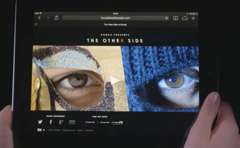
Car brands are always trying to show that their cars have different sides to their personalities, sporty vs reliable, safe vs cool, etc. What makes Honda’s latest effort unique is its YouTube video. By simply holding down the “R” key on the keyboard, the viewer can instantly switch between two different videos.

To execute this innovation, Wieden & Kennedy London had to create two storylines, one of an easygoing Dad doing the school run and the second as an undercover cop posing as a getaway driver. Both of which were then expertly mirrored with contrasting style and tone. The interactive experience was then put together by Stinkdigital at Honda’s YouTube Channel.

Why the mechanic matters more than the novelty

The “hold R to switch” idea is a simple interaction mechanic, meaning the viewer action changes how the story is revealed, but it changes how you watch. You are not just viewing a story. You are actively comparing two versions of the same moment, in real time.

Extractable takeaway: When a brand claim depends on contrast, the strongest format is often one that lets the audience trigger the comparison for themselves.

The real question is whether the interaction makes the brand point clearer, not whether the tech looks clever.

  • One scene, two meanings. The mirrored structure makes contrast instantly legible.
  • Viewer control. You control the cut, which increases attention and repeat viewing.
  • Storytelling as product proof. Different “sides” of a car become a narrative device, not a claim.

Execution discipline: mirrored scenes, opposite tone

This only worked because the two storylines were designed to align. Timing, framing, and beats had to match so the switch felt seamless, not like two unrelated edits.

The payoff is that contrast becomes the hero. Calm family routine vs high-pressure escape. The same underlying vehicle context. Two different emotional reads.

In digital brand storytelling, interactive mechanics only earn their place when they make the positioning easier to grasp, not harder.

The business intent is clear: turn Honda’s “different sides” message into a felt comparison, so the format demonstrates the proposition instead of leaving copy to explain it.

What to take from this if you build interactive brand content

  1. Make the interaction explain itself. If the mechanic needs instructions, you lose momentum.
  2. Design for replay. The best interactive films reward going back and re-watching with intent.
  3. Let structure carry the message. When the format proves the point, you do not need heavy-handed copy.
  4. Keep the tech invisible. Viewers remember the feeling of control and contrast, not the implementation details.

A few fast answers before you act

What is Honda “The Other Side”?

It is an interactive film experience where viewers can switch between two parallel storylines by holding down the “R” key.

What are the two storylines?

One follows an easygoing Dad doing the school run. The other follows an undercover cop posing as a getaway driver, with both narratives mirrored scene-by-scene.

Why is the “hold R to switch” mechanic effective?

It gives the viewer control and makes the contrast immediate. That active comparison increases attention, engagement, and replays.

Who created the work?

Wieden & Kennedy London created the two mirrored storylines, and Stinkdigital put the interactive experience together on Honda’s YouTube Channel.

What is the transferable lesson for digital teams?

If you can express your message through an interaction that is instantly understandable, the format itself becomes the persuasion.

Cheetos Mix-Ups: Cheetahpult Dual-Screen Game

In March I had written about how Google had inspired developers to convert mobile phones and tablets into remote controls for desktop browsers via a simple mobile URL. Now Cheetos, an American brand of cheese-flavored puffed cornmeal snacks, has successfully tapped this technology to engage with viewers as they watch a regular TV commercial on YouTube.

Viewers watching the Cheetos Mix-Ups ad on YouTube get a dual-screen experience. They can fling the new Cheetos Mix-Ups snacks from their phone into a video playing on their desktop. The campaign creates a new way to engage with the ad, and to get to know the product’s new shapes and colors through play.

At this point, the video is reported to have reached 8.5 million views on YouTube. People who played the game are reported to have stayed for an average of 7 minutes and 17 seconds, and flung an average of 56 Cheetos per game.

A YouTube ad that behaves like a game

The trick is simple and surprisingly scalable. Your desktop stays on YouTube, playing the film. Your phone becomes the controller via a lightweight URL experience, so interaction happens in your hand while the “world” of the ad stays on the big screen.

How the dual-screen catapult works

Instead of treating the mobile device as a companion banner, the experience treats it as an input device. You aim, fling, and see the result immediately in the desktop video frame, which turns passive viewing into a loop of action, feedback, and repeat.

In global FMCG launches, second-screen interactivity works best when it turns product attributes into gameplay, and makes “learning the product” feel like time well spent.

Why this lands while people are “just watching YouTube”

It hijacks a familiar behavior. People already watch ads on desktop while their phone is in hand. Cheetahpult converts that split attention into viewer control, and uses physics and repetition to teach what Mix-Ups actually is, in a way a standard product shot cannot. The real question is whether the interaction helps people understand Mix-Ups faster than a normal product shot would. In this case, it does, because the mechanic turns product variety into something people learn by doing.

Extractable takeaway: If your product is hard to describe in one sentence, let people handle it. Build a micro-game where the mechanic is the product benefit, and the reward is comprehension.

What Cheetos is really buying here

This is product education disguised as entertainment. The intent is to turn a new SKU with multiple shapes and flavors into something memorable, then associate that memory with the brand, so the next shelf moment feels familiar.

What Cheetos teaches about interactive video

  • Design for the device people already hold. Dual-screen works when the phone is the controller, not an afterthought.
  • Make the mechanic teach the product. If the game can be reskinned for any brand, it is not specific enough.
  • Keep the loop short and replayable. Fast rounds create “just one more try” behavior, which is where learning happens.
  • Use the main video as the stage. The desktop frame should feel like the real world, and the phone should feel like the tool.

A few fast answers before you act

What is Cheetahpult?

Cheetahpult is a dual-screen YouTube experience that turns a Cheetos Mix-Ups video into a simple physics-style game, with the phone acting as the controller and the desktop video acting as the playfield.

Why does second-screen interaction help an ad?

It converts passive reach into active time. When people interact, they process product details more deeply, and the ad becomes something they did, not just something they saw.

What makes this different from a typical “interactive ad”?

The interaction is not layered on top as buttons. The phone becomes a controller, and the main video becomes the environment, so the ad and the game feel like one system.

When should a brand use this pattern?

When a launch needs fast product education, and when the product has attributes that benefit from repetition, variation, and play, like shapes, combinations, flavors, or configurations.

What should a brand avoid when copying this idea?

Avoid mechanics that are fun but unrelated to the product. If the interaction does not teach something specific about the item being launched, the brand gets playtime but not product understanding.

Video Campaigns: When the Player Is Message

Two videos that did not just play, they proved the point

Video innovation rarely comes from “better footage”. It comes from changing how the viewer experiences the message. These two campaigns are clean examples of that approach.

In the last week or so I came across two campaigns that used video to innovatively deliver their message.

Volkswagen Hidden Frame – using the YouTube play bar as the story

The Volkswagen Side Assist feature helps drivers avoid accidents by showing other vehicles when they are in the side mirror’s blind spot.

To drive home the message, AlmapBBDO developed a film that used YouTube’s play bar to show the difference the VW Side Assist made in people’s lives.

No Means No – a player that interrupts denial

Amnesty Norway, in an attempt to change the Norwegian law on sexual assault and rape, developed a film that used a custom video player to pop up the key message.

The campaign was a success and the law was about to change as a direct consequence of the campaign.

Why interface-led video lands harder

Both ideas shift the viewer from passive watching to active noticing. By “interface-led” I mean the player UI, like the progress bar, overlays, or controls, doing storytelling work, not just housing the film.

Extractable takeaway: If the interface carries part of the argument, the viewer is forced to notice the point during playback, which reduces message loss.

The real question is whether your player can carry the argument when attention collapses.

Volkswagen used a familiar interface to make a safety benefit visible in the moment. Amnesty used an interface interruption to force the key message to be seen, not skipped. In both cases, the “player” stopped being furniture and became the persuasion device.

In global consumer brands and publisher-style marketing teams, interface constraints often determine what gets noticed and what gets ignored.

What these campaigns were really trying to achieve

The business intent was not “engagement” as a vanity metric. It was message delivery with minimal loss.

Volkswagen aimed to make an invisible feature feel tangible and memorable. Amnesty aimed to change perception and behavior at the cultural level, and the player design reinforced that urgency by refusing to be background noise.

Player-hacking patterns to copy

Here, “player-hacking” means designing the video controls and UI as part of the message, not just the wrapper.

  • Use the interface as evidence. When the message is hard to show, let the UI demonstrate it.
  • Design for the skip reflex. If your message is often ignored, build an experience that makes ignoring harder.
  • Keep viewer control intentional. Interactivity works when it serves comprehension, not novelty.
  • Make the “point” happen inside the viewing moment. Do not rely on a voiceover claim when the experience can prove it.

A few fast answers before you act

What is an “interface-led” video campaign?

An interface-led video campaign is one where the player experience, like the progress bar, overlays, or controls, is part of the storytelling, not just the container.

How did Volkswagen Hidden Frame use YouTube differently?

It used YouTube’s play bar as a narrative device to demonstrate the value of Side Assist, making the benefit feel visible rather than described.

What did Amnesty Norway’s No Means No change about the player?

It used a custom video player that surfaced the key message via a popup, ensuring the point was encountered during playback.

Why do these ideas work better than a standard film in some cases?

Because they reduce message loss. The viewer is guided to notice the point through the viewing mechanics, not just the content.

What is the practical takeaway for brands?

If your message is often missed, redesign the viewing experience so the message is structurally harder to ignore and easier to understand.