Orange: Instagallery

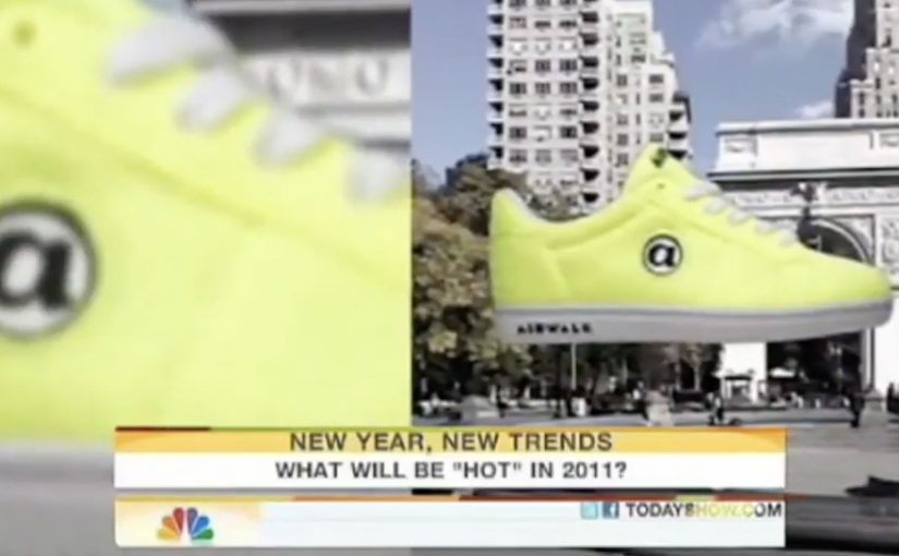
An Instagrammer posts a photo and suddenly sees it displayed as “art” in a gallery setting, complete with strangers commenting on it in real time. That is the hook behind Orange France’s Instagallery. A campaign built to make network speed feel like instant cultural presence.

A gallery built from other people’s feeds

To promote a new high-speed network, Orange works with Cake Paris to target influential Instagram users by pulling their photos into a staged photo exhibition in Los Angeles. The exhibition becomes a physical set for a second move. Capturing the reactions.

The mechanism: personal proof sent back to the source

Orange films people walking through the gallery and making awkward, unfiltered comments on the displayed photos. Those short films are then sent directly to the original Instagrammers, who share the clips with followers. The sharing loop creates buzz for Orange France without buying classic reach in the same way a traditional launch campaign would.

In European telecom marketing, speed messaging becomes more believable when it is demonstrated as immediacy inside a social platform people already use daily.

Why this lands

It works because it is personal before it is promotional. The influencer is not asked to “post an ad”. They receive a surprising artifact starring their own content, with a built-in narrative their audience wants to watch. The physical gallery in Los Angeles adds a scale cue, and the awkward commentary makes the clip feel real rather than polished brand content.

Extractable takeaway: If you need influencers to spread the message, give them a shareable object that is already about them, and let the brand benefit ride inside the story instead of sitting on top of it.

What Orange is really buying

The real question is how to make a technical speed claim travel through social sharing without feeling like a telecom ad.

This is less an Instagram stunt and more a distribution design. By distribution design, this means structuring the idea so the creator’s reason to share also becomes the brand’s route to reach. Orange turns “network speed” into a reason for participation, then uses personalization to lower friction. The brand benefit is present, but it is not the main character. The creator is.

What to borrow from Instagallery

  • Start with the creator’s ego, not your slogan. Make the shareable asset feel like a reward for them.
  • Move digital into a physical set. A real-world installation creates legitimacy and better footage.
  • Build a loop, not a one-off post. Content goes from user, to brand, back to user, then out to audience.
  • Make the reveal fast. The audience should understand “why this exists” in the first seconds.

A few fast answers before you act

What is Orange’s Instagallery?

It’s a campaign that turns selected Instagram photos into a staged gallery exhibition, then sends creators short reaction films they can share to drive buzz for Orange France.

Why build a gallery in Los Angeles for a French telecom brand?

A distant, recognisable cultural setting amplifies perceived scale and surprise. It makes the creator’s photo feel like it “travels” instantly and matters beyond their feed.

How does the influencer loop work here?

Creators post normally, the brand repackages their content into an event and a film, and the creator then shares the film because it features them, not because they were handed a script.

What are the main risks with this pattern?

Rights and permissions for using user photos, avoiding a “creepy” feeling, and ensuring the brand role stays clear enough that the message does not get lost behind the stunt.

How can a non-telecom brand adapt this?

Create a “real-world upgrade” of customer-created content, capture authentic reactions, and return a ready-to-share edit to the creator so distribution feels like self-expression.

Airwalk: The Invisible Pop-Up Store

GoldRun and Young & Rubicam have created what is billed as the world’s first invisible pop-up store. Here, “invisible” means the storefront is an AR layer that only appears on a phone at specific GPS coordinates.

Sneakerheads and skaters visit the virtual store at Washington Square Park in NYC and Venice Beach in LA. You show up, look through the phone, and the drop reveals itself.

A pop-up you cannot see until you are there

The mechanism is a location-based AR layer. The product is GPS-linked to specific places, so access is earned by presence, not by refreshing a webshop.

Instead of browsing shelves, people “capture” the virtual sneaker in the app and unlock a purchase path. The retail action is still commerce, but the pre-commerce moment is play.

In youth culture launches where scarcity and scene credibility matter, location-based drops create stronger heat than broad e-commerce blasts.

Why this lands with sneaker culture

This is not just novelty AR. It taps into three instincts that already exist in sneaker communities:

Extractable takeaway: When scarcity is the story, make the constraint experiential (where, when, who) so fans can earn access and retell the effort.

  • Scarcity: limited runs feel meaningful when access is constrained.
  • Proof of effort: being there becomes part of the story and the status.
  • Social retell: the experience is easy to describe and easy to show.

The “invisible store” framing also upgrades the idea from a promo to a cultural moment. It makes the drop feel like an event that happened, not a product that launched.

The business intent under the stunt

Airwalk gets a high-impact relaunch without paying for traditional retail real estate. The brand borrows the authenticity of parks and beaches, then turns those places into distribution.

The real question is whether you can make showing up part of the product value, not just the marketing.

That matters because it makes the product and the environment inseparable. The sneaker is not simply “for” skaters and surfers. It appears where they actually are.

Launch moves from geo-locked pop-ups

  • Make access physical, even if the product is bought digitally.
  • Turn scarcity into a mechanic, not a banner headline.
  • Design a one-sentence retell, for example “the store only exists at two spots.”
  • Pick locations that already signal the brand, so the setting does some of the messaging work.

A few fast answers before you act

What is an “invisible pop-up store” in practical terms?

It is a temporary retail experience that exists only through a phone interface at specific real-world coordinates. No physical store build is required.

What is the core mechanic that drives participation?

Geo-fenced discovery. People must travel to a location to reveal the product, then complete an action in-app to unlock purchase.

Why not just sell the shoes online normally?

Because the launch is the marketing. Turning purchase access into a hunt creates earned attention, social proof, and a stronger sense of drop culture than a standard checkout flow.

What are the biggest risks with this approach?

Friction and disappointment. If the experience is hard to access, unstable on devices, or feels unfair due to distance, enthusiasm flips quickly.

What should a brand measure to know if it worked?

Location visits, completion rate from “found” to purchase, time-to-sell-out, and the volume and quality of organic sharing that shows people proving they were there.

Samsung: Unleash Your Fingers

For the launch of the Galaxy S II in France, Samsung brought JayFunk, the internet finger tutting phenomenon, from Los Angeles to Paris to deliver an incredible and surprising choreography.

When “touch” becomes performance

Finger tutting is a style of dance where intricate shapes and geometric figures are created using hands and arms. Samsung frames that craft as the purest expression of what a touch device asks of you. Your fingers become the headline.

The mechanic is the metaphor

The film does one clear thing. It takes a niche skill. It stages it like a reveal. It lets the choreography do the talking, then uses visual treatment to make the hands feel almost “interface-like”. The message is implicit. This is a phone built for what your fingers can do.

In consumer electronics launches, the fastest route to preference is often a single metaphor that makes a feature feel obvious without listing specifications.

Why it lands

This works because it respects attention. There is no explanation tax, no product demo checklist, and no forced storyline. It is a short, repeatable spectacle that makes “touch” feel expressive, not functional. Because the performance externalizes touch as a visible skill, the product promise becomes intuitive before the viewer processes a single specification. Samsung’s own newsroom later described the video as quickly climbing viral charts and reaching millions of views at the time, which fits the format. It is built to be replayed and forwarded.

Extractable takeaway: When your product benefit is hard to visualize, borrow a human craft that embodies it, then let the craft carry the proof while the brand stays in the background.

What Samsung is really signalling

The brand is not only selling a handset. It is staking a position in culture. Touchscreens are not just input. They are a playground. Casting a specialist performer signals modernity, precision, and mastery, all without ever saying those words.

The real question is how to make touch feel culturally meaningful before anyone asks about specifications.

What launch teams can take from this

  • Lead with a single, watchable skill. Spectacle beats explanation when the benefit is sensory.
  • Make the metaphor tight. Fingers, touch, gestures. Everything points to one idea.
  • Keep product presence restrained. Let the audience connect the dots. It feels smarter and travels better.
  • Design for replay. Short, surprising sequences outperform long narratives for launch buzz.
  • Use culture as targeting. A niche community can become your amplification engine if you treat it with respect.

A few fast answers before you act

What is the main idea behind “Unleash Your Fingers”?

Turn touch interaction into a cultural performance, so the phone’s core benefit is felt rather than explained.

Why use finger tutting instead of a normal product demo?

Because it externalizes “dexterity on glass” in a way people can immediately understand and want to share.

What should a brand be careful about with a performance-led launch film?

Do not let the performance become disconnected from the product. The metaphor must stay legible, and the brand role must feel earned.

How could a non-tech brand apply the same approach?

Pick a human craft that embodies your promise, then film it so the craft proves the point without heavy narration or feature lists.

What is a practical success metric for work like this?

Beyond views, look for lift in branded search, share rate, completion rate, and recall of the single idea the film is built around.