
McDonald’s: Dollar Drink Days Ice Sculpture

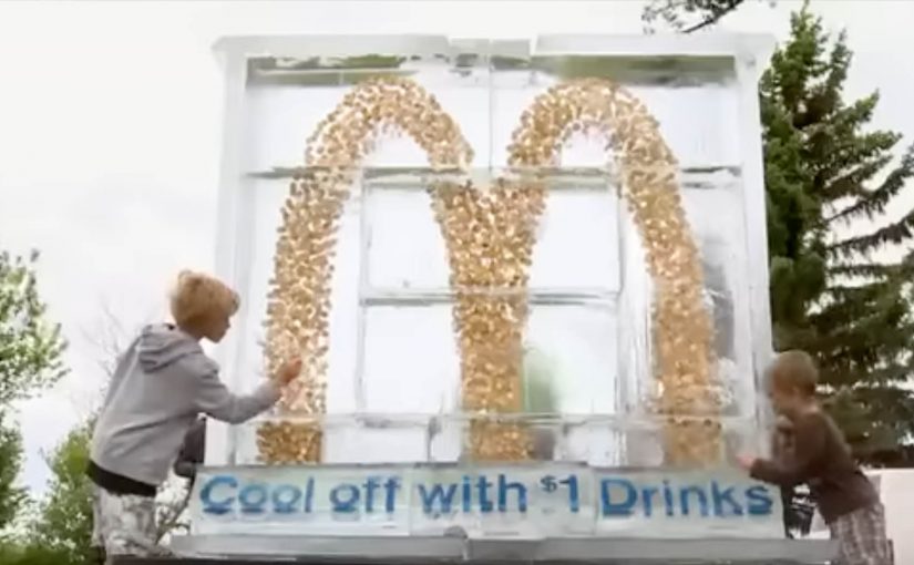
McDonald’s Canada and Cossette Vancouver brought to life one of the first interactive ice sculptures this summer on behalf of McDonald’s Restaurants in Alberta. The objective was to drive consumer interest in the company’s Dollar Drink Days campaign. Here, “interactive” means people can physically engage with the installation and change it in real time.

Hosted in the town of Sylvan Lake, the stunt saw 8,000 pounds of ice moulded into a seven-foot tall installation containing over 4,000 sparkling loonies, shaped into McDonald’s famous Golden Arches. The ice melted on a summer Saturday, and consumers chipped away at the sculpture to collect their bounty.

To attract high levels of interaction, the sculpture was strategically placed near the Sylvan Lake Pier, an area frequented by young adults and families. The day also featured a DJ, street promotional teams, hula hooping, limbo contests and giveaways.

In quick-service promotions, especially in seasonal, high-footfall leisure locations, the hard part is converting “cheap” into “must-see”.

The real question is how you turn a simple price offer into a moment people choose to chase.

Price promotions are forgettable until you give people a physical action that earns a visible payoff.

Why this activation pulls people in

The reward is visible and the deadline is unavoidable. Because the coins sit inside melting ice, the mechanism turns curiosity into action and keeps people moving from watching to participating.

Extractable takeaway: If you want a price promo to travel, make the payoff visible, put it behind one simple action, and bake in a deadline people can feel.

  • A clear, physical payoff. The value is visible and tangible, and the “win” is earned through participation.
  • Built-in urgency. Melting ice creates a natural time limit, which pushes people to act now rather than “later”.
  • Placement does the heavy lifting. Putting it at a high-traffic summer spot turns curiosity into crowds.

Reusing the melting-deadline mechanic

This is a strong example of turning a price promotion into a real-world spectacle. Instead of telling people “Dollar Drink Days is on”, the brand created a moment people wanted to be part of, and then made participation the mechanism for reward.

  • Make the payoff obvious. Put the value where people can see it before they commit.
  • Use a deadline that enforces itself. A physical countdown beats a marketing one, because it changes what people do right now.
  • Let the location supply the audience. Choose a place that already has the right crowd, then make the moment easy to join.

A few fast answers before you act

What was the Dollar Drink Days ice sculpture?

It was a seven-foot interactive ice installation in Sylvan Lake, Alberta, shaped like the Golden Arches and packed with thousands of loonies for visitors to collect as it melted.

How did people interact with it?

As the sculpture melted during the day, people physically chipped away at the ice to reach the coins inside.

Why stage it near Sylvan Lake Pier?

The location is naturally busy with young adults and families in summer, which increases footfall and keeps participation high.

What is the core pattern worth reusing?

Give people one simple action that unlocks a tangible reward. Add a natural deadline, and stage it where the right crowd already gathers.
McDonald’s: Pick N’ Play Billboard Game

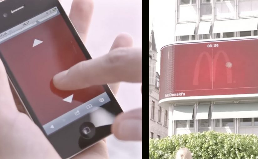
You are walking through central Stockholm and a McDonald’s billboard does something unusual. It invites you to play a quick Pong-style challenge on the screen, using your own phone as the controller.

DDB Stockholm has created another interactive outdoor campaign for McDonald’s Sweden called Pick N’ Play. Passers-by use their mobile phones as controllers to play for a chosen McDonald’s treat. If they last for more than 30 seconds, they score a coupon that earns them free fast food at a nearby McDonald’s.

Reportedly, the interaction avoids an app download and instead uses a simple mobile web flow, with proximity checks (via phone location) so only people physically near the screen can play.

Why this one pulls a crowd

The mechanic is instantly legible. Most people recognize Pong in a split second, which lowers hesitation and increases participation. The billboard also creates a public spectacle, which adds social proof and makes stopping feel normal, not awkward.

Extractable takeaway: This is rewarded interactivity, meaning the payoff is gated behind sustained attention instead of a tap. In outdoor, that simple “earn it” rule turns a public glance into a deliberate, measurable action.

What McDonald’s is really buying

The prize is not the point. The real value is a measurable bridge from street attention to store visit. A time-based win condition filters for people who are actually willing to pause, focus, and then act, which makes the coupon a higher-signal trigger than a generic discount blast.

The real question is whether your DOOH idea can turn a public moment into a private, trackable action without adding friction.

In global consumer brands and retail environments, interactive digital out-of-home earns its keep when it connects a public moment of attention to a private, trackable action on a personal device.

Steal these moves for your next DOOH game

  • Use a mechanic people already know. Familiar rules beat clever rules in outdoor contexts.
  • Make the phone the interface. It turns a billboard into a controllable experience and a trackable session.
  • Reward endurance, not clicks. Time-in-game is a simple proxy for real attention.
  • Close the loop fast. A coupon that can be redeemed nearby turns novelty into footfall.

Last year they had challenged pedestrians to take pictures of McDonald’s food to get it for free.


A few fast answers before you act

What makes an interactive billboard work in practice?

An interactive billboard works when the invite is understood in seconds and the first action feels effortless on a phone.

Do you need an app to control a billboard with a phone?

No. Campaigns like this are often built as mobile web experiences so participation is immediate and friction stays low.

How do you stop people from playing remotely?

By verifying proximity. A common approach is using phone location to confirm the player is physically near the screen before the session starts.

Why use a 30-second target?

It is long enough to prove engagement, short enough to feel achievable, and simple enough to explain with one line of copy.

What is the business upside versus a normal coupon?

You get a higher-intent audience. The coupon is earned through attention and action, which tends to correlate with stronger redemption and store visitation.

Miami Ad School: Three Student Concepts

Three student concepts that show their thinking in one move

This year Miami Ad School has produced a run of strong conceptual projects from current students. Here are three that stand out because each one has a clear mechanic and a crisp “why this brand” fit. Here, the mechanic means the one user action and system response that make the concept work.

What makes these concepts travel

Each idea takes a familiar behavior. Choosing food, correcting spelling, inviting friends. Then it adds a single interaction rule that turns the behavior into a branded moment. It is not “advertising about a thing”. It is an experience that demonstrates the thing.

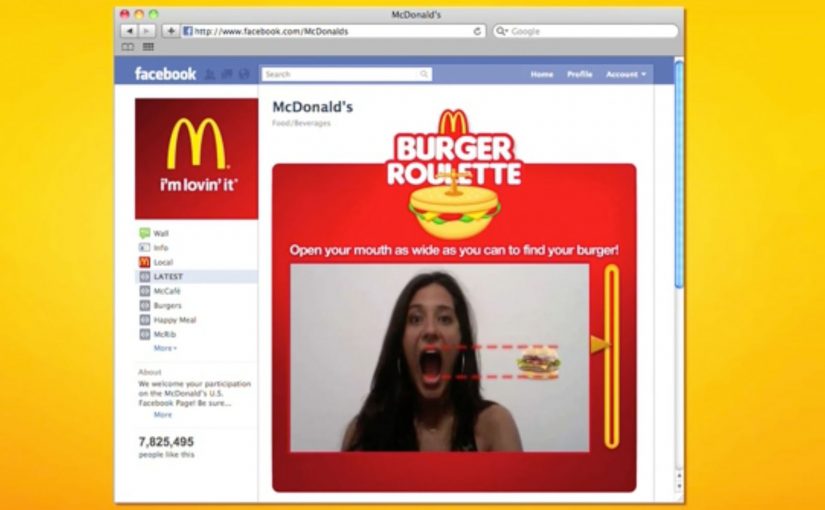
McDonald’s Burger Roulette App

This student concept is designed as a Facebook app that helps you find the “perfect” McDonald’s burger for your mouth. The premise is playful decision support. You answer a few prompts, the system narrows your choice, and the brand becomes the helpful guide instead of a menu you skim and forget.

UNICEF Donate A Word

This student concept proposes a new way to donate for child education by using the spelling feature inside Google Chrome. When a misspelled word is flagged, the prompt becomes a donation trigger, turning a small everyday friction into a small everyday contribution.

In portfolio-driven creative education, concepts like these matter because they show whether a student can turn brand strategy into a usable interaction, not just a line of copy.

Heineken Invite

This student concept uses a social-media-connected bottle opener that invites friends over for a beer. The social mechanic is competitive. Whoever has the most friends attending earns a free case of Heineken, turning “opening a beer” into an invitation ritual and a reason to gather.

Why it lands

All three ideas share the same advantage. They make the brand useful inside a moment people already have, rather than interrupting people to talk about the brand. The mechanic is the message, and the interaction is simple enough that you can explain it in one sentence without killing the effect. That works because a visible rule lets people grasp the idea instantly and connect the payoff to the brand.

Extractable takeaway: Build concepts around one native behavior and one immediate response. If the “rule” is explainable in a sentence and demonstrable in a clip, the idea will be remembered, and repeated.

The real question is whether the interaction makes the brand promise visible without extra explanation. The strongest student concepts are the ones where the interaction itself carries the branding work.

What brand builders can take from these student concepts

  • One behavior, one rule. Keep the mechanic tight. Complexity kills concept believability.
  • Make the brand the enabler. The best student concepts position the brand as the thing that makes the moment better, not the logo that arrives at the end.
  • Design for quick demonstration. If you cannot show it in 10 seconds, it will not spread beyond the pitch.
  • Payoff matters. Personal recommendation, effortless giving, or a social reward. The user needs a reason to do the action.

A few fast answers before you act

What is the common pattern across these three concepts?

Each turns a familiar action into a branded interaction rule with an immediate payoff, making the experience feel like proof rather than promotion.

Why are student concepts often framed around apps or gadgets?

Because interfaces make mechanics visible. You can show input, response, and reward quickly, which makes the idea easy to understand and easy to share.

What makes a concept like “Donate a Word” compelling?

It piggybacks on an existing habit and converts a tiny, repeated behavior into a tiny, repeated donation moment, which feels effortless and scalable.

What is the main risk when brands try to build ideas like this for real?

Friction. If the mechanic is not instant and obvious, people will not complete it in the real world, even if it looks great in a concept film.

What’s the single best takeaway for marketers reviewing student work?

Look for concepts where the mechanic expresses the brand promise without extra explanation. If the interaction itself makes the point, the idea is strong.