Deutsche Telekom: Hologram Christmas Surprise

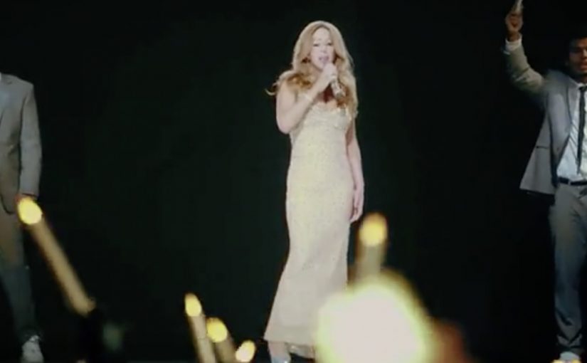
Deutsche Telekom stages a multi-city, multi-media Christmas surprise where people across five countries believe they are seeing Mariah Carey perform live, right in their city square.

The event is described as unfolding simultaneously in Germany, Croatia, Macedonia, Montenegro, and Poland. After roughly 10 minutes, the hologram “breaks” into the sky to reveal the surprise, then reforms to lead the connected crowds through “Silent Night”, finishing with “All I Want for Christmas Is You”.

How the spectacle is engineered

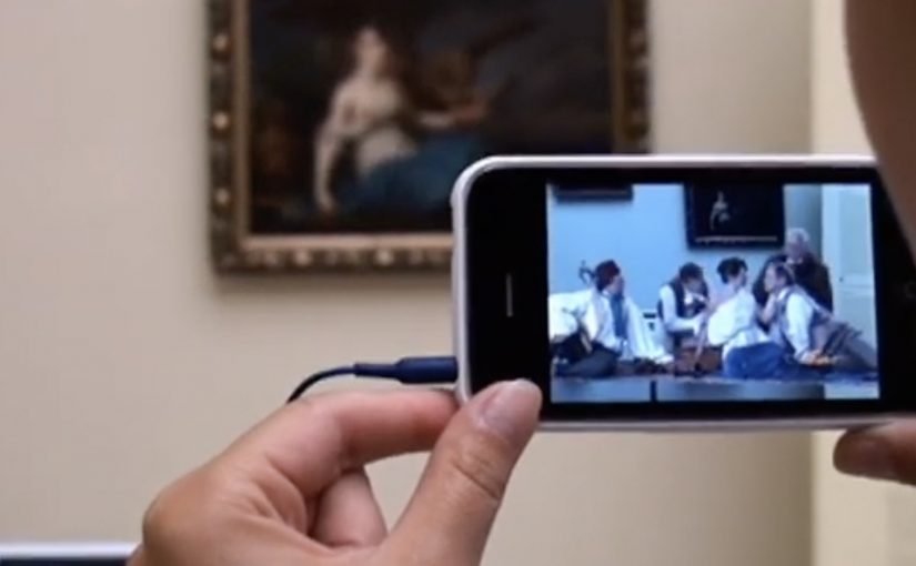
Mechanically, each city is linked live to the others, enabling interaction across locations while the performance plays out on large-scale public screens. Attendees are also given a QR code that takes them to a smartphone experience featuring a candle flame, turning the crowd into a coordinated visual.

In European telecom brand marketing, making the network feel like a shared human experience is a reliable way to give an invisible service a visible emotional payoff.

Why it lands as more than “a stunt”

This works because the surprise is collective, not individual. People do not just watch content. They witness their city being connected to other cities in real time, and that connection is the product truth Deutsche Telekom wants remembered. Because the cities are live-linked, the audience experiences “connection” as something happening to them, which makes the brand promise feel credible. The real question is whether your experience lets people feel the benefit in the moment, not just understand it in hindsight. If your brand sells connectivity, a shared public ritual beats a standalone content drop.

Extractable takeaway: When the benefit is intangible, engineer a shared moment that makes the benefit felt, then let the crowd carry the story.

What the numbers are really doing

The piece is framed with scale metrics. Attendance is described as 12,000 people in total, with an additional 27,000 watching via a live internet stream on lifeisforsharing.tv. Treated as reported figures, the strategic point is clear: the “in person” crowd creates authenticity, and the stream extends reach without losing the feeling of simultaneity.

Stealable patterns for cross-market surprise

  • Build one shared ritual. A carol everyone recognises becomes the simplest multi-language participation layer.
  • Make the reveal part of the story arc. Belief, disruption, then a coordinated finale gives the audience a plot to retell.
  • Link physical and mobile. A QR-driven phone element can turn a crowd into a synchronised visual without complicated instruction.
  • Design for “togetherness at distance”. The emotional payoff comes from knowing other cities are experiencing the same moment at the same time.

A few fast answers before you act

What is the “Hologram Christmas Surprise” in one line?

A simultaneous, five-country public concert that uses a Mariah Carey hologram and live city-to-city links to create a shared Christmas moment at scale.

What is the core mechanism that makes it feel real?

Live-linked public screens across cities, plus on-stage interaction cues and crowd participation elements that play out in real time.

Why add the QR code candle experience?

It gives the crowd a simple coordinated action, visually reinforcing the “connected” theme and making the audience part of the show.

How do you keep it from feeling like a pure tech demo?

Lead with a shared ritual and a simple participation layer so the emotion reads first, and the technology disappears into the experience.

What is the most transferable lesson?

If your brand benefit is intangible, engineer a shared public moment that makes the benefit visible, then let people do the storytelling for you.

Sukiennice: Secrets Behind Paintings

The Sukiennice Museum in Krakow is one of the oldest museums in Poland, and it is reopening after a complete renovation. The problem is not the building. The problem is attention. Young people do not automatically find 19th-century Polish art interesting.

Leo Burnett Warsaw gets the challenge to pull this audience back in, and answers it with an integrated campaign anchored by the New Sukiennice augmented reality app.

The mechanic: bring paintings to life with viewer control

The app turns the visit into an interactive layer. Point your phone at selected works and the paintings come alive, revealing their stories through short films and animated moments. Instead of reading a label first, you get pulled into a scene first, then you choose to go deeper. Here, viewer control means visitors choose when to trigger the story and whether to go deeper.

In European museums trying to win younger audiences, lightweight AR can translate static collections into short, shareable stories without rewriting the institution’s identity.

Why it lands: it swaps “art history” for narrative tension

This is not about making the museum more “digital”. It is about making the first minute feel rewarding. Young visitors do not need more information at the start. They need a reason to care. That works because short films give the paintings a hook, and the phone becomes a bridge between a familiar screen habit and an unfamiliar art period.

Extractable takeaway: If the barrier is “this feels irrelevant”, do not lead with education. Lead with story. Give people one fast, emotional moment they can experience, then let curiosity pull them into context and detail.

An integrated campaign that keeps the app from being a lonely download

The real question is how you make a heritage visit feel immediately worth a young person’s time without turning the art into a gimmick.

The app plays the central role, but it does not stand alone. The campaign also uses billboards, social media and e-cards to create buzz and point people toward the experience. The intent is clear. Get young people to show up, then let the AR layer turn “I visited” into “I discovered”.

The buzz generated by the campaign is described as attracting a significant share of Krakow’s population to the museum.

What to steal for your own cultural or heritage activation

  • Start with one irresistible moment: pick a small set of works and make them unforgettable, rather than trying to animate everything.
  • Put the story before the lesson: emotion first, interpretation second.
  • Make it usable on-site: the experience should work in the gallery without long setup or instructions.
  • Design for “showing a friend”: the best museum tech spreads when people can demonstrate it in seconds.
  • Support it with media that explains the payoff: billboards and social should communicate the “why” of the visit, not just the existence of an app.

A few fast answers before you act

What is the New Sukiennice app?

It is an augmented reality museum app designed to bring selected paintings to life and reveal their stories through short film content during a gallery visit.

Why is AR a good fit for 19th-century painting?

Because the barrier is often distance. AR can add narrative entry points and context quickly, helping visitors connect emotionally before they engage intellectually.

What makes this more than a tech demo?

The app is positioned as the core of an integrated campaign. The surrounding billboards, social media and e-cards create the motivation to visit, and the on-site experience delivers the payoff.

What’s the biggest risk with museum AR?

Friction and distraction. If setup is slow, or the experience pulls attention away from the original work instead of back into it, the technology becomes the point and the art loses.

How should a museum measure success here?

Look at youth attendance lift, repeat visits, time spent in targeted rooms, and whether visitors progress from the AR moment into deeper engagement like reading labels, joining tours, or exploring more works.

Mammogram Tags: What a Person Can Miss

A lingerie purchase. A beep at the exit. A message you cannot ignore

A woman buys a bra in a busy H&M store in central Warsaw. She heads for the exit. The security gate beeps, like it does when something is wrong, and everyone turns their head.

Then the twist lands. The “problem” is not theft. It is a special tag added to the purchase, designed to trigger the gate and force a second look at what you are carrying, and what you might be missing.

How it works: a mammogram metaphor built into the store’s own infrastructure

Most women know breast self-examination, and many see it as “good enough”, even if they do it irregularly. The Polish Federation of Cancer Survivors wanted to disrupt that assumption with a simple line. “What a person can miss the machine will find”. The aim was to get more women to sign up for regular mammogram scanning. Here, screening mammography refers to an imaging test designed to detect abnormalities that manual self-examination can miss.

The mechanic explains itself. A shop assistant adds the special tag to a bra purchase. The gate beeps on the way out. The tag copy then connects the feeling of “something is wrong” to the idea of early detection, and provides a fast path to book a mammogram appointment.

In mass retail and FMCG environments, point-of-sale public health activations work best when they use an existing habit and environment cue, then translate it into a single, unavoidable moment of attention.

Why it lands: it turns “I already check” into doubt, without lecturing

This is not a scare poster. It is a physical interruption at the exact moment a woman is already thinking about bras and bodies. Because the beep creates instant relevance and social visibility, the tag message lands as an explanation and next step, not a lecture. This is the kind of retail nudge worth copying because it uses friction to prompt action without shaming the customer.

Extractable takeaway: When you can borrow an existing “something is wrong” cue and attach a single booking step, you can convert attention into action without fear-based messaging.

The intent: change behaviour, not just awareness

The campaign targets a specific behavioural gap. Women believed self-checks were sufficient, so they delayed or skipped mammograms. This activation reframes the choice as a capability gap. humans miss things. machines catch them.

The real question is whether your activation turns a moment of attention into a booked appointment.

The initiative was supported by the Federation of Amazonki, the Ministry of Health and the Oncology Center in Warsaw. H&M hosted the action because it naturally reaches a wide age range, from teenagers to women in their fifties and sixties.

What to steal if you are designing a health nudge in retail

  • Use a familiar signal. The security gate beep already means “pay attention”. You borrow that meaning instantly.
  • Make the explanation self-contained. The tag is the media unit. No staff briefing needed to “sell” it.
  • Choose the moment with maximum relevance. Bra shopping is context. The message becomes harder to dismiss.
  • Design the next step to be frictionless. The tag points to how to book, while motivation is highest.

In the campaign write-up at the time, the team reported 330 tags given away in 2 days, 1,650 unique visitors to the site, and a 10% lift in phone calls versus the pre-action period. It also described a longer tail effect when women later heard similar beeps in other stores.


A few fast answers before you act

What is Mammogram Tags: What a Person Can Miss?

It is a Polish breast cancer screening activation where a special retail tag on a bra purchase triggers a store security gate beep, then explains why mammography can detect what self-checks may miss and how to book screening.

How does the in-store mechanic work?

A shop assistant adds a special tag to the bra purchase. When the customer exits, the security gate beeps. The tag reveals the message and directs the customer to the next step to book a mammogram.

Why use a store security gate as the medium?

The beep is a built-in attention trigger with public visibility. It creates an instant “stop and look” moment that the campaign reframes into a health reminder without needing a lecture.

What behavior change is the campaign trying to create?

It targets the belief that self-examination is “good enough” and nudges women toward regular screening mammography by positioning detection as a machine advantage, not a personal diligence test.

What is the campaign’s key message in plain language?

Humans can miss signs. Imaging can find abnormalities earlier. Do not rely on self-checks alone if screening is available.

What results were reported in the campaign write-up?

The write-up reported 330 special tags distributed in 2 days, 1,650 unique visitors to the site, and a 10% lift in phone calls versus the pre-action period.