Porsche: Interactive Hologram Print Ad

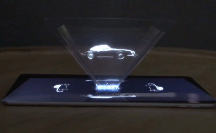
To launch its latest 911, Porsche created a print ad that behaves like a device. Working with agency Cramer-Krasselt, Porsche placed a small acetate sheet into Fast Company’s April issue, turning a magazine spread into a build-it-yourself prism and an interactive “hologram” experience.

The execution ran as a four-page spread inserted into around 50,000 copies, complete with assembly directions. Porsche billed it as the world’s first interactive hologram print ad.

When a magazine page turns into a viewing tool

The mechanic is the whole point. You fold the acetate into a small prism, place it on top of a tablet, then use the screen content to create the floating 3D-style illusion inside the prism. Print does not “show” the car. Print enables the car to appear.

That shift matters. Instead of asking a reader to imagine innovation, the ad makes them assemble it, which turns curiosity into action.

In premium automotive marketing, making print behave like a device is a fast way to earn attention from audiences who think they have seen every format.

Why the prism matters more than the hologram

The hologram effect is a spectacle, but the prism is the message. It signals precision, engineering, and fascination through the act of building. It also gives the reader a reason to keep the insert, show someone else, and replay the experience, which is exactly what print needs when attention is scarce.

What Porsche is really buying

The business intent is to make a high-end model launch feel as advanced as the product story. A conventional print page can carry features and beauty. This format carries a proof point. Porsche can credibly say, “We pushed the medium,” and that halo transfers to “we pushed the car.”

What to steal for your next “impossible in print” idea

  • Make the reader do one small action. Folding beats scanning when you want ritual, not convenience.
  • Let print enable the experience. The page becomes the trigger, not the canvas.
  • Keep the rules idiot-proof. If assembly fails, the entire idea fails.
  • Use scarcity and selectivity. A targeted drop can feel more premium than mass coverage.

A few fast answers before you act

What is an “interactive hologram print ad”?

It is a print ad that includes a physical component, in this case an acetate prism, that turns a tablet screen into a hologram-style viewing effect. The print unit is the enabling tool.

How does the prism create the hologram effect?

The prism reflects and refracts imagery from the screen into a floating illusion. The viewer sees the content “inside” the prism rather than flat on the tablet.

Why put this in a business magazine like Fast Company?

Because the audience expects innovation and is more likely to try a format experiment. It also gives the stunt credibility as “design and tech”, not just “advertising.”

What is the biggest execution risk?

Friction. If instructions are unclear, materials are flimsy, or setup takes too long, people drop the experience before the payoff.

What should you measure for a print-to-device activation?

Completion rate of the build, repeat views, sharing behavior, and brand recall lift versus a standard print placement. The real KPI is whether the mechanic gets retold accurately.

Coca-Cola: FM Magazine Amplifier

Coca-Cola to promote its FM app in Brazil allowed readers of the Capricho magazine to simply roll up the magazine and transform it into a portable amplifier for their iPhones. All the readers had to do was insert the iPhone into the spot indicated and tune into the Coca-Cola FM application. 😎

Why this is clever

The idea turns print into a functional accessory. No electronics. No QR-code dependency. Just smart physical design that rewards curiosity and makes the app the natural next step.

  • One simple action. Roll the magazine, insert the iPhone, hit play.
  • Instant utility. Louder sound is a real, immediate benefit.
  • Media becomes product. The magazine is not only a channel. It is the device.

What to learn from it

This is a strong reminder that “mobile activation” does not always need a screen-first mechanic. When you can create a physical trigger that is obvious and satisfying, you reduce friction and increase shareability. People demonstrate it to others because it is surprising, and because it works.


A few fast answers before you act

What is the Coca-Cola FM Magazine Amplifier?

It is a Capricho magazine execution in Brazil designed to be rolled into a tube that passively amplifies iPhone audio, used to promote the Coca-Cola FM app.

Why does a paper amplifier work at all?

The rolled shape acts like a simple acoustic horn, directing and concentrating the phone’s speaker output so it sounds louder.

What makes this effective as an app promotion?

The app is not advertised as a feature list. It is experienced. The physical utility creates a reason to open the app immediately.

What is the transferable pattern?

Turn media into a usable object, then connect that object to a single, obvious mobile behavior that completes the experience.

AXA: iPhone App for Car Accidents

AXA is Belgium’s first insurance company to launch an iPhone app. Their free application helps and guides you through some basic steps when you have a car accident.

To launch this new app Duval Guillaume Antwerp / Modem from Belgium created an innovative print ad that required your iPhone to complete the message.

Why the print idea is a smart match

The product promise is practical. Help me when I am stressed and do not know what to do next. The launch mirrors that by making the iPhone essential to “finishing” the ad, so the viewer experiences the role of the phone immediately.

  • Device as the missing piece. The iPhone is not just where the app lives. It is how the message becomes complete.
  • Low barrier to understanding. You do one simple action and the concept clicks.
  • Print-to-mobile bridge. The campaign uses print to trigger a mobile behavior, instead of treating print as a dead end.

What to reuse from this approach

If the utility of your app is “guidance in a critical moment”, your launch should demonstrate guidance, not describe it. A small, tangible interaction can do that faster than any list of features.


A few fast answers before you act

What does the AXA Belgium iPhone app do?

It helps guide drivers through basic steps after a car accident, providing practical assistance when they need it most.

What made the print launch ad innovative?

The print execution required the viewer’s iPhone to complete the message, turning the phone into an active part of the ad rather than a separate channel.

Why is this a strong launch mechanic for an insurance app?

It demonstrates the phone’s role as a helper in-the-moment, which aligns directly with the app’s accident-assistance promise.

What is the transferable pattern?

Design a simple physical or media trigger that forces a first interaction with the device. Then let that interaction explain the product in seconds.