Augmented Reality in 2013: when the real world becomes the interface
With smartphones and tablets becoming part of our everyday life, we also see more augmented reality apps mixing the virtual and the real world in 2013. Here are some examples from ARworks that recently caught my eye.
Audi Singapore Showroom app
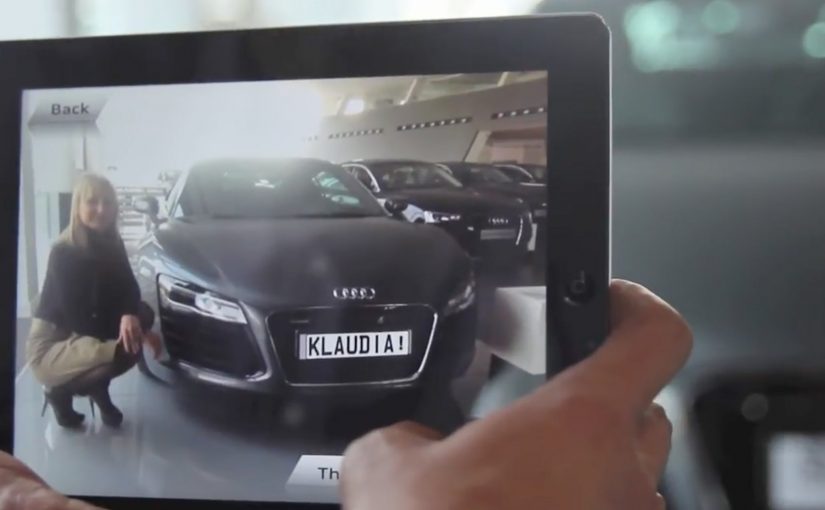
For the opening of their biggest showroom in South-East Asia, Audi created AR experiences that allowed visitors to fly around the showroom building without actually boarding a plane, or drive the Audi R18 race car around Singapore at full speed without the risk of getting a ticket. What’s more, they even allowed visitors to personalize their individual license plates and then take photos with the car.
Dakar race in a shopping mall
A real Dakar desert racecourse was built for the new Opel Mokka on a 4mtrs long table that was placed in a shopping mall. Visitors could use the provided iPads to race against time and each other. The results were then shared on Facebook, and the weekly and overall winners received various prizes.
Christmas Ornament Sling
Deutsche Telekom, for their Christmas promotion, developed an iPad app where visitors could throw virtual Christmas ornaments containing their personal message onto a huge Christmas tree erected in a mall. A successful hit to one of the real ornaments on the tree lit it up through an integrated server application.
The pattern across all three: AR turns “watching” into doing
None of these examples treat AR as a gimmick. Each one uses the device as a bridge between curiosity and action. You explore a building. You race a course. You aim a message at a real tree. The screen stops being a place to consume. It becomes a tool to participate.
In retail and shopper environments, augmented reality works best when it turns a physical setup into a simple, repeatable action loop for the visitor.
The real question is whether your AR layer gives the visitor a simple verb and a payoff worth repeating.
Why retail is the natural habitat for AR
Retail already has the ingredients. Footfall, dwell time, and physical objects that can anchor the experience. AR simply adds a layer of viewer control. The visitor decides where to look, what to try, and what to share. This works because the physical anchor keeps the choice set small, so the device can turn curiosity into a low-friction action with an immediate outcome.
Extractable takeaway: AR earns its keep when the physical setup stays simple and the device turns it into a repeatable action that produces a visible outcome worth sharing.
What’s really being built here
These are not “apps.” They are engagement machines, meaning they turn a physical setup into an interaction loop with a reward and an easy share path. Each one creates a clear reason to interact, a clear reward for completing the action, and a clear path to share or repeat. That is how you turn novelty into behavior.
Four retail-ready AR mechanics to copy
- Anchor it physically. Anchor the experience to a physical object people can gather around. A showroom, a tabletop course, a tree.
- Give the visitor a simple verb. Fly, drive, race, sling. Actions beat features.
- Design a tangible payoff. A photo, a score, a lit ornament. Make the outcome tangible.
- Make sharing a by-product. Make sharing a natural by-product of the activity, not a forced button at the end.
A few fast answers before you act
What makes these 2013 AR examples feel “ready” for real audiences?
They are built around clear actions and clear rewards. The device is used to do something in the physical environment, not just view an overlay.
Which devices are central to these activations?
Tablets and phones are the delivery mechanism. The examples explicitly reference iPads and handheld devices for the AR interaction.
What role does sharing play in these concepts?
Sharing is tied to the activity. Photos with the car, results shared on Facebook, and personal messages sent as virtual ornaments.
What is the common mechanic across the three examples?
The camera-enabled device acts like a controller that links a real-world setup to a virtual experience, giving the viewer control over exploration and interaction.
How do you keep AR from feeling like a gimmick?
Make the overlay serve a real action and a visible outcome. If the visitor can do something concrete and see a result that is worth showing, the experience stops being novelty and starts being behavior.


