
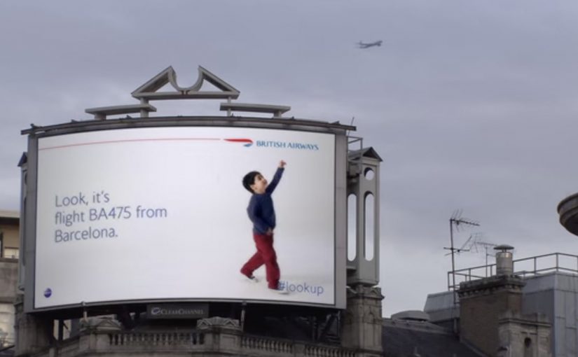
British Airways: #lookup points to planes

Last month, British Airways set up an interactive digital billboard in London’s Piccadilly Circus. It uses custom-built “surveillance technology” to track British Airways flights passing overhead. Here, that means identifying aircraft and matching them to British Airways flights in real time, not tracking individuals on the street.

On detecting a BA flight, the boy in the ad gets up and points to the plane. An accompanying message displays the flight number and the place it is arriving from.

In high-traffic city centres, digital out-of-home works best when it reacts to the environment rather than shouting at it.

Interactive advertisements are getting more popular with brands. In May, a Spanish organization called ANAR used lenticular printing to show different messages to kids and adults in their campaign for anti-child abuse.

How #lookup works (and what “surveillance” means here)

The magic is simple. The screen stays “normal” until the exact moment a British Airways aircraft is in view. Then the creative switches to a scene that makes you do what the boy does. You look up, spot the plane, and connect the brand to the real object above you.

“Surveillance technology” sounds heavier than what’s happening in practice. In this execution, it is reported as hardware and software used to identify aircraft and match them to British Airways flights in real time. The storytelling trigger is the aircraft, not the crowd.

Definition you can reuse: Context-aware DOOH is outdoor creative that changes based on live signals from the environment (location, time, weather, movement, or public data feeds). It works when the signal is instantly understandable and the change earns attention rather than interrupts it.

In European city-centre media buys, context-aware DOOH is one of the few formats that can earn attention without relying on volume.

Why it lands: a micro-surprise that answers a real question

Most outdoor advertising asks for attention first, and only then offers meaning. #lookup flips that order. It gives you meaning first. A child pointing at something real. Then it rewards your curiosity with an answer you cannot get from a static poster. What flight is that, and where has it come from? Because the trigger is a plane you can actually see, the data reveal feels like an answer to curiosity, not an interruption.

Extractable takeaway: If the environment makes people ask a question, your creative should answer it instantly with one human-readable data point that completes the scene.

The real question is how you turn ambient curiosity into a brand-credit moment people choose to share.

This is the rare “brand moment” where the interface and the emotion line up. A real plane prompts real curiosity. The billboard supplies the missing information. The brand gets credited for the experience.

What British Airways is really buying with this idea

At one level, it’s a smart stunt. At a deeper level, it’s a reframing of air travel. Instead of selling price, routes, or amenities, it sells the feeling of possibility and the breadth of the network.

It also turns a passive medium into an earned-media engine. When a billboard reacts to reality, people record it, talk about it, and share it because it feels like “proof,” not persuasion.

How to borrow the #lookup pattern

  • Pick a signal people already notice. Planes, trains, weather shifts, match scores, queue length, local landmarks. The trigger should be obvious without explanation.
  • Make the reaction immediate and legible. If the audience needs to read a paragraph to understand the mechanic, the moment is lost.
  • Answer a question the environment creates. “Where is that going?” is stronger than “buy now.” Build the creative around curiosity.
  • Use data as a storytelling ingredient, not a dashboard. Flight numbers and origins feel human when they complete the scene, not when they look like telemetry.
  • Keep privacy optics clean. If you must use loaded terms like “surveillance,” clarify what is being detected and what is not.

A few fast answers before you act

What makes the British Airways #lookup billboard “interactive”?

It changes its creative in real time based on a live external trigger. A British Airways aircraft passing overhead. That trigger causes the billboard to play a scene and display flight details tied to the specific plane.

Is this the same as QR codes or touchscreens in outdoor ads?

No. QR codes and touchscreens require deliberate user input. #lookup is environment-triggered interaction. The “input” is a real-world event, not a tap.

Why does real-time data improve out-of-home advertising?

Because it turns a static message into a situated experience. When the content matches what is happening around you right now, attention feels earned and the brand feels more relevant.

What’s the simplest way to replicate this pattern without complex engineering?

Use a clean, reliable signal you can access easily (time of day, weather, local transit status) and design one dramatic creative switch that is instantly visible from a distance.

What’s the biggest risk with “reactive” outdoor ads?

Overcomplication. If the trigger is rare, hard to understand, or the creative change is subtle, the concept will not land. Optimise for clarity and frequency of payoff.
MINI: Salutes You in London

In August I wrote about how Coca-Cola Israel used technology to personalise billboards for people who drove by.

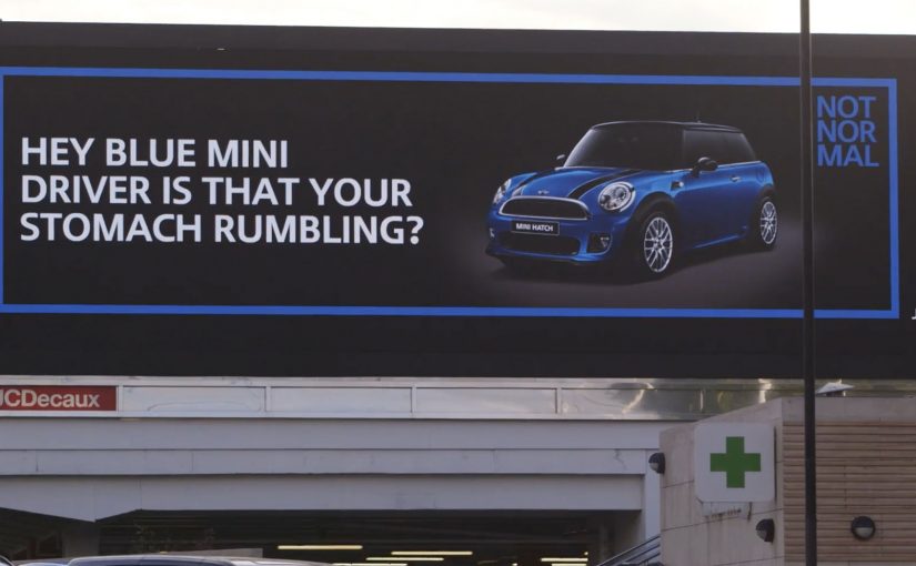
Now, as part of its ongoing Not Normal campaign, MINI decides to give MINI drivers in London a custom message by taking over a run of giant billboards along a fast-paced road for a two-week period. “Not Normal” is the positioning line for celebrating owners over product claims.

Reportedly, the campaign reached out to 1,941 MINI drivers in London during the run.

How the billboards “recognise” drivers

The mechanism is deliberately human. Spotters use iPads to identify approaching MINIs and trigger the right creative. Each message is sent with pictures of the make and model of the MINI it relates to, so the driver sees something that feels directed, not generic.

In urban out-of-home advertising, combining live triggers with personalised creative can make a brand message feel like a service moment, not just media.

A human-triggered approach is the right call on a fast road, because it keeps the moment specific without pretending you have perfect recognition tech.

Why this lands on a road, not in a feed

Most personalised media is private and one-to-one. This flips it into a public setting. The driver gets a direct salute, and everyone else sees a brand that appears to be paying attention to its community in real time. That publicness is the multiplier, because it turns a personal moment into shared talk value, meaning people retell it.

Extractable takeaway: Public personalisation works when the proof cue is instantly legible to bystanders, not just meaningful to the target.

What the campaign is really doing for MINI

The work reinforces the Not Normal positioning by celebrating owners rather than pushing product claims. It also turns “existing drivers” into the hero audience, which is a neat way to build loyalty and social proof at the same time.

The real question is whether the salute feels like a genuine community nod, not a clever stunt.

Transferable moves from MINI Salutes You

  • Use a simple trigger and a clear payoff. Recognition plus a tailored line is enough if the timing is perfect.
  • Keep it brand-native. A salute fits a community brand. A hard sell would break the spell.
  • Make personalisation visibly specific. Showing the make and model is the proof cue that prevents it feeling random.
  • Design for safety and readability. Short messages, high contrast, instant comprehension.

A few fast answers before you act

What is “MINI Salutes You” in one line?

A digital out-of-home activation that displays personalised messages to MINI drivers as they pass selected London billboards.

How are the personalised messages triggered?

Human spotters using iPads identify approaching MINIs and trigger the relevant creative, including make and model visuals.

Why use billboards for personalisation?

Because it makes recognition public. The driver feels noticed, and bystanders see a brand visibly celebrating its community.

What do you need to make this work without advanced tech?

A small set of tightly written messages, clear proof cues (like make and model), and a reliable human trigger that can fire the right creative at the right moment.

What is the main transferable lesson?

If you can time a simple personalised moment perfectly, you do not need complex tech to create a campaign people retell.

Cheetos Mix-Ups: Cheetahpult Dual-Screen Game

In March I had written about how Google had inspired developers to convert mobile phones and tablets into remote controls for desktop browsers via a simple mobile URL. Now Cheetos, an American brand of cheese-flavored puffed cornmeal snacks, has successfully tapped this technology to engage with viewers as they watch a regular TV commercial on YouTube.

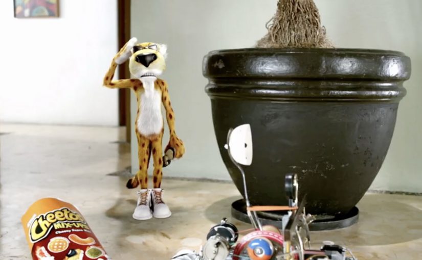
Viewers watching the Cheetos Mix-Ups ad on YouTube get a dual-screen experience. They can fling the new Cheetos Mix-Ups snacks from their phone into a video playing on their desktop. The campaign creates a new way to engage with the ad, and to get to know the product’s new shapes and colors through play.

At this point, the video is reported to have reached 8.5 million views on YouTube. People who played the game are reported to have stayed for an average of 7 minutes and 17 seconds, and flung an average of 56 Cheetos per game.

A YouTube ad that behaves like a game

The trick is simple and surprisingly scalable. Your desktop stays on YouTube, playing the film. Your phone becomes the controller via a lightweight URL experience, so interaction happens in your hand while the “world” of the ad stays on the big screen.

How the dual-screen catapult works

Instead of treating the mobile device as a companion banner, the experience treats it as an input device. You aim, fling, and see the result immediately in the desktop video frame, which turns passive viewing into a loop of action, feedback, and repeat.

In global FMCG launches, second-screen interactivity works best when it turns product attributes into gameplay, and makes “learning the product” feel like time well spent.

Why this lands while people are “just watching YouTube”

It hijacks a familiar behavior. People already watch ads on desktop while their phone is in hand. Cheetahpult converts that split attention into viewer control, and uses physics and repetition to teach what Mix-Ups actually is, in a way a standard product shot cannot. The real question is whether the interaction helps people understand Mix-Ups faster than a normal product shot would. In this case, it does, because the mechanic turns product variety into something people learn by doing.

Extractable takeaway: If your product is hard to describe in one sentence, let people handle it. Build a micro-game where the mechanic is the product benefit, and the reward is comprehension.

What Cheetos is really buying here

This is product education disguised as entertainment. The intent is to turn a new SKU with multiple shapes and flavors into something memorable, then associate that memory with the brand, so the next shelf moment feels familiar.

What Cheetos teaches about interactive video

  • Design for the device people already hold. Dual-screen works when the phone is the controller, not an afterthought.
  • Make the mechanic teach the product. If the game can be reskinned for any brand, it is not specific enough.
  • Keep the loop short and replayable. Fast rounds create “just one more try” behavior, which is where learning happens.
  • Use the main video as the stage. The desktop frame should feel like the real world, and the phone should feel like the tool.

A few fast answers before you act

What is Cheetahpult?

Cheetahpult is a dual-screen YouTube experience that turns a Cheetos Mix-Ups video into a simple physics-style game, with the phone acting as the controller and the desktop video acting as the playfield.

Why does second-screen interaction help an ad?

It converts passive reach into active time. When people interact, they process product details more deeply, and the ad becomes something they did, not just something they saw.

What makes this different from a typical “interactive ad”?

The interaction is not layered on top as buttons. The phone becomes a controller, and the main video becomes the environment, so the ad and the game feel like one system.

When should a brand use this pattern?

When a launch needs fast product education, and when the product has attributes that benefit from repetition, variation, and play, like shapes, combinations, flavors, or configurations.

What should a brand avoid when copying this idea?

Avoid mechanics that are fun but unrelated to the product. If the interaction does not teach something specific about the item being launched, the brand gets playtime but not product understanding.