In mid-2013, Spain’s theatre scene is described as taking a hit when taxes on theatrical shows reportedly rose from 8% to 21%, with audiences thinning out as a result. Teatreneu, an independent comedy theatre in Barcelona, responds with a pricing idea that sounds like a joke until you sit down.
Entrance is free. You only pay when you laugh. Every laugh costs €0.30, capped at €24 for 80 laughs. If the show is not funny, you pay nothing. If it is, you pay for what you consumed.
The mechanism: pricing tied to visible emotion
The model is made possible by fitting each theatre seat with a system that detects smiles during the show and increments the charge. The experience is framed as transparent and immediate. Laugh, the counter moves. Stay straight-faced, the bill stays still.
In European live entertainment, pricing experiments that align payment to perceived value can reset attention fast, because they turn a ticket into a story people want to debate.
Why this lands
This works because it reframes the risk. Instead of “pay up front and hope it’s good,” the audience gets an “only pay if it works” promise. Because the charge only rises when people visibly enjoy the show, the pricing mechanic feels fairer before the first joke lands. The smile-detection counter also adds tension and theatre inside the theatre, because everyone knows their reaction has a price. The result is a show that sells itself through the mechanic as much as through the jokes. The real question is whether performance-linked pricing can turn hesitation into trial without making the experience feel punitive. The stronger idea here is not the sensor but the risk reversal.
Extractable takeaway: If your category suffers from perceived value risk, attach payment to an observable outcome, then cap the downside so people feel safe trying it once.
What the numbers are trying to prove
Reported results claim that the average ticket yield increased by around €6 compared to the prior model, and that attendance rose by about 35% as the concept became widely talked about. Whether or not each figure holds precisely, the intent is clear. Make pricing the headline, and use that attention to refill seats.
What to steal from performance-based pricing
- Make the deal easy to repeat. “Free entry, pay per laugh” is instantly explainable.
- Instrument the experience. The detection system makes the promise measurable, not rhetorical.
- Protect the customer with a cap. A maximum price keeps the mechanic playful rather than punitive.
- Let controversy do distribution. A pricing model people argue about spreads faster than a standard poster campaign.
A few fast answers before you act
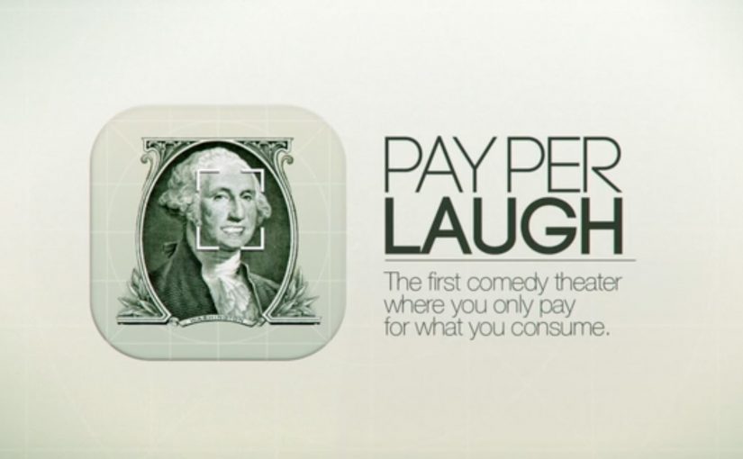
What is “Pay Per Laugh”?
It’s a comedy show pricing model where entry is free and spectators are charged €0.30 per laugh, capped at €24, using smile detection to meter reactions.
How is laughter detected?
The theatre fits seats with a system that detects smiles during the show and counts them toward the final charge.
Why set the cap at €24?
It limits downside and keeps the mechanic in the range of a normal ticket, so the idea feels like a playful wager, not an open-ended penalty.
What problem is this solving?
It addresses audience drop-off and price sensitivity by shifting risk away from the customer and turning ticket pricing into a reason to attend.
What’s the biggest risk with this approach?
Trust and fairness perception. If people doubt the accuracy of detection or feel pressured to suppress laughter, the experience can backfire.