Bogotá gridlock, turned into a cinema you are already sitting in
On an average, commuters in Bogota spend daily 4 hours stuck in traffic. The infernal rush hour traffic jams are the result of unfinished constructions on main avenues, as well as on the rapid transit system, TransMilenio, which has seen work on its expansion come to a halt, due to irregularities in the handling of funds, and corrupt contractors.
So Coca-Cola with ad agency Ogilvy Colombia turned these traffic jams into a drive in cinema. The soda-pop giant launched this ingenious initiative on the eve of their 125th anniversary.
The mechanism: a drive-in cinema without the driving
The idea is as direct as it gets. If people are trapped in cars for hours, give them something worth watching, right there on the route they cannot escape.
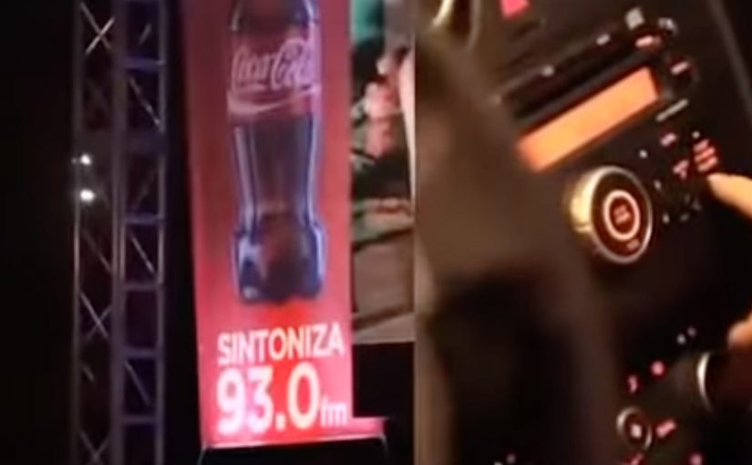
A drive-in cinema activation is a public screening designed for people inside vehicles, typically using a large screen for the picture and a radio frequency so the car stereo carries the audio.
In big-city commuting cultures, attention is already captive.
The smartest brand experiences do not try to fight the context. They use it.
The real question is whether you can turn inevitable waiting into a shared moment people remember, without adding friction.
Why it works: it flips frustration into a shared moment
Traffic jams create the same emotional pattern every day. boredom, irritation, and the feeling that time is being stolen. Rush Hour Cinema interrupts that loop with something communal. Drivers are not just waiting. They are watching the same thing together. Because the screen and radio audio synchronize everyone into the same story, the jam feels less like wasted time and more like an event. The experience also changes what people do with their phones. Instead of complaining or doom-scrolling, they have a simple story to capture and retell.
Extractable takeaway: When you synchronize strangers into the same moment, you convert “stuck” into “shared”, which boosts recall and retell.
The business intent behind the “nice surprise”
This is not a product pitch. It is brand behavior on display. Coca-Cola shows up as the brand that makes an unavoidable moment feel lighter, and it does it at scale, in the exact place where annoyance peaks. This is a strong play when the pain point is predictable and unavoidable, because you can upgrade the moment instead of interrupting it.
It is also efficient media. The audience is guaranteed. The dwell time is long. And the memory is anchored to a very specific location and feeling, which makes recall easier later.
Rush Hour Cinema is an ambient Coca-Cola activation in Bogotá that uses rush hour gridlock as the venue, transforming waiting time into a public drive-in style screening. Here, “ambient” means the experience lives in the environment people are already in, rather than pulling them into a separate channel.
Steal this pattern for pain-point media
- Pick a context where time is already lost. Commuting, queues, delays, waiting rooms. People will thank you for filling it.
- Make participation effortless. No app. No sign-up. Just look up and tune in.
- Design for group reality. People experience it side-by-side, so the moment becomes social proof.
- Keep the message implicit. When the gesture is the point, the brand earns goodwill without talking.
A few fast answers before you act
What is Coca-Cola’s Rush Hour Cinema?
It is an ambient activation in Bogotá that turns rush hour traffic into a drive-in style cinema. Drivers watch a large roadside screen while the audio plays through their car radios.
Why does a traffic jam make sense as a media channel?
Because attention and dwell time are already there. People cannot leave, and they are actively looking for relief from boredom and frustration.
What is the key design principle behind this idea?
Do not fight the context. Upgrade it. When you improve an unavoidable moment, the brand gets disproportionate gratitude and retell value.
How does the audio work in a drive-in setup?
The video runs on a big screen, and the audio is broadcast on a radio frequency so drivers can tune in using their car stereo.
What makes this feel like a shared experience, not just content?
Everyone watches the same thing at the same time, side-by-side. That turns private frustration into a communal moment, which increases memorability.
What is Coca-Cola trying to achieve with this execution?
It is not a product pitch. It is brand behavior on display. Coca-Cola shows up as the brand that makes an unavoidable moment feel lighter, right where annoyance peaks. If you copy this pattern, measure recall and sentiment in the moment, plus organic capture and retell.