Konzerthaus Dortmund has world-class acoustics and artists, but it still faces the familiar challenge. Most people do not automatically choose classical music. For the 2010/2011 season, Jung von Matt was asked to pull more of the “not naturally interested” public into the hall.
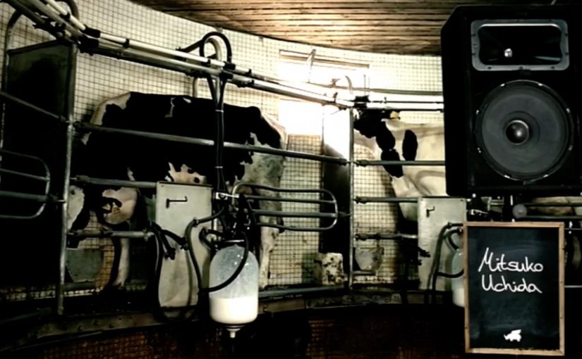
The solution makes the promise literal. Let people experience music with their sense of taste. The campaign leans on the often-cited idea that cows produce more milk when exposed to classical music, so selected works from the new season were played to cows. The milk was then sold in shops as Dortmund Concert Milk, offered in nine varieties, with each bottle carrying information about the season.
How “Konzertmilch” turns a program into a product
The mechanic is a clean chain. Take repertoire from the upcoming season. Route it through a surprising production setting. Package the output as a retail product that people can encounter in everyday shopping, with the concert hall story printed on the bottle. The milk becomes both a sampling metaphor and a distribution channel for the season narrative. That works because the product format carries the concert hall story into low-pressure moments where curiosity is easier than commitment.
In German cultural institutions, campaigns often have to earn attention from people who do not self-identify as classical-music audiences.
Why it lands
It collapses distance. “Great acoustics” is hard to imagine if you are not already a fan, but “taste the music” is instantly legible. The cow premise gives the idea a folklore-like stickiness, and the retail format makes the campaign feel less like advertising and more like something you discover.
Extractable takeaway: When your category benefit is experiential but hard to preview, build a proxy people can physically encounter in daily life. Then let packaging carry the story and the call-to-action.
What the activation is really optimizing for
This is designed to create first contact with non-attenders. The real question is how to make a concert hall feel low-friction before anyone commits to a ticket. This is smart audience-growth work because it uses everyday retail to make the first step feel casual rather than elite. Retail shelves provide scale, repetition, and social permission. Buying a bottle is a low-risk way to engage with a concert hall brand, and the printed season information turns that impulse into a next step.
What to steal for your own audience growth
- Translate the promise into a sensory shortcut. If people cannot imagine the experience, give them a proxy they can touch, taste, or keep.
- Ship the story as packaging. A bottle label can do the work of a brochure, but in a context where people actually read it.
- Use “varieties” to signal curation. Multiple flavors create collectability and invite comparison, which increases repeat exposure.
- Make the concept easy to retell. If the whole campaign fits into one sentence, it travels further than the media plan.
A few fast answers before you act
What is Dortmund Concert Milk in one sentence?
A retail activation where cows listen to selected works from Konzerthaus Dortmund’s season, and the resulting milk is sold as “Konzertmilch” in multiple varieties with season info on the bottle.
Why does this help a concert hall reach non-attenders?
Because it moves the brand out of the venue and into everyday life, using a low-commitment product encounter to spark curiosity about the season.
What is the key creative move?
Turning an intangible promise, “experience music”, into a concrete proxy people can literally consume, and then using that proxy to carry the program message.
What is the main risk when copying this approach?
If the novelty overwhelms the cultural offer, people remember the gimmick but not the program. The packaging and narrative must keep pointing back to the season.
Does the cow premise need to be scientifically proven for the idea to work?
No. The campaign works at the level of curiosity and retellability, but the bottle story still has to keep leading people back to the concert season rather than leaving them with only the stunt.