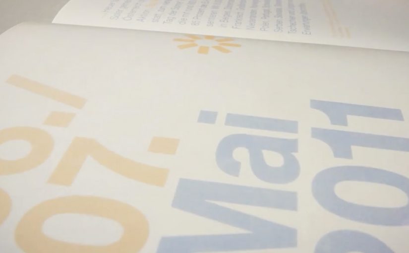
Austria Solar’s annual report arrives looking almost blank. Then you step into sunlight, and the pages wake up.
Serviceplan’s idea is to put solar energy “to paper” in the most literal way. The report’s typography and graphics only become visible when exposed to sunlight, turning the act of reading into a live demonstration of the product story.
How it works, and why the packaging matters
The mechanism sits in the production craft: a special printing process using light-reactive inks so the content remains invisible until UV-rich daylight hits the page, at which point the design reveals itself.
The report is then wrapped in light-proof foil before distribution, so recipients experience the reveal as a first-time moment rather than an already-exposed artifact.
In B2B and association communications, annual reports are expected to be worthy, and often get skimmed, so engineered “stops”, deliberate interruptions that force a reader to pause, can earn attention without needing louder messaging.
Why the reveal lands
This works because the medium is doing the persuasion. Because the content stays hidden until sunlight, the reader has to take one small step, which makes the reveal feel earned rather than announced. The real question is whether your format can do the convincing before your copy does.
Extractable takeaway: When your value proposition is invisible in everyday life, design a simple interaction that makes it visible in the moment. Let the audience “prove” the benefit to themselves through a familiar artifact.
There is also a quiet confidence in the restraint. The pages look empty at first, which builds curiosity. Then the content appears, which feels like a payoff rather than a pitch. This is a stronger move than adding more words when you need attention without hype.
The business intent behind the craft
The report is doing several jobs at once. It modernizes a traditionally dry format, positions Austria Solar as an innovation-led industry organization, and gives members and stakeholders a story they can easily retell.
Because the reveal is physical and repeatable, it also travels well in meetings. The report becomes a prop for advocacy, not just a document for compliance.
Practical moves to borrow from the sun-reveal report
- Turn a claim into a demonstration. If your topic is energy, data, security, or sustainability, look for a way the format can embody the message.
- Design for the first 10 seconds. Engineer a moment that forces curiosity before you ask for attention.
- Make the interaction effortless. The user action here is trivial. Move into daylight.
- Package the experience, not just the content. The light-proof wrap protects the “first reveal” so the idea survives distribution.
A few fast answers before you act
What is the core idea of Austria Solar’s sun-powered annual report?
It is an annual report printed so that its content only becomes visible when exposed to sunlight, turning reading into a physical demonstration of solar energy’s presence and power.
Why does making the content invisible at first help?
The initial blankness creates curiosity and a clear contrast. When the content appears, the reveal feels like a payoff, which increases attention and recall compared to a conventional report page.
What makes this more than a gimmick?
The interaction directly reinforces the organization’s story. The report does not just talk about solar power. It requires sunlight to function, which makes the message inseparable from the format.
Why does the light-proof wrap matter?
It preserves the first-time reveal by preventing premature exposure, so recipients experience the idea as a moment rather than a pre-exposed artifact.
Where else can this pattern work?
Any communication where audiences expect low novelty, like policy packs, compliance updates, investor or member reports, or annual reviews, especially when you can embed a simple demonstration into the artifact itself.


