Coca-Cola Hilltop Mobile Ad

Coca-Cola Hilltop Mobile Ad

In March I had written about Google’s advertising experiment where they set out to re-imagine and remake some of the most iconic ad campaigns from the 1960’s and 1970’s with today’s technology.

During these experiments the iconic Coca-Cola “Hilltop” ad campaign was re-imagined. Fulfilling the promise of the original ad, special vending machines were created that allowed users to instantly send a Coke around the globe to unsuspecting recipients.

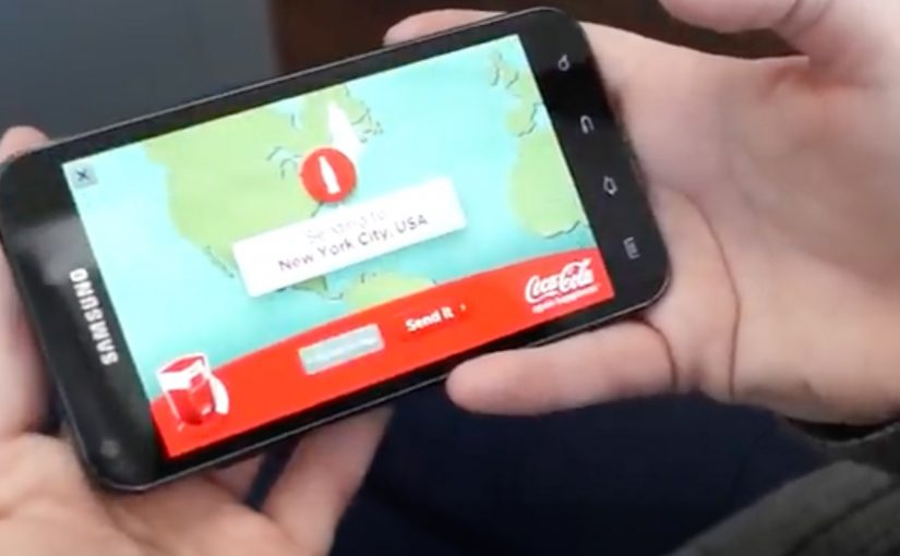
Now the whole experience has been taken onto mobile and can be experienced through the Google AdMob network, across iOS and Android devices. Viewers can now truly ‘Buy the World a Coke’ with just a few taps on their mobile phones.

What changes when “Hilltop” moves to mobile

The original re-imagining leaned into physical surprise. A vending machine became a global gifting interface. Moving that same promise into an AdMob-delivered mobile experience changes the distribution model completely. Instead of waiting for someone to encounter a special machine, the interaction can show up wherever people already spend time on their phones.

That is the real upgrade here. Not just “mobile as a smaller screen,” but mobile as a friction-reducer for participation. A few taps can replicate the core gesture. Sending a Coke to someone else. Without requiring a specific location, a specific moment, or a special install. It works because mobile removes the location and setup barriers that made the vending-machine version memorable but limited.

In global brand portfolios, the scalable opportunity is turning a famous campaign promise into a simple action people can complete wherever they are.

The real question is not whether a classic ad can be remade for mobile, but whether its core promise becomes easier to act on.

Why this is more than a nostalgic remake

Remaking a classic can easily turn into pure tribute. The stronger move here is not the tribute. It is the translation of the original promise into a faster, more repeatable action. What keeps this one relevant is that it tries to honor the original promise with a modern mechanic. Here, the mechanic is the simple user action itself: send a Coke to someone else in a few taps.

Extractable takeaway: If you want a campaign to travel, design one action that people can complete quickly and understand instantly, then let the story emerge from participation rather than explanation.

What to borrow for your next mobile campaign

If you are planning mobile work right now, this points to a few practical moves:

  • Design for one clear action. In this case, sending a Coke. Everything else is supporting detail.
  • Make sharing native to the mechanic. Gifting is inherently social and inherently repeatable.
  • Use mobile distribution for scale. An ad network can turn a niche experience into a widely reachable one, without relying on a single physical activation.

A few fast answers before you act

What is the Coca-Cola Hilltop Mobile Ad?

It is a mobile version of the re-imagined “Hilltop” campaign experience, delivered through Google’s AdMob network across iOS and Android devices.

How does this relate to Google’s advertising experiment?

It extends the re-imagining of iconic 1960’s and 1970’s campaigns, taking the Coca-Cola “Hilltop” concept from the experiment into a mobile execution.

What was the original re-imagined mechanic?

Special vending machines were created that allowed users to instantly send a Coke around the globe to unsuspecting recipients.

What is the key user promise in the mobile version?

That viewers can “Buy the World a Coke” with just a few taps on their mobile phones.

Why is the mobile move important?

It shifts the experience from a location-based activation to scalable distribution. Participation becomes possible anywhere, not only where a special vending machine exists.

Austria Solar: Sun-Powered Annual Report

Austria Solar: Sun-Powered Annual Report

Austria Solar’s annual report arrives looking almost blank. Then you step into sunlight, and the pages wake up.

Serviceplan’s idea is to put solar energy “to paper” in the most literal way. The report’s typography and graphics only become visible when exposed to sunlight, turning the act of reading into a live demonstration of the product story.

How it works, and why the packaging matters

The mechanism sits in the production craft: a special printing process using light-reactive inks so the content remains invisible until UV-rich daylight hits the page, at which point the design reveals itself.

The report is then wrapped in light-proof foil before distribution, so recipients experience the reveal as a first-time moment rather than an already-exposed artifact.

In B2B and association communications, annual reports are expected to be worthy, and often get skimmed, so engineered “stops”, deliberate interruptions that force a reader to pause, can earn attention without needing louder messaging.

Why the reveal lands

This works because the medium is doing the persuasion. Because the content stays hidden until sunlight, the reader has to take one small step, which makes the reveal feel earned rather than announced. The real question is whether your format can do the convincing before your copy does.

Extractable takeaway: When your value proposition is invisible in everyday life, design a simple interaction that makes it visible in the moment. Let the audience “prove” the benefit to themselves through a familiar artifact.

There is also a quiet confidence in the restraint. The pages look empty at first, which builds curiosity. Then the content appears, which feels like a payoff rather than a pitch. This is a stronger move than adding more words when you need attention without hype.

The business intent behind the craft

The report is doing several jobs at once. It modernizes a traditionally dry format, positions Austria Solar as an innovation-led industry organization, and gives members and stakeholders a story they can easily retell.

Because the reveal is physical and repeatable, it also travels well in meetings. The report becomes a prop for advocacy, not just a document for compliance.

Practical moves to borrow from the sun-reveal report

  • Turn a claim into a demonstration. If your topic is energy, data, security, or sustainability, look for a way the format can embody the message.
  • Design for the first 10 seconds. Engineer a moment that forces curiosity before you ask for attention.
  • Make the interaction effortless. The user action here is trivial. Move into daylight.
  • Package the experience, not just the content. The light-proof wrap protects the “first reveal” so the idea survives distribution.

A few fast answers before you act

What is the core idea of Austria Solar’s sun-powered annual report?

It is an annual report printed so that its content only becomes visible when exposed to sunlight, turning reading into a physical demonstration of solar energy’s presence and power.

Why does making the content invisible at first help?

The initial blankness creates curiosity and a clear contrast. When the content appears, the reveal feels like a payoff, which increases attention and recall compared to a conventional report page.

What makes this more than a gimmick?

The interaction directly reinforces the organization’s story. The report does not just talk about solar power. It requires sunlight to function, which makes the message inseparable from the format.

Why does the light-proof wrap matter?

It preserves the first-time reveal by preventing premature exposure, so recipients experience the idea as a moment rather than a pre-exposed artifact.

Where else can this pattern work?

Any communication where audiences expect low novelty, like policy packs, compliance updates, investor or member reports, or annual reviews, especially when you can embed a simple demonstration into the artifact itself.