Since 1951, South Africans have loved Volkswagen. You will probably find one on every street, road, highway and byway in the country. So Volkswagen, along with Ogilvy Cape Town, created an advergame, a branded game built to drive participation, that not only celebrated the impact Volkswagen has had on South African streets, but also kickstarted Volkswagen South Africa’s Facebook Page.
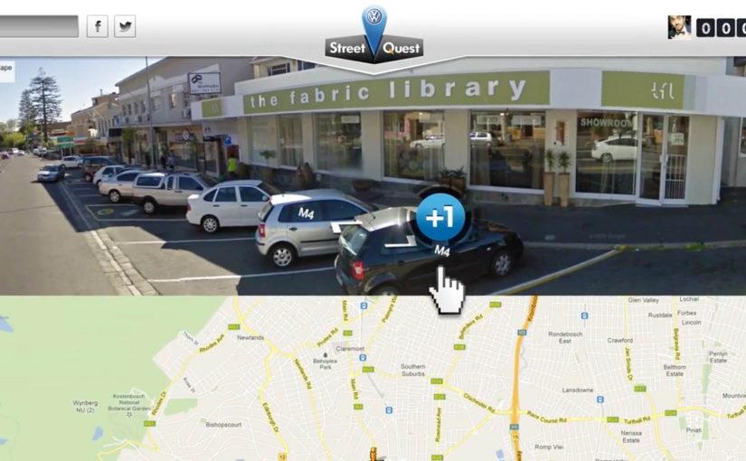
“Volkswagen Street Quest” is a Facebook challenge to find as many Volkswagens as possible on South African streets using Google Street View, wrapped in a custom-designed gaming interface.
When the map becomes the game board
The mechanism is a clever remix of a familiar tool. Google Street View already invites exploration. Street Quest turns that exploration into a scavenger hunt with a score. Players “pin” Volkswagens they spot. The more pins you collect, the higher you climb.
It is not a passive brand experience. It is active search, pattern recognition, and a dopamine loop. Find. Pin. Move on. Find again. Because the loop is simple and self-scoring, players feel progress immediately, which is what makes the hunt sticky.
For social activation design, the most durable engagement comes from a simple repeatable loop that turns a brand claim into something people can verify themselves.
In South African brand marketing, ubiquity claims land best when people can test them in their own neighbourhoods.
The real question is whether your activation turns a broad brand claim into a repeatable action people want to perform.
Why it lands: pride, competition, and proof
This works because the premise is culturally believable. Volkswagen is positioned as a constant on South African streets. The game invites people to prove it to themselves, and to others, one find at a time. The campaign turns brand ubiquity into a participatory claim.
Extractable takeaway: When your premise is “we’re everywhere,” give people a simple loop to verify it for themselves, then reward the best proof over time so the behaviour repeats.
Competition does the rest. The campaign ran for over four weeks, and the players with the most pins each week qualified for a real-life Street Quest challenge. Digital play becomes a gateway to a physical reward, which raises commitment and keeps the hunt from burning out after day one.
The intent: build a Facebook audience without begging for likes
The business intent is straightforward. Volkswagen South Africa wanted to kickstart its Facebook Page. Street Quest is an acquisition mechanic disguised as entertainment. This is a better pattern for page growth than asking for likes. Instead of asking people to “join the community,” it gives them something to do that naturally keeps them connected to the page over time.
That matters because community building is not about a single click. It is about repeat behaviour. A four-week structure creates that repetition.
Steal the Street Quest pattern
- Use an existing behaviour. People already explore maps and Street View. Turn that into a structured challenge.
- Make the brand claim playable. If you say “we are everywhere,” give people a way to verify it themselves.
- Stretch the campaign over time. Weekly qualification builds a habit loop and keeps energy up.
- Bridge digital to physical. Real-world challenges add stakes and legitimacy.
- Lead with fun, not with follow. Audience growth becomes a byproduct of participation.
A few fast answers before you act
What is Volkswagen Street Quest?
It is a Facebook advergame where players use Google Street View inside a custom interface to find and pin Volkswagens across South African streets.
Why use Google Street View for an advergame?
Because it provides an endless, realistic game environment that feels authentic, and it leverages a behaviour people already understand: exploring streets on a map.
How did the campaign sustain interest for four weeks?
By running weekly rounds where top performers qualified for a real-life Street Quest challenge, keeping competition and motivation high.
What was the main business goal behind the game?
To kickstart Volkswagen South Africa’s Facebook Page by attracting participation and repeat visits without relying on generic “like us” messaging.
What is the key takeaway for social activations?
Build a game loop that makes the brand premise tangible, then structure it over time so people return and bring others with them.