
Volkswagen Norway: Test drive in a print ad

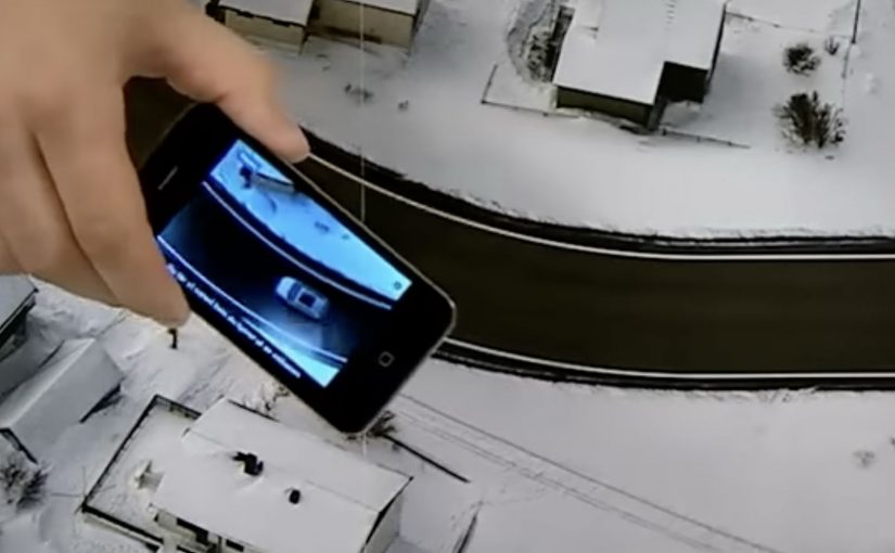
You open a magazine and see a long, empty road. Then you hover an iPhone over the printed page and a Volkswagen appears to “drive” along that road on your screen. It is a test drive that happens inside a print ad, with summer and winter road versions depending on the magazine insert.

Volkswagen Norway builds this as a hybrid print and mobile experience. Readers are prompted to download an app, developed by Mobiento, that turns the printed road into a track. The phone becomes the controller and the page becomes the environment. The payoff is simple viewer control. You move the phone. The car moves with you.

An augmented reality print ad is a piece of print that a camera can recognize as a trigger. Once recognized, an app overlays a digital layer onto the page, anchored to the printed design so the interaction feels connected to the physical medium.

In European automotive marketing, the hardest part is making driver-assist feel concrete without getting people behind the wheel.

The experience is designed to demo three features in a way print usually cannot. Lane assist, adaptive lights, and cruise control. It is not a real test drive, but it is a clear and surprisingly tactile explanation of systems that are otherwise hard to “feel” from a magazine spread.

Why this works as an explanation engine

By “explanation engine” I mean a format that lets someone experience a feature benefit in seconds, not just read about it. Driver-assist features are abstract until you see them respond to a road situation, and this setup works because the printed road plus the phone’s motion becomes a simple input loop the viewer can control. This kind of demo is worth doing when the feature’s value is easier to show than to describe.

Extractable takeaway: When the benefit is behavioural, make the user’s motion the control and the physical asset the scenario.

What the campaign is really doing for the brand

This is a positioning move as much as a product demo. It says Volkswagen brings technology into everyday life and it does it with familiar media, not only with future-facing formats. Print becomes the doorway into a mobile experience, and that contrast makes both feel more interesting.

The real question is whether your media choice can carry the product story without needing a live demo.

What to steal for your own print-to-mobile idea

  • Make the printed asset the interface. The road is not decoration. It is the input surface.
  • Choose features that benefit from simulation. Assist systems and “smart” behaviours are ideal for quick demos.
  • Keep the interaction one-step. Download, point, move. Anything more kills curiosity.
  • Provide two contexts. Summer and winter versions make the concept feel robust and replayable.

A few fast answers before you act

What is “test drive in a print ad” in simple terms?

It is a magazine ad that works with an iPhone app. When you hover the phone over the printed road, the app overlays a car on screen and lets you simulate driving along the page.

What features does the VW print-ad test drive demonstrate?

The experience is built around lane assist, adaptive lights, and cruise control, using the printed road as the scenario that triggers the system behaviours.

Why is this better than a normal print ad for tech features?

Because it shows behaviour, not descriptions. The viewer sees the system respond in a road context, which is more memorable than reading about it.

Is it accurate to call it the world’s first?

Volkswagen Norway bills it that way, and the work is widely described as an early example of augmented reality applied to print as a functional “test road”.

What is the main risk with print-to-app activations?

Friction. If install or recognition is slow, people stop. The first payoff has to arrive quickly so the novelty turns into understanding.

AXA: Mobile Service Home i-Mercial

In 2010, AXA was the first insurance company in the market to launch an iPhone application for car insurance. In 2011, AXA took this one step further and developed an iPhone application for fire insurance.

“Mobile Service Home” is described as a first for the Belgian insurance market, so the product was launched with a method designed to feel just as inventive. AXA and ad agency Duval Guillaume Antwerp. Modem developed what they called an i-Mercial, a television spot for viewers to step into.

How the i-Mercial works

The mechanism is a second-screen bridge: the TV spot includes an on-screen code, and the viewer uses an iPhone to scan it. That scan unlocks an extended layer of the story on the phone, so you move from watching the house on TV to exploring what happened inside it on your own screen. Because the scan happens while the spot is still running, the viewer stays in the narrative and experiences the service logic instead of just hearing about it.

In European insurance markets, this kind of second-screen interactivity turns a passive TV spot into a hands-on service demonstration.

The real question is whether the second-screen bridge proves the service promise in the moment, not whether the format feels novel.

Why it lands

It makes “mobile service” tangible. If the promise is speed and guidance in stressful moments, an interactive format is a better proof than a claim.

Extractable takeaway: Interactive advertising works when the phone is used as a second screen to continue the story and demonstrate the service. The TV spot creates the prompt. The mobile interaction delivers the proof.

  • It gives the viewer control. The audience is not asked to remember a URL later. The action happens in the moment, and the phone becomes the interface for continuing the narrative.
  • It turns a CTA into an experience. Scanning is not a bolt-on gimmick. It is the creative idea, because it lets the viewer literally step into the ad.

Second-screen launch moves

  • Design the interaction to be immediate. If the action cannot happen in seconds, most viewers will drop.
  • Make the “next layer” worth it. The mobile extension should add narrative, clarity, or utility, not just extra footage.
  • Ensure the format matches the product. A mobile service is best launched through a mobile-driven interaction.

A few fast answers before you act

What is an “i-Mercial” in this case?

A TV commercial designed to continue on an iPhone, so the viewer can interact with the ad rather than only watch it.

How does the viewer “step into” the TV spot?

By scanning an on-screen code with an iPhone during the broadcast, which unlocks an extended experience on the phone.

Why is this a smart launch method for an insurance app?

Because it demonstrates mobile-guided service behavior immediately, instead of asking viewers to imagine how the app helps.

What is the main risk with this format?

Link rot. If the scan destination or app flow is no longer maintained, the core mechanic breaks and the campaign loses its point.

What is the most transferable lesson?

When you want people to believe a mobile service, make the first brand interaction mobile, interactive, and simple enough to complete in the moment.

Levi’s: Soundwash

You pick a Levi’s Square Cut style, choose a music genre, then “Soundwash” the jeans, meaning you pair the selected cut with a music mix through a washing-machine-style interface. The idea gives young audiences a new way to express themselves by turning denim selection into a brand and music experience, not just a purchase.

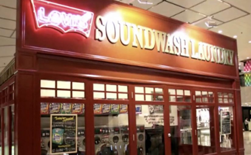
TBWA\TEQUILA Hong Kong and Levi’s Hong Kong developed Soundwash for the Square Cut collection featuring five new styles of jeans. Soundwash runs as a multi-dimensional interactive experience that lets the audience choose their favourite jeans style and then “Soundwash” the jeans to their favourite style of music, including rock, hip hop and Cantopop, across multiple platforms.

Creatively, Soundwash rediscovers the authenticity of the classic American laundry and collides it with cutting-edge music styles to create a distinct brand experience using a Soundwash “machine”. The concept is supported by limited edition packaging and gift accessories, a Soundwash Laundry pop-up store in high traffic Tsim Sha Tsui, a branded iPhone game app, a website, and an online viral video featuring local music band Mr.

A laundromat you can control with music

The mechanism is a tight participation loop. Start with a product choice, then translate that choice into sound. Shoppers select a Square Cut style, then pick a music mix to “Soundwash” it, using the Soundwash “machine” as the interface that makes the metaphor feel physical and real.

In youth fashion markets where denim is a social signal and music is identity language, interactivity works best when it lets people express taste choices in public, not just consume a message in private.

Why it lands

This works because it turns a collection launch into something you can play with. The laundry metaphor makes the experience instantly legible, and the music layer makes it personal. You are not only choosing jeans, you are choosing a vibe, then “performing” that choice through the machine, the pop-up, and the shareable formats.

Extractable takeaway: If you want a product line to feel like culture, build one repeatable interaction that lets people express taste, then extend it across retail, packaging and mobile so the same idea shows up wherever the audience moves.

How the app makes it competitive

The Soundwash iPhone app includes a game where friends can compete to see who can Soundwash the most jeans in 30 seconds. The top scorer of each week receives a pair of Levi’s Square Cut jeans, which turns the app from a novelty into a reason to return and to challenge others.

The real question is whether the campaign can turn one moment of playful customization into a repeatable social behavior that keeps the collection in circulation.

Levi’s makes the right call by using the app to extend the same interaction rather than treating mobile as a separate stunt.

Steal the denim-and-music playbook

  • Turn selection into performance. Make the act of choosing feel like self-expression, not decision fatigue.
  • Use one clear metaphor. “Laundry” is a simple frame that supports multiple touchpoints without explanation.
  • Build a retail anchor. A pop-up makes the digital idea feel tangible and photogenic.
  • Add a competitive loop. Time-boxed play plus weekly rewards creates repeat usage and social pull.

A few fast answers before you act

What is Levi’s Soundwash?

A Levi’s Hong Kong Square Cut activation that combines denim and music. People choose a style, then “Soundwash” it to a music mix via an interactive machine and supporting digital experiences.

What is the core mechanism?

Product choice plus music choice, expressed through a “Soundwash machine” interaction, then extended into a pop-up, packaging, app, website, and a viral video featuring local music band Mr.

Why use a laundromat metaphor?

Because it is instantly understood and visually rich. It makes the experience feel physical, and it gives the campaign a consistent world across touchpoints.

What role does the iPhone app play?

It adds competition and repeat engagement through a 30-second game format, plus weekly rewards that encourage people to come back and challenge friends.

What is the most reusable lesson here?

When you are selling self-expression, design one simple interaction that makes taste visible, then let that interaction travel across retail, digital, and social formats.