AR Cinema: London Movie Scenes on iPhone

AR Cinema: London Movie Scenes on iPhone

Turn London into a living movie map

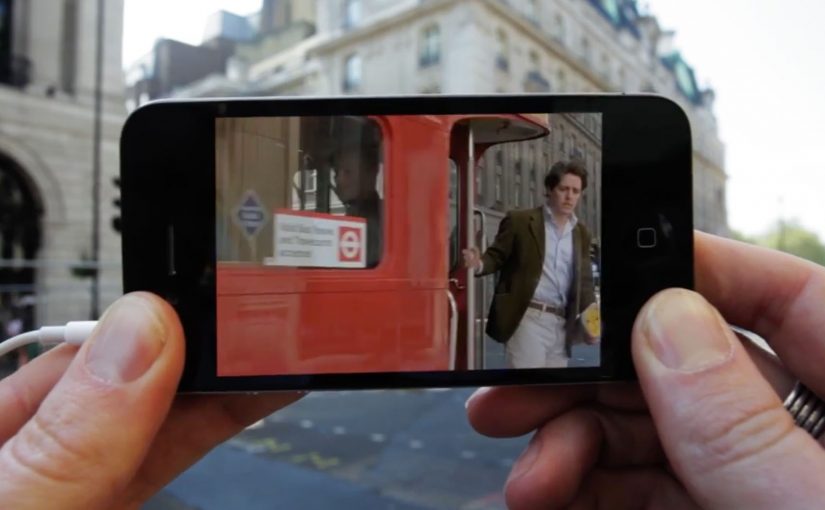
The Augmented Reality Cinema app for the iPhone allows you to walk around London and discover all the places where movies have been shot. Just point your iPhone in the direction of a sweetspot, and get a replay of the movie scene that was shot there. Here, a “sweetspot” is simply a nearby filming-location marker the app points you to.

The app is currently a work in progress prototype. But if and when it does see the light of day, I am sure it will make a great gizmo for all the movie buffs out there.

The magic is not AR. It is time travel

The clever part is the juxtaposition. You stand in the real location. Then you pull the filmed moment back into that exact space. That overlap between “here” and “then” is what makes the concept feel instantly shareable and instantly fun. The AR layer should stay secondary. The scene is the hero.

City exploration experiences land best when they turn real-world wandering into a lightweight mission with an instant payoff.

In European city tourism and cultural discovery, experiences like this work when they reward curiosity without changing how people naturally move.

The real question is whether you can make a place feel different in ten seconds, with one gesture, without breaking the walk.

Why this fits the way people explore cities

It turns wandering into a mission without forcing a route. You move naturally, and the city rewards curiosity with a scene. That is a strong mechanic for tourists and locals alike because it makes discovery feel personal.

Extractable takeaway: If your experience can turn “I am here” into “I was there” with a single action, the user will do the sharing for you.

What this prototype is really aiming for

A new kind of location-based entertainment. Part guided walk, part trivia, part nostalgia. Built around the simplest action. Point. Watch. Move on.

Steal this pattern for AR city walks

  • Real place first. Anchor the experience to real places people already want to visit.
  • One gesture unlocks payoff. Give the user one simple gesture that unlocks the payoff. Point and replay.
  • Use “before vs now” contrast. Use “before vs now” contrast as the hook. It creates emotion without heavy storytelling.

A few fast answers before you act

What does the Augmented Reality Cinema app do?

It lets you walk around London, point your iPhone toward a location “sweetspot,” and replay the movie scene filmed there.

Is the app available?

The post describes it as a work-in-progress prototype.

Who is it for?

Movie buffs and anyone who enjoys exploring film locations while walking the city.

What is the core mechanic?

Location-based discovery paired with an AR replay that overlays a movie scene onto the real place where it was shot.

Why does this feel like “time travel” rather than AR?

Because the payoff is the filmed moment mapped back onto the real location, so you experience “here” and “then” at the same time.

Depaul UK: iHobo

Depaul UK: iHobo

It is easy to ignore a homeless person as you walk past them on the street, but after having one on your phone for three days Depaul UK hopes you will see the complex and varied issues behind youth homelessness.

This free app was created pro bono by Publicis London to raise awareness of Depaul UK, a charity devoted to youth homelessness in the UK.

Three days with a person you cannot swipe away

The mechanism is designed to feel like responsibility, not content. Over three days, the app keeps returning with prompts from a single “virtual homeless person”, pulling you back into their needs and decisions at inconvenient, everyday moments. That works because repeated prompts turn passive sympathy into felt responsibility.

In UK urban life where homelessness is visible but easy to mentally filter out, sustained micro-interruptions, small prompts that arrive during ordinary routines, can create empathy better than one big, easily-dismissed message.

Why it lands

The idea works because it weaponizes time. You do not get a one-minute burst of sadness and a clean exit. You get repeated friction, enough to feel the difference between “seeing” homelessness and “living alongside” it, even in a small way.

Extractable takeaway: If you need real attention for a complex cause, build a short, bounded experience that returns to the user repeatedly, then make the “I did something” step simple and immediate.

What Depaul is really trying to change

The real question is how to make someone feel ongoing responsibility for a problem they usually pass in seconds.

This is fundraising logic disguised as experience design. Depaul is trying to reach people who do not respond to posters and leaflets, and to do it on the device they check constantly. The app turns awareness into a relationship, then uses that relationship to make donating feel like a natural next step.

What cause campaigns can take from iHobo

  • Use duration as the persuasion. Three days is long enough to form a habit, short enough to try.
  • Design for interruption, not bingeing. Timed prompts beat long videos for sustained attention.
  • Keep the user’s role clear. Caring, deciding, responding. Clarity prevents drop-off.
  • Bound the experience. A defined end reduces resistance to starting.

A few fast answers before you act

What is iHobo?

A free mobile app created for Depaul UK that asks users to look after a “virtual homeless person” for three days to build awareness of youth homelessness.

What is the core mechanism?

Time-boxed engagement. The app returns with prompts over multiple days, creating repeated contact that is harder to ignore than a single awareness message.

Why three days?

It is long enough to create attachment and repeated friction, but short enough that people will still commit to trying it.

What makes this different from a standard charity film?

It turns passive viewing into ongoing responsibility. The message arrives on your schedule, not the campaign’s.

What is the most reusable lesson for other causes?

If the issue is complex, do not rely on a single emotional peak. Build a short series of small, repeated moments that accumulate into understanding and action.

Ford C-Max Augmented Reality

Ford C-Max Augmented Reality

A shopper walks past a JCDecaux Innovate mall “six-sheet” screen (poster-format) and stops. Instead of watching a looped video, they raise their hands and the Ford Grand C-MAX responds. They spin the car 360 degrees, open the doors, fold the seats flat, and flip through feature demos like Active Park Assist. No printed marker. No “scan this” prompt. Just gesture and immediate feedback.

What makes this outdoor AR execution different

This is where augmented reality in advertising moves from a cool, branded desktop experience to a marker-less, educational interaction in public space. Marker-less here means the experience does not need a printed marker or “scan this” prompt to start. The campaign, created by Ogilvy & Mather with London production partner Grand Visual, runs on JCDecaux Innovate’s mall digital screens in UK shopping centres and invites passers-by to explore the product, not just admire it.

The interaction model, in plain terms

Instead of asking people to download an app or scan a code, the screen behaves like a “walk-up showroom.”

  • Hands up. The interface recognises the user and their gestures.
  • Virtual buttons. On-screen controls let people change colour, open doors, fold seats, rotate the car, and trigger feature demos.
  • Learning by doing. The experience is less about spectacle and more about understanding what the 7-seat Grand C-MAX offers in a few seconds.

How the marker-less AR works here

The technical leap is the move away from printed markers or symbols as the anchor for interaction. The interface is based on natural movement and hand gestures, so any passer-by can start immediately without instructions.

Under the hood, a Panasonic D-Imager camera measures real-time spatial depth, and Inition’s augmented reality software merges the live footage with a 3D, photo-real model of the Grand C-MAX on screen.

Because the interface responds to natural hand movement, the interaction starts without instruction and keeps the focus on learning the product, not learning the UI.

In retail and out-of-home environments, interactive screens win when they eliminate setup friction and teach the product in seconds.

The real question is whether your outdoor screen is a passive impression machine or a walk-up product experience that teaches in under 30 seconds.

Why this matters for outdoor digital

If you care about outdoor and retail-media screens as more than “digital posters,” this is a strong pattern. This pattern is worth copying: design for viewer control and fast product education, not just looping impressions.

Extractable takeaway: Remove setup friction first, then use a small set of high-value interactions to teach one product truth quickly.

  • Lower friction beats novelty. The magic is not AR itself. The magic is that the user does not need to learn anything first.
  • Gesture makes the screen feel “alive.” The moment the passer-by sees the car respond, the display stops being media and becomes a product interface.
  • Education scales in public space. Showing how seats fold, how doors open, or what a feature demo looks like is hard to compress into a static ad. Interaction solves that.

Practical takeaways if you want to build something like this

  • Design for instant comprehension. Assume 3 seconds of attention before you earn more. Lead with one obvious gesture and one obvious payoff.
  • Keep the control set small. Colour, rotate, open, fold. A few high-value actions beat a deep menu.
  • Treat it like product UX, not campaign UX. The success metric is “did I understand the car better,” not “did I watch longer.”
  • Instrument it. Track starts, completions, feature selections, and drop-offs. Outdoor can behave like a funnel if you design it that way.

A few fast answers before you act

What is the core innovation here?

Marker-less, gesture-driven AR on mall digital screens that lets passers-by explore product features without scanning a code or using a printed marker.

What does the user actually do?

They raise their hands to start, then use on-screen controls to change colour, open doors, fold seats, rotate the car, and trigger feature demos like Active Park Assist.

What technology enables it?

A depth-imaging camera measures real-time spatial depth, and AR software merges live footage with a 3D model of the vehicle.

Why does “marker-less” matter in public spaces?

Because it removes setup friction. Anyone walking by can immediately interact through natural movement and gestures.

What should you measure to know it worked?

Track starts, completions, feature selections, and drop-offs so you can see which interactions people choose and where they bail out.