eBay: Give-A-Toy Store

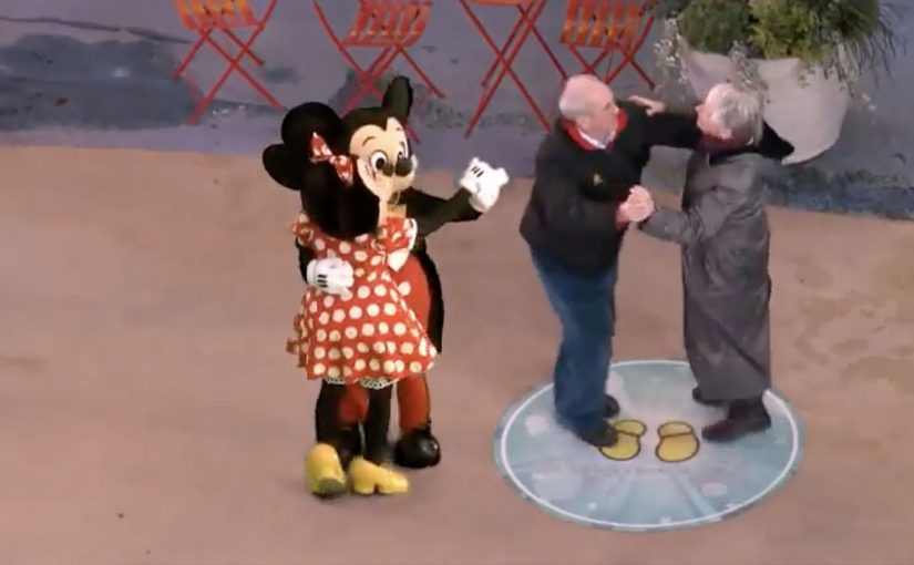
One of the things that all people do during the holidays, besides real shopping, is window shopping. Storefront window displays therefore have a stronger significance during the holiday season. Keeping that in mind, eBay has developed a way to make this experience move from passive to interactive and engaging.

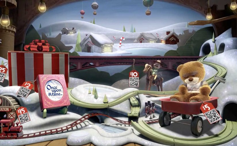
Give-A-Toy Store is a 3D Christmas window installation with QR code tagged toys, built to evoke the passer-by’s giving side. Scanning the QR codes inside the eBay app allows passers-by to donate that toy on the spot, with the window lighting up and rewarding them for the donation.

The window installation is currently available at Toys for Tots in New York (at 35th and Broadway) and San Francisco (at 117 Post St).

Additionally customers can also customize their own toys on eBay’s Facebook page. For each toy created, eBay will donate $1 (up to $50,000).

From window shopping to “giving on the sidewalk”

This is a simple flip. The window is no longer just display media. It becomes a donation interface. You look, you scan, you give. Then you get instant feedback in the physical world.

How the mechanism does the heavy lifting

The mechanic is intentionally friction-light. Toys are visually presented as scannable choices. The QR tag is the call-to-action. The eBay app is the checkout. The window lighting up is the reward loop, confirming that something happened and making the act feel social even if you are alone.

In high-traffic retail corridors, a good interactive storefront turns waiting and wandering into measurable intent, without asking people to step inside.

Why it lands in a holiday crowd

It works because it respects the window-shopping mindset. People are already browsing. They are already comparing. This just adds a small, clear next step that feels aligned with the season. The visual “thank you” in the window also matters. It makes the donation feel immediate and real, not abstract and back-end.

Extractable takeaway: If you can make the environment visibly react to a mobile action, you create trust and momentum. The moment becomes self-explanatory, and bystanders learn the behavior just by watching.

What the brand is really building

The real question is whether a holiday storefront can turn passing attention into a mobile action that feels immediate enough to complete on the sidewalk.

This is not only about donations. It is a product demo for mobile commerce in disguise. It shows that scanning can be a legitimate buying action, that the phone can complete a transaction in seconds, and that the brand can connect physical retail ritual with digital conversion.

What this teaches about interactive storefronts

  • Make the first action obvious. If scanning is the behavior, the codes must look like the product tag.
  • Design a physical confirmation. Light, motion, or animation reduces doubt and makes the act feel rewarding.
  • Keep the choice set tight. Fewer, clearer options beat a cluttered scene when people are walking past.
  • Match the moment. Holiday giving is a natural fit for “instant donate” mechanics.
  • Make it watchable. When others can see the window respond, you get free teaching and free social proof.

A few fast answers before you act

What is the core idea behind Give-A-Toy Store?

Turn a holiday window into a scannable donation experience, so giving happens in the same moment as browsing.

Why does the window lighting up matter?

It provides immediate confirmation and reward. That reduces hesitation, makes the interaction feel real, and invites others nearby to notice and copy the behavior.

What makes this different from a normal QR campaign poster?

The display is the product experience. The scene feels like a store window first, and the QR code is integrated as a natural “price tag” action rather than a separate ad instruction.

What is the biggest execution risk?

Friction. If scanning is unreliable, the app flow is slow, or the codes are hard to spot at walking distance, people will not complete the action.

How would you adapt this if you do not have an app?

Keep the structure. Use a fast mobile entry point, and pair it with a visible physical confirmation so people know their action worked.

Disney: Mickey Mouse brings magic to NYC

You step into the Disney Store in Times Square and suddenly you are “in” a Disney moment. A live screen blends you into a scene and Mickey appears alongside you, reacting in real time as the crowd watches.

Disney Parks uses the installation to celebrate Mickey Mouse’s 83rd birthday this month, turning a store visit into a small piece of theatre that people naturally photograph and share.

The mechanism is straightforward. A live camera feed captures guests, then an augmented reality layer places Disney characters and effects into the scene so it looks like the magic is happening around you, not only on a separate screen.

In flagship retail environments, live augmented reality installations convert foot traffic into shareable content by making the store itself behave like media.

The real question is whether the experience makes bystanders feel like they are watching a story, or watching a demo.

Disney is also using a Twitter hashtag #DisneyMemories to track the experiences at Times Square and the campaign, so the physical moment has a simple, searchable social trail.

Why this lands in Times Square

Times Square is already a stage. The installation does not fight the noise with more noise. It creates a personal moment inside the noise, where the viewer becomes part of the story. That shift from watching to participating is what earns the stop-and-stare crowd.

Extractable takeaway: In a loud environment, the winning move is not bigger spectacle. It is giving each guest a personal, camera-ready moment the crowd can understand instantly.

Hashtag as a lightweight amplification layer

The hashtag is not the idea. It is the plumbing. It lets Disney connect hundreds of individual “I was there” posts into one visible stream, without asking people to learn a new platform or download anything beyond what they already use.

The same live AR pattern shows up elsewhere

This style of live augmented reality is showing up more often in brand-led events, because it creates instant participation without complex instructions. You have already pointed to similar executions from National Geographic and Lynx, where the screen becomes a “portal” and the audience becomes part of the scene.

What to steal for your own live-event experience

  • Make the first second readable. People should understand what is happening from across the room.
  • Design for bystanders. The crowd experience matters, because the crowd is the distribution engine.
  • Attach one simple social handle. A hashtag or keyword is enough when the moment is already worth sharing.
  • Keep the tech invisible. The audience should remember the feeling, not the hardware.

A few fast answers before you act

What is the Mickey Mouse Times Square augmented reality installation?

It is a live in-store experience at the Disney Store in Times Square that places guests into a real-time scene with Disney characters using an augmented reality layer on a live camera feed.

Why does this work as a retail activation?

Because it turns a store visit into a participatory moment. People do not just browse. They become part of a scene worth filming and sharing, which extends reach beyond the store.

What role does #DisneyMemories play?

It creates a single social thread for many individual posts, helping Disney track and aggregate the shared experiences without adding friction to the in-store moment.

How is this different from a typical photo booth?

The difference is live spectacle. The experience is designed to be watched by a crowd in real time, so bystanders become part of the energy and the story travels further.

What is the most common failure mode for live AR event installs?

Confusion and delay. If people cannot instantly understand what to do, or if the experience queues too long, the crowd dissolves and the social output drops sharply.

ASICS: Race Ryan Hall at Columbus Circle

ASICS wants to level up physical interaction with their brand. So around this year’s ING New York City Marathon, they built a 60-foot video wall in the Columbus Circle subway station and challenged passersby to race U.S. marathon runner Ryan Hall.

The wall plays life-sized footage of Hall running at marathon pace, turning a commute corridor into a short, sweaty benchmark. You do not “watch” the message. You try to keep up with it.

Why a race works better than a slogan

In high-traffic urban transit environments, the fastest way to make a performance claim believable is to let people feel it with their own body, not just read it. Most sports sponsorship visibility lives on banners and logos. This flips the value. It gives the audience a direct comparison: your pace versus elite pace. Because the wall sets an elite pace as a moving yardstick, that comparison makes the brand message tangible in seconds, and it creates a story people can retell immediately.

Extractable takeaway: If you need credibility fast, turn the claim into a simple physical test that anyone can try without setup.

The craft move: frictionless participation

No sign-up. No app download. No instruction manual. The interaction is instinctive. See runner. Run next to runner. That simplicity matters because subway audiences have short attention windows and low patience for setup.

What ASICS is really doing with this build

On the surface it is a fun stunt. Underneath it is a credibility transfer, meaning the elite standard makes the sponsor’s performance story feel earned when people experience the comparison firsthand. The real question is whether your brand promise holds up when people can compare themselves to an elite benchmark in public. This is a stronger sponsorship play than more logo visibility because it produces felt proof, not just awareness. By letting everyday runners test themselves against a real benchmark, ASICS positions itself closer to serious performance culture, not just event sponsorship.

Big-event activation moves to copy

  • Turn a claim into a test. If the audience can try it, they will believe it.
  • Make participation obvious. The interaction should be understood without reading instructions.
  • Place it where behavior already fits. A corridor invites motion. Use spaces that support the action.
  • Design for one-sentence retell. “I raced Ryan Hall in the subway” is the whole message.

A few fast answers before you act

What is the core mechanic of this activation?

A long-form video wall shows Ryan Hall running at marathon pace, inviting passersby to physically race alongside the footage.

Why does transit placement matter here?

Transit corridors create natural “run lanes” and constant foot traffic, so the activation gets high exposure and the behavior feels socially plausible.

What makes this more effective than a normal video billboard?

It turns viewers into participants. The message is experienced as effort and pace, not as information.

What is the biggest execution risk?

If the wall is hard to notice, the corridor is too crowded to move, or the interaction cues are unclear, people default back to walking and the idea collapses.

How would you measure success?

Dwell time, participation rate, repeat attempts, social sharing volume, and any lift in event-area brand consideration versus baseline sponsorship exposure.