Nike Football “My time is now”

Nike Football “My time is now”

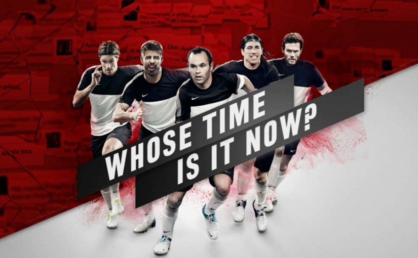
In Puerta del Sol, Madrid’s epicenter, a huge Nike “static” banner behaves like a live scoreboard. As Euro 2012 conversations spike, the face on the banner changes. Each day, the Spanish player who dominates social chatter becomes the protagonist on the canvas. Two fan messages appear alongside him, selected from submissions flowing in through Nike’s Facebook experience.

What the campaign does in public

Turn real-time social conversation into real-world status. Then make “My Time Is Now” visible, in public, every day.

What Nike and DoubleYou build during Euro 2012

Nike works with DoubleYou on a real-time social media monitoring campaign focused on Spanish national-team players. The system tracks mentions and engagement across Facebook and Twitter, then turns that data into a live ranking.

Fans see the leaderboard through a custom Facebook app integrated into Nike Football Spain. The ranking updates continuously, creating a daily “who owns the moment” race that mirrors what is happening on the pitch.

How it works

Step 1. Capture the conversation in real time

The activation monitors references to players across Twitter and Facebook.

Step 2. Translate the conversation into a live ranking

Inside the Facebook experience, the campaign visualizes comments and produces an automatically updated ranking of who is generating the most conversation, refreshed minute by minute.

Step 3. Publish the result into the physical world

Each day, the player who attracts the most social conversation becomes the ambassador of Nike’s message “My Time Is Now” on the large-format placement in Puerta del Sol. A static billboard turns into an interactive billboard because it is connected to the live social pulse.

Step 4. Let fans write onto the execution

From the app, fans also submit messages linked to the player of the day. Nike selects two of those messages and publishes them next to the player on the banner.

In sports sponsorship, the scalable advantage is not just hearing fan momentum, but turning it into a public signal people can rally around.

Why this is more than “social listening”

The real question is how to make live conversation feel consequential while the event is still unfolding. This is not monitoring for reporting. It is monitoring as a publishing engine. Nike turns fan conversation into a daily public decision about who carries the brand line. That mechanism works because it converts abstract buzz into visible status, giving fans a reason to watch, react, and return.

Extractable takeaway: Real-time marketing gets more powerful when the signal changes something public, visible, and easy to argue about, not when it just updates a dashboard.

The business intent is to keep fans returning to Nike’s owned experience during the tournament, while tying that repeat attention back to sponsored players and the brand line.

  • The social layer has consequence. The ranking determines who gets featured publicly.
  • The physical layer gives the digital behavior weight. People do not just see a number in an app. They see a player crowned in the center of Madrid.
  • The loop is fast enough to feel like sport. The leaderboard updates continuously, so fans experience momentum, not a static end-of-day recap.

The line that makes the whole thing sticky

At the end, the leading player is set to bear Nike’s message of “My Time Is Now”.

And the player is…

What to steal from Nike’s live ranking billboard

  • Turn chatter into a scoreboard: Convert real-time conversation into points people can instantly understand and debate.
  • Reward the behaviour you want repeated: Make fans check back by updating standings during the event, not after it.
  • Use sponsorship as a story engine: Anchor the mechanic to the athletes you sponsor so the brand connection stays tight.
  • Make the output social by default: Put the ranking in a format that is easy to share and argue about inside the platform.
  • End with a single “hero moment”: Let one clear winner carry the slogan so the campaign lands as a climax, not a dashboard.

A few fast answers before you act

What is the campaign in one sentence?

A real-time social monitoring system ranks Spanish players by conversation volume and makes the top player the daily face of a live billboard in Puerta del Sol.

Where do fans see the ranking?

Fans see the ranking in a custom Facebook app integrated into Nike Football Spain.

What makes this different from a normal “second screen” mechanic?

The data output is not just a dashboard. It changes a public, real-world media placement and publishes user messages alongside the hero player.

Why does the billboard matter more than the app alone?

The billboard turns digital attention into visible public status, so the campaign feels culturally present rather than trapped inside a social feed.

What is the repeatable pattern for brands?

If you can connect live signals to live publishing, you turn attention into status. That is how real-time becomes culturally meaningful.

Adshels with Difference: IKEA LEDshel and ANAR

Adshels with Difference: IKEA LEDshel and ANAR

Here are two adshel innovations currently doing rounds online. An adshel is a street shelter advertising unit, typically at a bus stop. Both use the media surface itself as the message, not just a place to hang a poster.

Ikea LEDshel

IKEA swapped the regular neon tubes found in adshels around Vienna with its LED range. The product becomes the medium, and the demonstration happens at full scale in the street. Credited to DDB Tribal Vienna, the move turns “better light” into something you can experience, not just read about.

Only for children

In an effort to give abused children a safer way to reach out for help, the Spanish organization Fundación ANAR created an ad that displays a different message to adults and children at the same time.

The poster uses a lenticular top layer to show different images at varying angles and heights. An adult sees the image of a sad child with the line: “sometimes, child abuse is only visible to the child suffering it.” A child sees bruises and a direct help message with a phone number. This work is widely credited to Grey Group España.

What makes these “adshels with difference”

The shared mechanism is simple: upgrade the shelter from a passive frame into an active communicator. One example changes the hardware so the ad site demonstrates the product. The other changes the optical layer so the message adapts to who is looking.

Because the shelter itself performs the claim, the viewer can grasp the argument in seconds, which is why these ideas travel in public space.

In European city out-of-home media, small physical changes to the site often persuade more powerfully than a clever headline alone.

The real question is whether your out-of-home idea still works when the media unit itself has to do the explaining.

These are the out-of-home ideas worth borrowing because the medium carries the proof, not just the copy.

Why it lands

It makes the proof unavoidable. IKEA does not claim “LED looks better.” It lets the street lighting show it. ANAR does not claim “victims can’t speak safely.” It builds a channel that protects the child in plain sight.

It respects context. Adshels sit in public space where attention is brief. Both ideas communicate at a glance, because the medium itself is doing part of the explanation.

It uses targeting without data. The lenticular execution “targets” by viewpoint and height, not cookies. It is a physical interface decision, not a digital one.

Extractable takeaway: Out-of-home innovations travel when the site behavior carries the argument. If the medium demonstrates the product, or adapts the message to the viewer’s vantage point, the campaign becomes self-explanatory and hard to ignore.

Borrowable adshel moves

  • Turn the placement into the demo. If the product has a sensory benefit, make the environment show it.
  • Use physical segmentation. Angle, distance, height, light, and motion can personalize a message without any personal data.
  • Design for public constraints. Fast comprehension wins. The structure should communicate before the copy finishes.
  • Let the medium do the persuasion. When the execution is the proof, the message needs fewer claims.

A few fast answers before you act

What is an “adshel” in this context?

A street shelter advertising unit, typically at bus stops, that combines a poster frame with lighting and protective glass.

What is the IKEA LEDshel idea actually demonstrating?

LED lighting quality in real conditions. The shelter itself becomes a live showroom for the light range.

How does the ANAR poster show two messages at once?

Through a lenticular layer that changes what is visible based on viewing angle and height, so adults and children see different visuals and text.

Why is this more effective than a standard awareness poster?

Because it delivers a help message to the child without alerting the accompanying adult, which is the real constraint in the situation.

What is the reusable principle across both examples?

Make the media unit behave like the idea. When the medium demonstrates, adapts, or protects, the campaign does not need heavy explanation.

Lupine: The Brightest Online Ad

Lupine: The Brightest Online Ad

A magazine you can only read in the dark

Publicis Germany created a cross-promotion for Lupine’s bike lighting system with BIKE Online Magazine that turns product use into the gatekeeper of content.

Subscribers could only read the magazine if they switched on a Lupine bike lamp. That simple constraint forces 100% attention onto the lamp because it is literally the way into the content. When readers shared the idea on social networks, their post distributed a link to a sneak preview where the lamp “illuminated” only a small part of the magazine. To read the full issue, users were prompted to order a trial subscription.

Click here to watch the video on the AdsSpot website.

The mechanic that makes it work

This is a clean attention trade. You get the content, but only if you demonstrate the product’s purpose in the moment you want to consume it. The campaign combines a physical trigger (the lamp) with a digital reward (magazine access), then uses sharing to distribute a constrained teaser that naturally pushes people toward the trial subscription step.

In enthusiast categories, tying media access to product behavior is a reliable way to turn curiosity into a demonstration people complete without being asked twice.

Why it lands

It does not ask you to “notice” a product. It makes the product the condition for progress. That flips advertising from interruption to utility, and it also reframes the lamp from a spec-sheet item into a felt experience: bright enough to read, controllable enough to focus, and instantly associated with the moment cyclists actually need light.

Extractable takeaway: When a product’s value is experiential, build a rule that forces the audience to experience it in context, then let sharing distribute a teaser that proves the rule rather than describing it.

What Lupine is buying with the stunt

The immediate goal is obvious: attention and trial subscriptions. The deeper goal is mental availability. The real question is how to make product use inseparable from the value people already want. Once “light equals access” is planted, the lamp is no longer a commodity accessory. It becomes the enabler of something people already value, and that is a stronger buying cue than another brightness claim.

The execution is also the kind of idea awards juries like because the medium and the message are welded together. It is listed with awards recognition including Cannes Lions Mobile Lions Bronze (2013) and The One Show Interactive Merit (2014).

What to borrow from Lupine’s access rule

  • Make the product the permission slip. If you can gate a valued experience with the product’s real function, you remove the need for persuasion copy.
  • Ship a “teaser mode” for sharing. Constrain the preview so it demonstrates the idea, then let curiosity do the rest.
  • Pick a partner with built-in habit. BIKE readers already have a reason to open the magazine. Your job is to attach your product to that routine.
  • Keep the conversion step aligned. Trial subscription is consistent with “try it to unlock it.” Anything more complex would break the spell.

A few fast answers before you act

What is “The Brightest Online Ad” for Lupine?

It is a cross-promotion with BIKE Online Magazine where the magazine is only readable when a Lupine bike lamp is switched on, turning product use into the mechanism for accessing content.

Why does “lamp-gated reading” create 100% attention?

Because the lamp is not adjacent to the content. It is the condition for seeing it. The user must interact with the product to continue.

What role does social sharing play in the concept?

Sharing distributes a constrained preview that demonstrates the idea while withholding the full experience, which naturally pushes interested people toward the trial subscription prompt.

What’s the transferable principle for other brands?

When your product’s value is best understood through use, make it the enabler of something the audience already wants, and let the enabling action become the message.

What would be the common failure mode of copying this?

Gating something people do not care about, or adding friction that feels punitive. The gate must feel like a fair trade, not a trap.