Tokyo Shimbun: AR Reader App for Kids

Tokyo Shimbun: AR Reader App for Kids

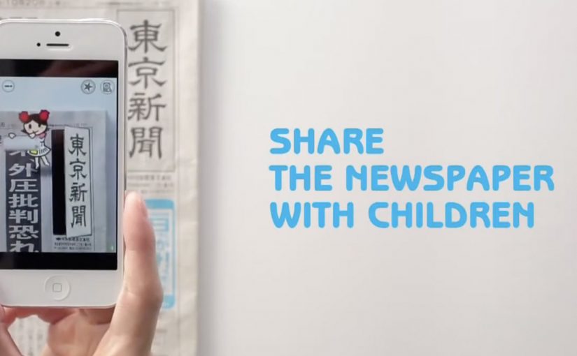
A kid points a smartphone at a newspaper article and the page starts “talking back”. Characters pop up, headlines simplify, and the story becomes easier to understand without leaving print.

Connected devices such as smartphones and tablets have contributed to an explosion in digital media consumption. As these devices gain adoption, print newspapers around the world are seen suffering from declining readership and revenue. To combat this, Tokyo Shimbun, along with Dentsu Tokyo, came up with a new way to connect with readers. An augmented reality reader app brings the newspaper to life by overlaying educational, kid-friendly versions of selected articles.

How the newspaper becomes a “teaching layer”

The mechanism is straightforward. The app uses the phone camera to recognize specific articles, then overlays animated commentary, simplified explanations, and visual cues on top of the printed page so kids can follow along. Here, “teaching layer” means this AR overlay that translates the printed article into simpler language and guided visuals. Because the overlay sits directly on the printed article, kids do not have to leave the page to get context, which lowers friction and keeps attention on the story.

In publishing and media brands that still rely on print touchpoints, augmented reality can turn paper into an entry point for younger audiences without abandoning the physical ritual of reading.

Why this lands with parents and kids

It respects the newspaper as a shared household object, but removes the comprehension barrier for children. The child gets a friendly “translator”. The parent gets a moment of joint attention that feels educational, not like more screen time for its own sake.

Extractable takeaway: If you want kids to adopt a legacy touchpoint, use the digital layer to reduce comprehension friction first and add spectacle second.

What the business intent looks like

This is not only a novelty layer. It is a retention and habit play. If children can engage with a paper alongside adults, the newspaper has a better chance of staying present in the home and staying relevant as a family product.

The real question is whether the AR layer builds repeat, family co-reading habits, not whether it feels novel the first time.

Practical moves for print-plus-AR translation

  • Overlay explanation, not just effects. Make the digital layer add clarity, not only animation.
  • Choose a narrow trigger set. Start with selected stories that benefit most from translation and context.
  • Design for “family co-use”. Make it easy for a parent to participate without taking over the phone.
  • Keep the print object central. The magic works best when the page remains the interface.

A few fast answers before you act

What does the Tokyo Shimbun AR reader app do?

It lets kids scan selected newspaper articles with a smartphone and see animated, kid-friendly explanations layered on top of the print page.

Why pair augmented reality with a newspaper at all?

Because the newspaper is still a household touchpoint. AR can lower comprehension barriers for kids while keeping the shared reading ritual intact.

Is this mainly entertainment or education?

The strongest value is educational translation. The animations act as attention hooks, but the real utility is simplifying and explaining complex topics.

What makes this different from sending kids to a website?

The entry point stays on the printed page. The experience is anchored in the article the family is already holding, which supports shared attention.

What is the biggest execution risk?

If scanning is finicky or the overlays feel gimmicky, kids will not repeat the behavior and parents will not recommend it.

Hyundai Elantra: Driveway Decision Maker

Hyundai Elantra: Driveway Decision Maker

When choice made the Elantra harder to buy

In North American automotive marketing in 2012, the hardest moments are often the ones created by success: when a winner expands and the buyer suddenly has more to compare.

The Hyundai Elantra was named 2012 North America Car of the Year. Momentum was strong.

Then Hyundai introduced two additional variants. The Elantra Coupe and the Elantra GT. Suddenly, a clear win turned into a harder purchase decision.

More choice created more hesitation. Hyundai needed to simplify the decision again, without reducing the range.

Turning your driveway into the showroom

Instead of pushing another brochure or comparison chart, Hyundai built the Driveway Decision Maker, a tool that let prospective buyers preview what an Elantra would look like parked outside their own home.

By combining Google Street View, projection mapping, and real-time 3D animation, prospective buyers could see exactly what an Elantra would look like parked in their own driveway.

The experience replaced imagination with visualization. No guessing scale. No abstract renders. Just your house, your street, and the car.

In high-consideration categories where products physically live at home, a realistic preview in the buyer’s own environment reduces comparison fatigue.

Why seeing it at home removed friction

Car buying is emotional, but doubt creeps in when people cannot picture ownership.

Extractable takeaway: If your buyer must imagine ownership to decide, put a realistic preview into their own environment so the choice feels concrete.

The Driveway Decision Maker collapsed distance between consideration and ownership. By anchoring the car to a familiar, personal environment, Hyundai removed uncertainty about fit, size, and presence.

The experience also shifted control to the viewer. Instead of being told what to like, buyers explored the car in their own context.

The business goal behind the experience

The intent was not novelty. The real question is how you help someone choose when a clear winner becomes a lineup.

Hyundai wanted to reduce decision paralysis created by a broader lineup and move people confidently from interest to purchase. By helping buyers visualize the outcome, the brand shortened the path to commitment.

This was about restoring clarity, not adding noise. Interactivity is only worth it when it makes a decision easier.

What brands can steal from Driveway Decision Maker

  • Bring the product into the customer’s world. Context beats abstraction.
  • Replace imagination with visualization. Show the outcome, not the promise.
  • Use technology to remove doubt. Innovation works best when it answers a real buying question.
  • Support choice instead of limiting it. Help people decide rather than forcing simplification.

Hyundai invited consumers to try the experience themselves on the PickMyElantra site.


A few fast answers before you act

What problem was Hyundai solving?

Too much choice created hesitation. Buyers struggled to decide between Elantra variants.

How did the Driveway Decision Maker work?

It combined Google Street View, projection mapping, and real-time 3D animation to place the car into a buyer’s actual driveway.

Why was this more effective than a configurator?

Because it grounded the decision in a personal, familiar environment instead of abstract specifications.

What business outcome did Hyundai target?

Reducing purchase friction and restoring confidence across an expanded model lineup.

What is the transferable lesson?

If your product requires imagination to buy, use technology to make the outcome visible.

AR in 2013: Three Retail-Ready Examples

AR in 2013: Three Retail-Ready Examples

Augmented Reality in 2013: when the real world becomes the interface

With smartphones and tablets becoming part of our everyday life, we also see more augmented reality apps mixing the virtual and the real world in 2013. Here are some examples from ARworks that recently caught my eye.

Audi Singapore Showroom app

For the opening of their biggest showroom in South-East Asia, Audi created AR experiences that allowed visitors to fly around the showroom building without actually boarding a plane, or drive the Audi R18 race car around Singapore at full speed without the risk of getting a ticket. What’s more, they even allowed visitors to personalize their individual license plates and then take photos with the car.

Dakar race in a shopping mall

A real Dakar desert racecourse was built for the new Opel Mokka on a 4mtrs long table that was placed in a shopping mall. Visitors could use the provided iPads to race against time and each other. The results were then shared on Facebook, and the weekly and overall winners received various prizes.

Christmas Ornament Sling

Deutsche Telekom, for their Christmas promotion, developed an iPad app where visitors could throw virtual Christmas ornaments containing their personal message onto a huge Christmas tree erected in a mall. A successful hit to one of the real ornaments on the tree lit it up through an integrated server application.

The pattern across all three: AR turns “watching” into doing

None of these examples treat AR as a gimmick. Each one uses the device as a bridge between curiosity and action. You explore a building. You race a course. You aim a message at a real tree. The screen stops being a place to consume. It becomes a tool to participate.

In retail and shopper environments, augmented reality works best when it turns a physical setup into a simple, repeatable action loop for the visitor.

The real question is whether your AR layer gives the visitor a simple verb and a payoff worth repeating.

Why retail is the natural habitat for AR

Retail already has the ingredients. Footfall, dwell time, and physical objects that can anchor the experience. AR simply adds a layer of viewer control. The visitor decides where to look, what to try, and what to share. This works because the physical anchor keeps the choice set small, so the device can turn curiosity into a low-friction action with an immediate outcome.

Extractable takeaway: AR earns its keep when the physical setup stays simple and the device turns it into a repeatable action that produces a visible outcome worth sharing.

What’s really being built here

These are not “apps.” They are engagement machines, meaning they turn a physical setup into an interaction loop with a reward and an easy share path. Each one creates a clear reason to interact, a clear reward for completing the action, and a clear path to share or repeat. That is how you turn novelty into behavior.

Four retail-ready AR mechanics to copy

  • Anchor it physically. Anchor the experience to a physical object people can gather around. A showroom, a tabletop course, a tree.
  • Give the visitor a simple verb. Fly, drive, race, sling. Actions beat features.
  • Design a tangible payoff. A photo, a score, a lit ornament. Make the outcome tangible.
  • Make sharing a by-product. Make sharing a natural by-product of the activity, not a forced button at the end.

A few fast answers before you act

What makes these 2013 AR examples feel “ready” for real audiences?

They are built around clear actions and clear rewards. The device is used to do something in the physical environment, not just view an overlay.

Which devices are central to these activations?

Tablets and phones are the delivery mechanism. The examples explicitly reference iPads and handheld devices for the AR interaction.

What role does sharing play in these concepts?

Sharing is tied to the activity. Photos with the car, results shared on Facebook, and personal messages sent as virtual ornaments.

What is the common mechanic across the three examples?

The camera-enabled device acts like a controller that links a real-world setup to a virtual experience, giving the viewer control over exploration and interaction.

How do you keep AR from feeling like a gimmick?

Make the overlay serve a real action and a visible outcome. If the visitor can do something concrete and see a result that is worth showing, the experience stops being novelty and starts being behavior.