
Checkout-Free Stores: 2 Startups Shape Retail

In-store shopping changes when the phone becomes the checkout

With smartphone penetration crossing the halfway point, two new start-ups push to change how we shop in-store.

The shift is simple. The phone is no longer just a companion to shopping. It becomes the point-of-sale, the service layer, and the trigger for fulfillment inside the store. By “checkout-free” here, I mean shoppers scan and pay on their own phone, with staff stepping in only for exceptions.

Because scanning and payment happen during the journey, peak demand spreads across aisles instead of stacking at one cashier line.

The real question is whether you can make the exception path feel as simple as the happy path.

Checkout-free is worth scaling only when your exception paths are as smooth as the happy path.

Why this lands in practice

In omnichannel retail operations, the biggest shopper experience gains often come from removing time sinks like queues and size-hunting, not from adding more screens.

Extractable takeaway: If you want measurable lift, redesign the store journey to delete time sinks first, then let the phone execute the flow.

QThru

QThru is a mobile point-of-sale platform that helps consumers at grocery and retail stores to shop, scan and check out using their Android and iOS smartphones…

The ambition is clear. Remove queues. Remove friction.

Shoppers move through the store with the same control they have online. Browse, scan, pay, and leave without the classic checkout bottleneck.

Hointer

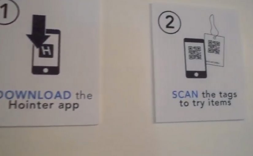
Hointer automates jean shopping through QR codes.

When scanned using the store’s app, the jean is delivered in the chosen size to a fitting room in the store and the customer is alerted to which room to visit.

Once the jeans have been tried, customers can either send the jeans back into the system or swipe their card using a machine in each fitting room to make a purchase.

This approach removes two of the most frustrating in-store steps. Finding the right size and waiting to pay.

The store behaves like a responsive system rather than a manual process.

Steal these moves for checkout-free pilots

  • Delete one time sink first. Pick queues or size-hunting and design the flow to remove it end-to-end.
  • Make exceptions feel normal. Mis-scans, out-of-stocks, returns, and overrides need a fast, humane path.
  • Keep the shopper flow simple. The phone should execute scan-and-pay cleanly, without adding extra steps.
  • Operational reliability beats novelty. Inventory accuracy and in-store routing have to hold up when the store is busy.

A few fast answers before you act

What is the common idea behind both examples?

They move checkout and fulfillment logic into the shopper’s hands. Scanning, sizing, and payment become distributed across the store journey instead of centralized at a cashier line.

How do QThru and Hointer differ in the problem they solve?

QThru focuses on scan-and-pay to reduce queues. Hointer focuses on discovery and fitting-room fulfillment to remove size-hunting, then completes payment in the fitting room.

What has to be true operationally for checkout-free to work?

The system has to be reliable under load: accurate inventory, fast in-store routing, dependable scanning, and a payment flow that stays simple even when the store is busy.

What is the simplest way to pilot this without overbuilding?

Start with one store format and one tight journey. Measure queue time saved and staff exception workload, then expand only if operations stay stable.

What is the biggest failure mode teams underestimate?

Edge cases. Mis-scans, out-of-stocks, returns, fraud handling, and staff override paths. If exceptions are painful, the “friction-free” promise collapses at the worst moment.

BMW i window into the near future

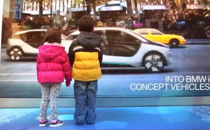
A street-level window in New York City behaves like a digital mirror. Here, “digital mirror” means a live street scene that can replace the cars in the image in real time. As traffic passes, the “reflection” transforms everyday cars into BMW i3 and i8 vehicles, giving passersby a glimpse into the near future.

The context. BMW i and “Born Electric”

The upcoming BMW i vehicles look distinctly futuristic and are positioned to arrive as early as late 2013. To build awareness for the BMW i Born Electric Tour in New York City, BMW reinforces a simple message. The future is closer than you think.

The real question is whether you can make a future-state product promise feel present without asking people to opt in.

This kind of work succeeds when the transformation is unmistakable from a distance and repeats for every passerby.

The execution. A live reflection that rewrites reality

BMW turns a window at the event location into a real-time “reflection” of passing traffic. The system captures what is happening on the street and swaps the vehicles in the live view for BMW i models, so the future feels present in the exact moment people walk by.

In public spaces, low-friction interactive experiences win when they are legible from a distance and require no download or instruction.

Why this works. Low friction, high surprise

The interaction requires no download, no instruction, and no commitment. It is immediate, legible from a distance, and designed for public curiosity. Because the swap happens in the same sightline people already have, surprise arrives before skepticism. The value is the reveal. A familiar street scene. Then a future version of that same scene.

Extractable takeaway: If you want people to believe “the future is close,” show the future inside a familiar frame, in real time, with one unmistakable before-and-after.

Make the promise feel present

  • Borrow a default behavior. Use a frame people already check, like a reflection or a window, so attention is automatic.
  • Make the change binary. One clear swap that anyone can spot, even in motion.
  • Let repetition do the work. Design it so the reveal happens again and again for new passersby, without setup.

A few fast answers before you act

What is BMW i Window Into the Near Future?

A street-level installation that turns a window into a live digital “reflection,” transforming passing traffic into BMW i3 and i8 vehicles.

What is it promoting?

Awareness for the BMW i Born Electric Tour in New York City, and the idea that the future is closer than you think.

What is the main user behavior?

Walk by, notice the window, and experience the surprise as the street scene is transformed in real time.

Why is the window format effective?

It uses a natural behavior, looking at reflections, then subverts it with a future-state overlay.

What is the transferable pattern?

Place the experience where attention already exists, then deliver one high-clarity transformation that makes the product promise tangible.

Happy Holiday Videos 2012: Agency Stunts

Welcome back. Hope everyone had a great holiday season. Now for a great start to 2013.

Taking off from my last post, here are a series of holiday action videos created by ad agencies around the world in their lead up to Christmas 2012. By “holiday action videos,” I mean greetings built around a simple interaction or trigger with a visible payoff.

Holiday greetings that behave like products

The mechanism across this set is consistent. Use the “holiday card” moment as permission to ship something people can experience, not just watch. A hacked player, a tweet-triggered donation, a synchronized “orchestra,” a physical gag product.

In global agency culture, the holiday card is a low-risk moment to test interactive mechanics and craft that can later show up in bigger client work.

Why this format keeps working

These pieces earn attention because they trade greeting-card sentiment for an observable action. The real question is whether your greeting demonstrates a capability people can experience, not just a sentiment they can scroll past. You should treat the holiday card as a tiny product launch, not a branded message. The viewer is not only receiving wishes. They are triggering something, learning something, or being surprised by a mechanism that is simple enough to retell.

Extractable takeaway: If you want something to travel during peak-season noise, design a one-step interaction with a visible payoff, and make the payoff describable in a single sentence. That is retellability, meaning a friend can summarize it in one sentence.

Maurice Lévy’s Digital Wishes by Publicis Groupe

Maurice Lévy, the chairman and chief executive of Publicis Groupe, traditionally records a holiday greeting-card video. This year, through a special deal with YouTube, Publicis modified the function buttons of the video player and embed tricks into what seems like another long, boring address by an ad industry veteran.

TwinterWonderland by 360i

To celebrate the arrival of the holiday season and provide assistance to those affected by Hurricane Sandy, 360i wanted to do something big. For every #TwinterWonderland tweet they received, 360i donated $5 to an aid organization helping with the post-Sandy cleanup effort.

25th Anniversary Holiday CompuCard by TBWA\TORONTO

To celebrate their 25th anniversary, TBWA\TORONTO brought in their digital expert from 1988, who then, through an e-card, tried to capture the spirit of their past along with their digital future.

Buzzed Buzzer by Havas Worldwide Chicago

The first New Years Eve noise maker that only works when you’re drunk.

Christmas carol played on food by FullSIX Spain

To wish happy new year to customers and friends, FullSIX transformed typical Spanish Christmas food into a carol-playing piano.

Click here to watch video on the AdsSpot website.

The Snow Machine by Weapon7

Passers-by were invited to Tweet #snow to @thesnowmachine Twitter account. For every tweet received, the machine gave ten seconds of snow flurry. The event ran all day, was seen by thousands of people and generated over one thousand tweets.

Stealable patterns for next year’s greeting

  • Give the audience one trigger. One hashtag, one button, one simple mechanic.
  • Make the payoff visible. Something changes immediately, on-screen or in the real world.
  • Design for retellability. If the idea cannot be summarized in one sentence, it will not spread.
  • Let craft do the selling. Use the holiday excuse to demonstrate capability, not just sentiment.

A few fast answers before you act

What makes “holiday action videos” different from normal holiday ads?

They are built around a visible action or interaction. The greeting is the excuse. The mechanism is what people experience, talk about, and share.

Why do agencies use holiday cards as a playground for experimentation?

The stakes are lower and the audience is receptive, so it is easier to try unusual formats, technical tricks, and interactive mechanics that would be harder to justify elsewhere.

What is the common mechanism across the strongest examples?

One clear trigger and one clear payoff. A hacked player that surprises you, a tweet that causes a donation, a simple “instrument” that performs when activated.

How do you keep it from feeling like a gimmick?

Anchor the interaction in a human reward. Delight, generosity, togetherness, or a simple shared joke. Then keep friction low so the idea survives first contact.

How do you test retellability before you publish?

Ask someone outside the project to explain the idea back to you after a 10-second description. If they cannot say the trigger and payoff in one sentence, simplify the mechanic.