The future of Augmented Reality

The future of Augmented Reality

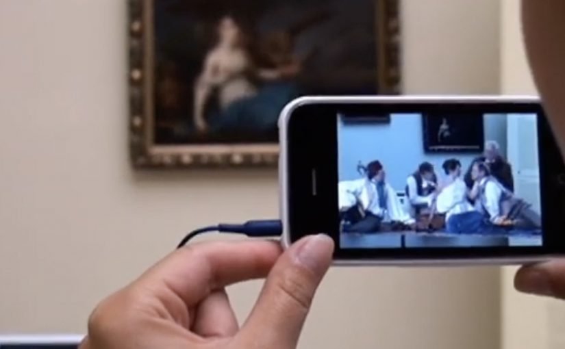
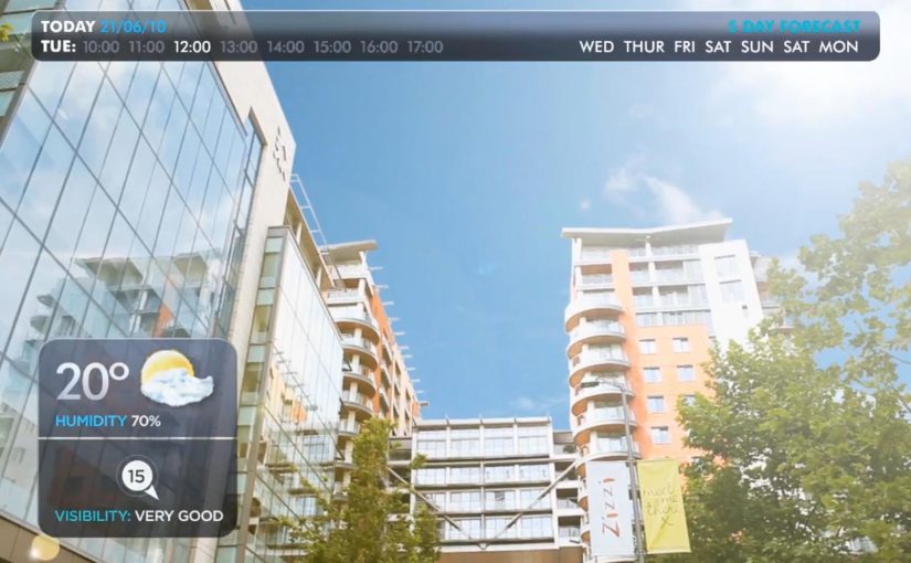
You point your phone at the world and it answers back. In Hidden Creative’s video, a mobile device scans what’s around you and returns live, on-the-spot information. The same AR layer lets you preview change before you commit to it, by virtually rearranging furniture or trying colours in a real space.

Utility AR: the phone becomes a real-time lens

The value is not “wow.” It is utility. The device behaves like a real-time lens you can use in the middle of a decision:

  • Scan surroundings and get contextual information immediately.
  • Overlay objects into physical space to plan renovations or layout changes.
  • Configure colours virtually before making real-world changes.

What the mechanic actually is

At its simplest, the camera feed becomes the interface. The device recognises elements in the scene, then anchors relevant information and virtual objects to the real world so you can act on what you see. When overlays reliably “stick” to reality, the experience stops feeling like a gimmick and starts behaving like a tool you can trust.

In consumer retail and home-improvement scenarios, AR becomes habitual only when it works predictably across devices and requires near-zero setup beyond opening the camera.

Why this kind of AR lands

People do not adopt AR because it is impressive. They adopt it when it reduces uncertainty in a moment that matters, like “Will this fit?”, “Will this look right?”, or “What is this thing in front of me?”. Campaign AR often optimises for novelty. Everyday AR has to optimise for reliability, speed, and repeatability.

Extractable takeaway: If AR does not reduce a real decision into a faster yes or no, it will stay a one-off experience, even if engagement looks great in the first week.

The real question is standardisation, not creativity

Augmented Reality is already active in brand campaigns around the world, mainly because it creates high engagement and talk value. Yet it still does not play an everyday role in most people’s lives because the experience is fragmented across ecosystems.

Before daily-life AR becomes normal, platform owners and developers need to standardise the experience across their ecosystems. Apple, Google, and Microsoft/Nokia each move in their own direction, and the result is fragmentation.

By “a standard AR experience,” I mean a consistent base layer for recognition, anchoring, lighting, scale, and interaction patterns so users do not have to relearn AR every time they switch apps or devices.

One master app vs. an app store full of one-offs

Right now the app stores are cluttered with many Augmented Reality apps, each doing a slice of the job. One cross-platform “master app,” or at least a consistent base layer, is a plausible starting point for making AR feel like an always-available capability instead of a novelty download.

The stance: AR becomes mainstream when it is treated like a standard capability layer, not a series of isolated one-off apps.

What to steal for your next AR decision

  • Design for repeat use. Pick a high-frequency decision moment, not a “shareable” moment.
  • Reduce setup friction. If the experience needs a special download for a single task, adoption will stall.
  • Make reliability visible. Use cues that show tracking and anchoring are stable so users trust what they see.
  • Define the base layer you depend on. Be explicit about which platform capabilities you require and what breaks without them.

A few fast answers before you act

What does the Hidden Creative video demonstrate?

It shows a phone scanning a real environment, returning contextual information in real time, and overlaying virtual objects into the scene for practical tasks like planning and previewing changes.

What is the core AR mechanic described here?

The camera feed becomes the interface. The device recognises the scene and anchors information or objects to it so the overlay stays aligned with the real world while you move.

Why does AR still feel like a campaign tool in most cases?

Because many AR experiences optimise for novelty and short-term engagement, not for reliability and repeat use. Fragmentation across platforms also prevents a consistent everyday habit.

What does “a standard AR experience” mean in practice?

It means consistent behaviour across devices and apps for recognition, anchoring, scale, lighting, and interaction patterns so users do not have to relearn AR each time.

What is meant by a “base layer” or “master app” for AR?

A shared foundation that reduces fragmentation. Instead of dozens of one-off AR apps, users get a consistent AR capability that multiple experiences can plug into.

What is the simplest next step if a brand team wants AR to drive real adoption?

Target one repeatable decision moment and design the experience to work quickly and predictably with minimal setup. If it does not reduce uncertainty, it will not become a habit.

Sukiennice: Secrets Behind Paintings

Sukiennice: Secrets Behind Paintings

The Sukiennice Museum in Krakow is one of the oldest museums in Poland, and it is reopening after a complete renovation. The problem is not the building. The problem is attention. Young people do not automatically find 19th-century Polish art interesting.

Leo Burnett Warsaw gets the challenge to pull this audience back in, and answers it with an integrated campaign anchored by the New Sukiennice augmented reality app.

The mechanic: bring paintings to life with viewer control

The app turns the visit into an interactive layer. Point your phone at selected works and the paintings come alive, revealing their stories through short films and animated moments. Instead of reading a label first, you get pulled into a scene first, then you choose to go deeper. Here, viewer control means visitors choose when to trigger the story and whether to go deeper.

In European museums trying to win younger audiences, lightweight AR can translate static collections into short, shareable stories without rewriting the institution’s identity.

Why it lands: it swaps “art history” for narrative tension

This is not about making the museum more “digital”. It is about making the first minute feel rewarding. Young visitors do not need more information at the start. They need a reason to care. That works because short films give the paintings a hook, and the phone becomes a bridge between a familiar screen habit and an unfamiliar art period.

Extractable takeaway: If the barrier is “this feels irrelevant”, do not lead with education. Lead with story. Give people one fast, emotional moment they can experience, then let curiosity pull them into context and detail.

An integrated campaign that keeps the app from being a lonely download

The real question is how you make a heritage visit feel immediately worth a young person’s time without turning the art into a gimmick.

The app plays the central role, but it does not stand alone. The campaign also uses billboards, social media and e-cards to create buzz and point people toward the experience. The intent is clear. Get young people to show up, then let the AR layer turn “I visited” into “I discovered”.

The buzz generated by the campaign is described as attracting a significant share of Krakow’s population to the museum.

What to steal for your own cultural or heritage activation

  • Start with one irresistible moment: pick a small set of works and make them unforgettable, rather than trying to animate everything.
  • Put the story before the lesson: emotion first, interpretation second.
  • Make it usable on-site: the experience should work in the gallery without long setup or instructions.
  • Design for “showing a friend”: the best museum tech spreads when people can demonstrate it in seconds.
  • Support it with media that explains the payoff: billboards and social should communicate the “why” of the visit, not just the existence of an app.

A few fast answers before you act

What is the New Sukiennice app?

It is an augmented reality museum app designed to bring selected paintings to life and reveal their stories through short film content during a gallery visit.

Why is AR a good fit for 19th-century painting?

Because the barrier is often distance. AR can add narrative entry points and context quickly, helping visitors connect emotionally before they engage intellectually.

What makes this more than a tech demo?

The app is positioned as the core of an integrated campaign. The surrounding billboards, social media and e-cards create the motivation to visit, and the on-site experience delivers the payoff.

What’s the biggest risk with museum AR?

Friction and distraction. If setup is slow, or the experience pulls attention away from the original work instead of back into it, the technology becomes the point and the art loses.

How should a museum measure success here?

Look at youth attendance lift, repeat visits, time spent in targeted rooms, and whether visitors progress from the AR moment into deeper engagement like reading labels, joining tours, or exploring more works.

IKEA Manland

IKEA Manland

Last month IKEA in Sydney, Australia ran a four-day trial of Manland. They created a dedicated area in the store which men with short retail attention spans could use to escape the pains of weekend shopping at IKEA. In simple words, it was day-care for husbands and boyfriends who wanted to take a break from the shopping.

The store offered free hot dogs, Xbox consoles, pinball machines and nonstop sports action on TV. IKEA even handed out buzzers so women would get reminded to come back and pick up their men after a short session.

Turning “waiting time” into a branded service

Manland works because it is not pretending men suddenly love shopping. It acknowledges the reality. Some people will be there for the relationship, not the retail. So IKEA reframes the pain point as a service, the same way Småland turns “kids are restless” into a solved problem.

The mechanism is deliberately low-effort. You do not need an app, a QR code, or an explanation. You just drop in, decompress, and rejoin the trip with less friction and fewer arguments.

In big-box retail, weekend shopping is often a couple activity, and boredom is a conversion killer for the accompanying partner.

Why this becomes press, not just a gimmick

It is instantly legible. A “day-care for men” is a headline. The imagery does the distribution work. Consoles, sports, hot dogs, and a buzzer are all recognisable symbols, so the concept travels across cultures even if you have never been to an IKEA.

Extractable takeaway: If you want earned media from an in-store experience, design one idea that reads in a single photo and a single sentence.

It is also slightly provocative, which helps. People argue about whether it is funny, patronising, or brilliant. That debate is oxygen for earned media.

The business intent: protect dwell time and reduce walk-outs

The practical goal is simple. Keep groups in-store longer, reduce the urge for someone to storm out, and make the trip feel easier, especially on peak weekend traffic. The PR upside is a bonus. But the operational benefit is the real value.

The real question is whether you can remove that boredom without turning the idea into a stereotype.

If your store relies on group shopping, design for the bored companion as deliberately as you design for the primary buyer.

Steal the companion-lounge playbook

  • Solve a real friction. If it does not remove pain, it will not spread.
  • Make the rules obvious. The best retail ideas need zero onboarding.
  • Build a “photo truth”. If the experience photographs well, it earns its own distribution.
  • Use time limits to keep it fair. A short session keeps it accessible and stops it becoming a hangout that blocks capacity.

A few fast answers before you act

What was IKEA Manland?

Manland was a short trial inside an IKEA store in Sydney. It offered a staffed, game-and-sports lounge where men could take a break while their partners shopped.

Why did the buzzer matter?

The buzzer turned “come back later” into a simple timing system. It made pickup predictable and helped manage capacity without complicated queueing.

Is this primarily an ad idea or an operations idea?

Both. It is an operations idea that creates PR. The experience removes friction inside the store, then the simplicity of the concept turns it into a shareable story.

What makes this kind of activation risky?

Stereotypes. If the tone feels insulting or dated, the press flips from amused to critical. The safest version is to frame it as optional decompression, not a judgment.

What should you measure if you do something similar?

Dwell time, drop-off rates, and satisfaction in exit feedback. For comms, track earned pickup and social sharing, but only after the in-store metrics look healthy.