IKEA: A New Kind of Catalog

IKEA: A New Kind of Catalog

Every year, the IKEA Catalog inspires people around the world to create homes they love. For the 2013 edition, IKEA takes the inspiration one step further by bringing technology to the paper catalog and creating a more seamless connection to purchase.

IKEA worked with McCann New York to re-imagine the catalog via a visual recognition app that brings select pages and the offerings within to life. The experience is positioned around inspirational videos, designer stories, “X-ray” views that peek inside furniture, and more.

How the catalog becomes an interface

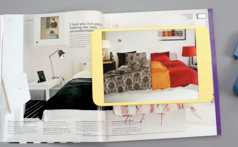
The mechanic is page recognition. You point your phone at a printed page and the app identifies the exact spread, then overlays or opens the matching digital layer. That is what “visual recognition” means here. The camera view is used to recognize the image itself, so the print can stay clean without obvious codes taking over the layout.

This is interactive print done as a product layer, not as a QR code workaround. The page remains a premium editorial surface, and the interactivity is unlocked through recognition rather than visible markers.

In global retail organizations with massive print distribution, recognition-based layers let brands turn a static catalog into a measurable, updateable experience without redesigning the entire print grammar.

The real question is whether your print can behave like an interface without sacrificing the editorial feel that makes people pick it up in the first place.

Why “X-ray” and stories beat a pure commerce push

What makes this approach land is that it does not start with “buy now.” It starts with curiosity. Here, the “X-ray” layer is a simple cutaway view that lets people see inside furniture to understand utility. Peek inside a unit. Watch the product in context. Hear the thinking behind a room setup. Those are the moments where browsing becomes intent.

Extractable takeaway: If you want print-to-digital to stick, lead with reassurance and curiosity, not a commerce CTA. Use interactivity to remove uncertainty in one fast payoff, not to add a menu of options.

The “X-ray” idea is also a smart translation of a physical store behavior. People open drawers and cupboards in-store to understand utility. This gives a lightweight version of that reassurance from the page.

What IKEA is really building with this

At face value, it is an augmented catalog. Underneath, it is a bridge between inspiration and action. A catalog is already a decision-shaping channel. Adding tappable layers makes it a trackable channel and creates new points where IKEA can educate, reassure, and nudge the path to purchase.

Copyable moves for print-to-digital catalogs

  • Keep the print clean. If the page looks like a code sheet, you lose the lifestyle premium.
  • Use interactivity to remove uncertainty. Show how it works, what fits inside, how it looks in a room.
  • Design for quick wins. One scan should yield something useful immediately, not a long menu.
  • Make the layer repeatable. If it can work on many pages, it becomes a system, not a stunt.

A few fast answers before you act

What is a “visual recognition” catalog app?

An app that recognizes a printed page using the phone camera, then unlocks related digital content tied to that exact spread.

Why is recognition better than QR codes for premium catalogs?

Because it preserves design. Recognition can keep layouts clean and still enable interaction, while QR codes often force visible markers into the page.

What is the “X-ray” feature actually communicating?

Utility and confidence. It helps people understand storage and function without needing to visit a store or guess from a single photo.

What is the main business value of interactive print?

It turns inspiration into measurable engagement and creates additional moments to guide purchase decisions, especially for considered categories like furniture.

What is the biggest risk with print-to-digital layers?

Friction. If scanning is slow, unreliable, or the payoff is thin, people abandon the habit after one try.

Lacta: Love Messages on Real Bars

Lacta: Love Messages on Real Bars

OgilvyOne Athens created another innovative campaign for Lacta Chocolate. This time, people write their own love messages and see them appear on real Lacta bars through an augmented reality mobile app.

The twist is that the message is not “published” online first. It is revealed on the physical product when the receiver scans the wrapper with the app, which turns a simple bar of chocolate into a personalized moment.

Click here to view some of the past Lacta Chocolate campaigns that are equally innovative.

How the AR message reveal works

The mechanism is a clean three-step loop. The sender composes a message in the app and chooses who it is for. The receiver is prompted to use the app too, then scans a Lacta bar to reveal the hidden message in augmented reality. Because the reveal depends on scanning the product, the experience is designed to connect emotion and purchase in the same gesture.

In FMCG gifting categories where love and ritual drive preference, adding a personal reveal layer can create differentiation without changing the core product.

Why it lands

It modernizes a familiar behavior, writing something personal on a gift, without losing the physicality of giving chocolate. The message feels private and earned because it only appears when the recipient holds a real bar in their hands and chooses to reveal it. That makes the brand’s role feel like an enabler of intimacy, not an interruption. That works because the product scan turns anticipation into part of the gift, which makes the interaction feel more meaningful than a standard message.

Extractable takeaway: If you want personalization to drive both attention and sales, tie the reveal to a physical trigger. Make the digital layer unlockable only through the product, so the magic moment and the transaction reinforce each other.

What Lacta is really optimizing for

The real question is how to make personalization pull product demand instead of floating as a nice digital extra.

This is built to turn gifting into repeatable behavior. One person sends a message, another person downloads the app, then the product becomes the key that unlocks the experience. That creates a loop that can scale through relationships rather than through media weight alone.

The strongest strategic choice here is keeping the chocolate bar as the gate to the experience, not just the branded wrapper around it.

What to steal for your own packaging-led digital work

  • Use the pack as the trigger. If the wrapper is the marker, the product stays central.
  • Make the reveal the reward. The moment of discovery is what people remember and retell.
  • Keep the steps simple. Create, send, scan. Anything more complex reduces participation.
  • Design for reciprocity. The best gifting mechanics invite the receiver to respond, not just consume.

A few fast answers before you act

What is the core idea of this Lacta campaign?

An AR mobile app that lets people write a love message that only appears when the recipient scans a real Lacta chocolate bar.

Why does tying the reveal to the physical bar matter?

It keeps the product as the gateway to the experience, so personalization supports purchase rather than replacing it.

What is the main emotional benefit versus a normal digital message?

The message feels more intimate because it is hidden and revealed in a physical moment, not broadcast in a feed.

Why not publish the message online first and then link to the product?

Because that would make the product secondary. Here, the chocolate bar is the access point, so the physical gift remains central to the experience.

What is the biggest execution risk with AR-on-pack ideas?

Friction. If install, scanning, or recognition is unreliable, the magic becomes disappointment. The reveal has to work fast and consistently.

Disney: Mickey Mouse brings magic to NYC

Disney: Mickey Mouse brings magic to NYC

You step into the Disney Store in Times Square and suddenly you are “in” a Disney moment. A live screen blends you into a scene and Mickey appears alongside you, reacting in real time as the crowd watches.

Disney Parks uses the installation to celebrate Mickey Mouse’s 83rd birthday this month, turning a store visit into a small piece of theatre that people naturally photograph and share.

The mechanism is straightforward. A live camera feed captures guests, then an augmented reality layer places Disney characters and effects into the scene so it looks like the magic is happening around you, not only on a separate screen.

In flagship retail environments, live augmented reality installations convert foot traffic into shareable content by making the store itself behave like media.

The real question is whether the experience makes bystanders feel like they are watching a story, or watching a demo.

Disney is also using a Twitter hashtag #DisneyMemories to track the experiences at Times Square and the campaign, so the physical moment has a simple, searchable social trail.

Why this lands in Times Square

Times Square is already a stage. The installation does not fight the noise with more noise. It creates a personal moment inside the noise, where the viewer becomes part of the story. That shift from watching to participating is what earns the stop-and-stare crowd.

Extractable takeaway: In a loud environment, the winning move is not bigger spectacle. It is giving each guest a personal, camera-ready moment the crowd can understand instantly.

Hashtag as a lightweight amplification layer

The hashtag is not the idea. It is the plumbing. It lets Disney connect hundreds of individual “I was there” posts into one visible stream, without asking people to learn a new platform or download anything beyond what they already use.

The same live AR pattern shows up elsewhere

This style of live augmented reality is showing up more often in brand-led events, because it creates instant participation without complex instructions. You have already pointed to similar executions from National Geographic and Lynx, where the screen becomes a “portal” and the audience becomes part of the scene.

What to steal for your own live-event experience

  • Make the first second readable. People should understand what is happening from across the room.
  • Design for bystanders. The crowd experience matters, because the crowd is the distribution engine.
  • Attach one simple social handle. A hashtag or keyword is enough when the moment is already worth sharing.
  • Keep the tech invisible. The audience should remember the feeling, not the hardware.

A few fast answers before you act

What is the Mickey Mouse Times Square augmented reality installation?

It is a live in-store experience at the Disney Store in Times Square that places guests into a real-time scene with Disney characters using an augmented reality layer on a live camera feed.

Why does this work as a retail activation?

Because it turns a store visit into a participatory moment. People do not just browse. They become part of a scene worth filming and sharing, which extends reach beyond the store.

What role does #DisneyMemories play?

It creates a single social thread for many individual posts, helping Disney track and aggregate the shared experiences without adding friction to the in-store moment.

How is this different from a typical photo booth?

The difference is live spectacle. The experience is designed to be watched by a crowd in real time, so bystanders become part of the energy and the story travels further.

What is the most common failure mode for live AR event installs?

Confusion and delay. If people cannot instantly understand what to do, or if the experience queues too long, the crowd dissolves and the social output drops sharply.